Seamless, an online food delivery website, allows you to order from over 12,000 restaurants that use their services to deliver food direct to your doorstep. The mission of the website is to cut contact between the user and the restaurant that often causes much aggravation. The website revolves around the user by attempting to be as human-centered as possible. The main attributes of this website (seamless.com) is searchability/ finding the website, ordering/ navigation and design. The digital interface of the Seamless website has mostly positive and some negative Norman elements. Using Norman principles, I will critique Seamless.com, but on a whole congratulate them on a job well done.
On a whole, Seamless.com is a pretty well designed and thought out website. It has searchability- when searching for food delivery, Seamless is listed as a top search result on Google making discovering the website quite simple. It’s simplistic navigation style and clear instructions displayed throughout the website, makes the ordering process easy to use. However, there are some faults in the system in regards to user clickability and having icons that look like signifiers but don’t afford clicking.
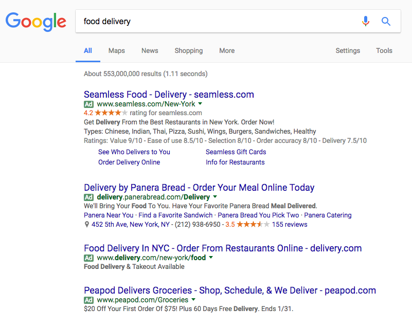
Key to its success in findability is the promotion of its website which therefore promotes searchability by paying for the top spot in the Google search platform (Figure 1). The website has easy to follow instructions: where they put “knowledge in the world.” Using labels on controls and offering a map of the website shows positive discoverability.

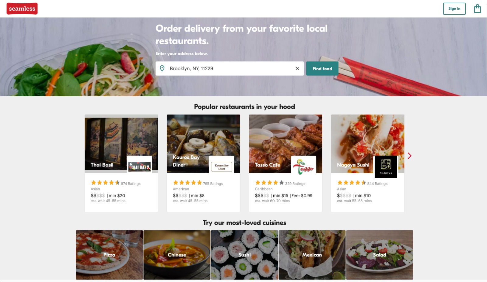
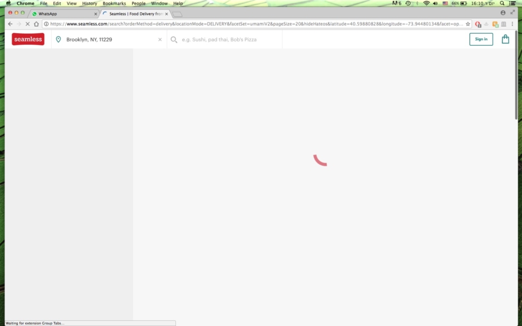
Figure 3 shows the ease with which the website lets us search either by address or zip code, or searching by the type of food and/ or name of restaurant.
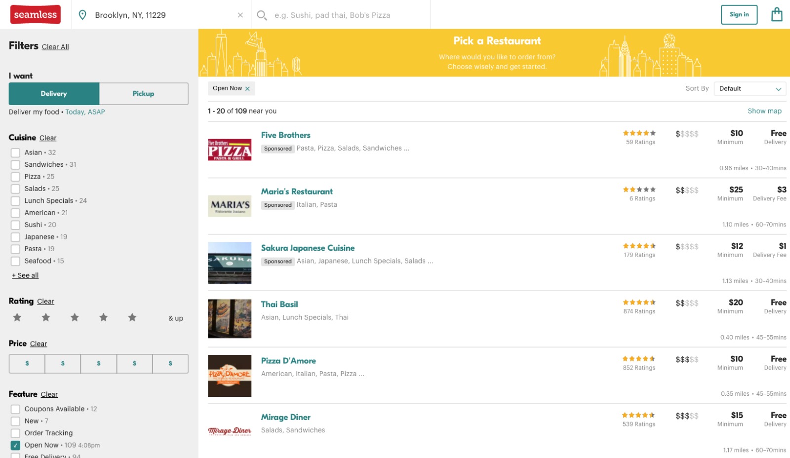
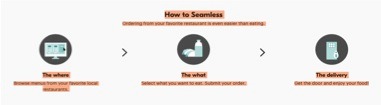
The design of the navigational system makes the ordering of food simple through a series of quick steps in the center of the website: input of location, type of cuisine, input filters (i.e. ratings, price, delivery/ pickup…), choosing restaurant and once inside- choosing food items from the menu (figure 4). It also uses natural mappings (i.e. where clicking on a name or object does that action). Because all the instructions are on the screen, there is no need to use any knowledge in the head and therefore there will be no gulf of execution. However, the website has some faults when it comes to the signifiers on their main menu where the icon (Figures 5 & 6) seems for clicking but is not clickable. According to Norman, this can be fixed by either removing the icon that would then lessen the websites discoverability or by making it able to be clicked and doing the desired action that the icon suggests.
The design of the website itself, makes the website very appealing and gives positive feedback when something is clicked on or a filter is added. For instance, when clicking on a restaurant there is a swirling design or when adding a filter the screen turns grey so no other action can be performed (as seen in Figure 7). Additionally, on the main page the website is broken into different levels of Seamless website usability: The top is the main use of the website for searching for restaurants; underneath in bright yellow is an advertisement for their apps on Androids and iPhones; below it the user can find instructions of how to Seamless; and so on and so forth with each level having a designated color containing different content.
The seamless.com website is designed so that users can order food without having the hassle of dealing with restaurants (getting the wrong item or something being bad) and tries to make the process simple and quick. It is my opinion that Seamless.com on a whole accomplishes this according to most of Normans principles and the ones that don’t can be chalked up to “not every website is perfect.”