Spotify is a popular streaming music app, with both free and Premium paid plan options. With Spotify Premium, users can stream unlimited music, create and curate playlists, and discover new music all through the mobile app, available for both iPhone and Android through the corresponding app stores. Full access to Spotify is dependent upon either a mobile data plan, or connection to wifi, though certain saved playlists can be synced for offline play.
![]()
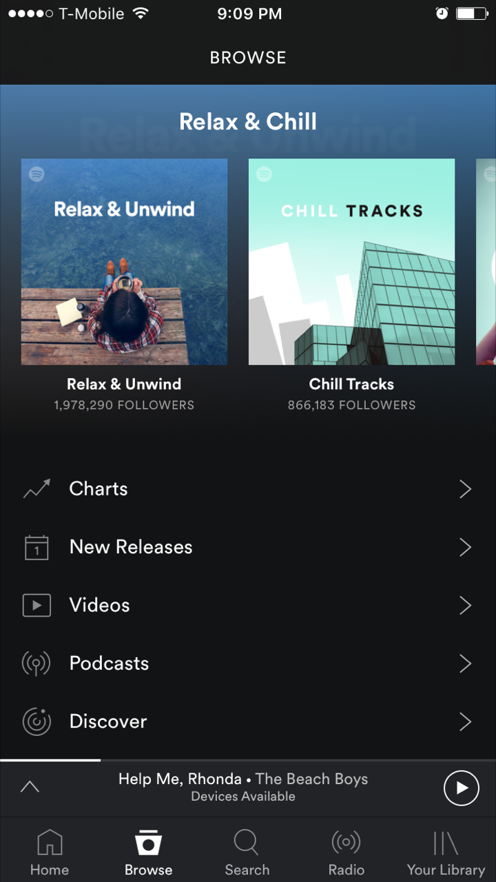
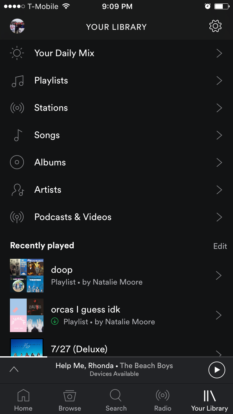
After launching the app, users have access to a clearly discoverable navigation bar along the bottom of the screen with five main categories. Upon first download of the app, Spotify is not well tailored to a user’s preferences. Unlike Seamless or Yelp or similar apps that might make use of location services to immediately make suggestions relevant to the user, Spotify’s mobile app relies solely on repeated use and saving of data to craft the experience to match the needs/wants of the user. As one continues to use the Spotify app, the “Library” tab will fill with saved playlists and albums, the “Home” tab will populate with recently played songs and podcasts to resume or select again, and the suggestions in the “Browse” tab will learn from the user’s tastes and recommend music of related genres, artists, and themes. The usability and effectiveness of the Spotify mobile app increases and improves with use, similar to the general functionality of Amazon.com.
The Spotify app makes use of culturally recognized signifiers to create positive, intuitive mappings for music playback. The familiar triangular play button, double-lines pause button, and arrows pointing “forward” and “back” to skip to the next or previous track while listening. Some extra features are discoverable in immediate ways that make themselves known, even if the user had not previously been aware that they existed.

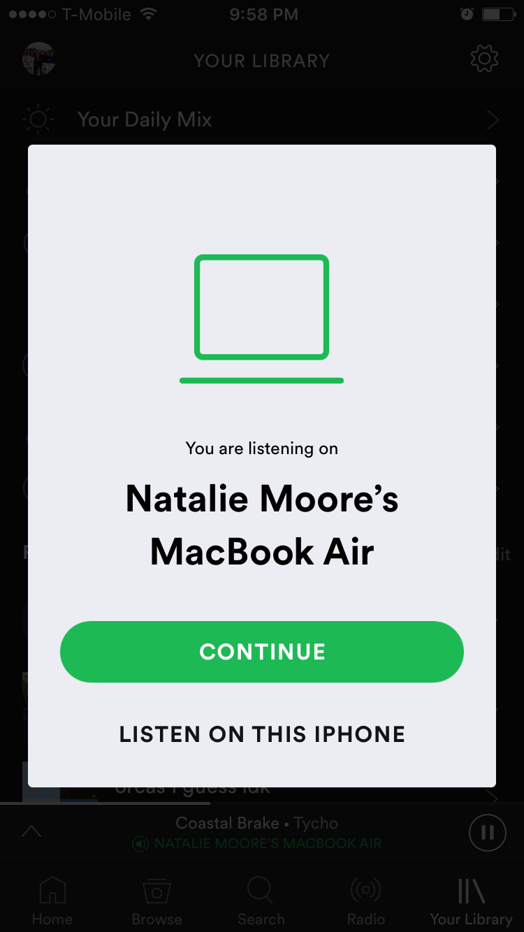
One of these features is a built in lyrics database, that one can access by dragging down while listening to a track (album cover “bounces” down to reveal this while listening to a new track) and perhaps the coolest of these is that if the account linked to the mobile app is open and being used to play music elsewhere (for example, on a laptop) the app will prompt the user to decide which they would prefer to continue streaming on. This works both ways, so if a user had been streaming on the desktop application and opens their phone to travel, the user can seamlessly transition from desktop to mobile app without interrupting playback. This is an example of positive feedback as it clearly indicates to the user that the app has recognized activity on the account. Feedback is also received by the user audibly when music can immediately be heard playing from whichever device was selected from the pop-up menu.
The cog/gear icon is also used as a common signifier to indicate the “Settings” menu, however, this is unnecessarily difficult to find, as it is for some reason only visible above the “Your Library” tab and does not appear on any of the other five category tabs. If one is looking at the “Browse”, “Home”, “Search”, or “Radio” tabs the settings icon is absent from the upper right hand corner. This makes the settings unnecessarily difficult to find, and could be remedied by putting the gear icon at the top of each panel, allowing a user to access settings from any facet of the app without hassle.
The app also makes good use of constraints with regards to online/offline usage. If a user is out of service range or using airplane mode, only the lit-up song titles with a green download icon afford clicking, and the song titles which appear in a dim gray cannot be clicked until internet access is restored to the mobile device.

In general, I consider the Spotify mobile app to be very user friendly and to adhere well to Norman’s definitions of usability. While some small changes could always be made to maximize functionality, I use this app multiple times daily and have no significant complaints.