The Frick Collection website is the digital hub for the museums on-line content. The website houses many features such as the Frick’s digital archives, reference library, and photo archives, including the Frick’s entire collection. Users can also find information about upcoming and current events, programs, exhibitions, as well as, a history of the Frick Collection. The website is the digital interface for the physical institution.
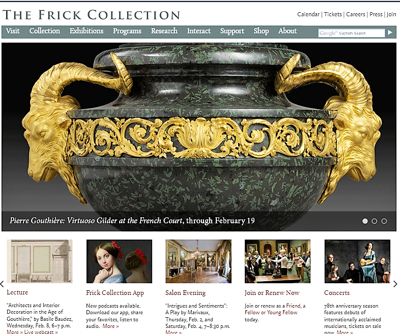
For the purpose of this design critique I will focus mainly on the homepage interface of the Frick’s website. Upon first visit to the Frick Collection’s on-line site, there is over-all easy discoverability of the functions that can be performed when using the site. The main menu bar located across the top of the page, displays clear navigational tools like Visit, Collection, Exhibition, Programs, ect. This feature makes it easy for users to quickly understand the main areas of the website and how to access them. Along with listing the primary areas of the site, this main navigation bar also displays drop down menus with sub-categories. For example, under Collection there are varying sub-sections like Works On View that can be visited. This feature is helpful in navigating the website to a user who is both familiar to the site, and one who is not.
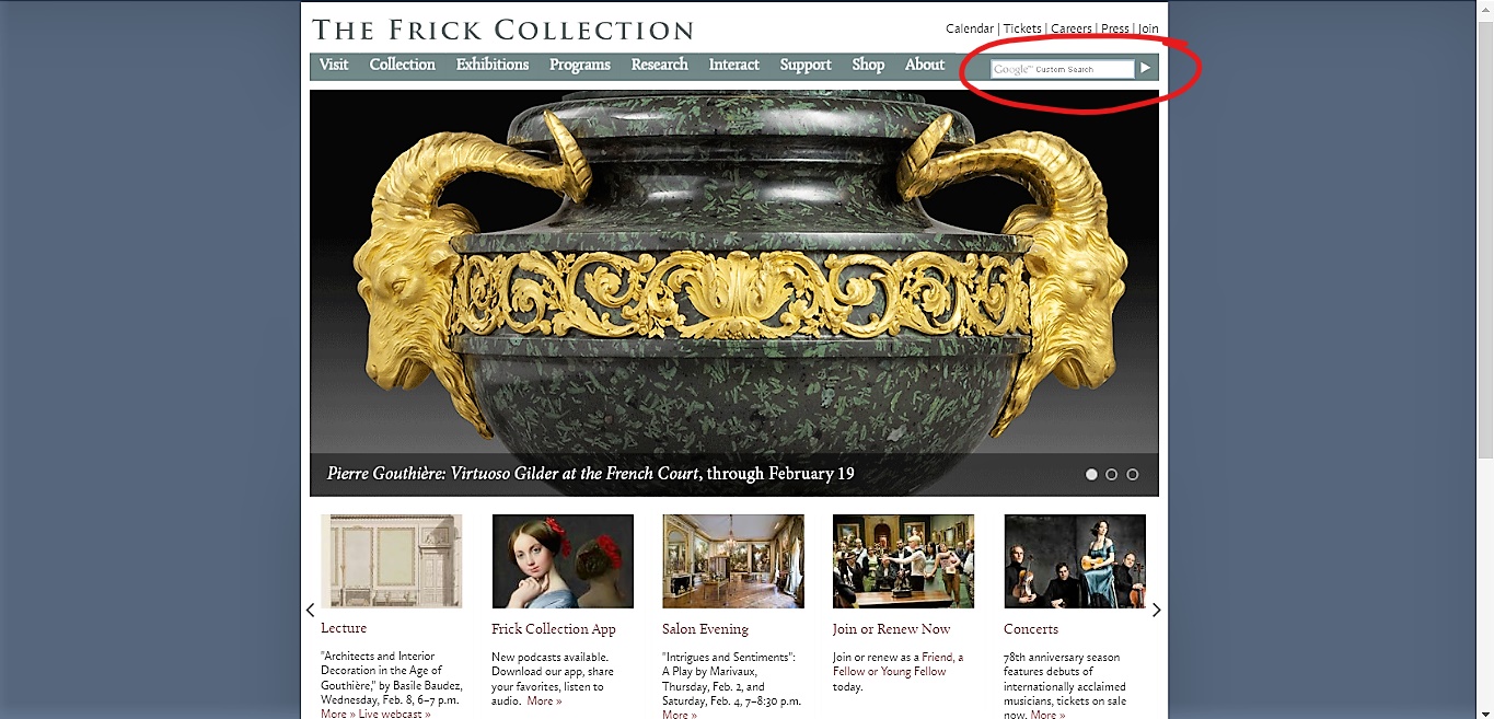
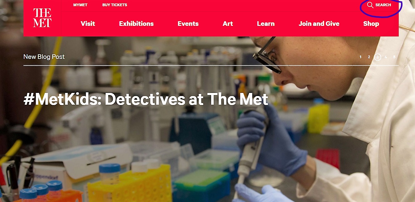
In contrast, finding the Search Box option, which is located at the end of the main menu bar, is small and not noticeable. To help this feature become more distinguishable, perhaps the search icon should be moved to a separate and more predominate space on the page. For reference, the MET museum website has the search box isolated from the rest of the main menu tools; in the upper right hand corner of the page. Its function can easily be understood as a search box, as indicated by the images.
The Frick website also has an easy layout, and for the most part natural mapping of the attributes displayed on the site. Visiting the institutions homepage, a user can easily understand the way the website functions. Natural mapping within the Frick’s website would be again the main menu navigation bar. Users can read it from left to right and understand that the different topics displayed will bring them to that specific area of the website. Ex: About icon will bring users to a page that gives information about the Frick.
This also showcases that the Frick Website has appropriate affordances within the site. The navigational icons bring users to the designated areas. There are also images on the homepage that can directly bring a user to a particular part of the site when the user clicks on them. The signifier for this action can be understoon when the mouse turns from an arrow to a pointing hand, suggesting that the image is a link. This Frick’s website has a few signifiers to indicate what a user can do with this website and what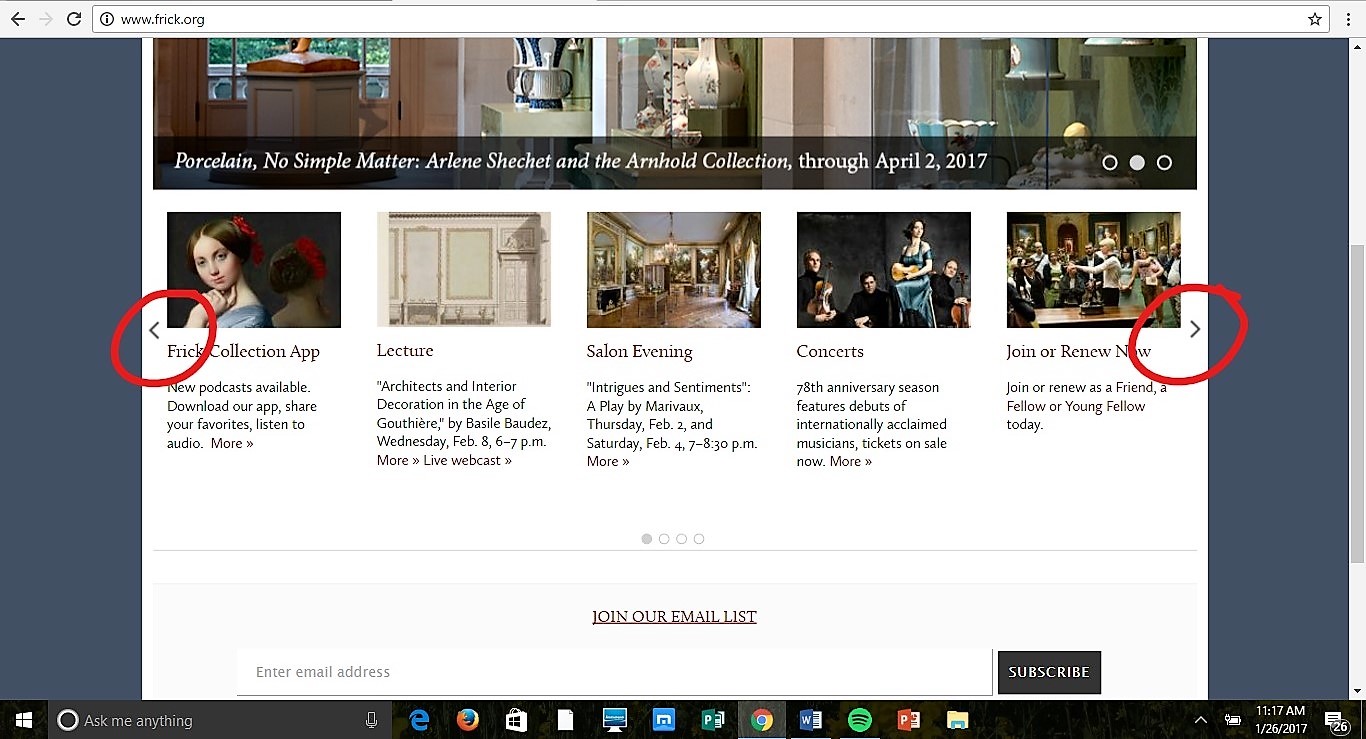 actions can be performed. Across the lower middle portion of the homepage there are images in a row that showcase current events/news. The pictures are book-ended by arrows pointing left and right, this indicates to the user that if they click ether arrow the images will proceed in either direction they choose. If those arrows were not present, then it would be hard for the user to understand that there is more information to see. This is also another example of the good use of natural mapping; the right arrow when clicked, moves the images right, and the left arrow moves them left.
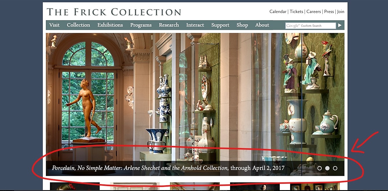 There is also an example on the homepage when what looks like signifiers are present but do not allow for an action to be performed. This is demonstrated with the three large rotating images in the middle of the page. The images can rotate on their own, or a user can scroll their mouse over to change them, but there is also what seems to be a third option to manually move the images. On the lower right hand side of the image label there are three small circles that indicate what image in the sequence is being displayed. The circle is either filled in with color or transparent. A user could easily take those circles as a signifier to click through the images on their own. Much like the arrows provide. These circles however do not afford the user to click or progress the images in any way. To make this less confusing would be to change the function of those circles or delete them.
The website also displays physical restraints, meaning that the actions that can be performed within the site, like clicking on a navigational button, will only bring a user to that specific area that they clicked on and by preforming that action a user can easily see immediate feedback from the site. If the user clicks on a certain image or icon, the user is brought right away to that section, there is a direct result of that action performed.
All in all The Frick Collection website does the main purpose it was designed to do which is to effectively connect users with The Frick’s on-line content.
http://www.frick.org/