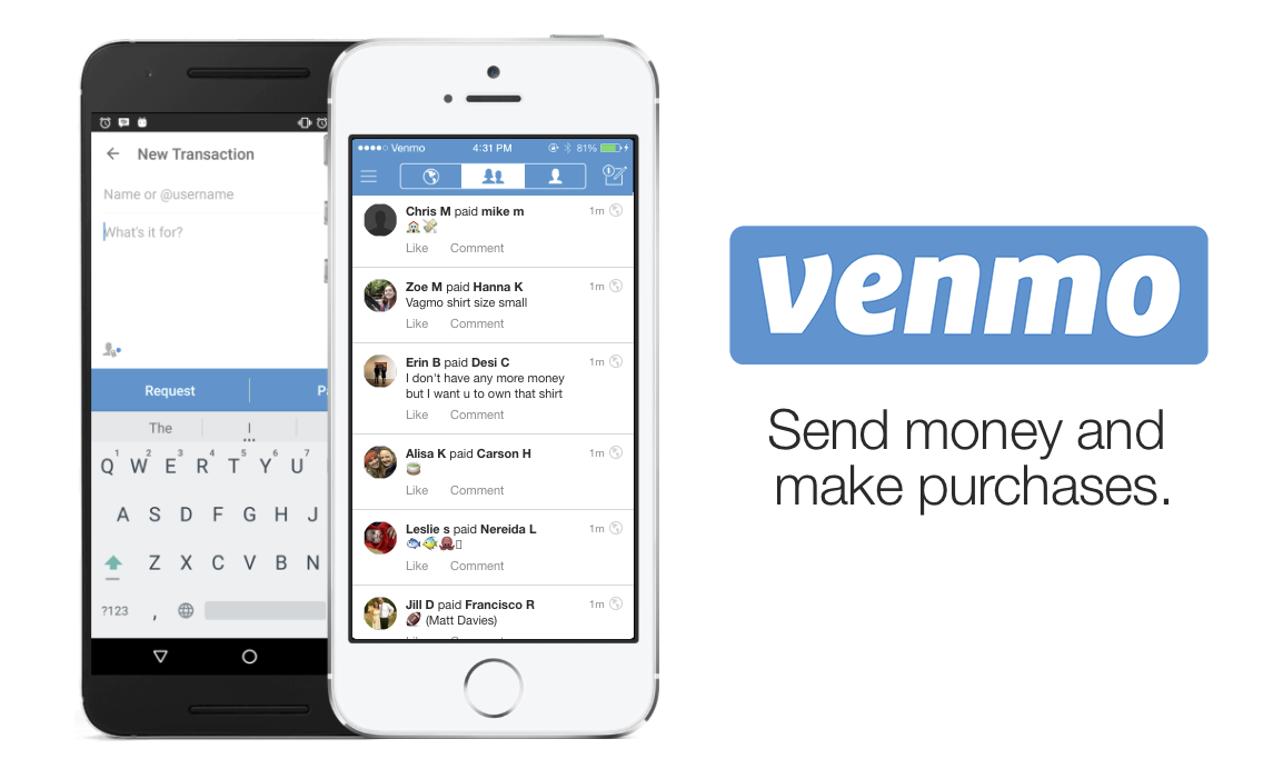
Venmo is a payment app providing a frictionless way for friends to pay one another without ever touching cash with the added element of social sharing. The users off-load tasks with the bank to Venmo. This allows them to directly transfer money to another person.
This PayPal owned app is basically a next generation checking account. On receiving a payment, users have the option of depositing a payment directly into their connected bank account, or save a step and just leave a balance on the app (Venmo cash) for future payments.
In Norman’s terminology, Venmo ‘affords’ financial transactions for its users without the physical constraints of paper bill, offloading the tasks of using paper bills, and withdrawing money from the bank. Anyone who has the app, a US bank account and a US based phone number can successfully use Venmo for transactions among peers.
#1 Easy to Use & Understand
Venmo as an app is fairly easy to use. On signing up, the app provides clear instructions making the discoverability of the app fairly simple. Along with this it uses the ‘knowledge in the world’ concept by placing well recognized and conventional icons & buttons to navigate through.
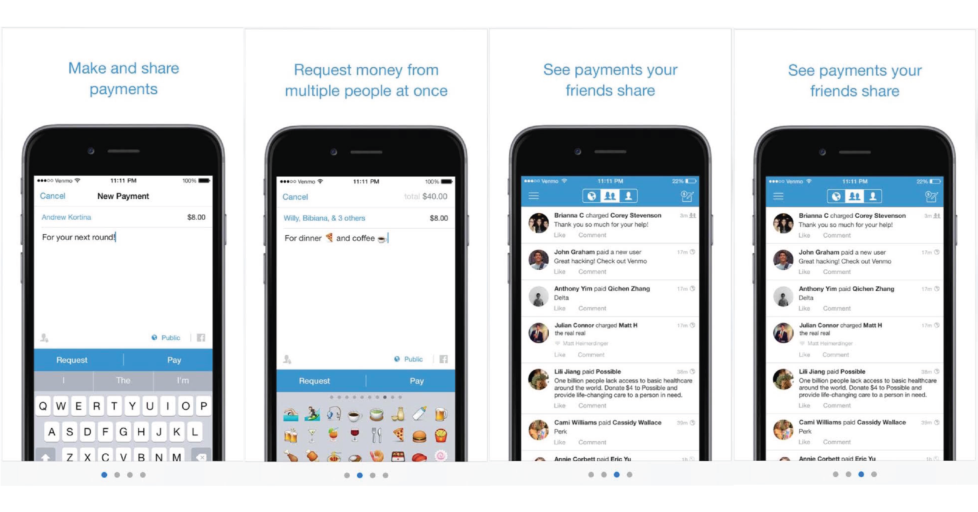
Fig 1.1 shows the introductory Venmo walk-through before signing up
However to make an account, the user has to use ‘knowledge in the head’ to enter personal and bank account details. Which can be a slow process, but is necessary considering it is a payment based app. Some shopping apps just require users to take a picture of their card but Venmo requires it to be a more thorough process because it deals with the bank directly.
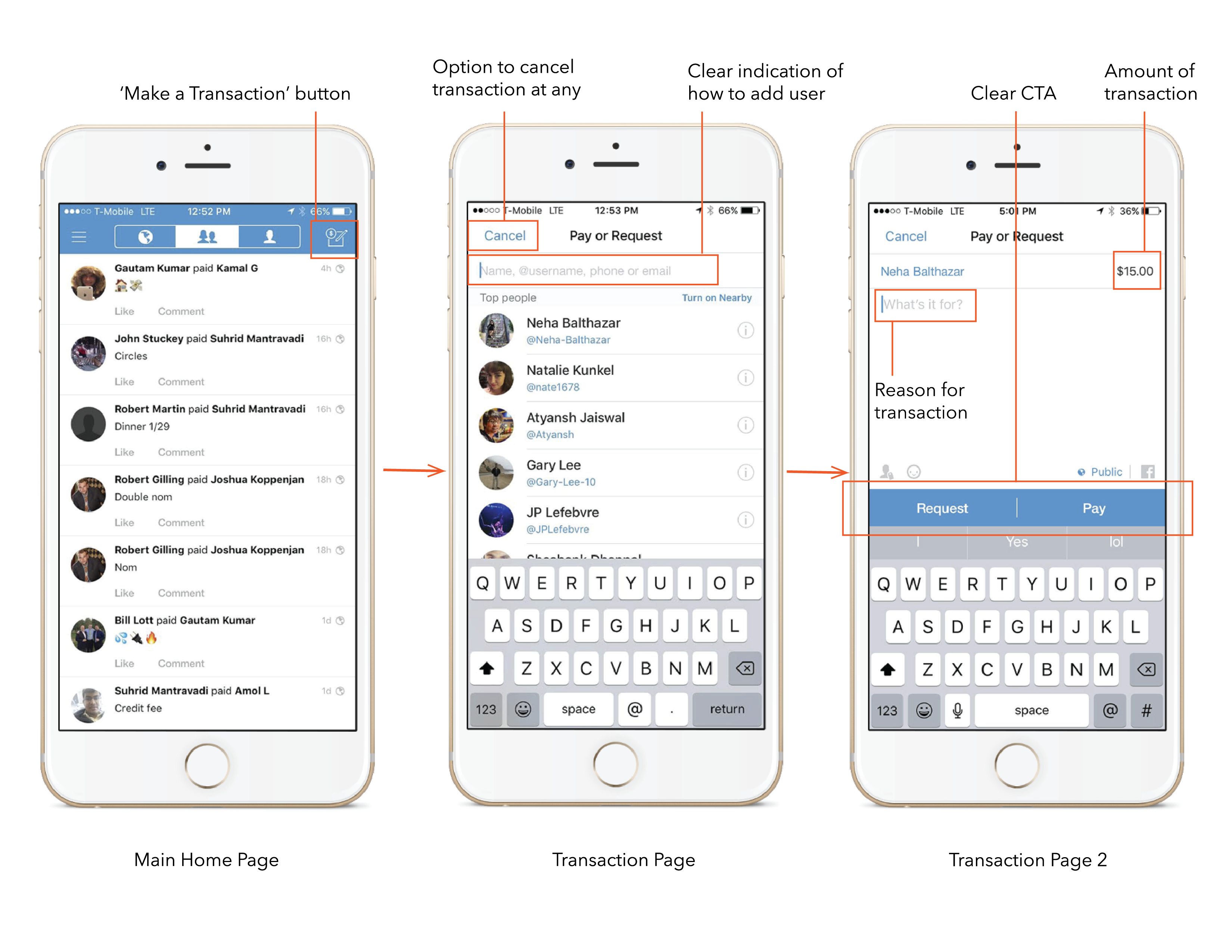
#2 Smooth Transaction Process
I found Venmo to have a simple, natural mapping structure and an understandable set of signifiers for executing a transaction. The memo pad with a dollar sign icon on the top right corner signifies a transaction and following are set of sequences to get the transaction done.
Fig 1.2 & 1.3 show how easy it is to make a transaction with the help of signifiers
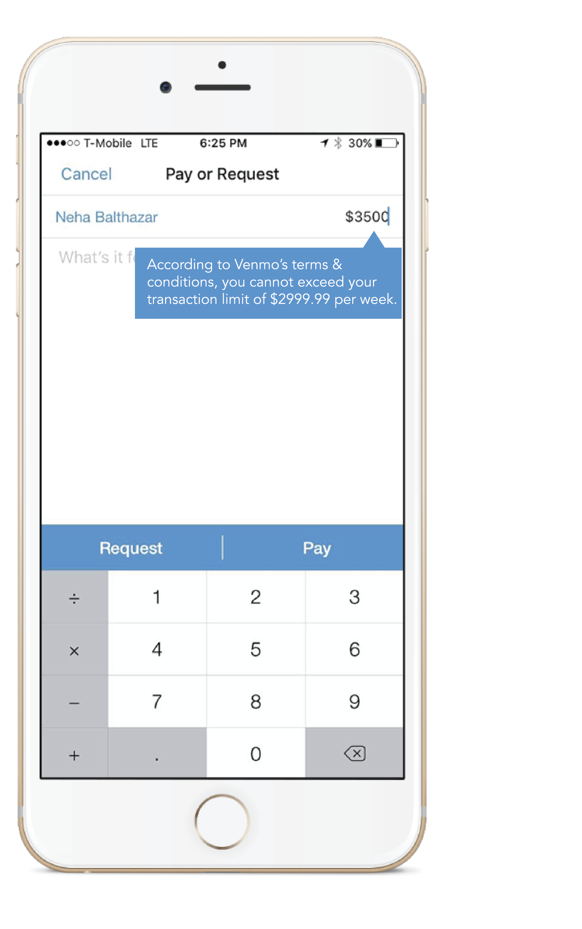
#3 Cash/Transaction Limits
Venmo as an app has transaction constraints, i.e. the users cannot send more than $2999.99 per transaction per week. However, this is not communicated clearly in the app. The cash limit is specified in the FAQs under the ‘Get Help’ section. I would recommend them having a lock-out when the limit is crossed. A warning pop-up should also appear while entering the amount for transaction if it exceeds the limit.
Fig 1.4 shows the recommended pop-up option roughly illustrated
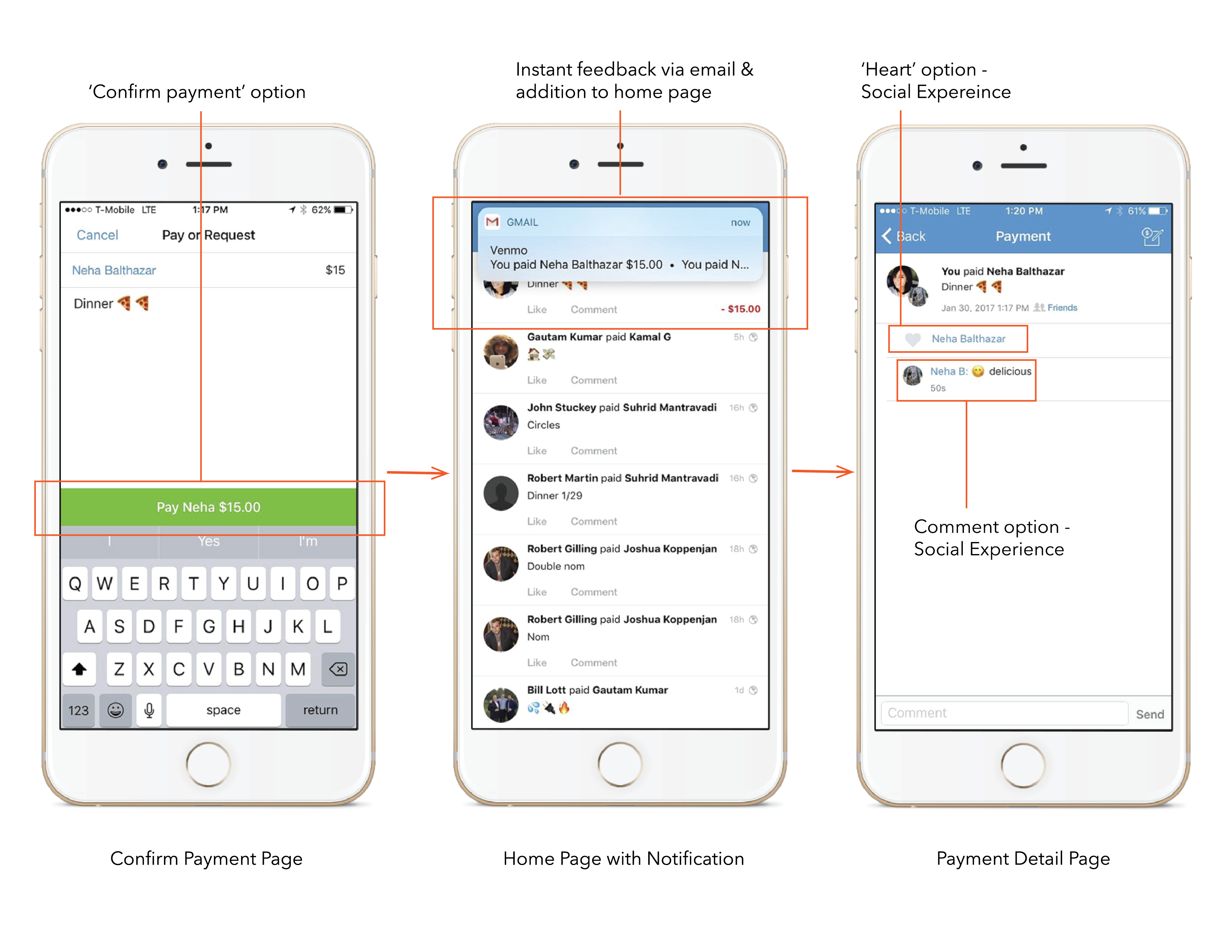
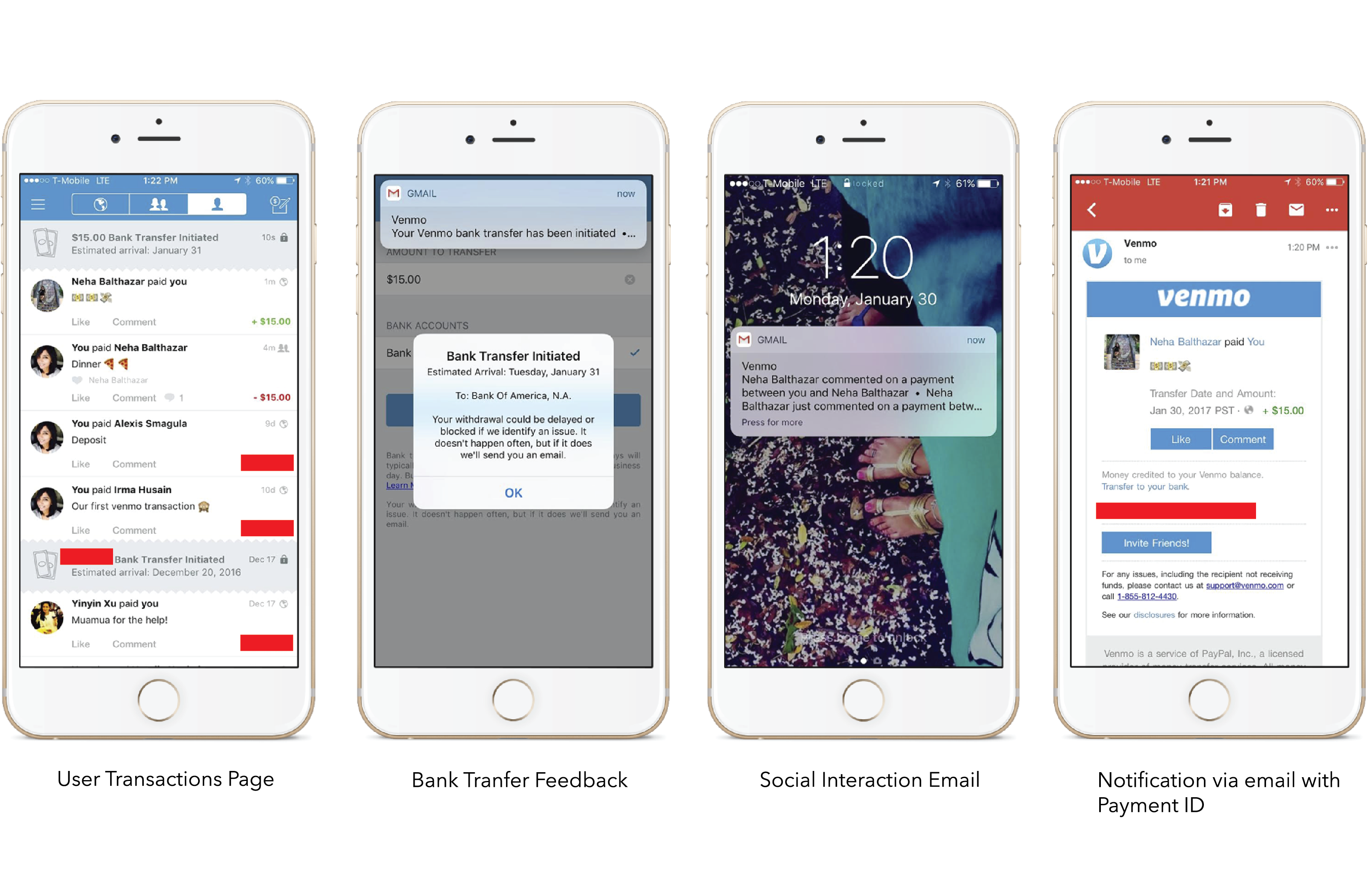
#4 Transaction Notifications
Venmo is excellent at providing feedback. Be it a transaction among peers or with the bank, it communicates the information via e-mail and also shows it in the transaction history of the app.
Fig 1.5 shows the effective feedback from the app to the user
#5 No scope for Transactional Errors
Incase the user sends their money to an incorrect username, there is no way they can retract that payment immediately. Venmo’s policies cannot cancel a transaction and it is only upon the approval of the receiver if the amount can be returned. This can be a good thing as all transactions are final and they don’t leave any room for scams, but incase of error/slips the user cannot undo their transaction.
To prevent this, I would recommend an instant ‘Undo’ button (similar to the one for Gmail) in a 5-10 second time limit, so that, if an immediate slip is identified, the user can cancel the transaction. To prevent scams, an email notification can be sent to the person on the receiving end.
Overall, Venmo has a great conceptual model. This convenience oriented app is user-friendly and clearly specifies what it does. The overall casual System Image of the app goes really well with the social media experience aspect. Venmo is for the millennials. It gets the job done, doesn’t look too serious and intimidating like other mobile wallet apps and is great for sharing activities on the dashboard with quirky transaction histories. And if one of the pals “forgets” to pay what they owe, the user doesn’t have to resort to the awkward step of asking for the money—the app’s “request” button will do the job.