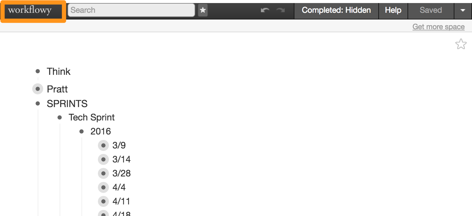
Workflowy is a flexible digital notebook for students, professionals, and any person who wants to keep notes, to-dos, and information organized in a simple interface. Using intuitive and easily discoverable interactions, Workflowy allows users to compress huge amounts of data into a series of small, collapsable categories. Entire books, successful corporations, and households are made more efficient and organized with the help of Workflowy.
Signifiers
One of the main strengths of the Workflowy interface is its use of signifiers. Using universally understood interface elements, Workflowy is able to communicate a lot of information in a very small amount of interactions.
Upon entering Workflowy for the first time, a user is presented with a bullet point with a blinking cursor. While simple, both the bullet point and the cursor are powerful signifiers of what this tool is to be used for.
The fact that a user starts off with a bullet point instead of a completely blank slate shows the user that this is a tool to make lists. This relies on a certain amount of “knowledge in the head”, assuming that a user has been presented with and has understood these symbols previously. Immediately, a user familiar with word processing or even writing an email is predisposed to understand the general structure of how information is organized within Workflowy.
And the blinking cursor immediately visible to a user is again, very simple, and nearly universally understood. That blinking cursor means “You can type here”, a powerful indicator of what should be done.
Feedback
Workflowy also does an exceptional job of providing feedback, specifically using the “hover” function. As I hover over a note that I’ve made, I am able to see two things. First, a user is able to tell if there are more notes nested underneath that level in the hierarchy due to the “+” or “-” symbols that show on hover. Also, users are able to see a small menu of options for each note in the hierarchy as soon as they hover over the bullet point. Since everything that a user can interact with responds to being hovered over, it provides excellent feedback to a user where they are on the page and what they’re able to do.
On a click or a key press, there is also immediate feedback to show that it was successful, in the form of a page change, an expansion of a bullet point, or a change in the text on the screen.
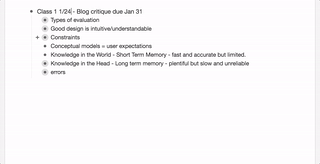
Conceptual Models
A user with experience making digital lists or outlines has a certain conceptual model for how lists are made. Enter for a new line and pressing tab to indent are all functions that are familiar to a typical user. Workflowy uses this prior knowledge almost exclusively, and thus users require almost no training to use the basic features of Workflowy.
Discoverability
One way in which the design of Workflowy suffers is in discoverability. While signifiers do show a user the basic functionality, it is nearly impossible to discover the more advanced features through simple use. The designers of Workflowy have gone with a more minimalist interface, but it does provide a key of potential functions to the user just one click away. So while not immediately discoverable, the interface does offer a method for scaffolding users to become more expert. And as experts memorize the functions, they become more and more adept and efficient while using Workflowy.
Design Suggestions
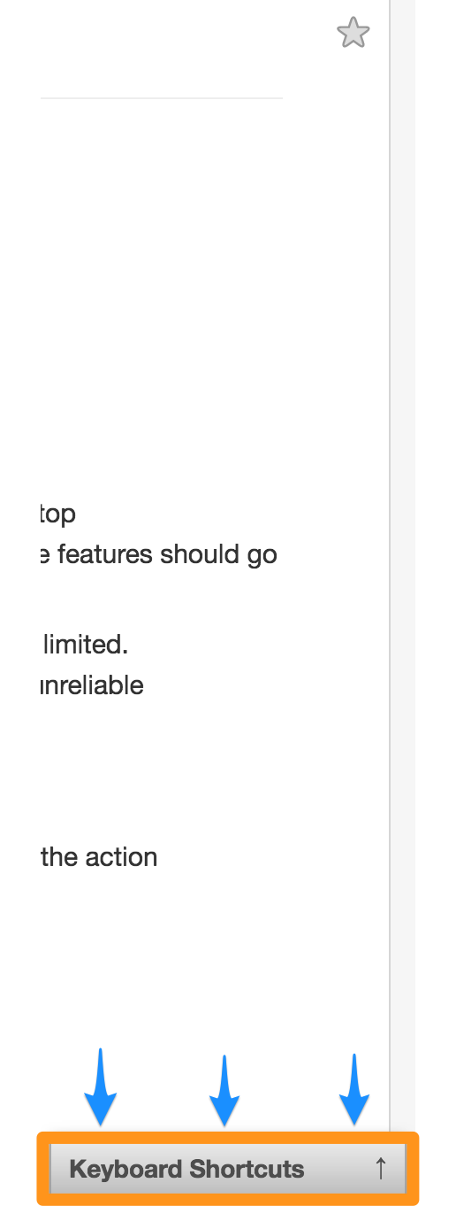
This ability to expand and hide the menu of possible functions is a well-designed feature. However, were I to redesign Workflowy, I would direct users to this interface element when they were obviously struggling to do something. For example, sometimes pressing enter adds a new line. But sometimes this button press outdents the line. If a user presses backspace, then enter, then backspace, then enter again – a signal that they may be struggling to get the system to do what they want it to – I would add in some logic to direct a user’s attention to the keyboard shortcuts. A brief visual signifier like a grow/shrink or a highlight or glow may encourage struggling users to check out the key of shortcuts. See brief mockup below for how I imagine it would function.
Workflowy keeps the plethora of tasks, notes and ideas that need to be done or remembered or thought about organized in an intuitive, elegant, and very functional way. Through expert use of elegant signifiers, as well as leveraging a user’s conceptual models of word processing, Workflowy provides a clear environment for users to track and organize their notes. While all of the features of Workflowy are not immediately discoverable, the interface scaffolds a user to become more expert. Workflowy is a well designed product that fills a need that many people experience.
Try it out for yourself by using this link.