Universe is a new environment for radical expression and experimentation. It’s an app. But moreover, it’s an instrument, a medium, and a community all-in-one. The atomic unit is a verse, a 3×5 grid for infinite creativity: art, stories, interactive experiences, radical video collages, immersive soundscapes, musical instruments, even games. Or go the practical route: make a portfolio, invitation, how-to guide, recipe, or even a business card.
#1 Core function (Creating the verse): Easy to use & Understand.
When user touch the units on the screen, the app will give him an immediate and clear feedback so the user can perceive that clicking on that location is a meaningful, useful action to perform. So that he can create the verse without any instruction. Moreover, this APP provides many templates that can effectively help users to create novel and interesting results in a short period of time. This plays an important role in arousing and maintaining the user’s interest in this App.
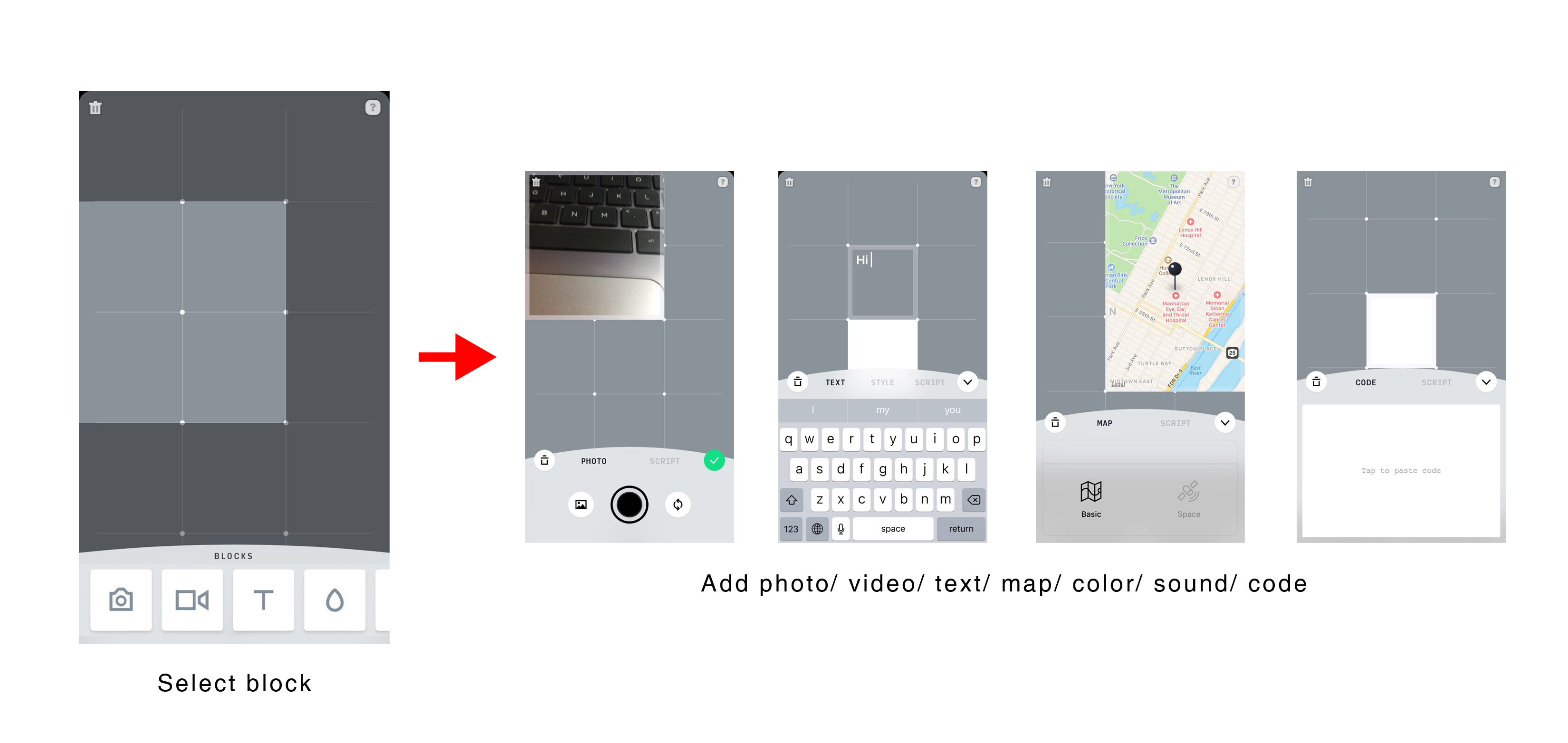
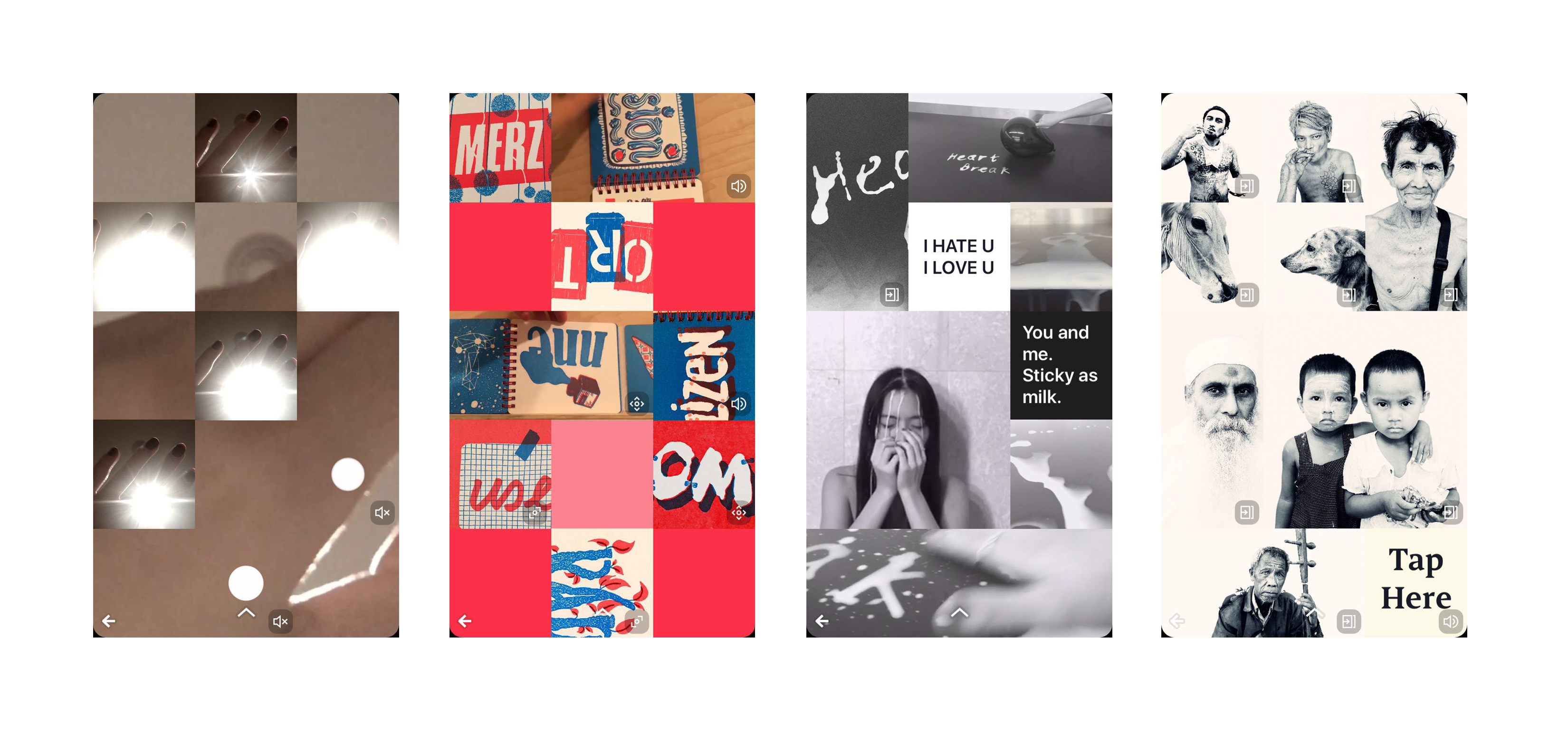
Figure 1.1 : Creating the verse

Figure 1.2 : The verse – vocal, dynamic, interactive
#2 Navigation Design: Can cause confusion
Information Architecture of Universe App is not clear and lack of obvious hierarchy. When people open this app, they will see the contents are being organized into several topics, arranged from top to bottom. But it’s hard to see the relevance and even difference of these content blocks. Universe App has many very good video tutorials in the help block, but it is in the lower position and is juxtaposed with other contents so it is hard for users to find. On the personal home page, operations closely related to the user’s account like edit profile, sign in, sign off cannot be performed, this is inconsistent with the people’s mode of thinking.
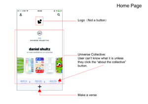
Figure 2.1 : Home Page
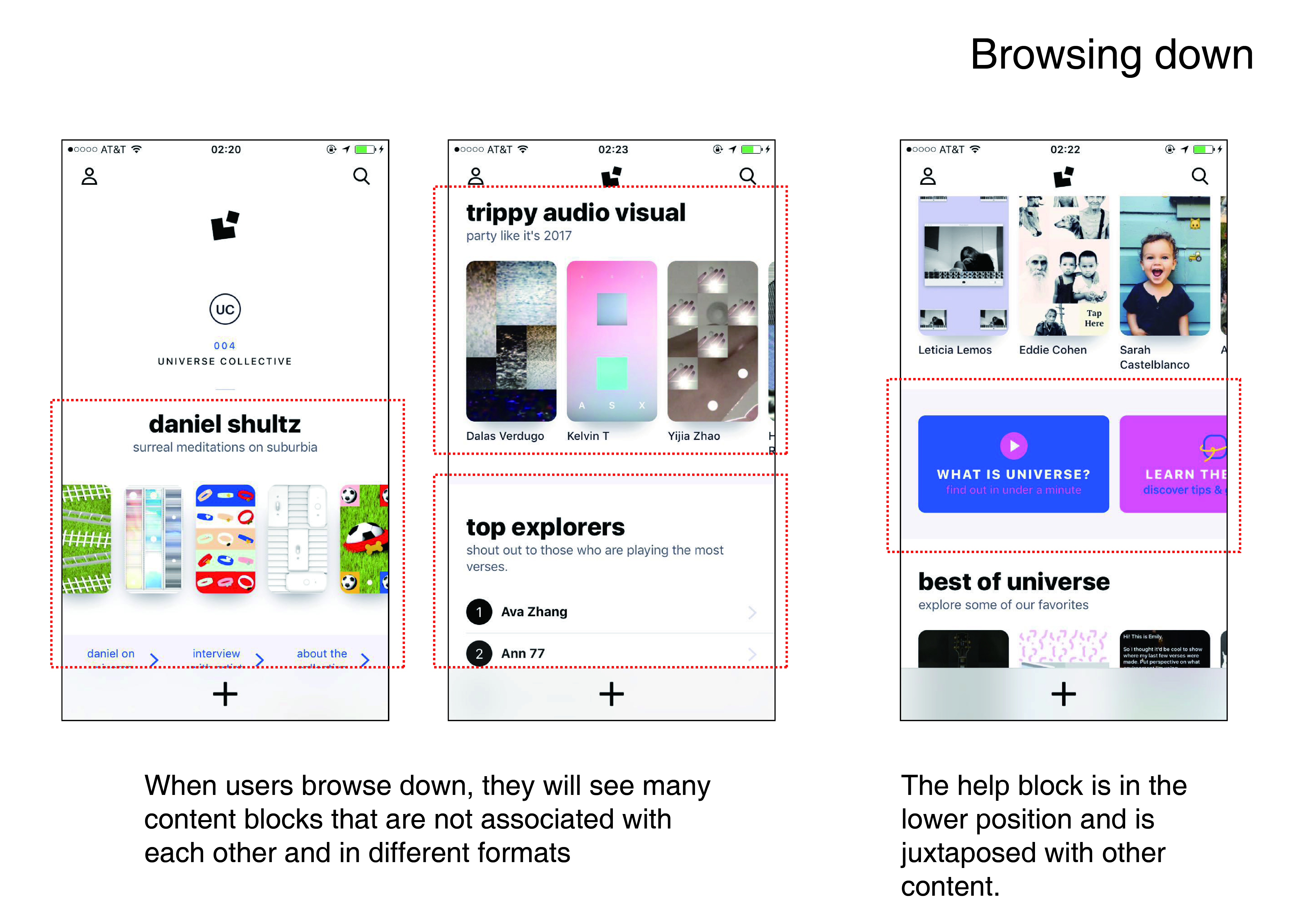
Figure 2.2 : Browsing Down
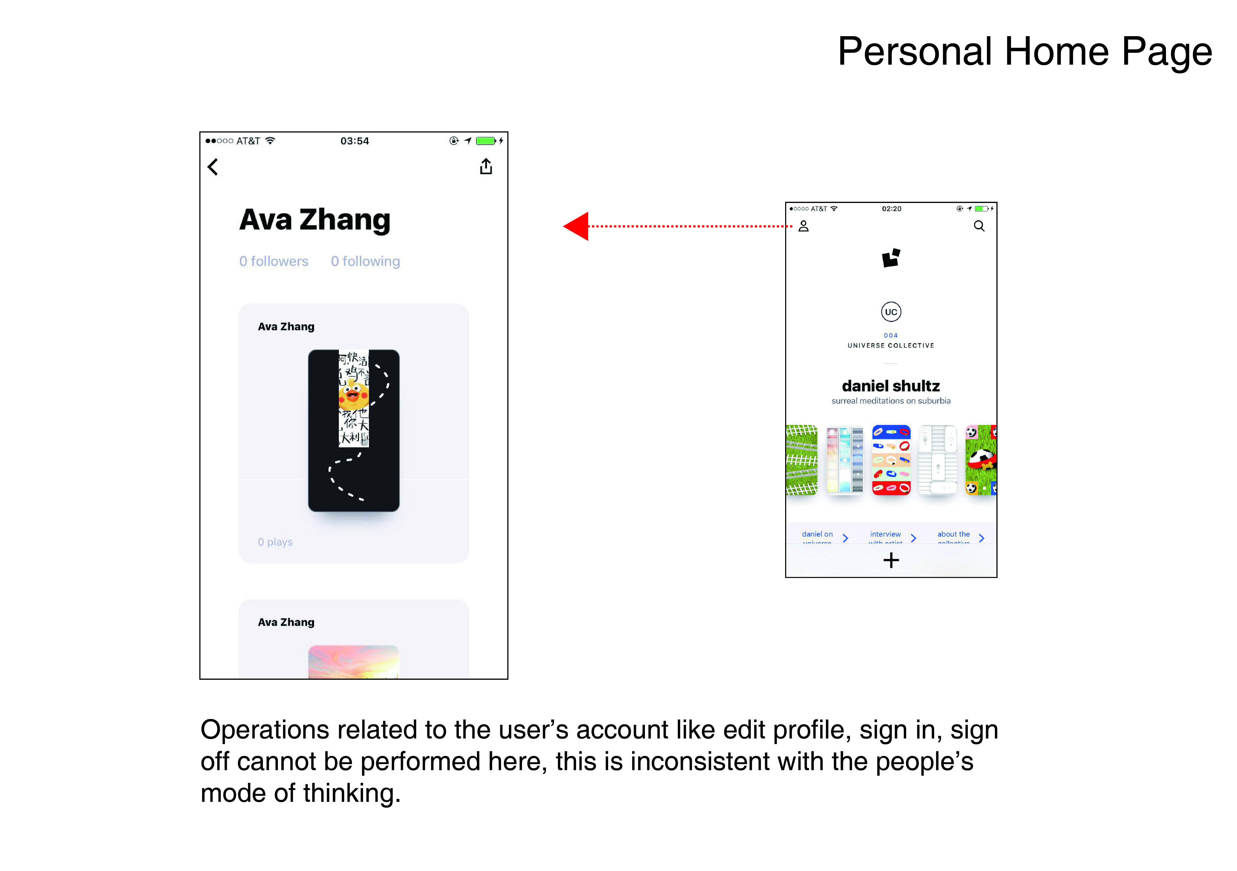
Figure 2.3 : Personal Home Page
#2 Recommandation
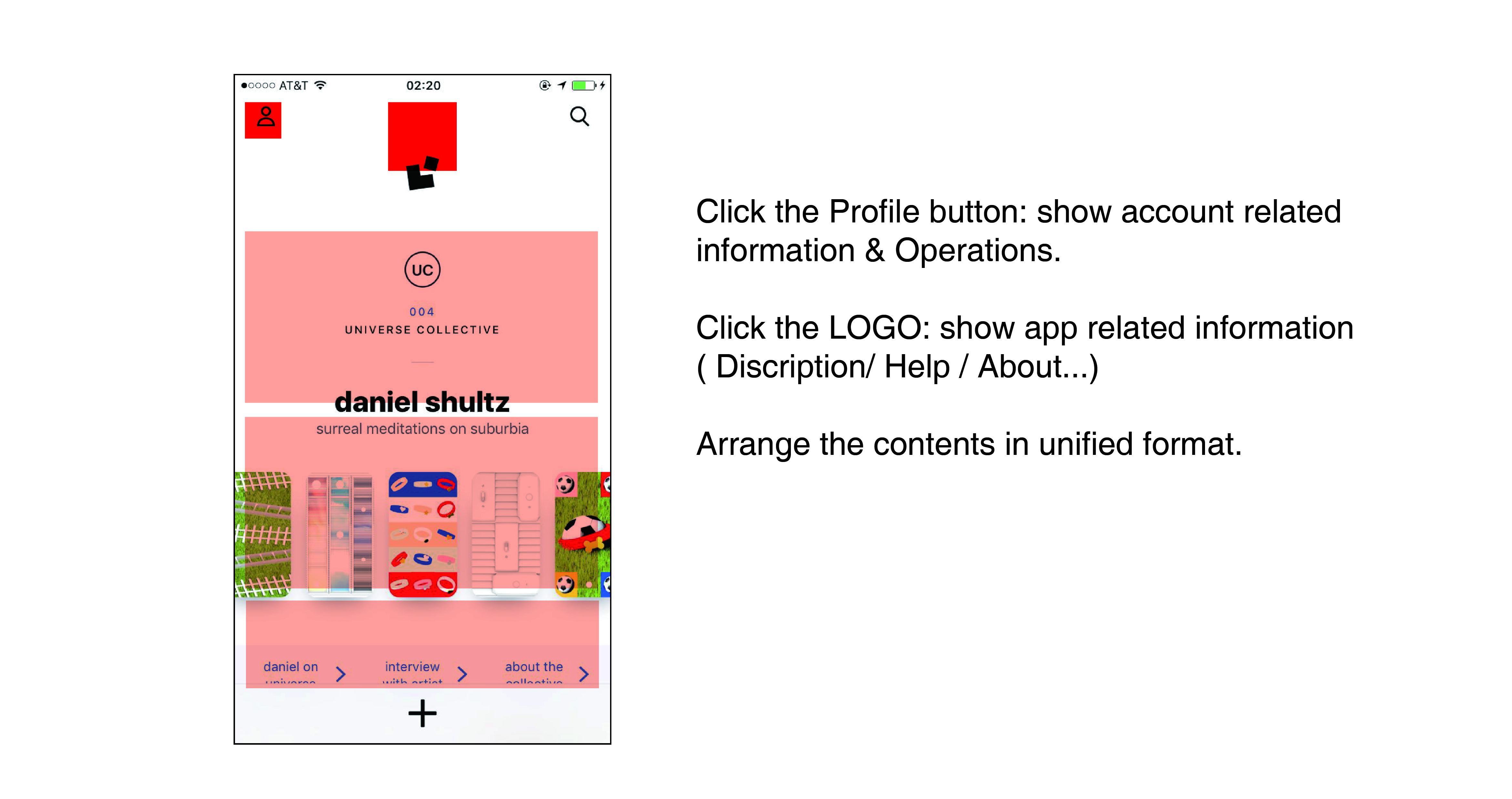
Figure 2.4 : recommendations
#3 Visual and interaction design:
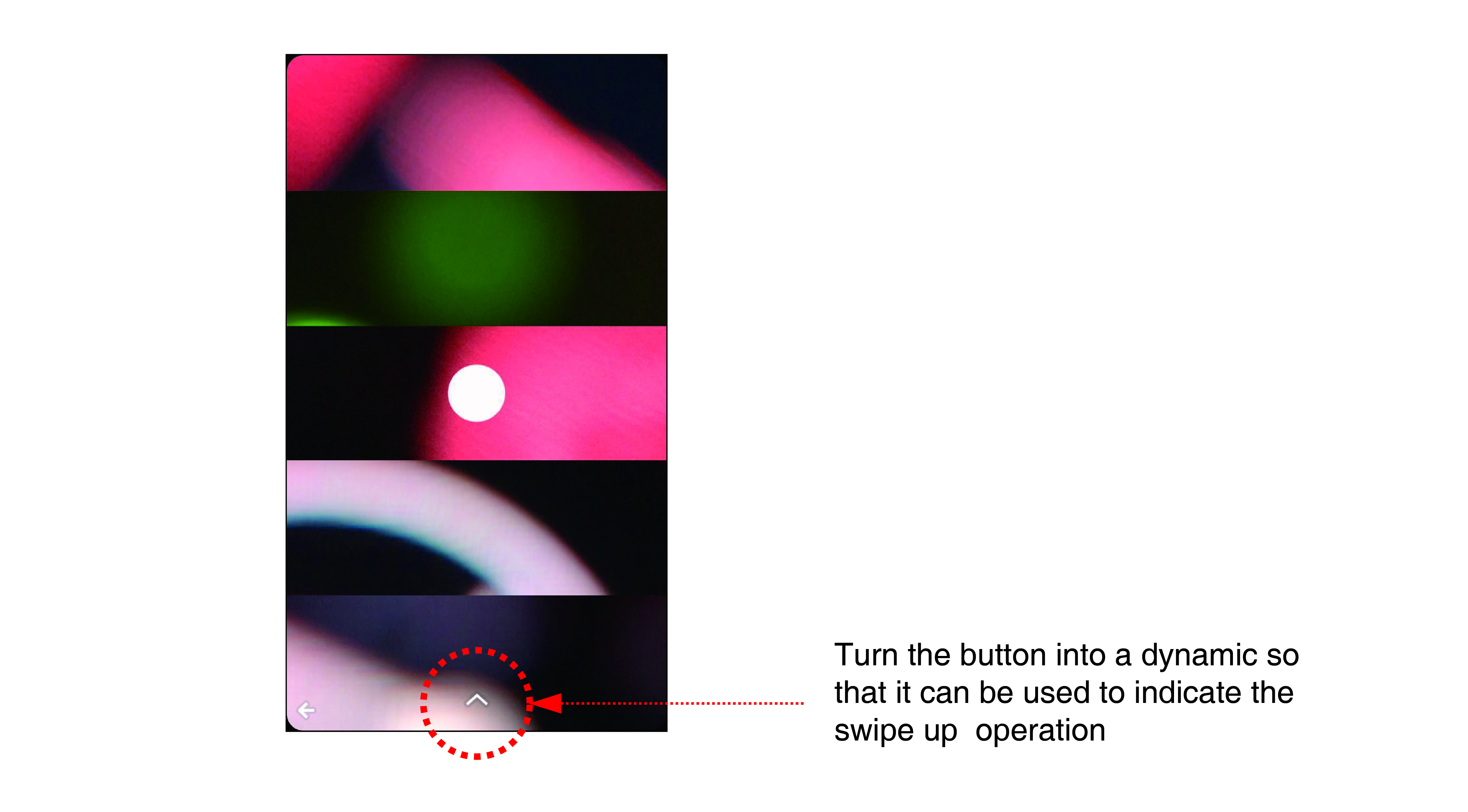
Lack of clear guidelines for users, can cause confusion when using. When you are viewing a verse, you can see there are two buttons on the bottom of the screen, a left arrow and an up arrow. When you click the left arrow, you can return to the previous interface. And when you click the up arrow, you will see the verse become very small and move to the top of the screen, meanwhile, most of the screen will show the information and function of play, like and share. You can’t go back unless you click the verse and make it full screen again. The location of these clicks is very far away, so it is very inconvenient for users to achieve this simple “return” request.
But in fact, the user can achieve the operation through the swipe up and swipe down. However, because the up arrow button and the left arrow button(only click)are in the same form, users can not predict the operation of swipe.
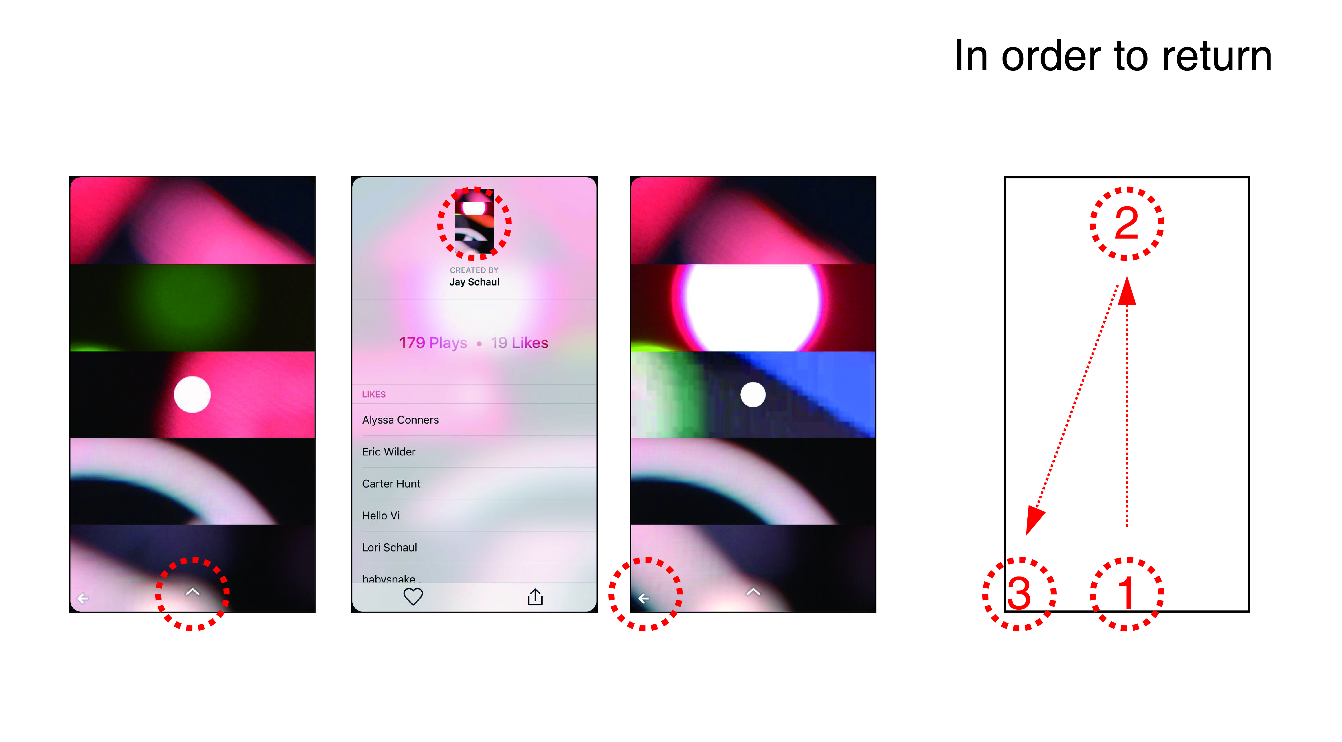
Figure 3.1 : Return Operation
#3 Recommendation: