In an effort to design a new kids video interface, I started doing a lot of research on the kinds of media that kids were consuming and making. This quest inevitably led me straight to Snapchat. The average Snapchat user opens the app 18 times per day, for a total of about 30 minutes. She sends 16 snaps a day. Through ad-revenue, Snapchat makes $1-$2 per user per day.
In the first few months of designing our interface and system of interactions, I was puzzled. Snapchat seemed to be the most un-usable application that I had ever encountered. It was the opposite of intuitive, requiring me to Google how to get to the facial filters. How could an interface so impossible to understand be so successful?
Snapchat is a sticky app. Its users return often, they are active, and based on their enthusiastic participation, they enjoy the experience.
As I went through my day to day, I asked my colleagues working in user experience how this interface worked – how could it possibly gather so many new users with such a difficult interface? One of my UX teachers at Pratt even said, “It’s one of the greatest mysteries of our time. I don’t think anyone will ever figure it out.”
Eventually I came across the concept of shareable design.
Examples of Shareable Design
In looking at the most popular apps for kids today, they are not necessarily designed to be intuitive to the user. Minecraft has no tutorials to get you started, nor does it include a packet of directions like Lego, its analog predecessor. Musical.ly shows kids amazing video creations, with a huge amount of user interface elements, but no explanation of what each icon does. Prisma outputs incredible, artistic images from your photo roll, but the interface is extremely minimal. Users either have to discover the process themselves, or more simply, ask their friend how they made something, and learn in a social way.


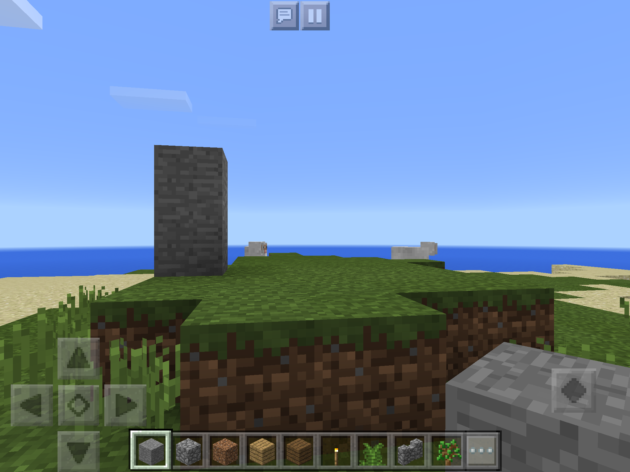 Minecraft – Users are immediately taken into the world, without any tutorials or orientation, and expected to just go. YouTube and friends teach users all they need to know.
Designing for Social Interactions
The interfaces that we are designing for now are overwhelmingly and inevitably social platforms. Even word processing has turned into a social endeavor, with Google Docs and Dropbox allowing collaborative work on the same document. Users can expect that, on a variety of platforms and devices, they are going to share not only the content that they create, but also their process for creating it. And with technology existing ubiquitously in everyone’s pockets, it’s easy to take opportunities to share with friends and coworkers.
Knowing that this social interaction is occurring regardless of the higher level purpose of the app, designers may want to include these shareable features. It may actually lead to higher levels of adoption, and certainly higher percentage of return users. Josh Elman explains why shareable design is so sticky: “It’s a physical memory combined with a social memory, so it stays.”
This is a powerful, but risky design methodology. Shareable design leverages users’ natural tendency to learn information and processes in a social way. With an awe-inspiring output and a core user group of social people, your product and its experience can be a sticky one, bringing users back again and again, magnifying your reach.