A 2014 Tech Crunch article called it the devil.
Why does it provoke such reactions? Is it really that bad? Where did the menu even come from?
First, a little history lesson.
The menu debuted in 1981, as part of a system called the Xerox Star, a software package created to run on Xerox 8010 workstations. 
Software designer Geoff Alday began researching the inventor of the much-maligned menu, and located the interface designer, Norm Cox. Alday asked “who designed the menu?” Turns out it was Cox himself.
Over email, Cox said of the menu: “…I designed that symbol many years ago as a “container” for contextual menu choices. It would be somewhat equivalent to the context menu we use today when clicking over objects with the right mouse button…” (Alday, 2004)
Little did Mr. Cox know, let alone imagine, that a 30-plus year old design would yield such negative reactions in the UX field.
Its problems are often discussed, including low discoverability (out of sight, out of mind), decreased efficiency (menu must be opened, only then are choices displayed), and limited visibility of app-specific items (navigation into the app required to see the desired area).
What’s a company to do? Rather than reworking the menu, Spotify and other companies (such as Facebook, in 2013), have dropped it altogether.
After introducing the tab bar on Ios, Spotify research showed a positive impact on user engagement. Users with the tab bar clicked 9% more general items and 30% more menu items. In addition, the number of options in the tab bar were reduced to five, increasing the reach of programmed content. Before full implementation of the tab bar, Spotify tested it with new and existing users to verify there were no ill effects.
Results showed the tab bar encouraged users to explore more and different content types, without affecting retention or engagement metrics. Additionally, new users were “more engaged” with the navigation menu in their first session than when the hamburger menu was in place. After those results were in, Spotify rolled out the tab bar for the iOS platform.
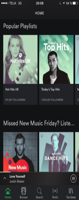
Notably, Spotify did not do the same for its Android users at the time, saying the Interface for each platform should be considered individually. A beta version using the bottom tab bar was launched in July 2016, with the change rolled out to all users in the fall of 2016, to less-than-positive reviews. The bottom tab replaced the classic slide-out menu Android users recognized. The new navigation method requires users to change old habits and adapt to a new landscape.
So what is to become of the hamburger menu? Some say Apple will kill it outright, while others say it still has its place in the design arena, subject revisions to overcome its limitations.
Even though its future is cloudy at best, the hamburger menu will be with us for some time to come.