![]()
![]() I’ve recently read this interesting article – Creating Usability with Motion: The UX in Motion Manifesto on Medium. This article is written by Issara Willenskomer, the founder of UX in Motion. He creates the theory of 12 principle of UX in motion and talks about how a good motion improve the usability.
I’ve recently read this interesting article – Creating Usability with Motion: The UX in Motion Manifesto on Medium. This article is written by Issara Willenskomer, the founder of UX in Motion. He creates the theory of 12 principle of UX in motion and talks about how a good motion improve the usability.
I used some GIFs to show the function. Now, we also can see a lot of UI motion on either business project or personal works. The original idea I used motion in my works is only showing the user flow and the functions. I’ve never thought if I use these motion in a smart way, it can help users have a better user experience.
UI animation is not only what users think. Most designers think of as “UI animation” is a higher modality of design. UI animation can be used in realtime and non real time. “Real Times” means users directly interact with the interface and they can get the feedback immediately. “Non-realtime” means that users are out of the user experience and they only can see the interaction after transition completes. Therefore, if designers implement some animation principles into the UI animation, it can level up the usability and also provide the higher leverage opportunities for designers.
Issara Willenskomer mentioned the four ways of motion supporting usability and organized the 12 Principles of UX in Motion.
Motion supports usability in four ways:
- Expectation - how users perceive what an object is, and how it behaves
- Continuity – the user flow and the ‘consistency’ of the user experience.
- Narrative – the linear progression of events in the user experience that results in a temporal/spatial framework
- Relationship – the spatial, temporal, and hierarchical representations between interface objects that guide user understanding and decision making.
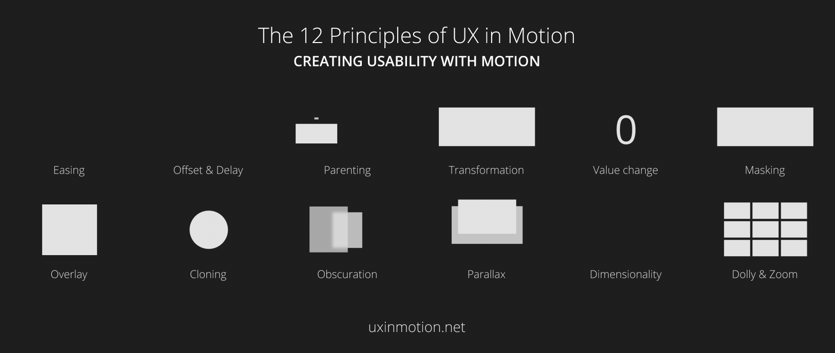
The 12 Principles of UX in Motion
- Principle 1: Easing – Object behavior aligns with user expectations when temporal events occur.
- Principle 2: Offset & Delay – Defines object relationships and hierarchies when introducing new elements and scenes.
- Principle 3: Parenting – Creates spatial and temporal hierarchical relationships when interacting with multiple objects.
- Principle 4: Transformation – Creates a continuous state of narrative flow when object utility changes.
- Principle 5: Value change – Creates a dynamic and continuous narrative relationship when value subject changes
- Principle 6: Masking – Creates continuity in an interface object or object group when utility is determined by which part of the object or group is revealed or concealed.
- Principle 7: Overlay – Creates narrative and object spatial relationship in visual flatland when layered objects are location dependent.
- Principle 8: Cloning – Creates continuity, relationship and narrative, when new objects originate and depart.
- Principle 9: Obscuration – Allows users to spatially orient themselves in relationship to objects or scenes not in the primary visual hierarchy.
- Principle 10: Parallax – Creates spatial hierarchy in visual flatland when users scroll.
- Principle 11: Dimensionality – Provides a spatial narrative framework when new objects originate and depart.
- Principle 12: Dolly & Zoom – Preserves continuity and spatial narrative when navigating interface objects and spaces.
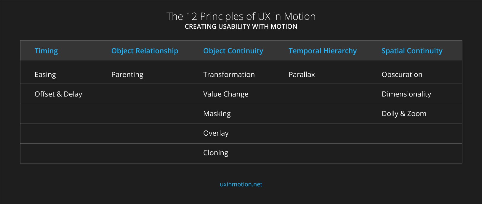
The principle 1 Easing and the principle 2 Offset and Delay are related to timing. From implementing different delay on different objects, users can know the relationships and the hierarchies between objects. Users can know that the bottom object is separated from the top 2 objects.
The principle 3- Parenting help users understand the relationship between. Designers can link objects together to create their relationships and hierarchies by using scale, opacity, position, rotation, shape, color, value.
The Principle 4- Transformation, the principle 5- Value Change, the principle 6- Masking, the principle7- Overlay, and the principle 8- Cloning all relate to object continuity. They can help designers to tell a story and also garb user’s attention. The increasing number can make user feel it happen in reality and also grab users attention.
The principle 10 – Parallax makes users get the idea of temporal hierarchy. Users can focus on the main actions and know which objects are higher priority.
The Principle 9- Obscuration, the principle 11- Dimensionality and the principle 12- Dolly & Zoom both relate to spatial continuity. It is like in a real world. User can change their perspective by folding, swiping, zooming to feel like a real special. It commutes to the viewers and help user understand the scenes of objects are “inside” or “outside. “ It help users creates the spatial mental models.
In conclusion, these 12 principle of animation in UX looks like a small stuff. As a UX designer, I think if we can notice these detail stuff and implement into our products. I believe that we can improve the usability and make users have a better user experience.
More References:
Functional Animation In UX Design: What Makes a Good Transition?
https://uxplanet.org/functional-animation-in-ux-design-what-makes-a-good-transition-d6e7b4344e5e
How to Use Animation to Improve UX
https://uxplanet.org/how-to-use-animation-to-improve-ux-338819e93bdb
The Principles of UX Choreography
https://medium.freecodecamp.com/the-principles-of-ux-choreography-69c91c2cbc2a
Motion Design: An Intro to UX Choreography
http://uxpamagazine.org/motion-design/