By Kristen Droesch & Lily Martin, Spring 2017
For our Advanced UX Design course, we were charged with developing and prototyping a new calendar system.
We kicked off our project by selecting the user group we were most interested in designing for, eventually settling on arts and media freelancers. To boil down the essential needs of our users, we identified key traits we knew to be common among arts and media freelancers, as we are both well-acquainted with multiple freelancers ourselves and have witnessed roadblocks to their productivity on many occasions.
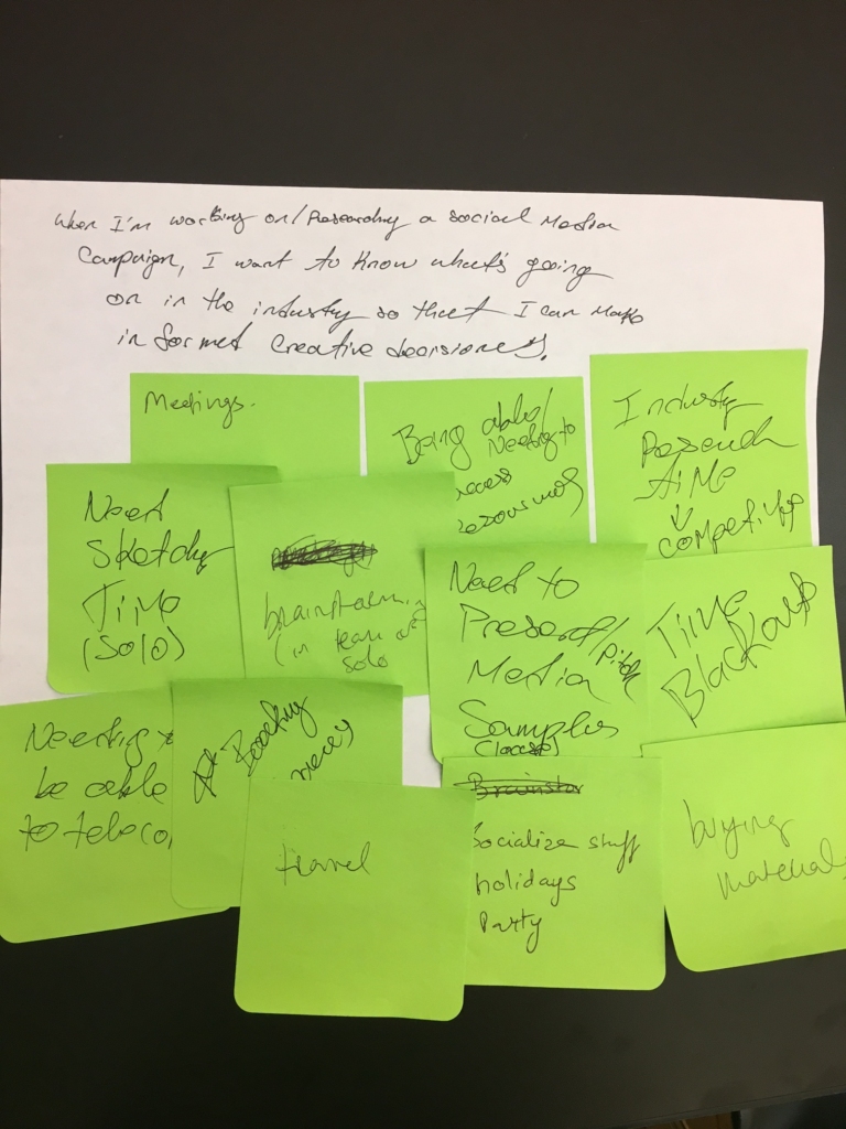
Among the factors we identified, there were the needs for:
- Creative time
- Telecommute with clients
- Time blackouts
- Meeting /client communication management
- Invoice tracking
- Something that could travel with them
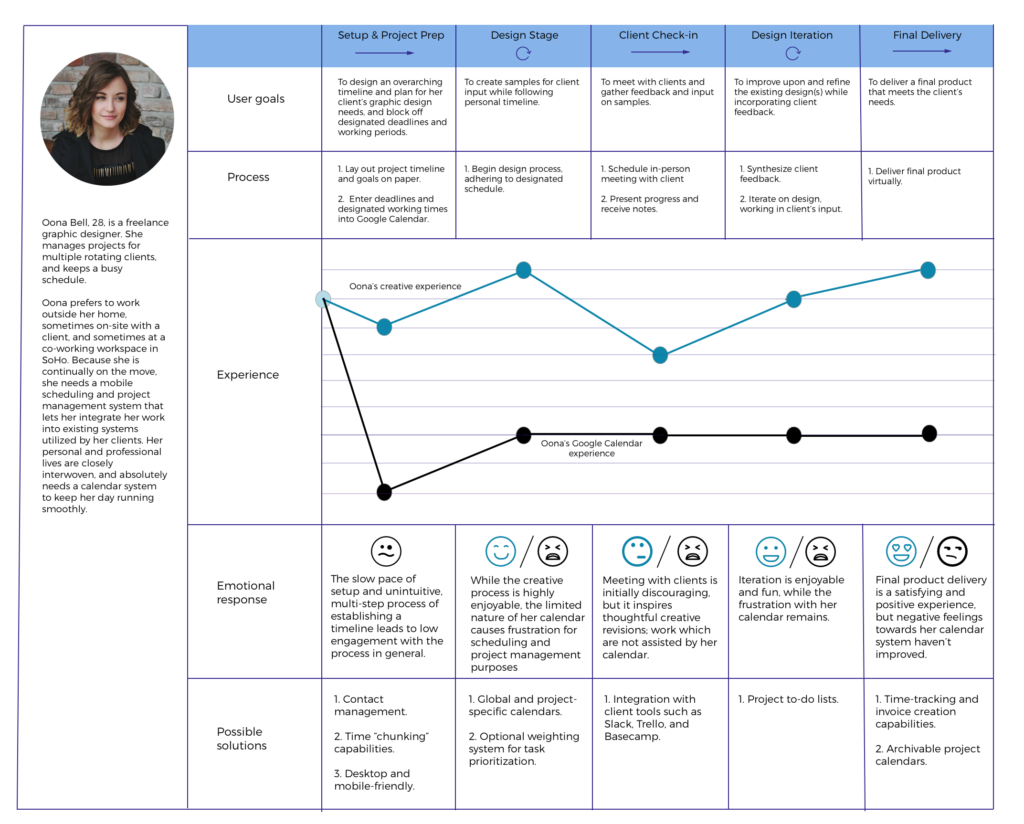
We then continued our exploration of the average arts and media freelancer’s needs by creating a persona (Oona Bell), followed by a journey map.
During this time, we also performed multiple rounds of user testing, first screening freelancers, and then performing interviews to learn their needs, likes, and dislikes in regards to calendar systems. From these interviews, we learned that the majority of our interviewees were “stuck” with using Google Calendar, as there is “no better option, even though it sucks.”
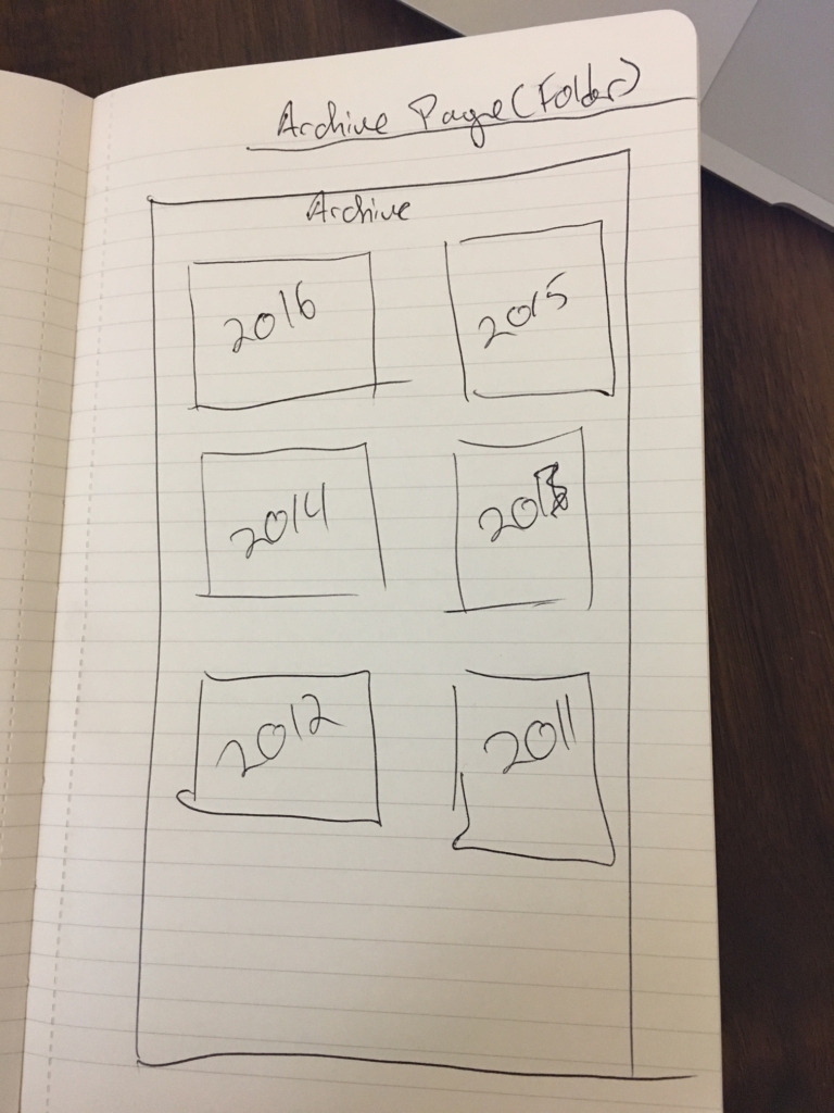
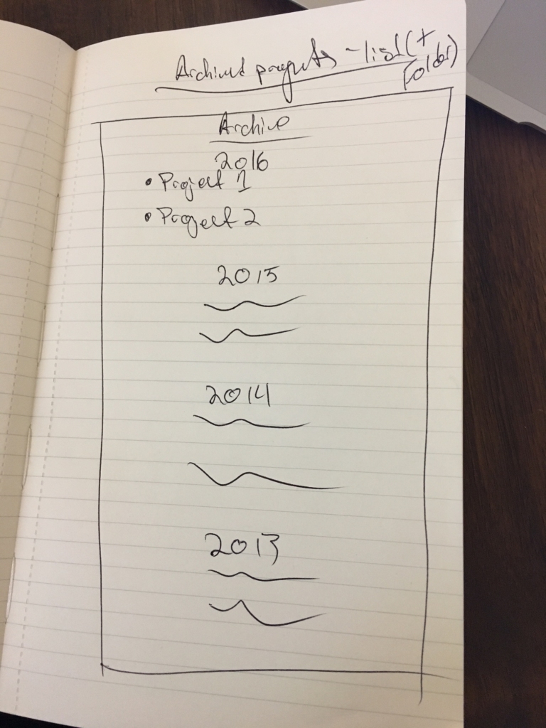
We wanted to create a calendar system that incorporated invoice-tracking, management capabilities for multiple projects, to-do lists, and project archiving, among other functionalities.
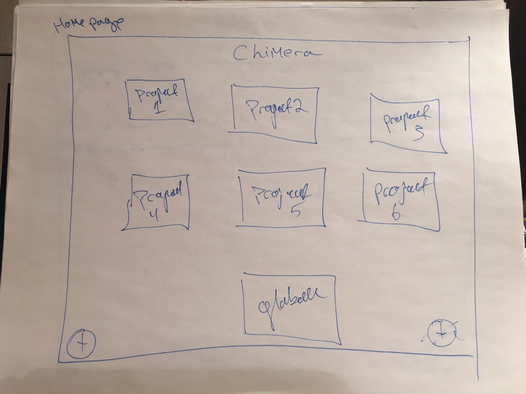
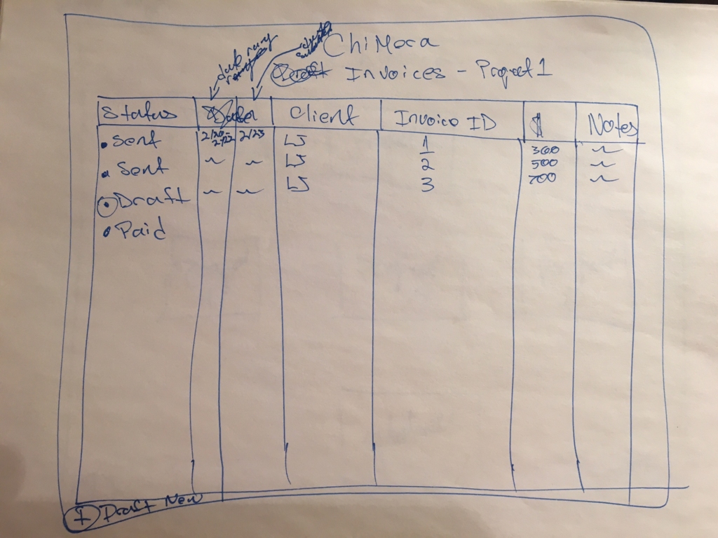
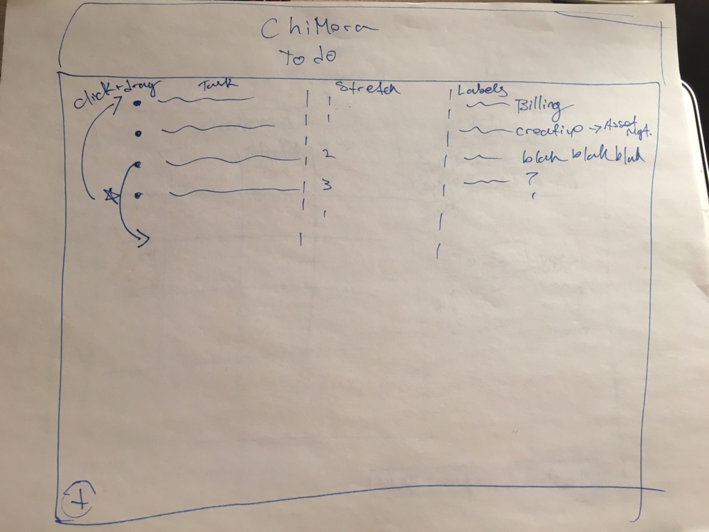
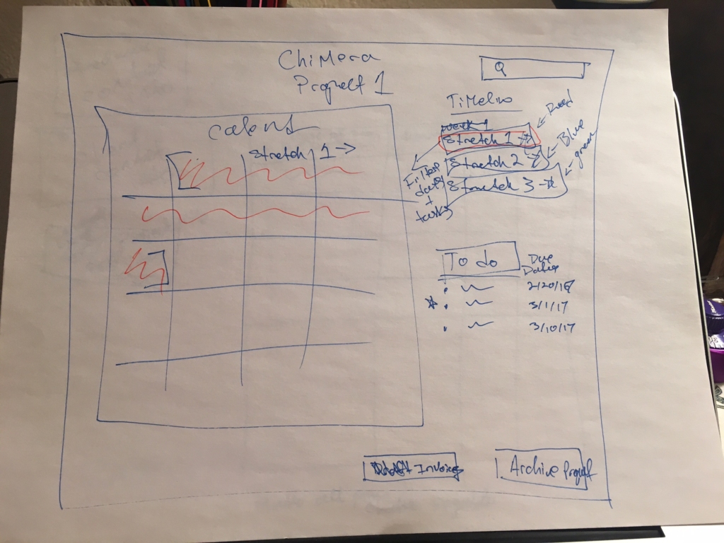
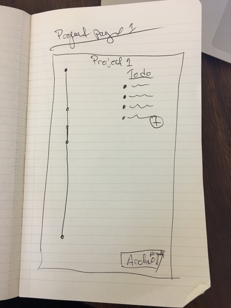
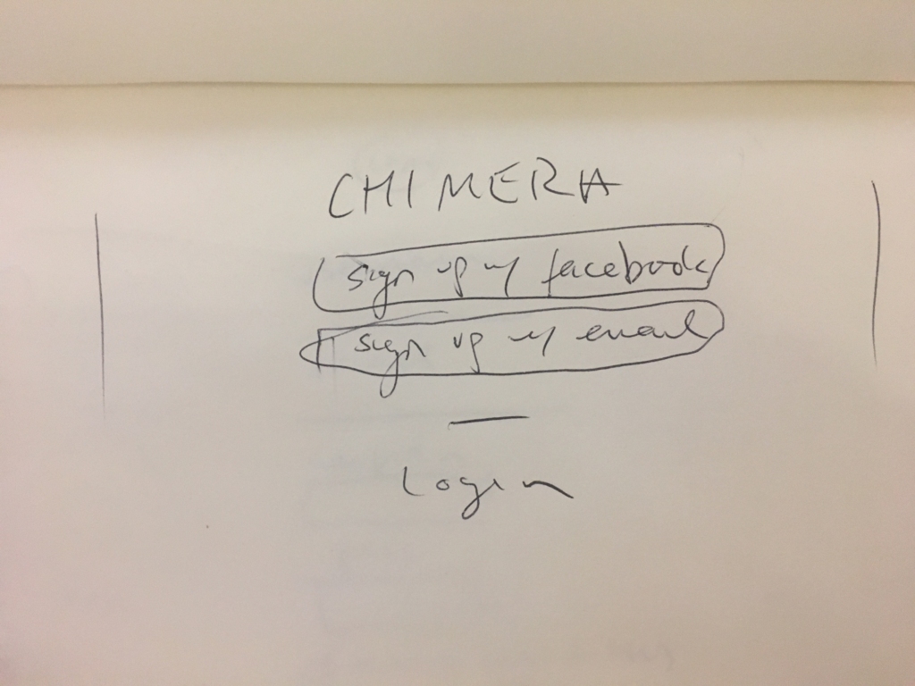
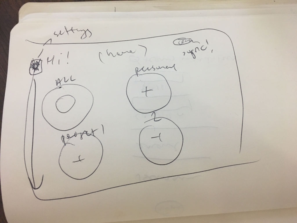
At this point, we began sketching out an initial draft of Chimera. You can see some very messy sketches, and the initial wireframe’s individual project page, below. 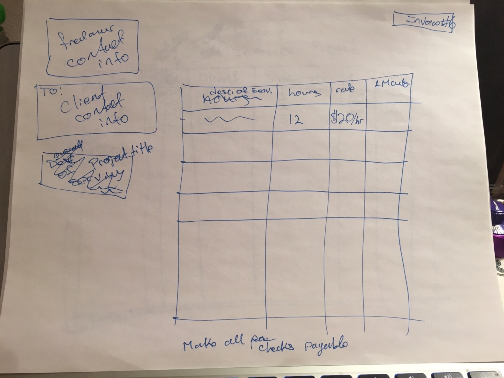
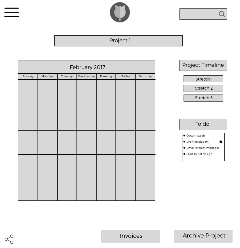
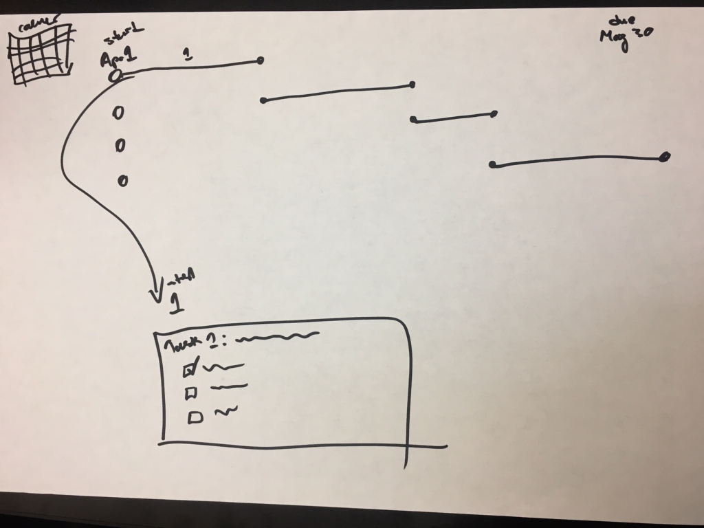
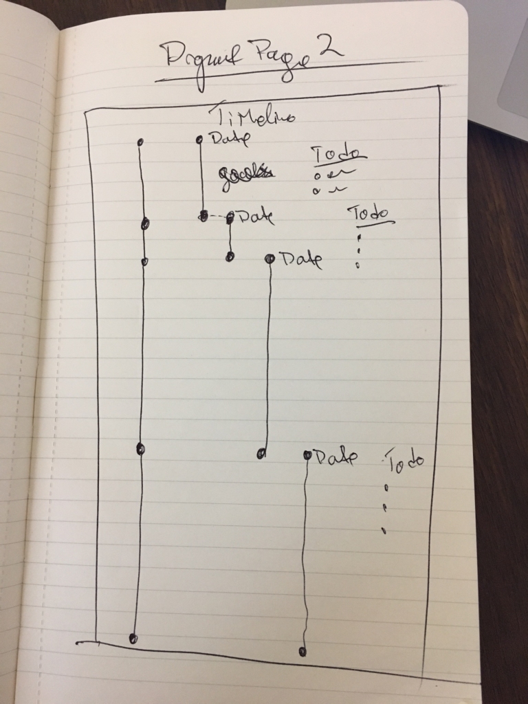
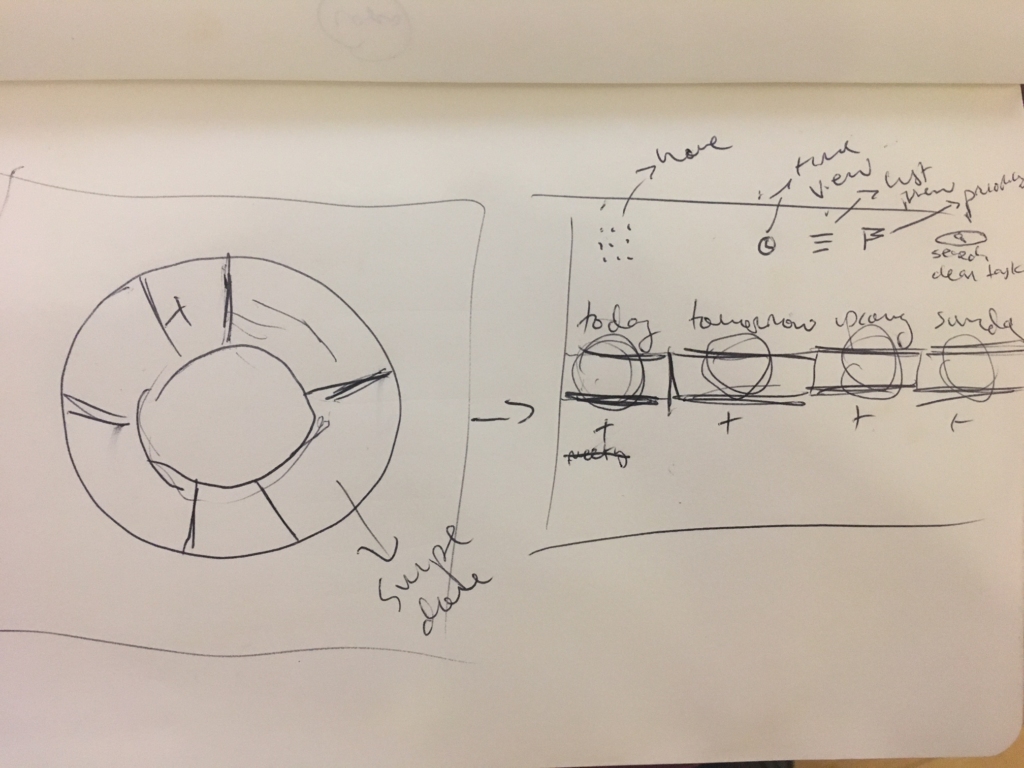
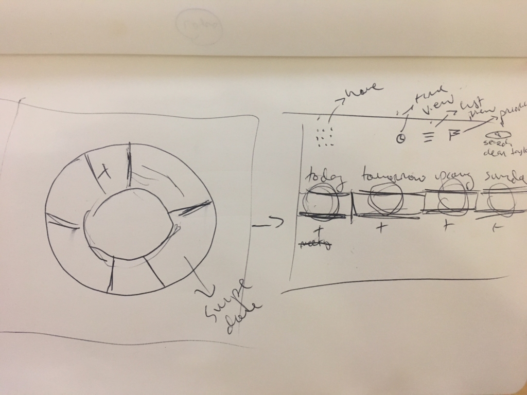
We presented our first wireframe to stakeholders and took away a key suggestion: move away from the grid-based layout for the calendar. With that in mind, we studied the structure of timelines and Gantt charts to explore an alternative way to visualize time. This resulted in a new set of sketches:, including an illustration of a 28-day sliding mini-calendar:

The second iteration of our design was presented to a new set of stakeholders, who critiqued our prototype, visible on InVision, and directed us away from the timeline format. In addition, we were advised to create a desktop format, to make setting up accounts and projects easier before syncing to mobile.
We returned to the drawing board and began sketching a new prototype that included desktop and mobile, and which was more mobile-friendly (the timelines having been deemed too difficult for mobile use).
Our final prototype is now visible on InVision in desktop and mobile.