Design Story for the Intrepid Sea, Air & Space Museum
Group: Arushi, Julie, Alexa, Krissy.
The Challenge:
Our group had the opportunity to reimagine a new website for the Intrepid Sea, Air & Space Museum Complex. The goal was to research users and analyze content to create a prototype we feel best serves the Intrepid mission while giving users a flawless and consistent experience.
Identifying Concerns:
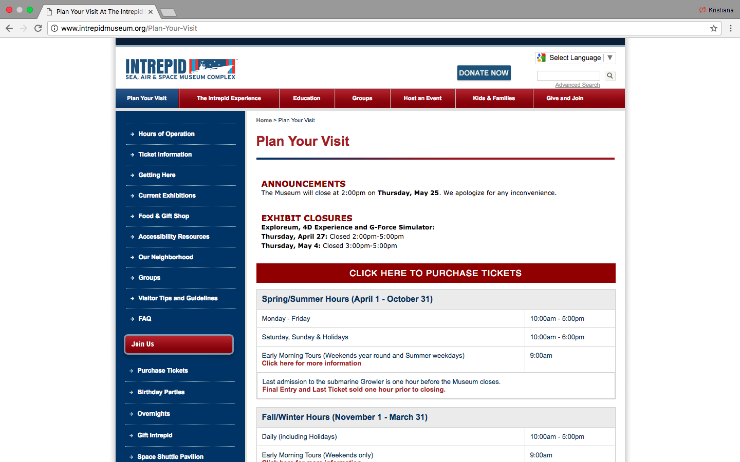
Arushi, Alexa, Julie and myself quickly did a review of the existing site and gave our first impressions. We all felt the colors were too brash and there was way too much information on the home page. We also determined too many categories were presented on the side bar creating clutter and confusion. We concluded that what would best serve this website was to simplify the content and organize it to be more user friendly. Before we began it was important to conduct research on who exactly the users are.
Understanding Users:
For my portion, I decided to focus on parents as they are a key demographic for the Intrepid. I designed a questionnaire and conducted in-person interviews. I found the in-person interviews to be helpful in that I could converse with the subject in a casual manner instead of getting fixed, formula like responses. The questionnaire proved to be very effective in getting many people to participate. Some key findings were:
- Over half of parents surveyed research a museum before visiting.
- Parents are concerned with travel time and hours involved in visiting so logistical information should be easily accessible.
- Parents care about price and look for deals so details like membership information should be easy to locate.
The Content:
Once we gathered data about our users our next objective was to start working with the content. Using the card sorting method, test subjects organized topics into categories by using the program Optimal. Afterward we reviewed the data. My role involved looking at Optimal’s analytic tools and relaying the information to the group. Some tools we found useful were the similarity matrix and the dendrogram. They allowed us to visually identify what users grouped together and we could see patterns emerge.
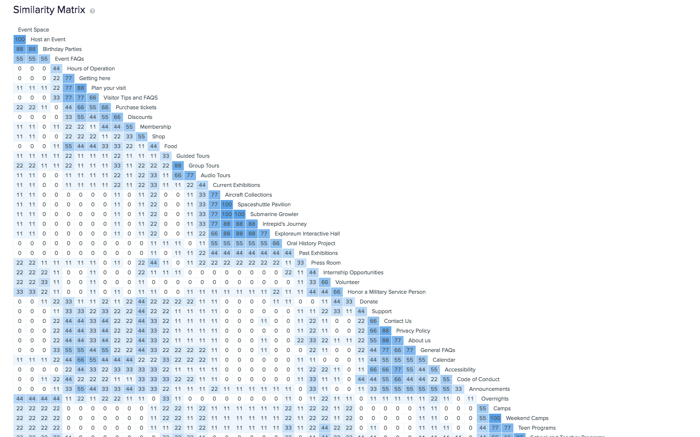
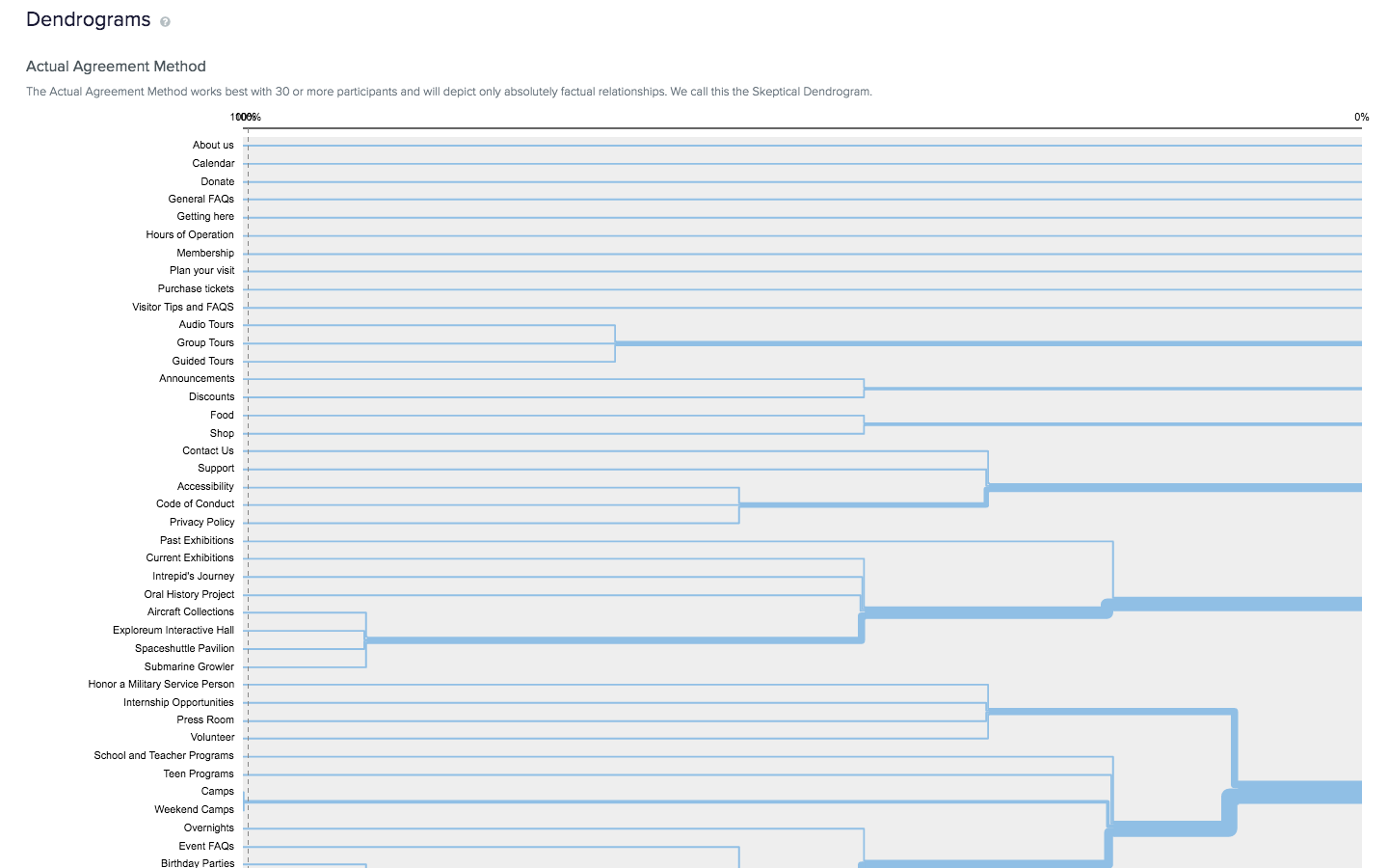
It was apparent there were major connections among categories like events, exhibitions, and visitor information, but there were also many smaller topics that had no strong links. We used the tree testing method to test these lone topics like ‘food’ or ‘how to honor a veteran.’ After looking at these results we quickly set to organizing the content.
Another method that proved helpful was the comparative analysis. Our group decided to analyze similar cultural institutions where the website conveyed a cleaner, more concise message to users. We chose:
- Smithsonian Air and Space Museum
- USS Missouri
- Exploratorium
- The Faraday Museum.
My job was to examine the label and navigational features of these websites. A key component I discovered was all four websites use a scroll over menu. Users can see a drop down menu over main buttons without having to click anything. We also discovered a ‘Buy Tickets’ button was always prominently displayed. I found this analysis to be very effective in determining what features we should incorporate into our design.
The Design:
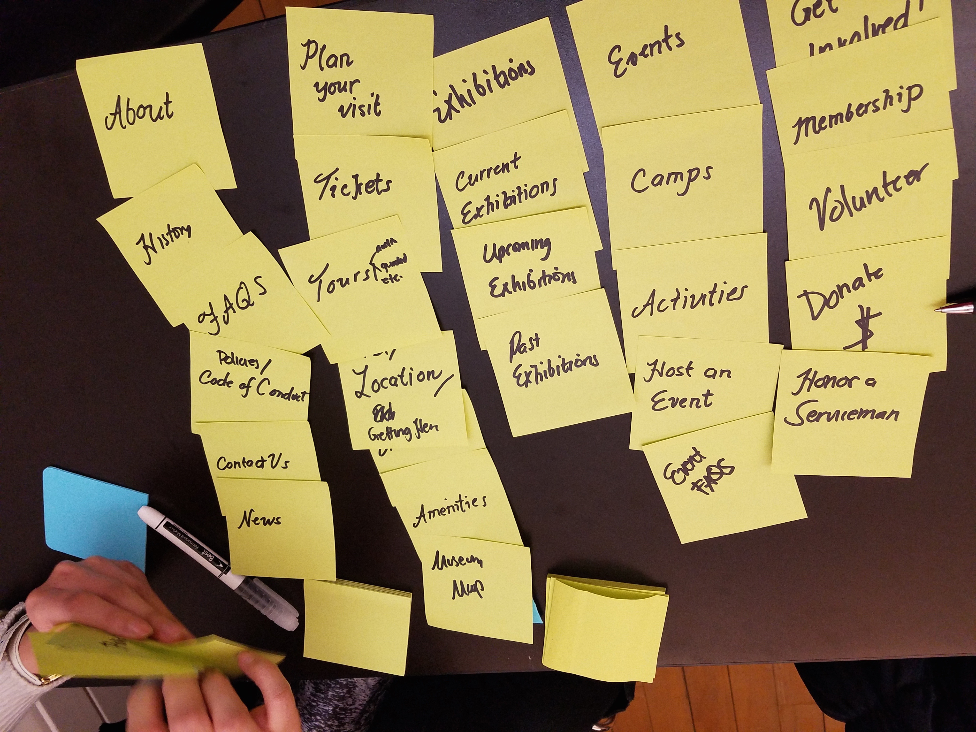
Our main vision was to create a simple design where users could easily navigate to the information they needed without getting lost or bombarded with unnecessary information. We had an idea of our categories and main page headings, but not the layout. I used Microsoft OneNote to create very simple wireframes.
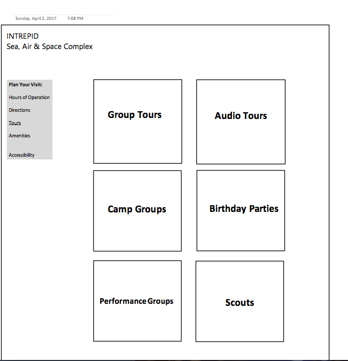
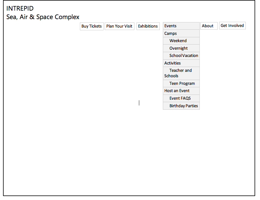
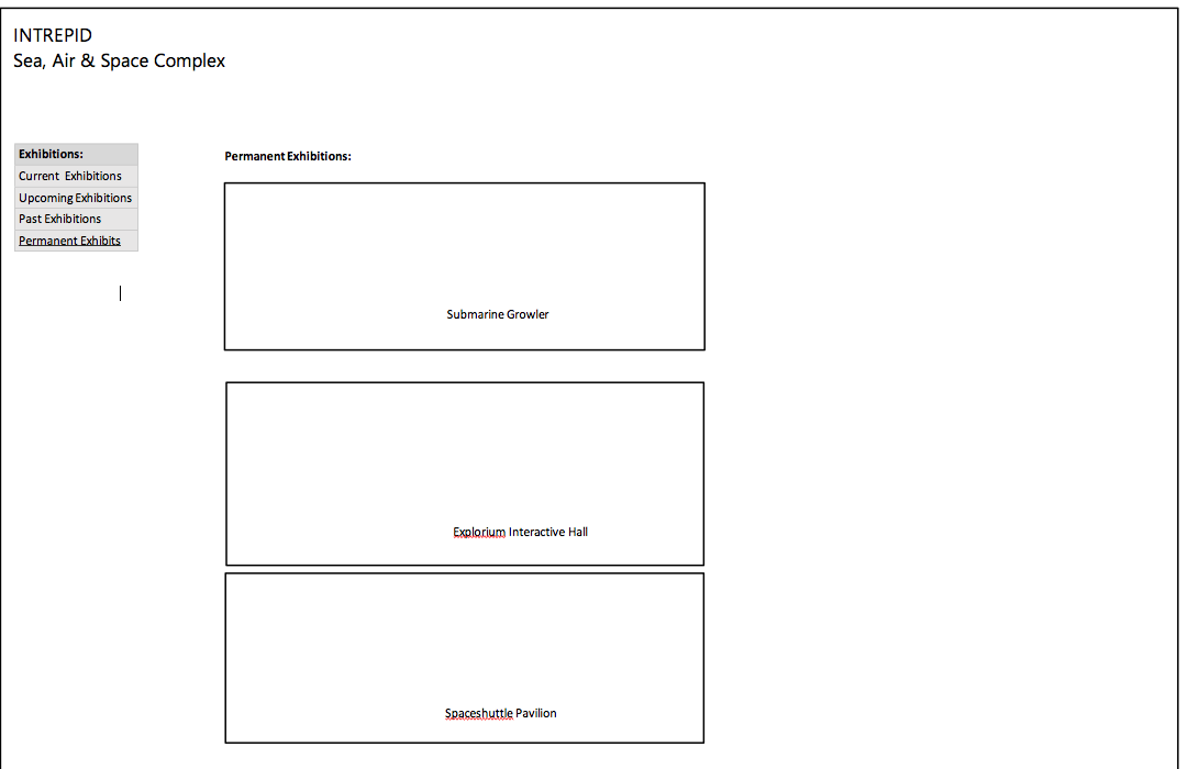
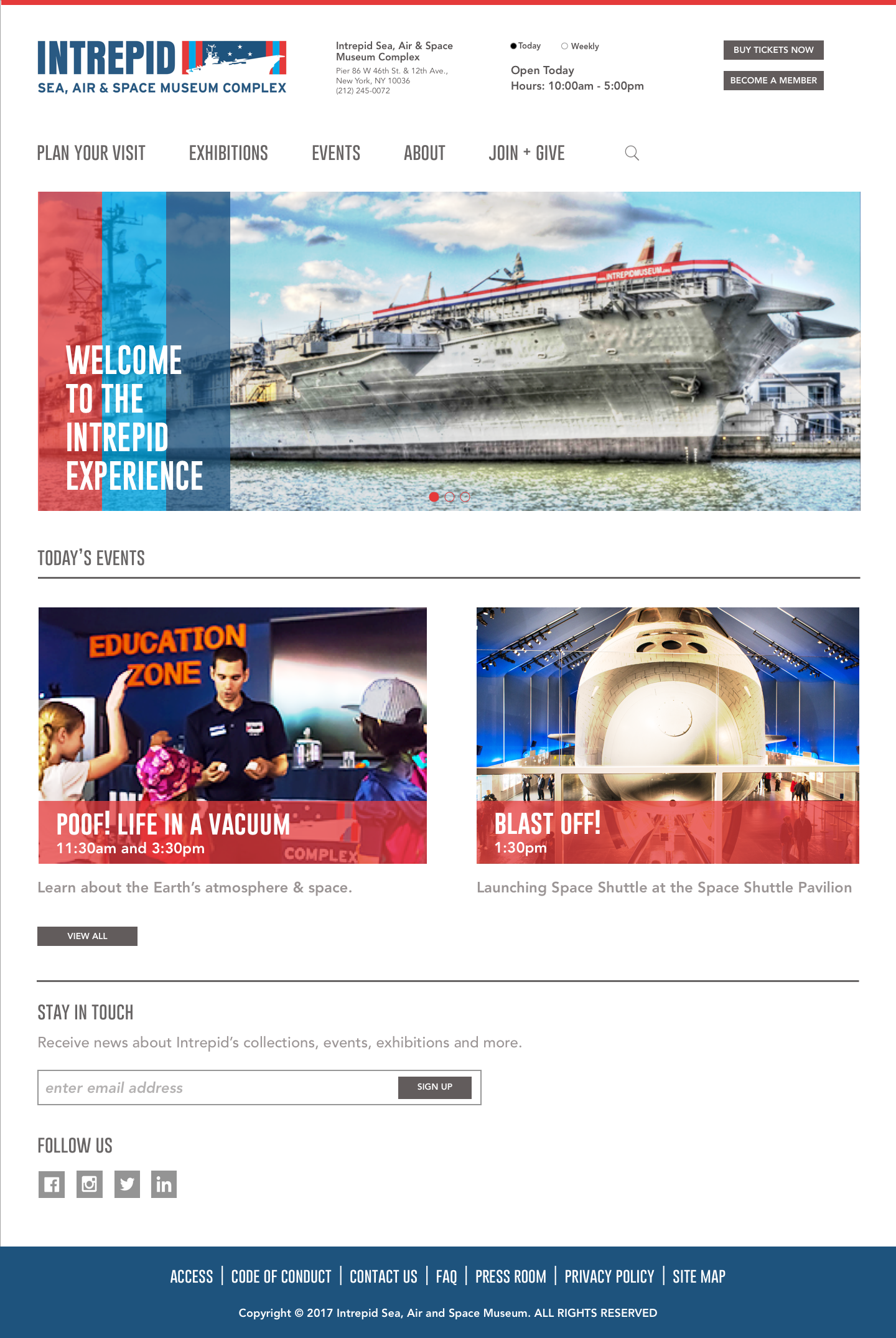
These simple designs helped our group form opinions and ideas on how to move forward with a new design. A crucial change was incorporating the address and hours on the top of the home page. Based off our research, this was one thing that many users seek and we felt it was important give immediate access to. We all agreed that the tours page would work in a grid pattern to limit users from having to scroll too much. After the initial sketches were finalized, the prototype was ready to be implemented using InVision.
The Initial Prototype:
Our first prototype test gave us good insights into the overall effectiveness of our design and also a few problem areas.
- Test subjects liked the ease of using the events calendar and the option to shift from day, weekly, or monthly views.
- They also liked the immediate access to current exhibitions when clicking the exhibitions button.
- ‘Get Involved’ button was not inclusive of membership and users found it confusing.
- Users needed more information about guided tours to know what the specific tours were about.
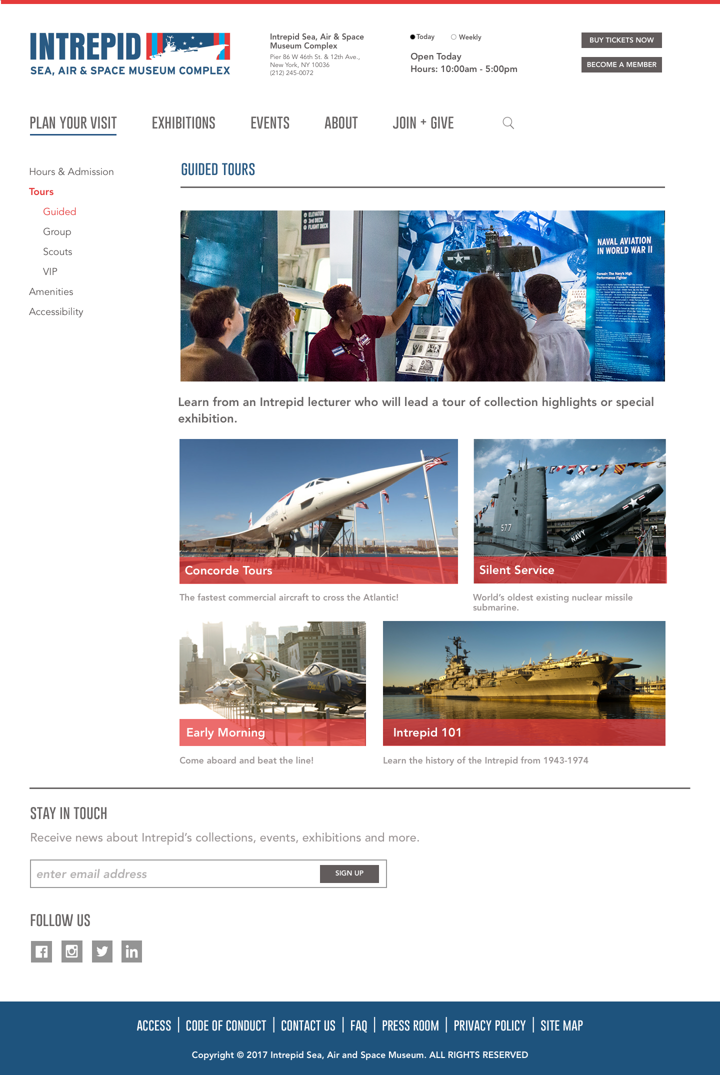
Final Phase Prototype:
After making changes to our initial prototype, we feel our final prototype improves upon the existing website greatly by providing content in a clearly organized, more refined layout. The site’s easy to use navigation will give visitors a more seamless, enjoyable experience.