QUEENS HISTORICAL SOCIETY SITE REDESIGN
ABOUT THE PROJECT
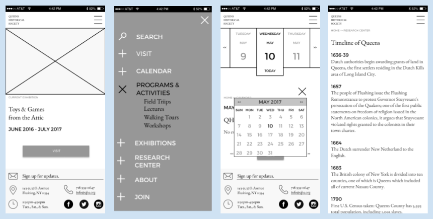
MAJR Queens was contracted to complete a user-centered redesign of the Queens Historical Society (QHS) website emphasizing an improved user experience and responsive, multi-platform design. The 4-month project generated several deliverables which supported efforts to understand users, structure content and design the final prototypes. –Jo Polanco, UX Research
CHALLENGES
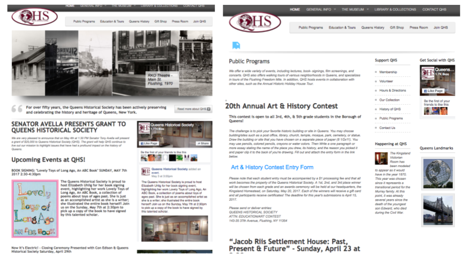
The QHS is a repository of collections on the history of Queens and Long Island housed in an 18th century homestead building. In addition to being a source for primary and secondary research, they host regular educational programs and events for all age groups. Their online presence consists of a website and major social media platforms, (Facebook, Instagram, and Twitter). Our initial review of the website found it to be visually cluttered and structurally disorganized. Double navigation bars are vaguely labeled and direct users to overlapping content.
Comprising of a museum, library, archives, regular programs and events, the QHS site presents the challenges of understanding the users’ contexts in order to prioritize content and make it findable online.
MY ROLE
The scope of the project required us to work as both information architects and interaction designers. Collectively, we conducted user research, competitive reviews, and evaluated nav/labeling schemes to inform our new IA. We then created a digital prototype through iteratively sketching and testing interim design ideas. Specifically, I designed task flows and wireframes. Tools used: Optimal Workshop, Figma, Invision
DESIGN EMPATHY
We created personas to communicate insights gathered through user research (interviews, surveys, and observations). Considering educators, parents, and non-academic history enthusiasts gave us some contextual details about how they might use the site. 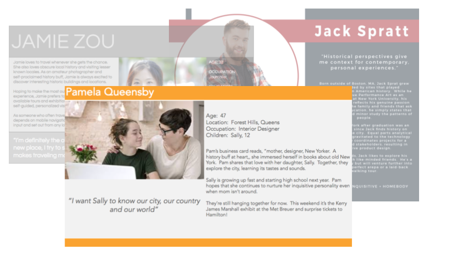
We found when deciding to visit a cultural institution, both parents and history buffs:
- seek activities close to home
- rely on word of mouth
This process challenged our notions of who users of the QHS site might be and why and how they would use it.
A NEW INFORMATION ARCHITECTURE
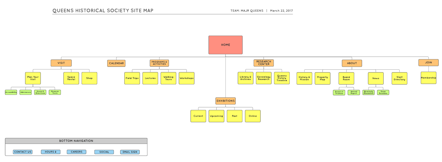
To tackle the site’s navigation and labeling issues, we first ran a card sort to learn about users’ mental models and used the results to design a new IA. A tree test was run to evaluate the new structure.
Our research found that participants:
- grouped content into fewer categories than current site
- still found some labeling ambiguous (Visit, Programs)
These findings led us to consider additional options for easier navigation to Programs resulting in an interactive calendar feature.
REVISED SITE MAP
COMPETITIVE REVIEW
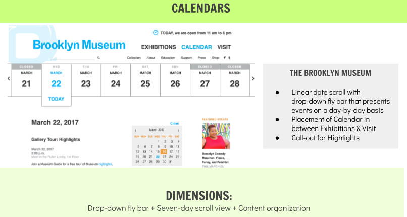
A competitive analysis provided inspiration and a look at design challenge solutions. Through this process we found multiple examples of calendars navigating to content and chose one. The takeaway from this process was perfect websites with perfect solutions are difficult to find.
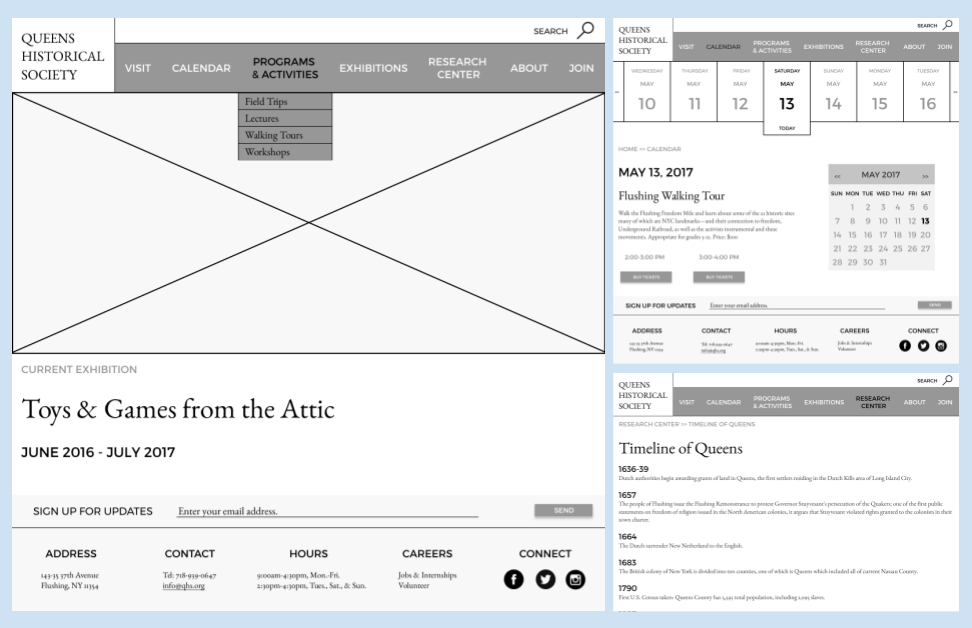
Our IA was ready to take on a system image. Iterations of sketching refined ideas and helped us develop mobile and desktop paper prototypes. 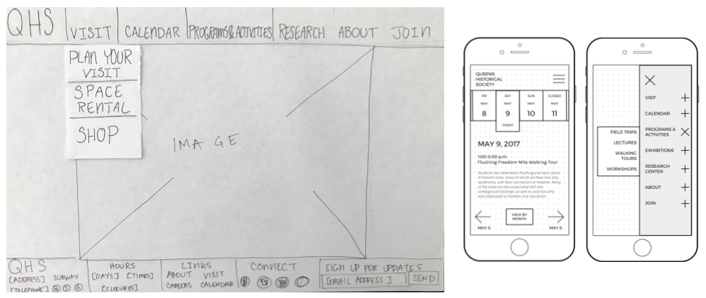
Findings on pilot and user testing of task flows prompted further revisions focused on usability including:
- Add scrolling page to calendar
- Add cost & RSVP information to events/programs
- Add breadcrumbs
- Add page titles
- Add search bar
Testing ideas on real users identified gaps early on in the prototyping.
USER-CENTERED DESIGN, DELIVERED
MQ delivered responsive desktop and mobile prototypes which are “cleaner, streamlined, and easier to understand than the current site”. We received rave reviews on the usability of the calendar functions. Looking back through the course of the project, the missteps along the way served to keep us focused on the primary goal.

