Queens Historical Society
About the Project
At the beginning of the semester we were broken up into groups and asked to tackle redesigning the Queens Historical Society website. In my group, each of us identify key issues within the website, these key issues helped us design a more friendly website using the following procedure.
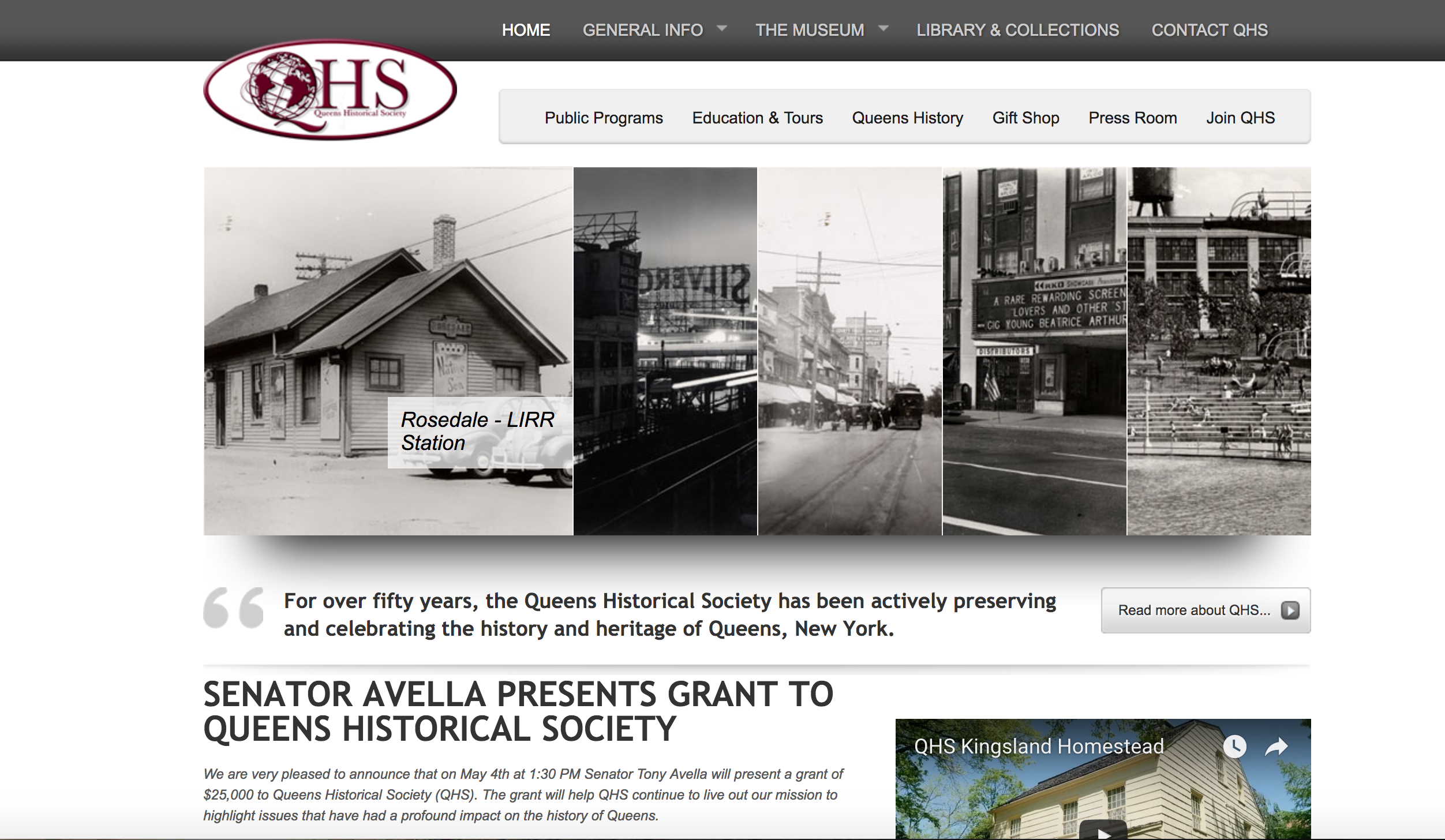
Current Design
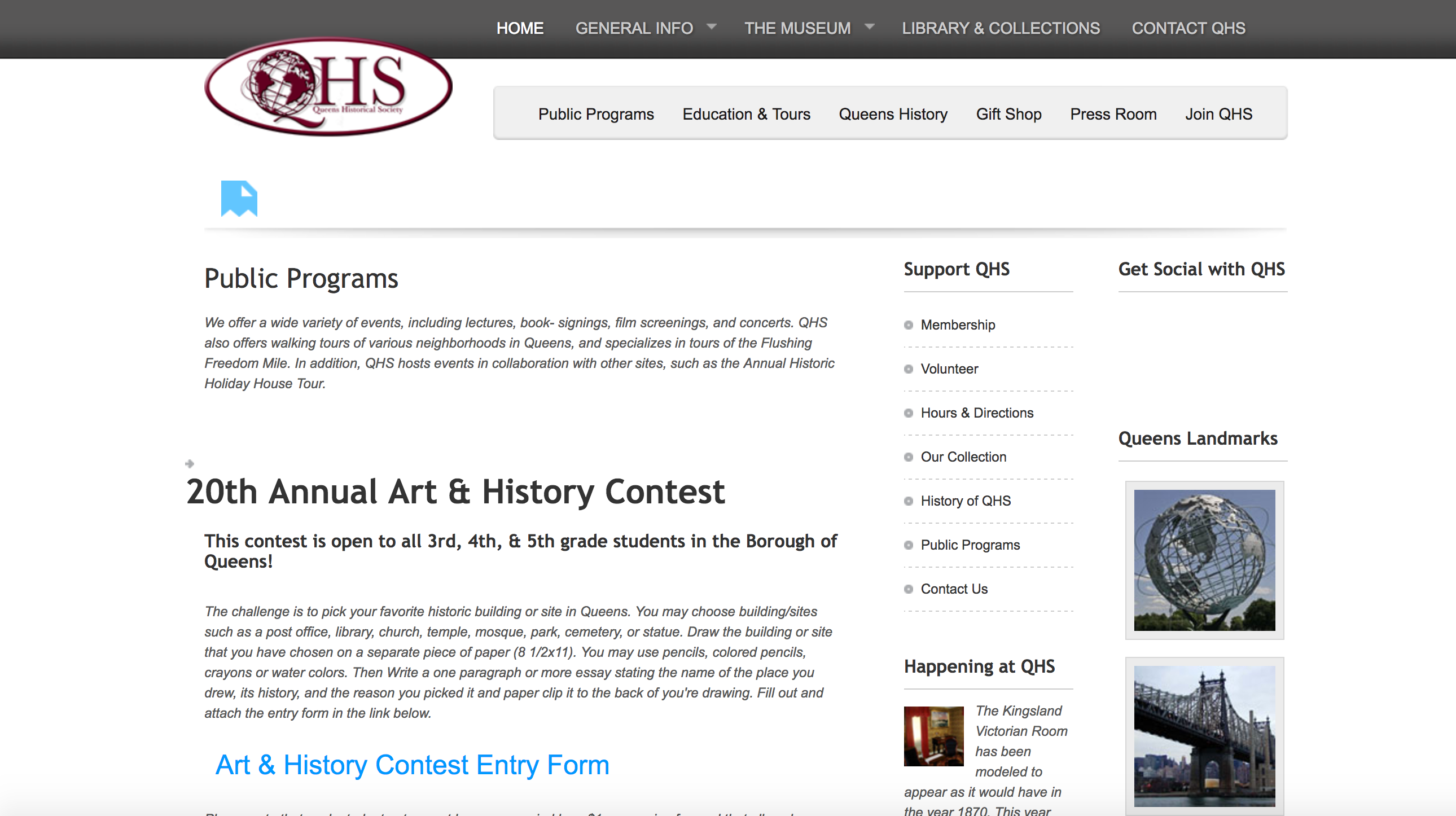
Upon looking at the Queens Historical Society website some of the key issues are the double navigation bars, the non-interactive slider, the follow of content and the heavy text content located on the first page.
Understanding the User:
The step of our progresses was identifying our individual user groups. I decided to focus on pre-professionals, meaning students that are finishing their degrees or recently graduated individuals. During the testing of my user group I conducted two interviews and two observations. Both of these tested revolved around the usage of cultural institutions websites and how often they visit these websites.
The observations and interviews lead me to the following information that they deemed most important about websites.
Discoveries:
- Content
- Structure
- Images
These discovers lead me to create a persona, that would signify one of the many users of this website.
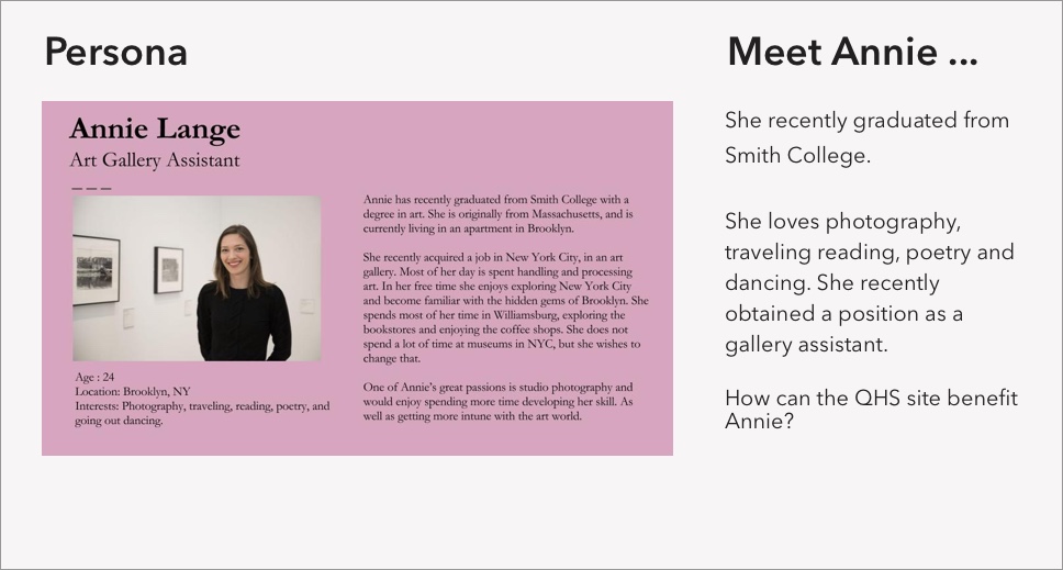
In this section we all learned that each user is different and we cannot assume they contain the same perspective as us. During my testing I discovered that something logical to me is not the same to other users. As a group we discovered that most of our users were very keen on the navigation, content and images of the website.
Content Construction:
In learning what are users are general looking for within websites we proceeded to the next step.
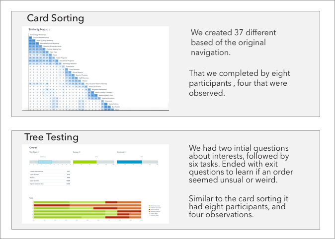
The card sorting and tree testing helped us understand and see how our users go about locating information within the website. It was interesting to learn that most of our users had completely different ways of sorting the cards and completing the tasks. The card sorting gave us insightful information on how to go about designing our site map. It also provide us with insight on how others process and look for information.
Site Map:
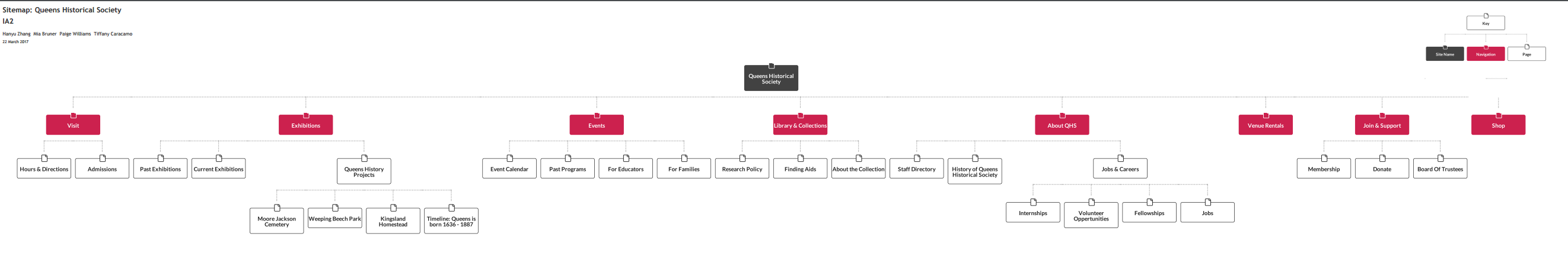
The site map along with the competitive analysis helped us design the paper prototype that would lead to the final product. The site map was created from the card sorting data and the tree testing. Both of these resources helped us learning the best way to group and range labels. We also realized that language is really important, common phrases to us do not mean the same to others.
Competitive Analysis:
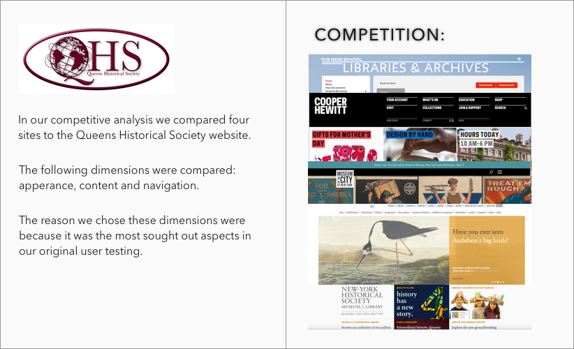
The competitive analysis helped us with:
- Creating a better navigation
- Better arrangement of content
- The overall appearance of the website
Prototype:
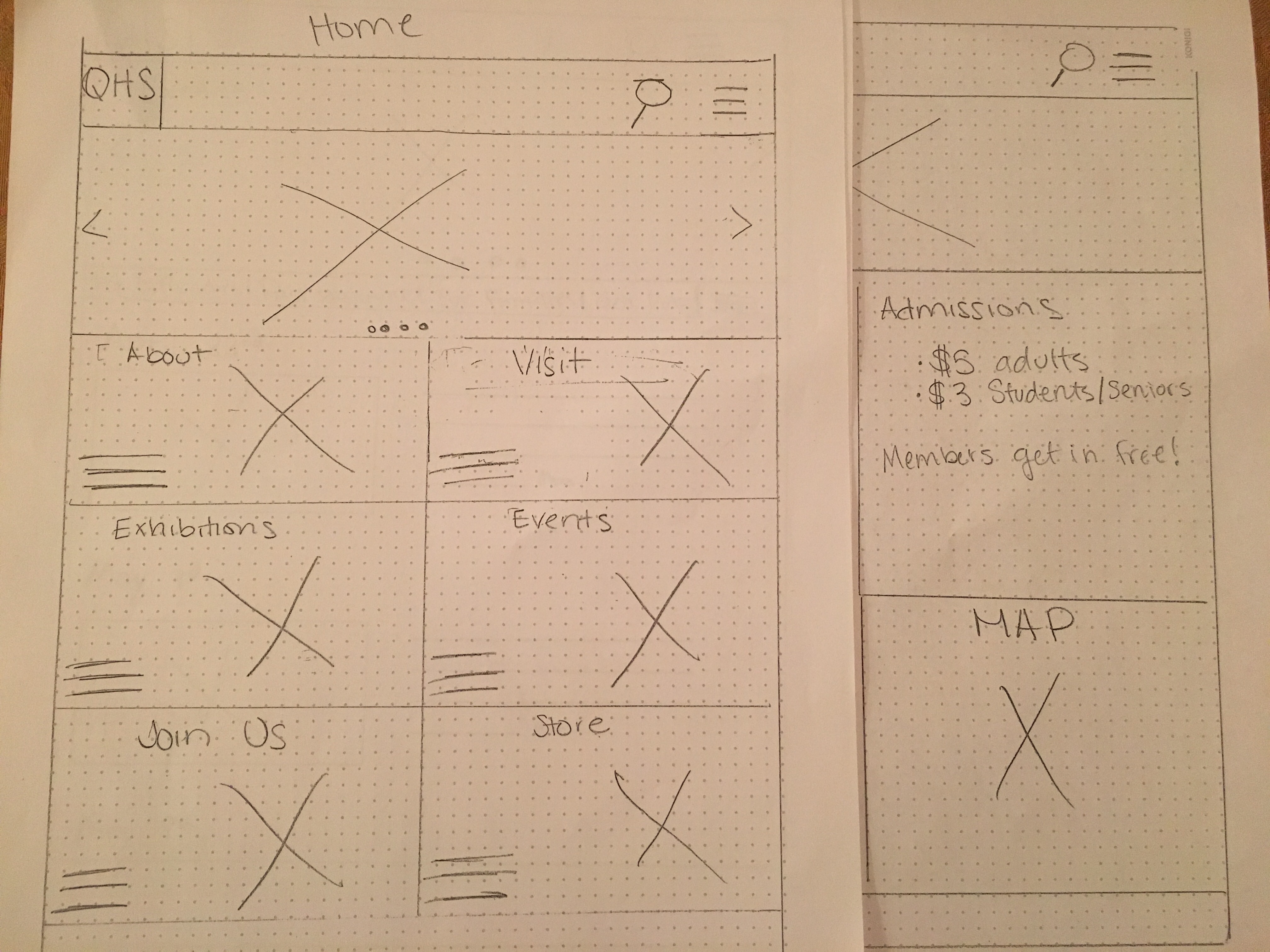
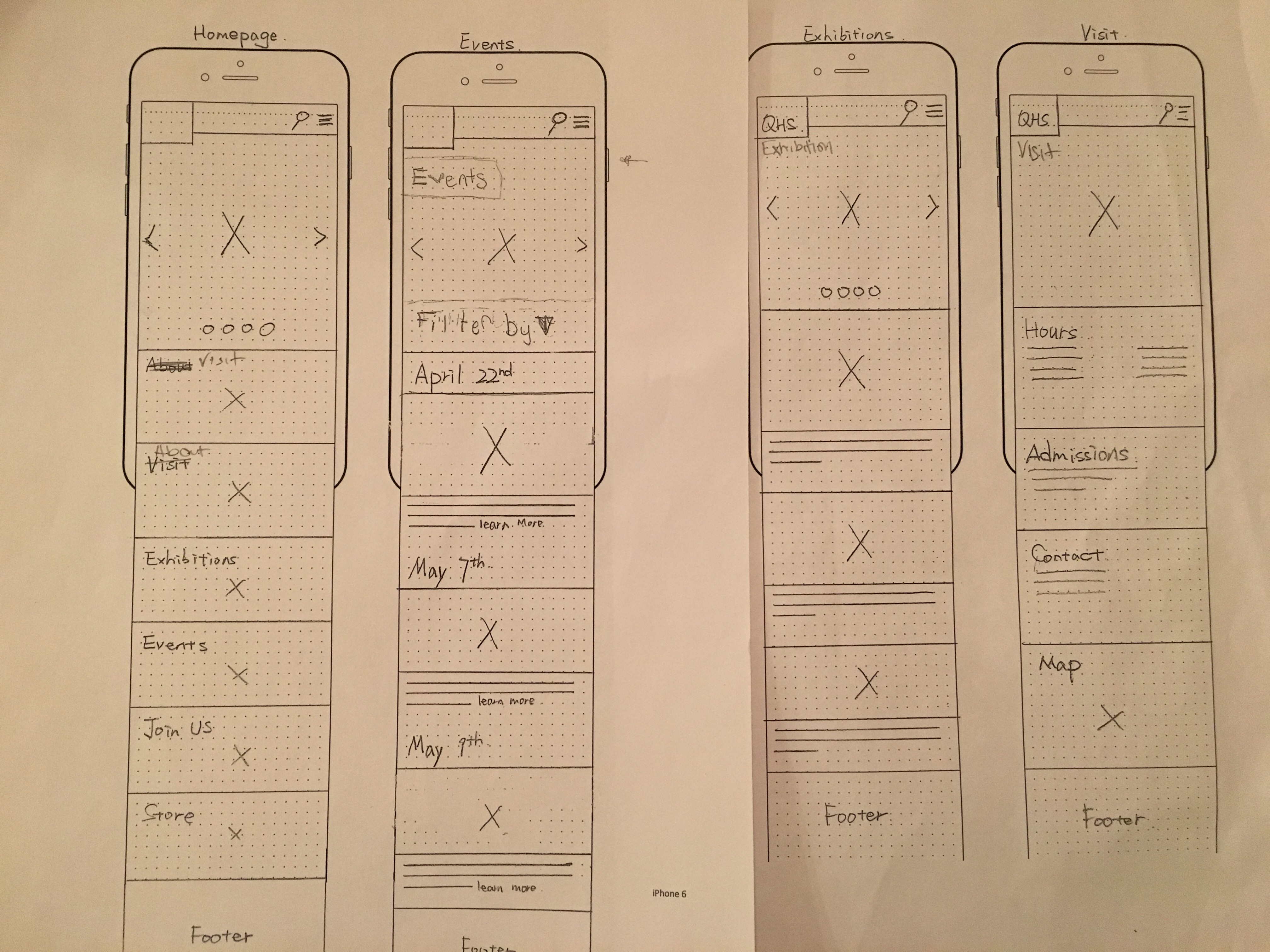
We first designed the desktop paper prototype and modeled it after the Cooper Hewitt and the Museum of New York City, we then designed the mobile site. We chose these websites because they had the best appearance, content and navigation. As a group we tested the paper prototype on eight individuals, our first round of testing came back helpful information.
Overall are design was good but it had some minor issues:
- Language – meaning some terms were confusing
- Label Arrangement – this had to do with the desktop version and what was found on top and bottom of the page
- It also helped us realize we need to put the title of the page and not assume users know what page it is
Wire Framing:
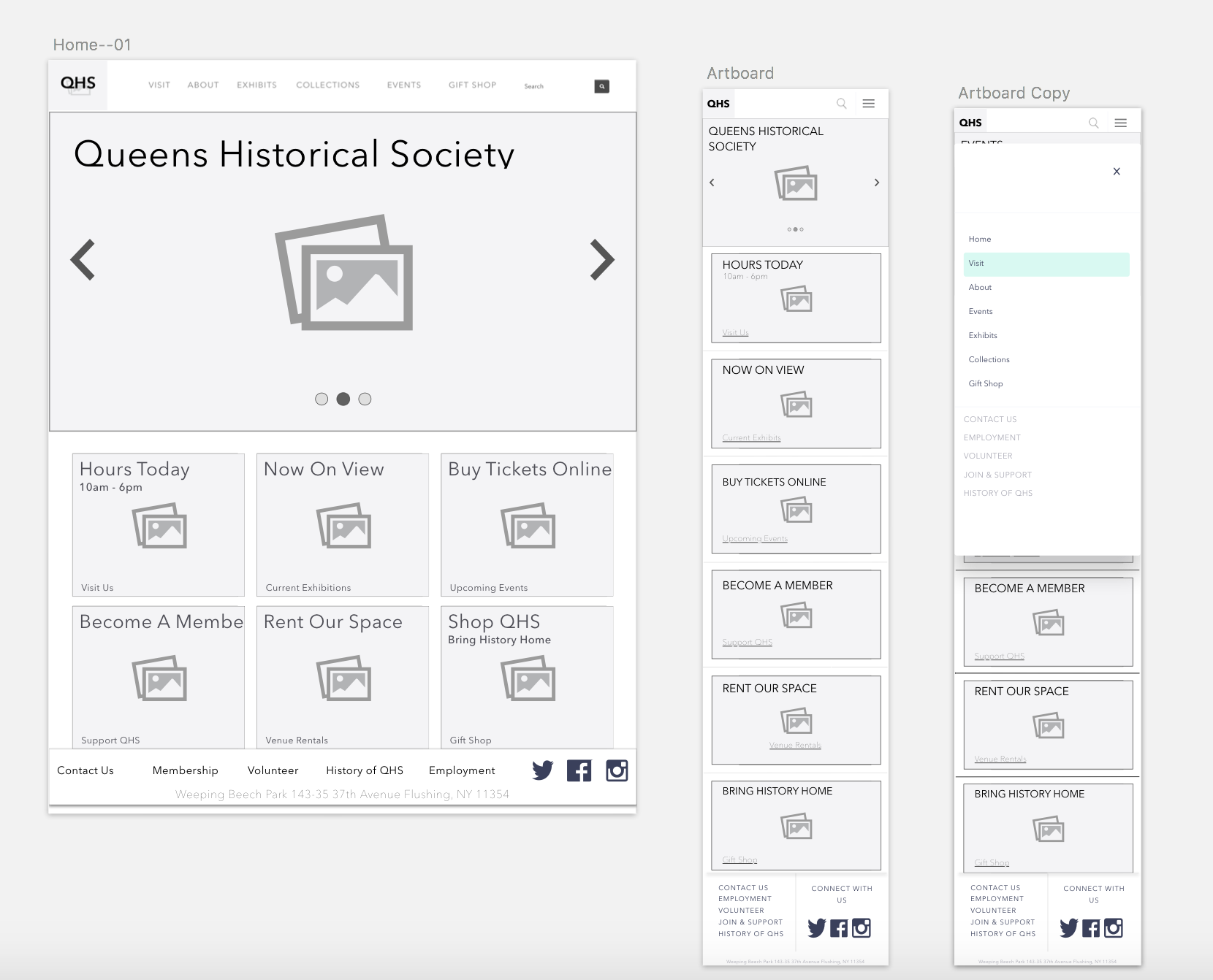
The next step of our process was designing the wire frame, as a group we decided to use sketch to bring our paper prototype to life. We divided the work into sections, I and my follow group member took the mobile site and the other two members took the desktop version.
- First we made the necessary changes to the paper prototype to incorporate into the wire frame.
- Second we meet as a group with our first designs, which lead to revisions because of the inconsistence between the mobile and desktop.
- Lastly we used InVision to create an interactive wire frame.
Final Product:
Overall I am very happy with the redesign of the Queens Historical Society website. The user testing was a great help in obtaining insight on what users general want from websites, as well as the overall design.
As a group we decided to go with a more image heavy site because we believe images speak louder than words. It is also more visually appealing than text heavy pages. Our second accomplishment is the reorganizing of the navigation bar and adding filters to the exhibition and event pages. Also with the help of my teammates: Paige, Harry and Mia, we were able to bring different perspectives to help create a more user friend website.
Mobile
Desktop