About the Project
We were tasked with completely redesigning the Intrepid Museum’s website. After some research, we found the current site to be severely lacking in its ability to be aesthetically pleasing while providing users with easy access to information.
My Role
One of the main roles I took on in the group was as a communicator and editor. Since my groupmates all learned English as a second language, there were occasionally more technical or specific UX concepts that they were familiar with (in most cases more so than I), but had trouble communicating in English. In these cases, my writing background was perfectly suited to helping them communicate these ideas both to the group as a whole and to help refine the wording for user tests and tasks.
In terms of tangible creations, I wrote and created the first set of cards for our card sort, developed the six tasks we used in our tree test, and created the tasks that we used for our first and second set of digital prototype tests. I also created the task flow that was delivered as part of the final prototype.
Initial Design
Our initial design was heavily based on the results of our card sort. The card sort results pointed towards seven top-level navigation tabs: Events & Programs, Exhibits, Join & Give, About, Shop, Video Gallery, and Plan Your Visit. Several of these tabs had second-level navigation options, based on both the card sort and our notions of what were related. We did deviate from the card sort in one respect: the “Events” and “Programs” groups were deemed too similar to be split, so we put their content into one heading so that users wouldn’t have to choose immediately.
Since these were the most-used headings, we assumed that our users were in agreement that this set of options would form an understandable and intuitive information architecture (IA).
Decision 1: The Education Tab
Our tree test involved six different tasks to test our information architecture. Task three quickly revealed a large problem with our hierarchy. We asked our users where they would find information regarding scheduling a tour for a school group (see Picture 1). The correct tab was Tours (found under the Plan Your Visit heading), but the majority (eight of twelve participants) chose Group Visits (also a sub-level of Plan Your Visit). A ninth user chose a different incorrect path. After this, we decided to make our first major change to the IA: creating a top-level “Education” tab to try and prevent this confusion in the future. Under this tab would be three sub-levels, as seen in Picture 2.
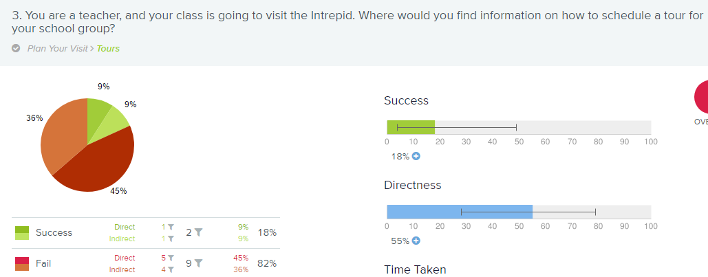
Picture 1: Tree Test, Task 3
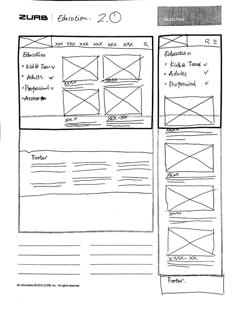
Picture 2: Top-level Education Tab.
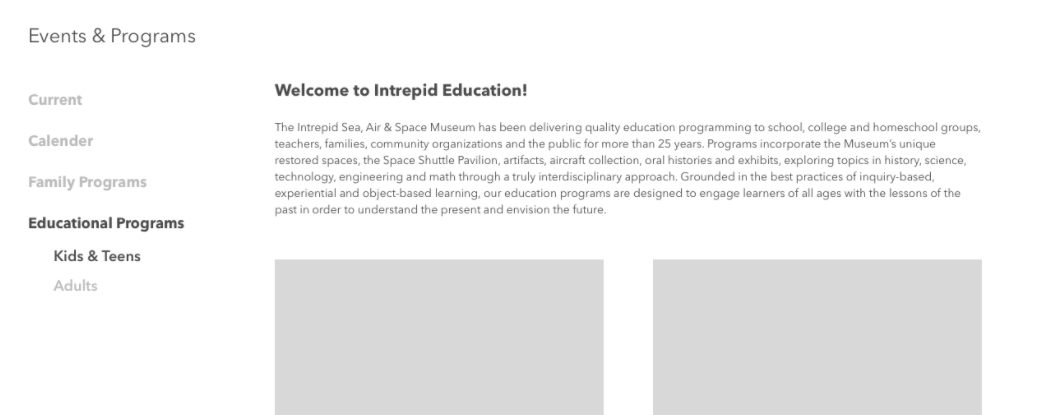
This top level Education tab remained throughout our IA, until we conducted our first set of user testing for our digital prototype. Task one was to find an appropriate event for an elementary school class to attend. The ideal task flow was to select Education, then Educational Programs, and then select a single event. Our users instead went to the Events & Programs tab. As a result of this, we decided to divide Education up: Tours were moved back under the Visit tab (changed from Plan Your Visit), and the rest was moved to a second-level Educational Programs tab, with sub-levels that can be seen in Picture 3. We believe that most of the confusion arose from the fact that Education is too general a term for users to intuit what content is under it.
Picture 3: Revised Prototype
Our second round of prototype testing was much more successful, and appeared to confirm the placement of the new Educational Programs tab. Ultimately, we learned that there is a significant difference in whether the users are creating headings based on content versus users knowing what content is there based on a heading. Though users agreed that certain events could be grouped under the word Education, they could not reliably interpret what would be found under it when it was presented to them.
Decision 2: The Calendar
Our initial plan for the calendar was to put it on the Events & Programs page. This was based on the assumption that the calendar would primarily be used to discover which days had events and programs occurring (See Picture 4).
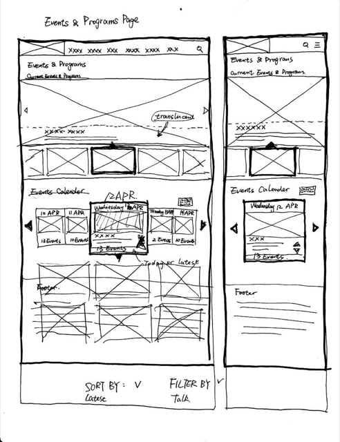
Picture 4: Events & Programs with Calendar
This idea was supported by our card sort, in which the calendar was closely linked to events and programs. While we kept the Calendar under that same tab, we eventually moved it to its own page. This made it easier to find, as it now had a designated second-level heading that users could see in the hierarchy. As for the design of the calendar, we felt that a rotating style would serve better on mobile. The Intrepid’s user base being slightly older, a small grid calendar could prove frustrating when users were trying to select specific days (see Pictures 5 and 6).
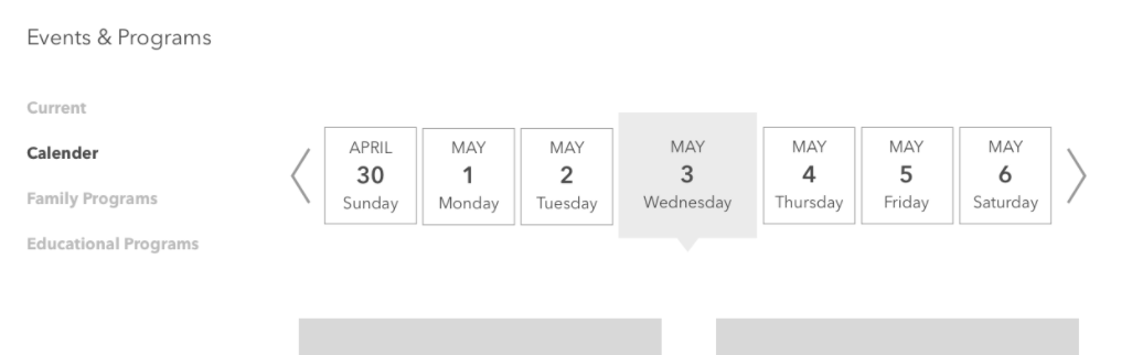
Picture 5: Desktop Calendar
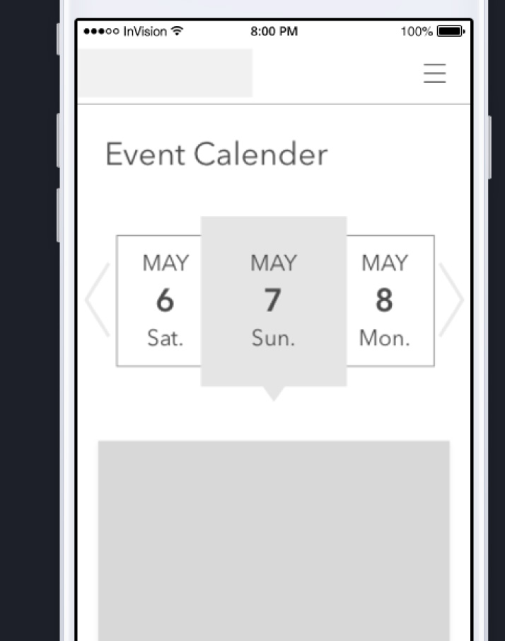
Picture 6: Mobile Calendar
Ultimately, while we were tempted to simply use the calendar format that is the most popular, we were able to innovate and come up with an alternative that helps to set our design apart without compromising usability.
Decision 3: Drop-Down Menus
Our first design for the desktop prototype involved hovering drop-down menus that displayed the content available under each of our top-level tabs. We believed that this would allow users to see the options for each tab without having to navigate to any new pages. During our first round of prototype testing, however, several users complained that the drop-downs actually forced them to decide between the second-level options.
For example, one of the tasks in the digital prototype testing was for the user to find parking information. This information was located under the second-level Plan Your Visit tab, under the top-level tab Visit. Users, however, were unable to see this without selecting Plan Your Visit, and so some instead selected the About Intrepid Museum second-level navigation, which is located under the top-level tab About (See Picture 7).
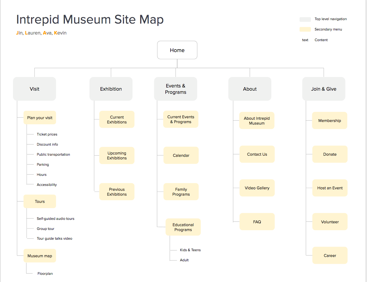
Picture 7: Site Map
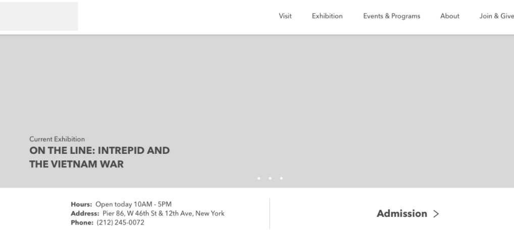
To correct this issue, we removed the drop-down menus from the desktop version, instead creating single pages for each top-level tab. This way, when a user selected Visit, they would be able to see all the third-level options, but could still easily navigate to a different top-level tab (see Picture 8).
Picture 8: Visit Page
We thought we were saving users time by providing them a look at the second-level tabs via the drop-down menus. Instead, we were forcing them to make decisions without being able to see the content, and a wrong choice would actually result in more time and more clicks than if we’d simply sent them to a second-level page. It was as if we’d removed the top-level tabs (and their intuitive meanings) and forced users to click through three times as many options to find the information they needed.
Decision 4: Hamburger Menu
Our group was split on how the top-level navigation should be presented on our mobile prototype. My half of the group wanted to use the “hamburger” menu, and the other half wanted to find an alternative solution.
The arguments in favor of the hamburger menu were that it was recognizable and would allow us to save a significant amount of space on the screen. If we were to provide our full menu, it would take up nearly the entire home page on a mobile phone (See Picture 9).
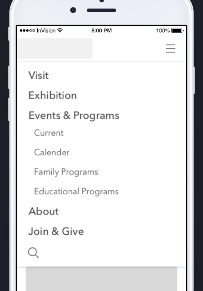
Picture 9: Mobile Prototype Menu
The counterarguments were that the hamburger menu is not intuitive and forces an extra action from the user to see the actual menu options. Ultimately, I was able to convince my groupmates that there were simply no viable alternatives to the hamburger menu that would allow us to keep our home page visible. We used the hamburger menu in the user testing, and encountered no significant issues nor complaints.
We learned that though certain common design options may seem clunky or outdated, it is not as easy to replace them as it may first appear. Being recognizable is the most crucial facet of a successful symbol, and since you are not your user, it’s not easy to create something intuitive to replace it.
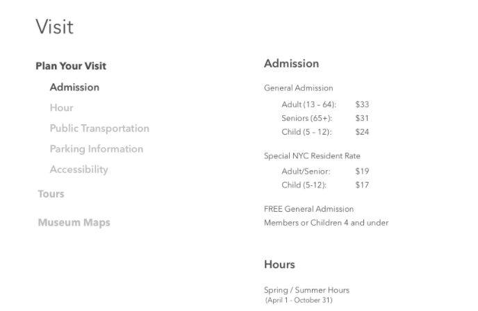
Decision 5: Admission Prices
Two of the main pieces of information that my users had trouble finding when I conducted my initial website evaluations were the location of the museum’s hours and the ticket prices. They considered these to be a crucial piece of information, and were frustrated when it was hidden in a footer (in the case of the American Museum of Natural History) or only available once you’d committed to buying tickets. Therefore, I went into the design process with the belief that these pieces of information should be easily accessible.
My group’s initial idea was to simply include this information under the banner on the home page. The hours were easy to fit in, but after seeing how complex the ticket prices could be, we realized that they would take up too much room. I then had the idea to create a “Plan Your Visit” button, which would serve both as a call to action and an easy way to jump right to pertinent information. Clicking on the button would bring users right to the Plan Your Visit page, where the ticket prices were immediately visible. During our user testing, however, users did not follow this logic, and instead used the top-level navigation to find the information. We decided that the wording should more accurately reflect the landing page, rather than the section of the site that users would be on. After briefly trying “Get Tickets,” we settled on “Admission.” This allowed users to know exactly what they would see when clicking it and once they were there, they could find whatever else they needed to plan their trip (See Picture 10).
Picture 10: Desktop Home Page
We learned that while shortcuts can help direct users to highly requested sections of the site, the shortcuts shouldn’t be treated the same way as top-level navigation. The wording for these should be as specific as possible, otherwise the user still has to sift through the rest of the navigation anyway.
The Final Product
Our final design incorporated aspects from every decision we made, both those detailed above, and countless smaller ones made consciously or unconsciously. Some of these decisions came from our past experiences, but in many cases we had to override these assumptions when our data and testing challenged our way of thinking. The lessons I learned were not just applicable to these specific situations, but to the design as a whole.
While the prototype is certainly not perfect, some of our decisions appear to be validated. Our final round of user testing saw no significant issues. Our top-level navigation options were exactly the same as one of the other groups’ results, which would suggest that our decisions are also supported by their research and user testing.
Kevin Cosenza
Information Architecture and Interaction Design: 643-02