For over fifty years, the Queens Historical Society (QHS) has been actively celebrating and preserving the heritage and history of Queens, New York through educational programs, exhibitions, and its public repository of archival collections and sources. The QHS website is a key vehicle for communicating their mission to the widest audience possible, yet their message gets lost in the clutter of content, images, navigation bars, and more.
THE CHALLENGE
How can we gain hands-on experience of information architecture and interaction design, meet the goals and objectives of this particular course, and collaborate and communicate with a team of strangers to create a cohesive re-design proposal for a nonprofit’s website in need of a facelift? With a four month timeline, our solution was to employ a user-centered design (UCD) process that emphasized aesthetic simplicity and navigational speed.
MY ROLE
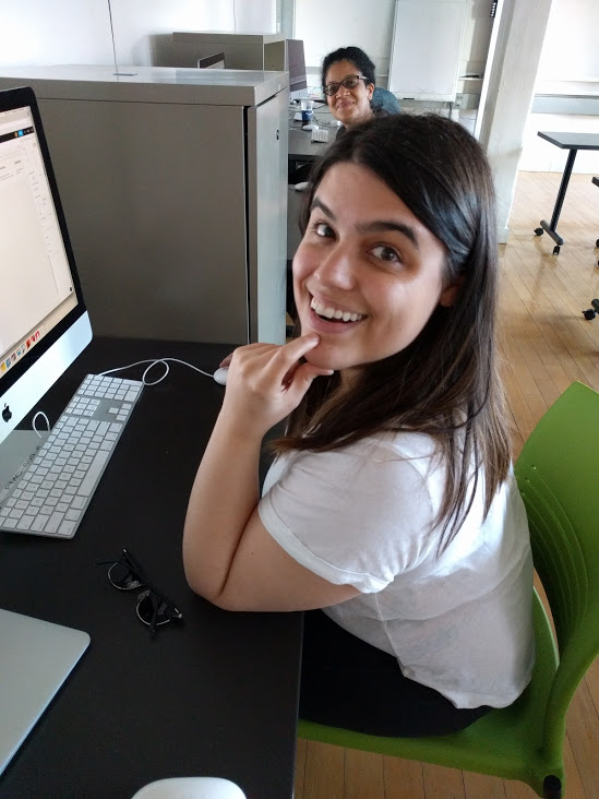
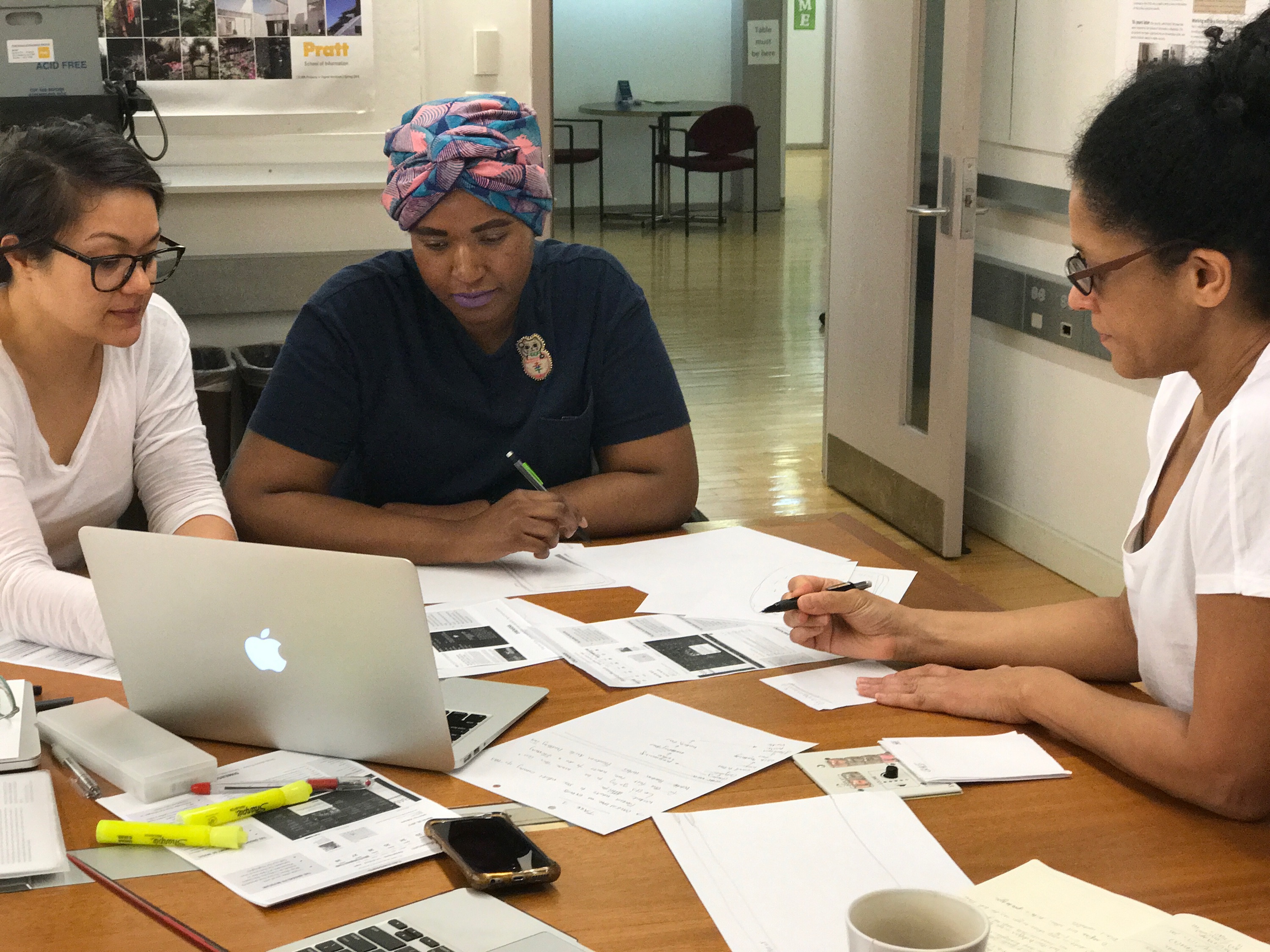
I was a member of team MAJR Queens comprised of four graduate students attending Pratt Institute School of Information under the guidance of Dr. Craig MacDonald. All team members conducted user research, drafted briefs, and participated in brainstorming and sketching. I was responsible for the technical design of many group deliverables, including the final sitemap, the low-fidelity mobile prototype, and the high-fidelity digital wireframe prototypes for both desktop and mobile display.
THE PROCESS
Understanding Users: Personas and Goals
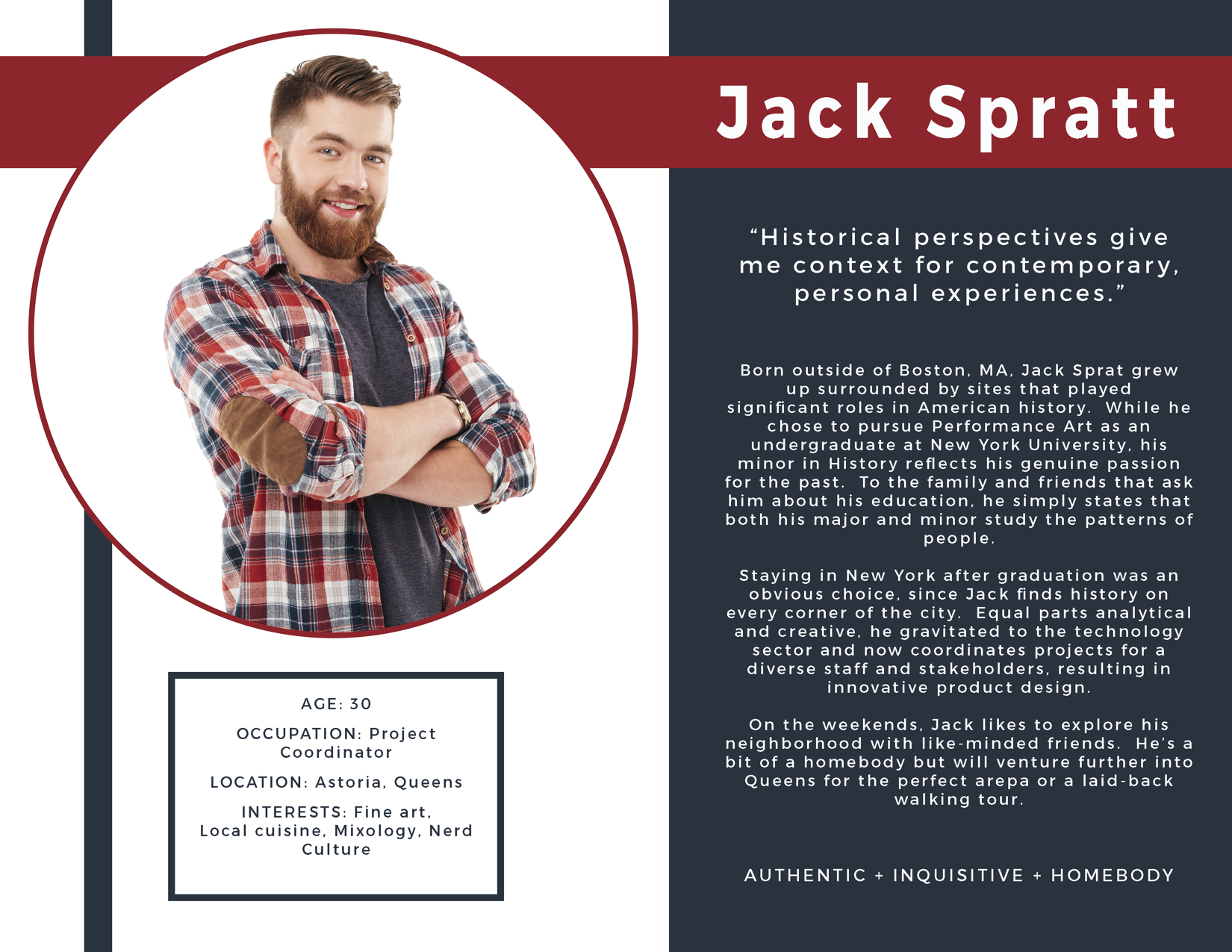
To gain a deeper understanding of the QHS website’s users, each team member focused on a specific user group through a series of interviews, observations, and questionnaires. For instance, by deep diving into the attitudes, behaviors, and goals of “historically-curious New York residents” or “non-expert locals,” I discovered that users in this group possess technological fluency and possess a discerning eye for interface design. They also tend to be attached to their neighborhoods and prefer to search for activities nearby. In order to ensure that all future design decisions were based on user needs and guide the ideation process, we each created an engaging persona for inspiration and reference.
Structuring Content: Mental Models and Site Map
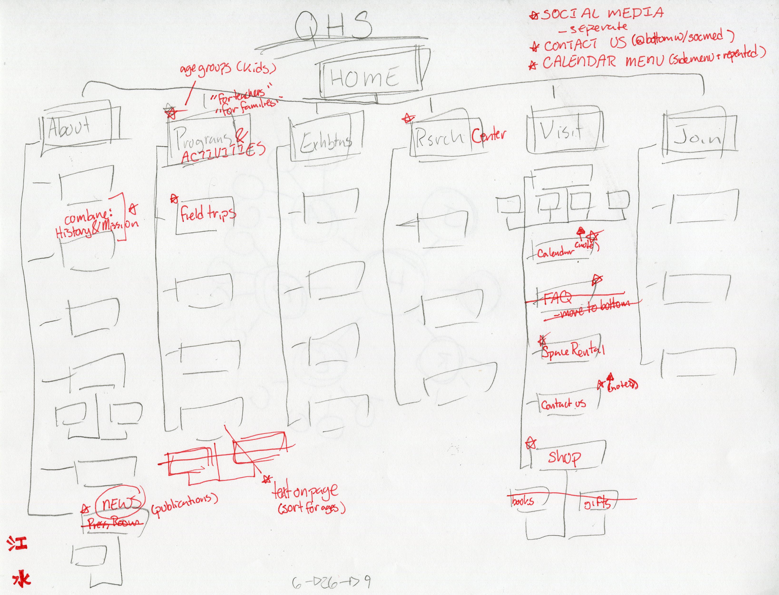
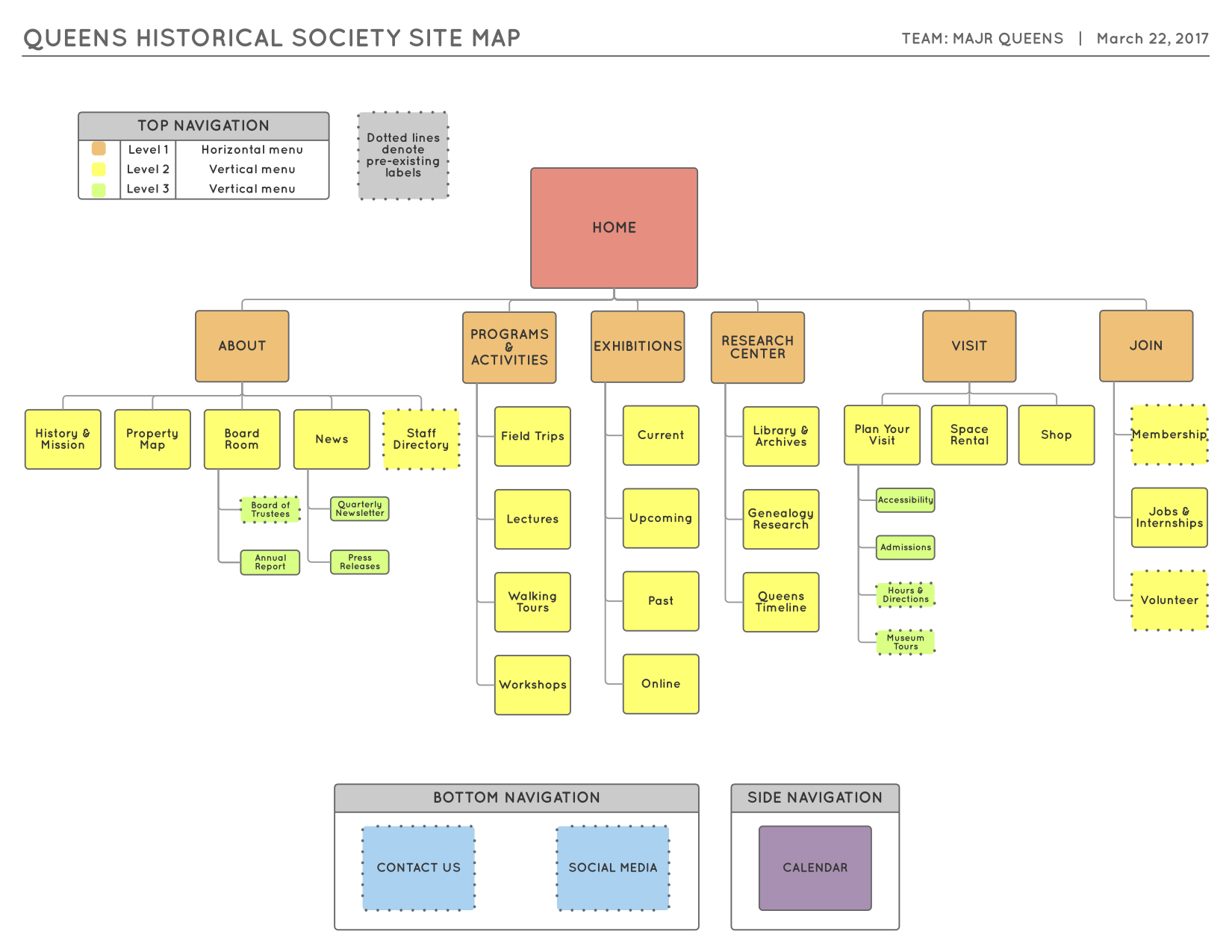
After discovering our users’ goals through observation and condensing this research into user archetypes, the next step was to structure content for the QHS website re-design in a way that would help users figure out where they could find what they needed. How did our users expect this information to be organized? What terminology did they find confusing? What better terms could be used? To answer these questions and uncover our users’ mental models, we conducted an open card sort. One of the more valuable insights was that all 11 participants grouped content into fewer categories than there were on the QHS website at that time. One participant even asked: “Why are there so many options? I feel like you could eliminate half of these with a few good titles.” Keeping this “less is more” mentality in mind along with other insights derived from the card sort data, we proposed a new information architecture (IA) for the QHS site and then evaluated it through a tree testing study. When reviewing the tree testing results, we noticed that participants would vacillate between some of our top-level navigation labels, along with other insights. Revisions to our IA were made accordingly, as seen in the red annotations added to original sitemap sketch.
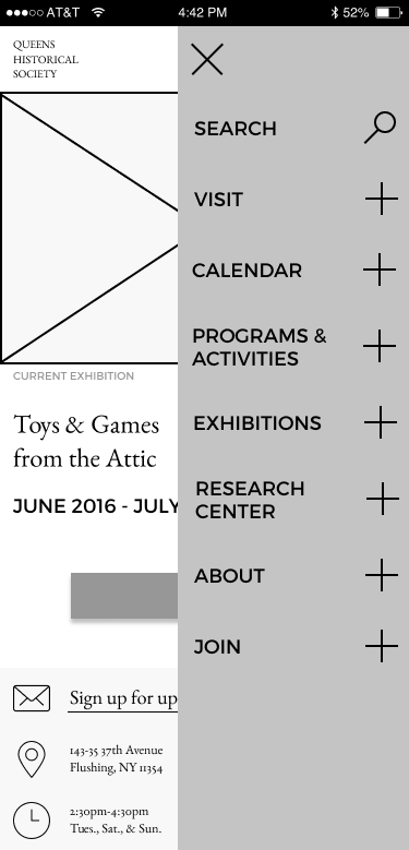
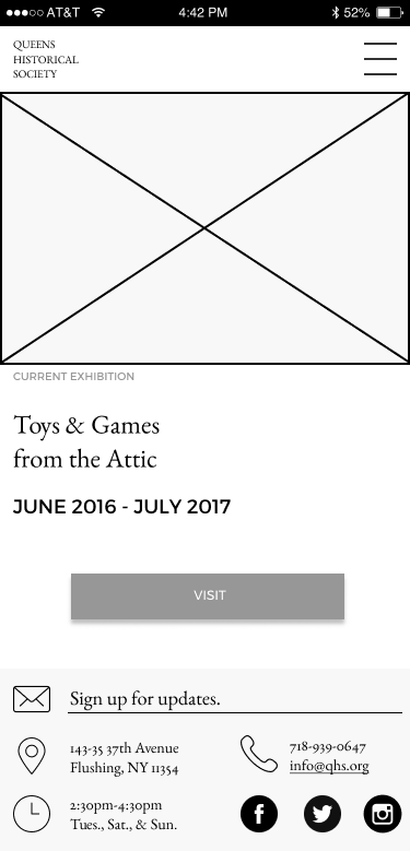
Prototyping With Purpose: Wireframes and Transitioning from Lo-Fi to Hi-Fi
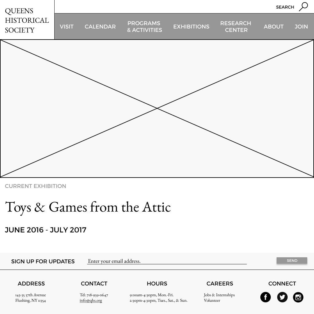
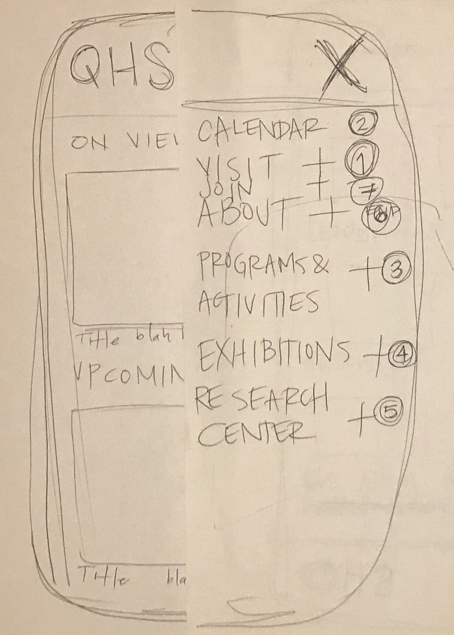
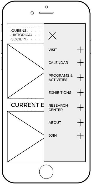
In order to clarify our design direction going forward and to explore other approaches to solving similar problems, we conducted a review of comparable non-profit websites. This competitive analysis directly influenced many of the re-design features for the QHS website, such as the calendar (e.g. seven-day scroll view) and site footer (e.g. column formatting). Next, we chose an adaptive, mobile-first approach, sketching the layout for mobile display around task flows crafted to address areas of our design that we felt might still be confusing to users and inspired by our personas’ motivations. These sketches became the template for our low-fidelity paper prototypes and were evaluated by each team member through user testing. Analysis of these findings resulted in further changes to content formatting and labeling in our digital prototype, like adding secondary navigational breadcrumbs to minimize the user’s memory load.
THE PROTOTYPE
Mobile
https://projects.invisionapp.com/share/G2BK7KYVM
Desktop