Amazon Kindle is an application for reading electronic books. It takes advantage of the affordances offered by touch screens, including pressing and swiping on the screen. The app’s design is simple, with different operations completed by enabling modes through touching the screen. However, its simplicity does not translate to understandability.
Easy reading, poor discoverability
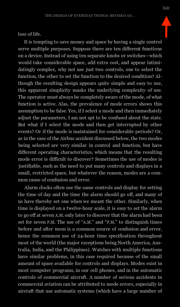
The Amazon Kindle app follows the conceptual model of a print book in the Western tradition by replicating the motion one makes when turning book pages, an example of what Norman calls “skeuomorphic” design. If we turn the page of a print book, we would slide the right hand side of the page toward the left; likewise, sliding a finger across the page of the app in reading mode in the same manner moves the pages forward. Users may also press the side of the screen to move the page forward, an apt mapping since right typically means forward and left means backward in a print book. However, different methods of pressing the screen can enable separate modes and features, leading users to slip when trying to execute the correct press. These functions can be difficult to track because there are few, if any, signifiers indicating where and how to press. A small “Help” link (Fig. 2) in one corner that is constantly on, but remains unobtrusive while reading, could help guide users about the specific functions of each press.
Where is the bookmark?

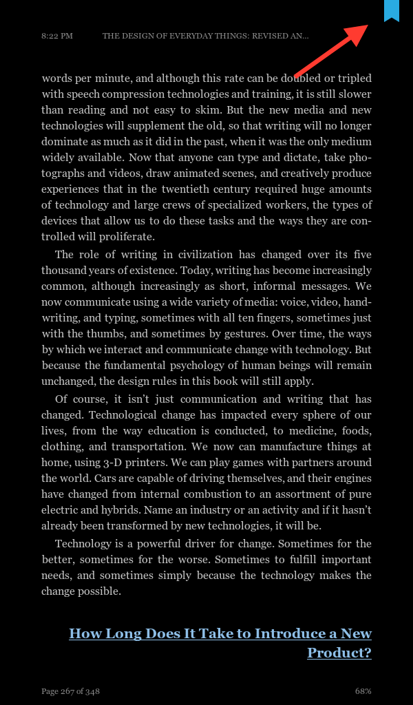
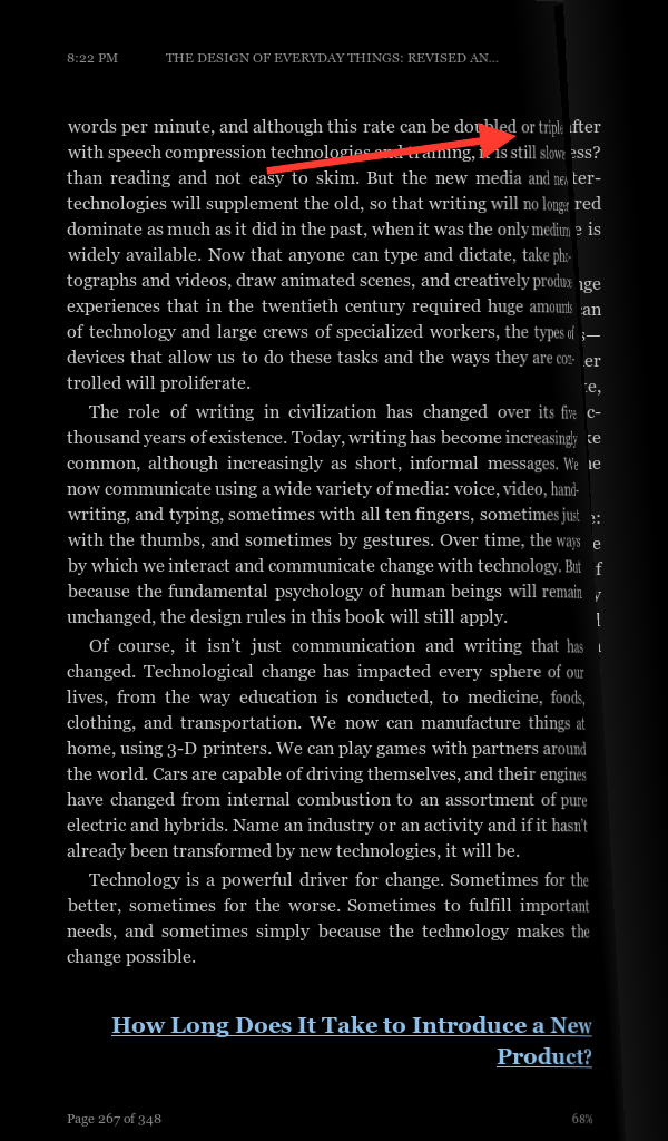
A particularly difficult feature to enable is the bookmark. The bookmark has no signifier when it is not activated (Fig. 3), making it nearly impossible to recognize for those wanting to mark a page. Users can easily make a description-similarity slip here while trying to press the bookmark and end up swiping to the next page (Fig. 5) or even pulling it out of the reading mode. Although feedback is immediate and errors can be quickly recognized, repeatedly performing the wrong task while trying to mark the page can lead to a poor experience with the app. This issue would be rectified with a signifier, perhaps an outline of the bookmark that can be filled when the bookmark is activated (Fig. 6), which would encourage users to touch the area of the bookmark rather than activating another function.
Location, location, location
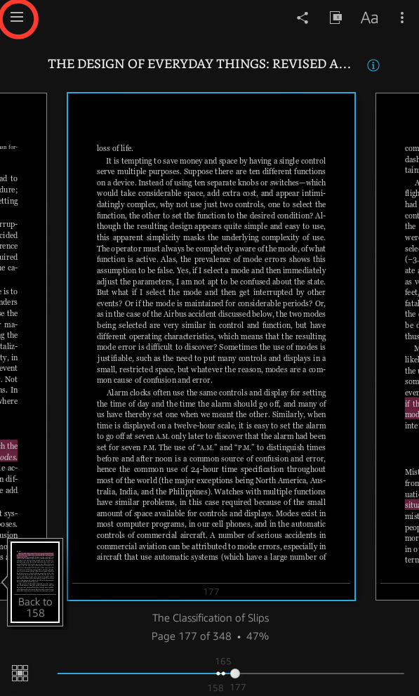
Another feature of the Amazon Kindle app is the location tracker, which is displayed at the bottom left hand side of the page in the reading mode (Fig. 7). Users may press the tracker and change the tracking mode to one that suits them. This affordance is not signified, though, and readers often accidentally press the location tracker due to its position. The action can lead to slips when they inadvertently change the tracking mode and may not know how to go back. App developers could move the location tracker (and therefore the area pressed to change the tracking mode) to a more centralized and less touched position at the bottom to alleviate some of the issues regarding accidental switching (Fig. 7). Additionally, underlining the tracking mode would signify to users that it is clickable, therefore encouraging them to press it if they would like to change tracking modes.
A clear table of contents
A final design feature of the Amazon Kindle app is the table of contents. When readers are in the navigational mode, the table of contents is easily discoverable and signified by a series of bars in the upper left corner (Fig. 8). However, the initial discoverability of the table of contents is low because users cannot see it unless they press the page into the correct mode. This issue could be remedied by having a faded version of the bars present on each page as a signifier while in the reading mode (Fig. 9).

The table of contents is also located where one would expect, mapped directly below the bar signifier (Fig. 10). Additionally, it is organized well, with chapters listed as well as subheadings enumerated in a collapsible menu below each chapter. There is a clickable arrow indicating whether the subheadings are currently described (Fig. 10), clarifying what the reader is looking at in the table of contents. The Kindle app’s table of contents is simple to use thanks to these properties, and could be more easily discovered with a constant signifier.
Conclusion
The Amazon Kindle app offers many features that can enhance the ebook reading experience. It does not necessarily fall victim to “featuritis”, or an increasingly excessive addition of features described by Don Norman, since these features often benefit the user. However, some of these features have poor discoverability, making it difficult for a novice user to understand. The app would benefit from clarification through signifiers.