The Amazon Kindle Reading App was designed to allow readers to take advantage of the numerous electronic books available today. It allows users the comfortability of downloading thousands of books, while not having to carry the physical books. The user interacts with the reading app by simply swiping or touching the screen but some key features do not translate well.
In my interaction with the Amazon Kindle Reading App I’ve discovered some usability issues. Upon opening any book the app immediately takes you to the table of contents which allows you to select the chapter you wish to read.
Discoverability is one of the issues I encountered upon using the app. In being able to select the chapter you wish to read, you then must figure out how to go back to the table of context or how to use the other key feature of this app. In order to read the book the user simply swipes or taps on the screen to turn or go back. This aspect of the app is well design because it provides immediate feedback but the issue is discovering how to access the other components. The user must also tap the screen to reach the page below, the navigation bar. This in itself sometimes causes confusion or frustration.
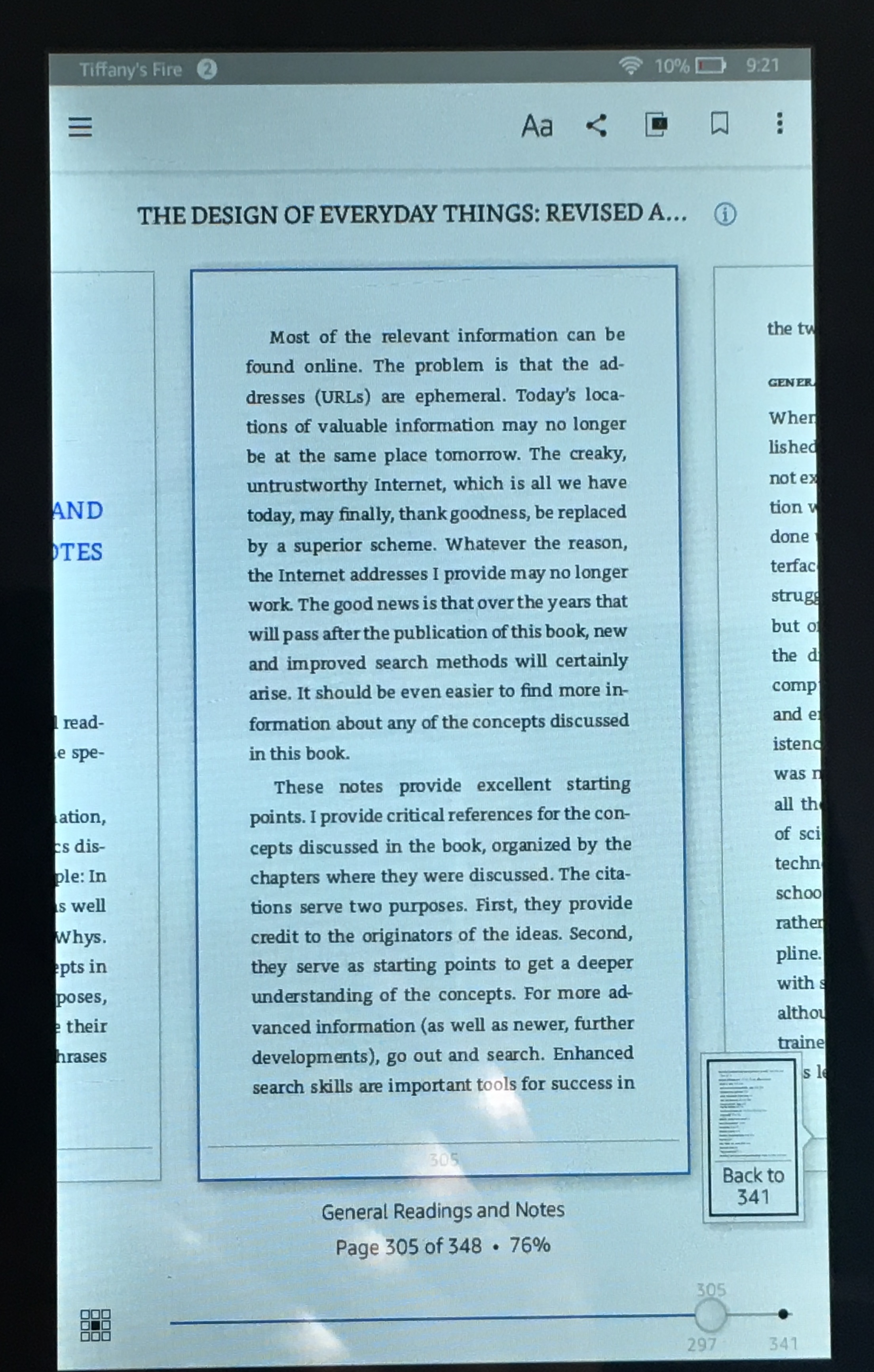
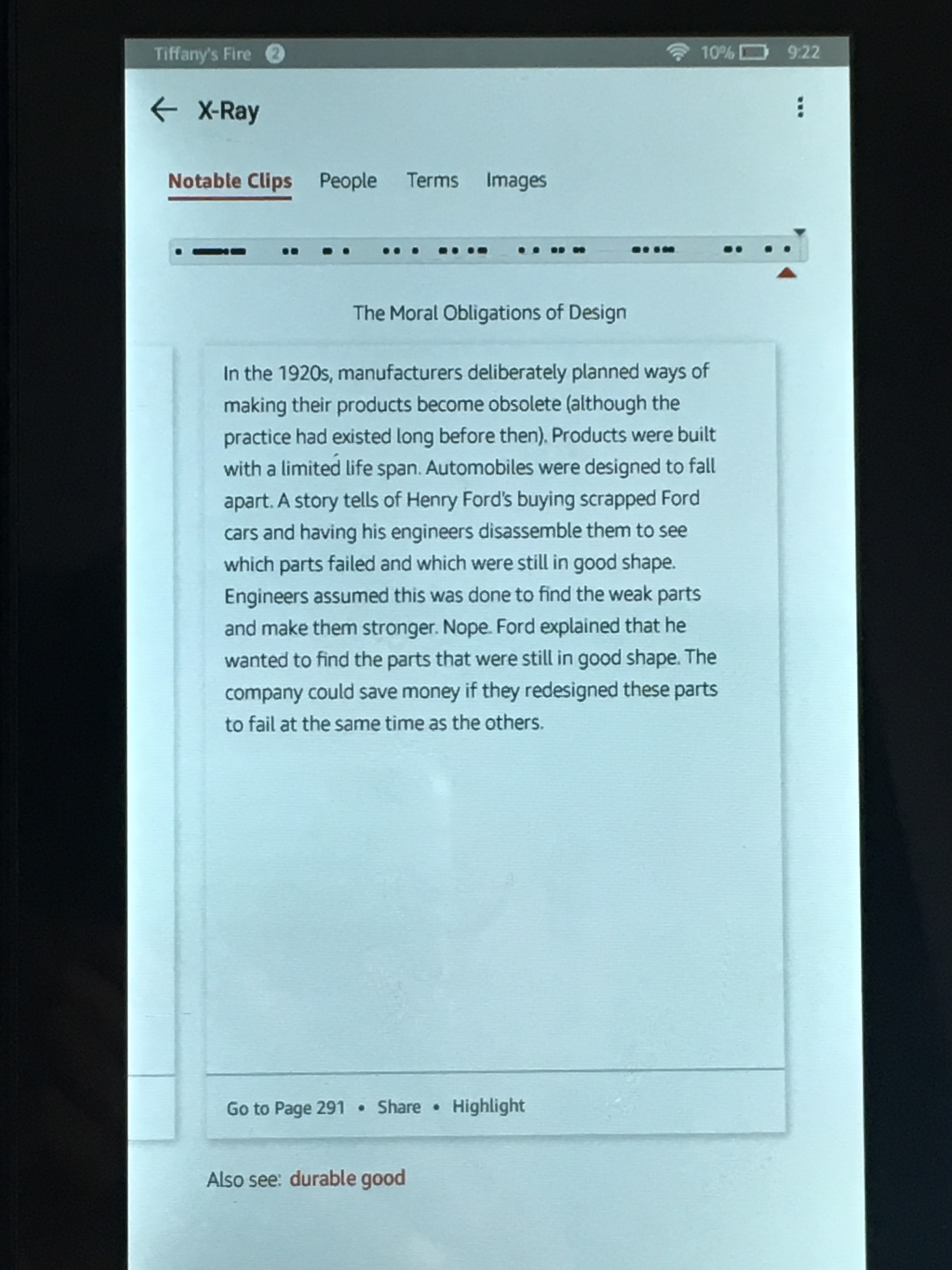
Upon looking at the navigation page the user might have a hard time identifying some of the components. Don Norman talks quite a bit on memory in his book, The Design of Every Day Things. He identifies that sometimes the only reason an object works is because we have been accustomed to certain social norms. In the image above we would be able to identify key aspects of the app but some features are new to the user. For example the middle icon on the top navigation bar is the X-Ray feature. This feature allows readers to obtain a more in-depth reading, it provides notable clips, terms, images, and highlighted lines. In touching this icon I became aware that highlighting is possible within the pages.
In order to highlight, the user must press on the line they wish to highlight but this action alone causes confusion. The motivation of tapping, swiping or holding causes the app to either change pages or display the navigation bars.This makes it difficult to highlight because the app is already sensitive to touch, in my perspective this seems like a mapping issue.
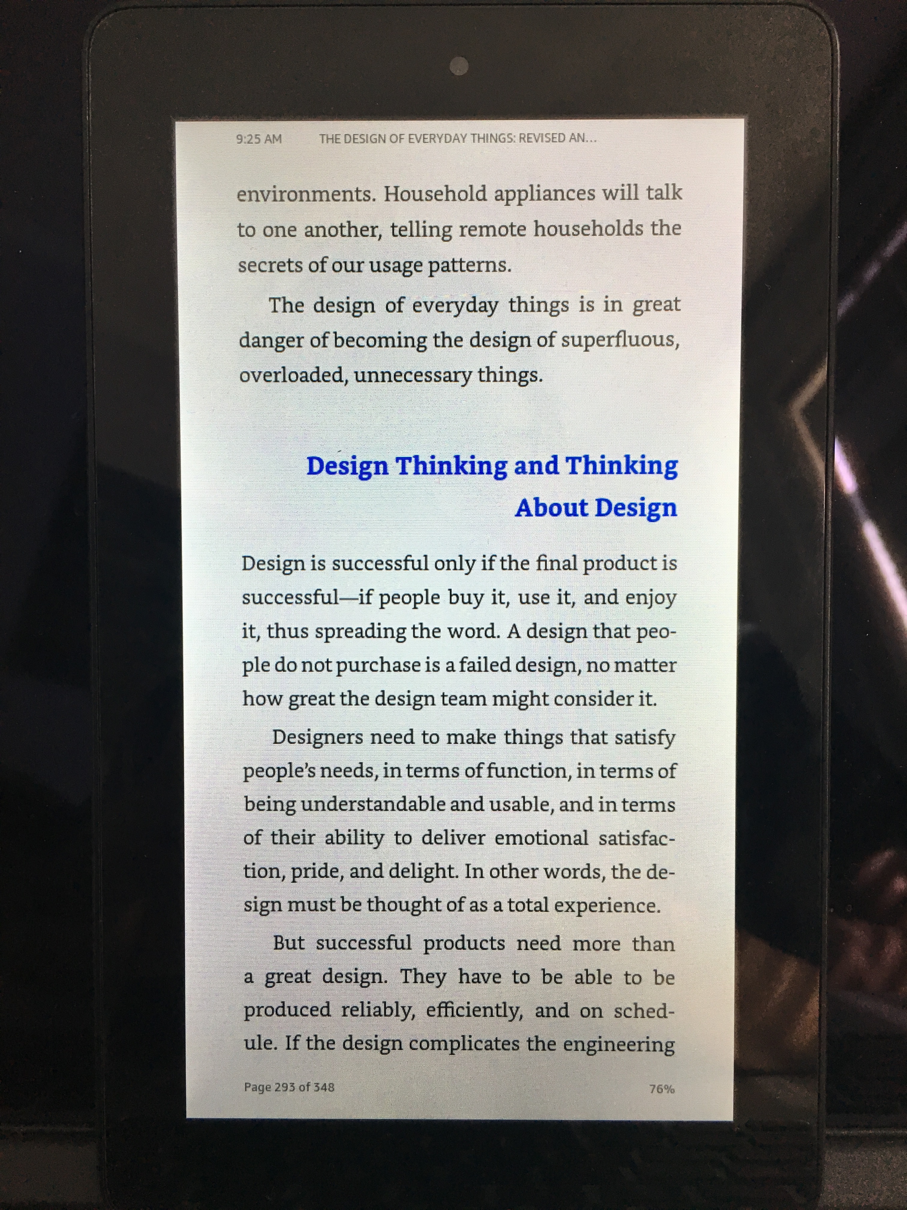
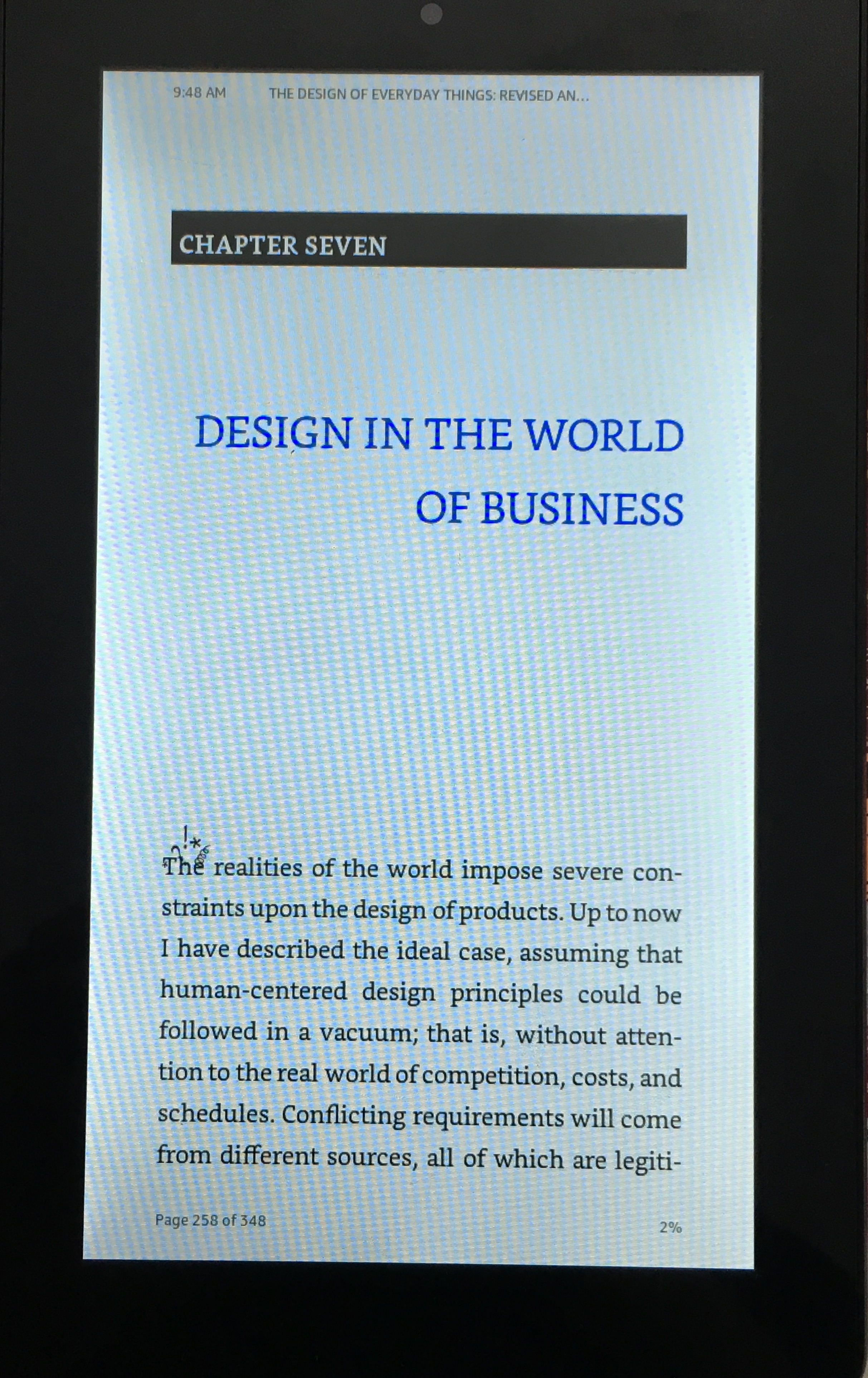
The app does contain some signifiers, in the image above we can distinguish two signifiers the blue text and the page count at the bottom of the page. These two signifiers provide the reader with clues on their progress within the book. The blue text indicates to the reader the start of a new section within the chapter. In my experience I have come to know that if you accident tap on the text you are immediately brought to the table of context. This does not translate well, eventually the reader realizes the blue text identifies with a url link, but might accident press the text when changing pages. The page indicator at the bottom does not translate well either. When reading the page indicator changes from hours remaining to finish the book to the number of pages left. I have not discovered how to keep it in one setting nor does it benefit the reader two see different forms of page indicator.
In conclusion, I believe that the Amazon Kindle Reading App has well design features within the app but there are many features that are difficult to discover. In using the app I’ve realized, I know how to use the app properly because of my constant frustrations and errors. I am able to use the app because of my memory of the frustrations. Which I’ve recently discovered is not my inability to use to app properly but errors within the design of the app. I believe that the app would benefit from signifiers and better mapping of the components.