
Domino’s app is an iOS and Andriod application that allows the user to conveniently order Domino’s Pizza from many devices including the Apple Watch. The application has the features to build pizza and order any other items the pizza store offers for delivery or pick-up from a nearby store location.
The process of ordering a pizza on the Domino’s app follows the logical experience similar to the one that can be experienced when ordering a pizza in the physical store. This familiarity allows the app to have strong discoverability and understandability of the affordances of the app. The constraint of the steps of ordering keeps the process easy to follow and limits room for slips.
Delivery or Carryout
The initial page of the app greets the user with two prominent 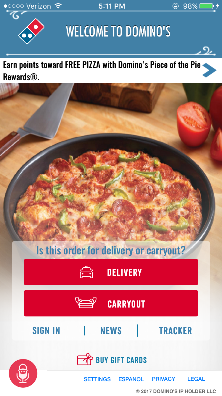 buttons that says “Delivery,” and “Carryout.” Although the two buttons are led with the question, “Is this order for delivery or carryout?” it is difficult to read with the choice of font color and background image. The message to select is clear with the two recognizable red buttons and they effectively signifying the options for the user. Removing the leading question will not take away from the discoverability of the buttons and instead simplify the page. In addition, selecting “Delivery” or “Carryout” provides immediate feedback as the user is taken to the next step. The designer’s conceptual model seems to be very close, if not the same, as the user’s mental model as the app follows a very logical thought process.
Building Pizza
 Once the customer information is filled out, the user is
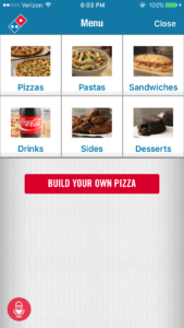
taken to the menu page. It introduced with categories available
to order. The design is easy to perceive that the user is on the menu page but the page lacks attractiveness to be considered as good design according to the design challenge in the book, The Design of Everyday Things. The “Pizzas” option
and the red button to “Build Your Own Pizza” both are signifiers to go into the pizza section. The duplication makes it confusing and the red button being a shortcut to skip the pre-designed pizza and go directly to customize pizza, the red button
should be clarified by adding a label that communicates it
is a short cut.
The “Build Your Own Pizza” 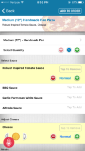 section is filled with list of items that can be added to the pizza. The interface is straight-forward with clear labeling of the topping categories. The order of the toppings follows the logical steps of making a pizza with choosing the sauce first to cover the base of the pizza. When the “plus” button is pressed to add onto the customized pizza, there is immediate feedback to show that the topping was added through the flashing red overlay on the top pizza summary section and yellow overlay over the item that was added. The “plus” button is dimmed when the topping has hit the maximum amount that can be on the pizza. This constraint delivers a clear message of reaching the maximum. The summary section on the top does not move when scrolling up and down the page. This keeps the summary visible at all times and provides a up-to-date mapping of the process.
Order Review
Once the order is finished and it is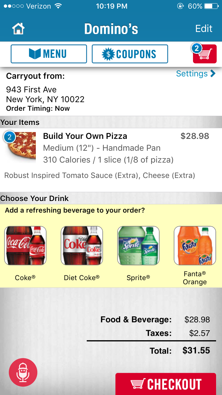 added to the cart, a review page appears showing all the items in the cart. Price is also calculated below. This is the first time price has been revealed. There were no immediate feedback of the total sum of price in the process of building the order and no way for the user set an expectation of the price previous to this step. For clear communications and expectations, the price of the items should appear on the order page (previous to the review page) as the user adds into the cart. Although the user is surprised with the sum total, the review page gives a chance to correct the slips and mistakes that might have occurred in the process.
Mapping “Tracking Delivery”
The Domino’s Tracker is a great mapping tool that shows liv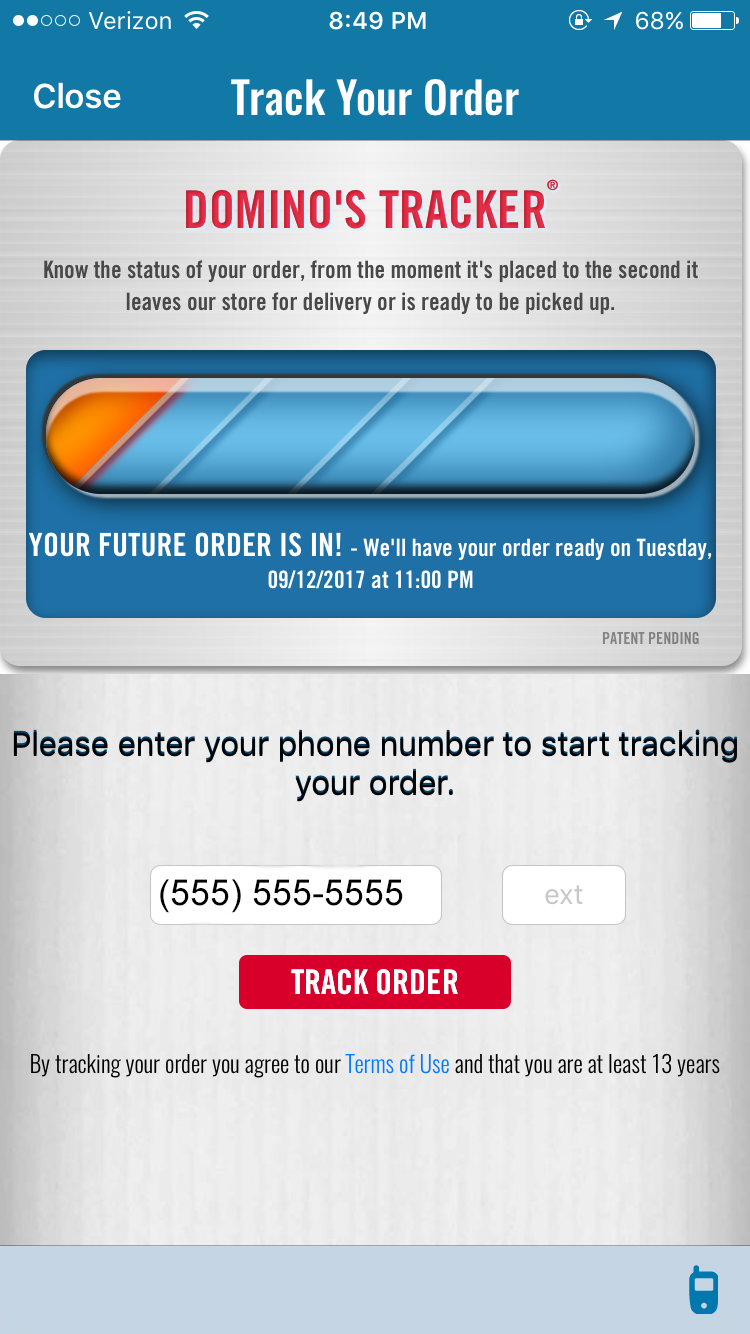 e updates with what step the order is in. This tracker was a huge hit when it was first released because it is evidently a human aware, human centered design that understood both technology and needs of the user. Ordering food that is advertised to be “fast” sets an expectation for the food to arrive quickly. This expectation turns negative when the term “quick” is miscommunicated from Domino’s to the customer. The tracker clearly communicates what is happening and what is about to happen. If there is any sort of problem, the tracker informs the customer. The design of the tracker is familiar from information picked up in other tracking design. The tracker addresses the user’s frustration of not knowing where the order is and when it is estimated to arrive.
Conclusion
The overall design flow of the Domino’s app is user friendly. The design principles of Don Norman have been addressed with clear signifiers, useful feedbacks, easy to understand and discoverable features. This app is designed with human needs, capabilities, and behaviors in mind to accommodate what the users want and what technology is capable of. It is reliable and usable. However, the app lacks attractiveness of the design. It has easy to maneuver functions but has room to improve in its appearance. Editing and enhancing the application will make it greater experience for the users.