This design critique is for the mobile iPhone application for Goodreads.com. Goodreads is a site that helps users keep track of which books they have read and those they want to read. This critique focuses on four different attributes of the app: the scanning feature, the search function, the “want-to-read” button, and duplicate editions.
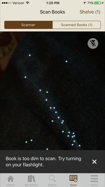
The scanning feature is a feature on the app that utilizes the iPhone’s camera to scan a book’s ISBN number. This allows the user to circumvent any searching and immediately find both the book and the correct edition in one action. As soon as the barcode is read, the corresponding book pops up on the screen, giving the user instant feedback. If the barcode was only partially scanned, for example, the user can quickly recognize that the wrong book has been displayed. Additionally, a message appears if the scanner doesn’t have enough light to operate (Photo 2). This message provides feedback that clarifies what the problem is for the user’s benefit instead of causing them frustration.
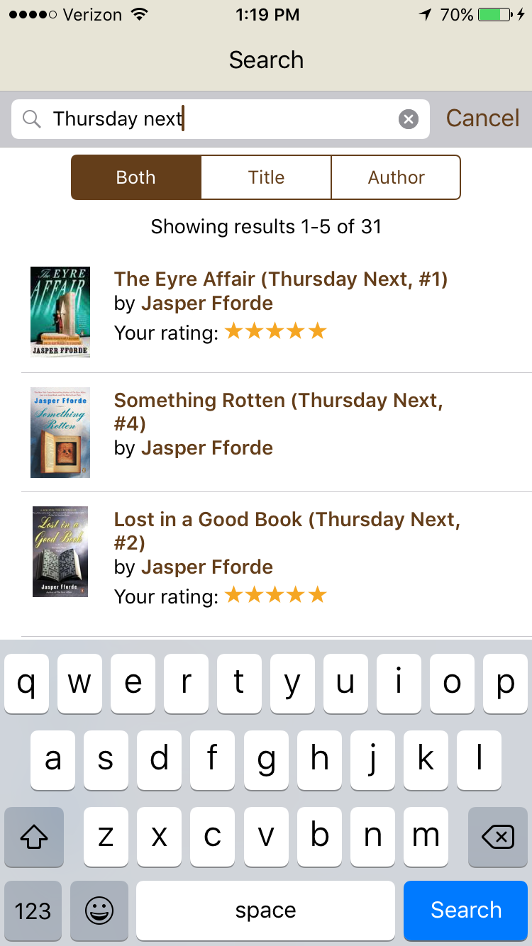
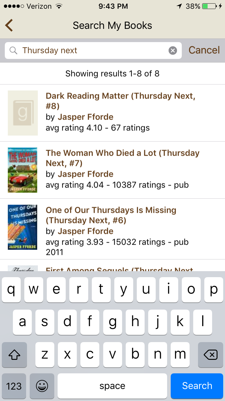
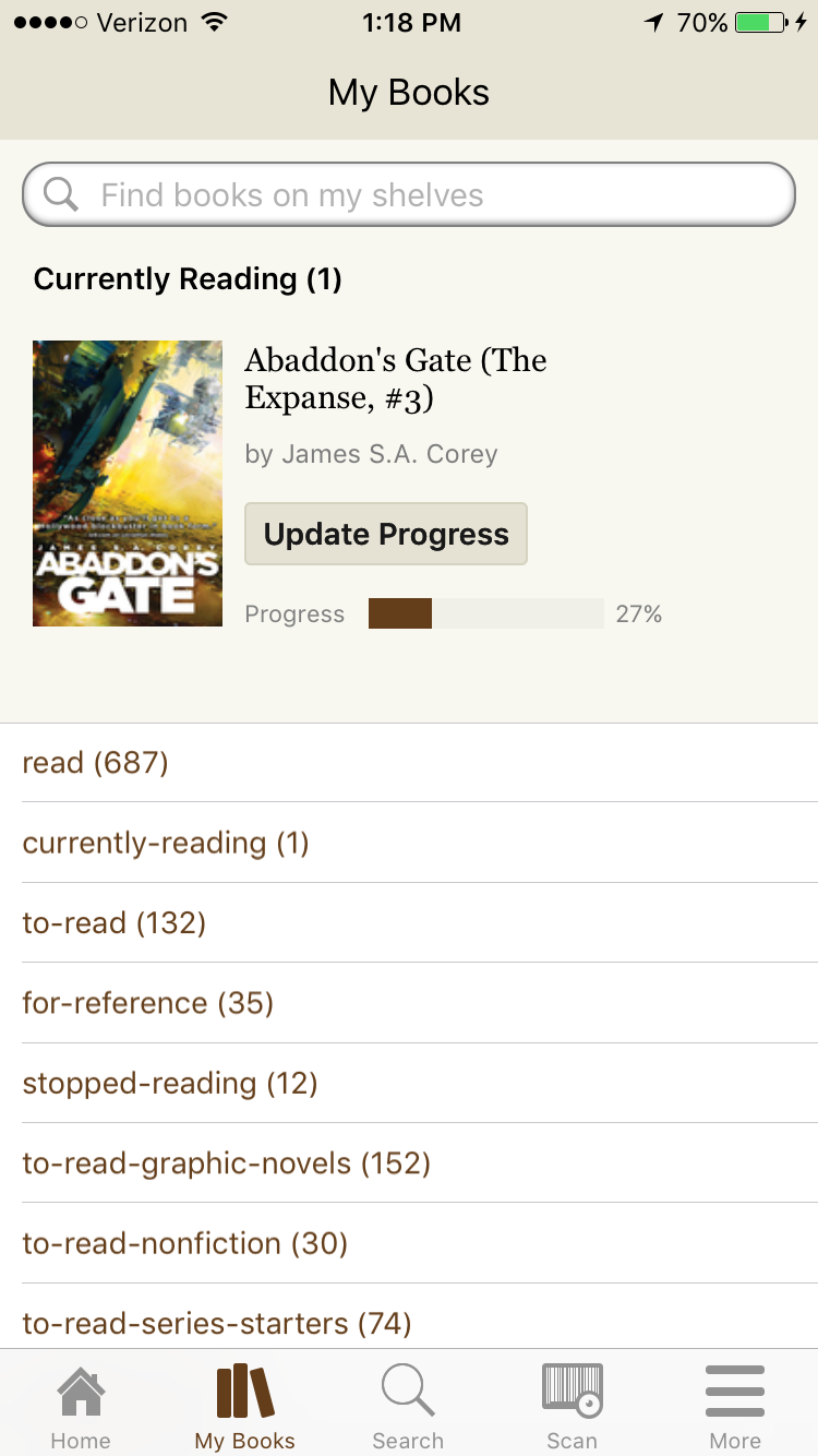
The Goodreads app has built-in affordances for two different search features. The main search feature is accessed via the center button in the footer of the app, and is clearly signified by a magnifying glass icon. This search bar checks the entire Goodreads database for matches (Photo 3). However, when on the “My Books” screen, the search bar at the top is not the same (Photo 1). This search bar is prominent, and appears in the same place, but it only searches the books that are already on the user’s shelves. When selected (Photo 4), both search bars bring the keyboard up and are only differentiated by the words “Search My Books” as opposed to “Search” (Photo 3). This has led to users searching only their books when they meant to search the entire catalog and vice versa. One possible way to mitigate this confusion would be to change the catalog search screen to say “Search Goodreads” or “Search the Catalog” so that it is clearer to users which action they want to take. Another solution is to move the “Search My Books” bar to the bottom of the page, so that users can associate it with a different place on the app.
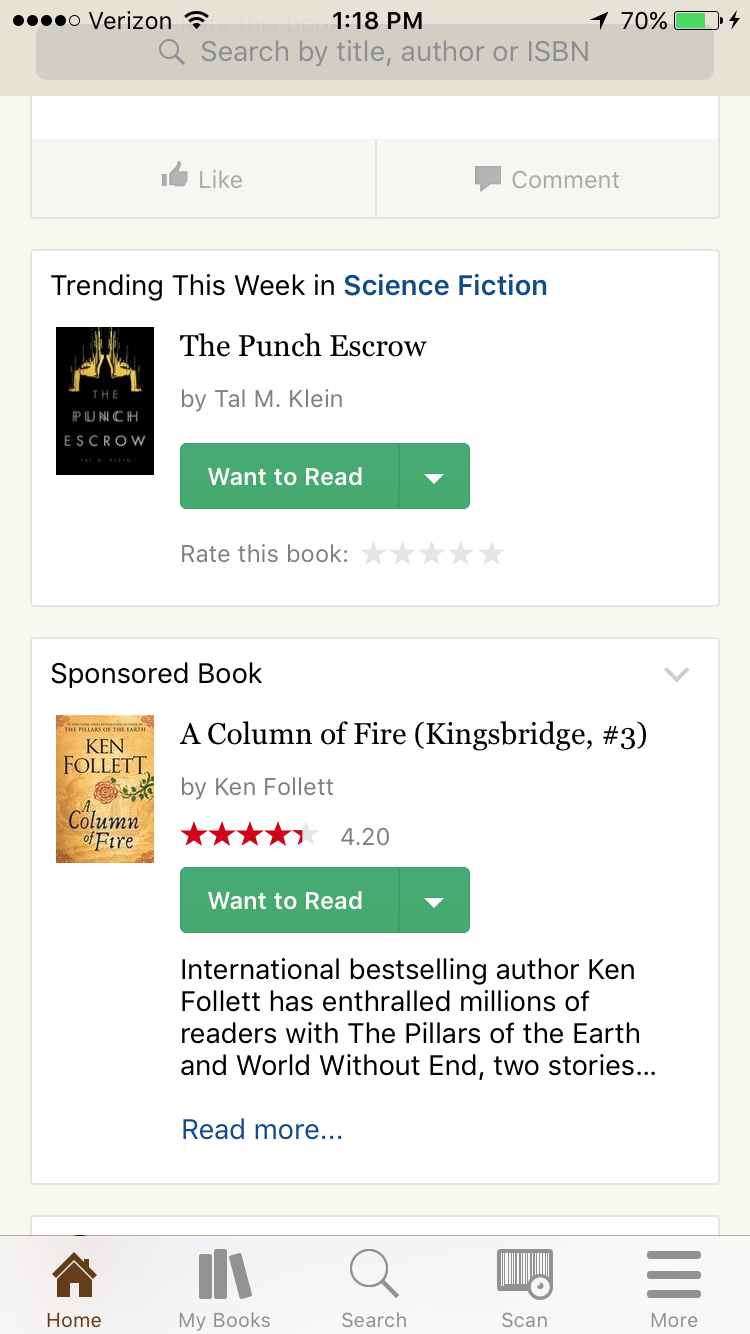
The home page of the app is where users can see what their friends are reading (Photo 5). This feature is available so that users can easily add books they find interesting to their shelves. To facilitate this process, the “Want to Read” button is made as discoverable as possible. It is bright green on a mostly tan page, and has clear signifiers to tell users that it should be clicked. If a book is already on the user’s shelf, the button will be depressed, and the user’s rating will appear. This design is based at first on knowledge in the head, because users have to learn to recognize a green button as a way to add a new book to their shelves. Despite this, the design is intuitive enough (using green as a signal to take an action) that users will soon shift to using knowledge in the world.
One major issue with Goodreads is the ease with which users can add a book to their shelves multiple times. While the app shows users if a book is on their shelf when they come across it, this only extends to that specific copy of a book. If a user finds another edition of a book, they may accidentally add it to their shelves without realizing the error. These are frustrating because they are mistakes, rather than slips. If it was simply a case of hitting the wrong button, the user would realize and quickly correct the error. Instead, users have to use the “find duplicates” feature, which helps them tidy up their shelves after the mistakes have been made. This could be rectified by changing the UI to notify users when they are about to add a different edition of a book to their shelves. A confirmation window would be a relatively simple way to stop users before they commit to the action.
The Goodreads app is one of the least frustrating and smoothest apps to use on the iOS. It mimics the feel of the website while providing features that use the full potential of the iPhone.