Introduction
IMDb or Internet Movie Database is a popular online database of information related to movies, TV shows, video games, awards, and events. The database comprises of information on production crew and cast, summaries, synopses, reviews and ratings, which millions of registered users consume daily. As per Google Play Store, there are over 100 million users of the app on the Android platform!
Android App by IMDb: Well-designed?
The IMDb Android app’s design language has evolved slowly and has recently adopted Material Design. While some design decisions made across the app are backed by strong logic and can be applauded, few flaws can also be uncovered in the design. Here are some of the key findings –
![]()
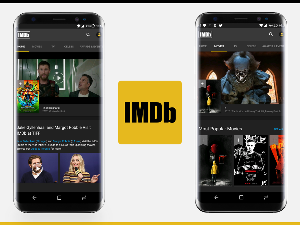
Failed to scroll on the home screen: Encountered a gulf of execution
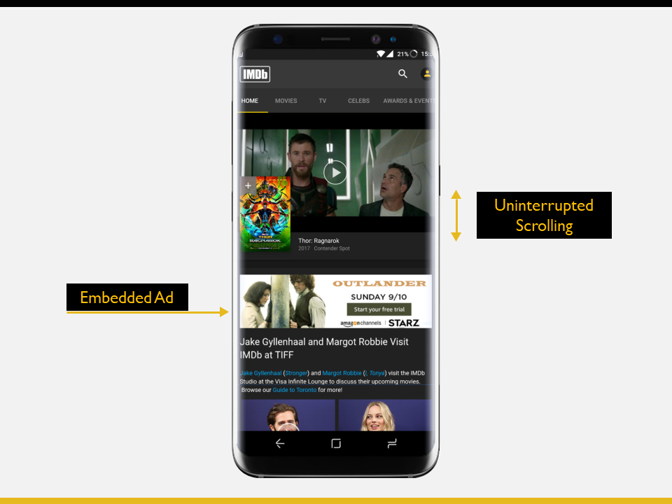
Upon launching the app, a scrollable newsfeed-like interface is presented. With a goal – ‘find a good movie’ in mind, there is an immediate intent to explore the landing screen. The mind creates a plan to scroll for exploration. However, due to an obtrusive advert that blocks the lower ~10% of the screen (which happens to be the most usable area of the display), scrolling fails, as the swipe is registered on the advert’s overlay element, rather than on the app’s interface (Fig. A). This creates a gulf of execution as the intended action could not be executed.

Recommendation: Embedding the advert in the app’s main interface, rather than having it as a static overlay, will eliminate the obstruction and bridge the gulf of execution, thereby improving the design (Fig. B). An alternate solution would be to substantially reduce the height of the advert to decrease the probability of the user’s thumb landing on it.
![]()
Swiping between tabs is disabled: A logical constraint
With increasing importance being given to design, several Android apps have greatly improved their overall quality and conformance to the Material Design guidelines. The ‘easy to understand’ navigation of the IMDb app makes it an excellent example of this. Labels such as ‘Home’, ‘Movies’, ‘TV’ etc. are straightforward and map very well with users’ potential goals.
Navigation tabs are seen in several popular apps such as Messenger, Twitter etc. and users are well versed with the interaction patterns associated with them (For instance, switching between tabs can be achieved by swiping left or right in the tab container) However, when it comes to the IMDb app, tabs cannot be swiped across (Fig. C). But why though?

It is important to note that there are several horizontal-scroll lists in the app (Eg. ‘Most popular movies’ in Fig. C) that encourage exploration by swiping left or right to reveal more list items. Having the same gesture for swiping between tabs can cause a conflict and make the interface error prone (users might want to scroll through the list, but might end up switching tabs or vice-versa). The designers of the app have, therefore, intelligently made use of Donald Norman’s principle of constraints by disabling ‘swipe to switch tabs’, so that users do not fall prey to making these errors.
![]()
Unable to find articles about awards or events: Poor discoverability
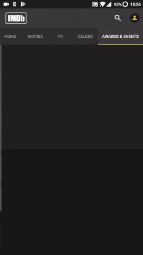
As stated by Donald Norman – “Two of the most important characteristics of good design are discoverability and understanding“, it is very important to ensure that features or functions that the user desires are discoverable. The IMDb app, while mostly working well in this regard, does seem to fail in a particular scenario. With the goal of ‘reading articles about awards or events’ in mind, tapping on the ‘Awards & Events’ tab seems logical, but the landing screen only displays videos at the top with no indication of any other information. On revisit, however, articles suddenly appear below the video-container (Fig. D). So, what went wrong?
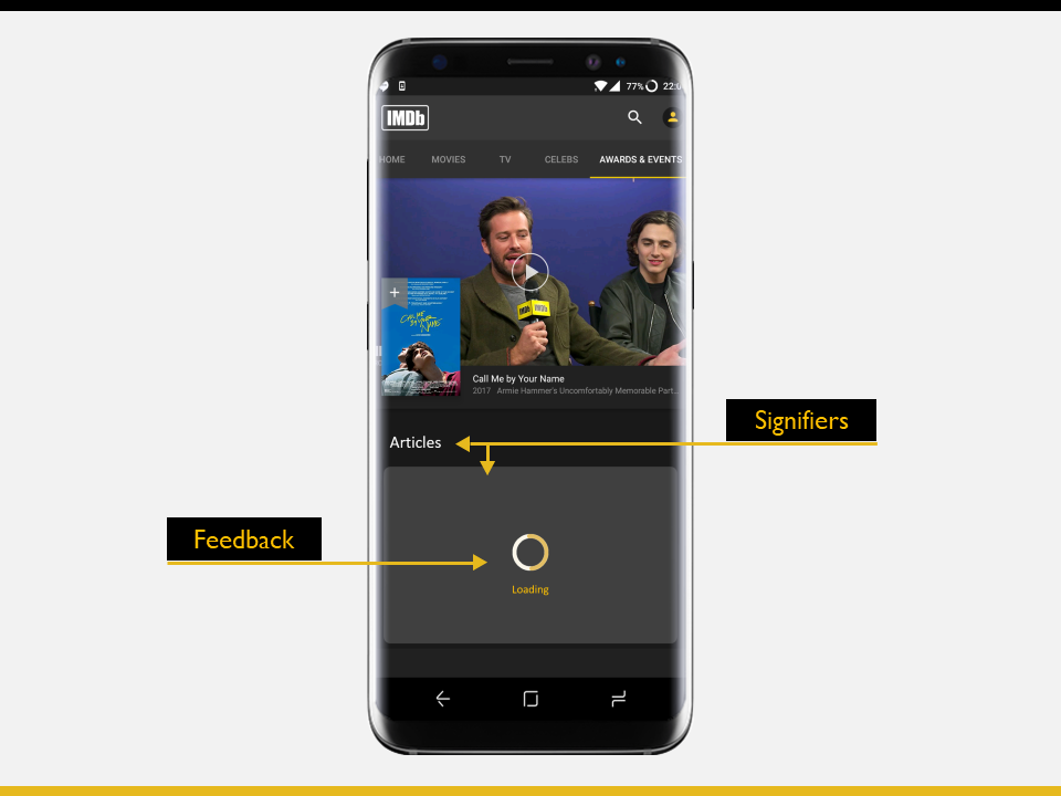
There was lack of feedback to indicate that the app is loading up list items below the video. There were also no signifiers present, to indicate that there is a list of articles present (maybe in the form of a heading label or a container). These factors lead to poor discoverability of the feature, resulting in failure to achieve the goal of finding articles about events or awards.
Recommendation: Improving discoverability can be achieved by fixing the root causes of the problem: i.e. improving feedback, and providing strong signifiers. A loading / in-progress spinner can be added for feedback, and a container along with a heading label (such as ‘Articles’) can be included below the video-container to indicate the upcoming content. (Fig. E)
Conclusion
In light of the above, it is clear that even though IMDb is the world’s most popular database related to movies, TV shows etc., and their Android app is quite well-designed, robust and effective, a few design flaws still plague the interface. Making improvements to these potential flaws is sure to greatly enhance the experience for users.
![]()