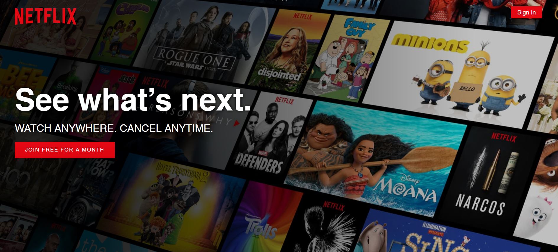
Fig 1.1 – Before signing into Netflix
Netflix is a major streaming service that allows users to watch TV shows, movies, animations and more. It has so much entertainment that you can never say, there is nothing to watch. In order to use Netflix, the new user could start with a one month free trial (which they can cancel anytime) or subscribe by paying monthly. The app itself is free, which is available in mobile, tablet and desktop versions.
The Netflix library of shows is huge, which ranges from movies to major TV shows like: Friends, Arrow, Grey’s Anatomy, documentaries, animations, stand up comedies and a lot of Netflix original series. One of the best things about Netflix is that they have a download feature, where you are able to download shows via WiFi and watch it without data. It’s a very useful feature if you want to watch something for example on a subway, where there is no data. I personally love this streaming service in particular because my favorite shows are all in one place.
Main Features: Human Centered and Activity Centered Design
The Netflix app is pretty straight forward and it does a great job at using Norman’s concept of human-centered and activity-centered design. The concept of human-centered design is shown in their “My List” feature. For this feature, a user is allowed to create a fully personalized show list just for them. They also do a great job at using Norman’s concept of activity-centered design. This is shown in their “Top Picks” and “Popular on Netflix” features. These two features collect data from its mass users and present shows to all users based on popularity of each show.
Main page: Good Discoverability and Understandability
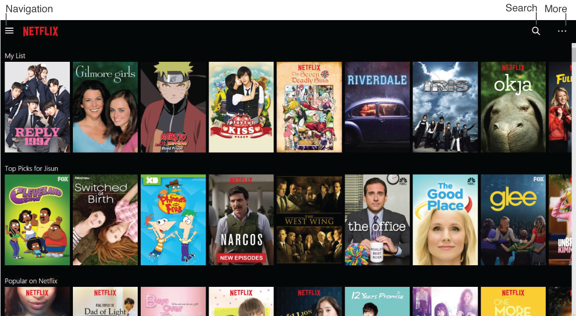
Fig 1.2 – Displays what the user needs to see and the three icons
Netflix has a great design. The main page only shows what is necessary and everything is clean and minimalistic. The user can easily discover the three icons on top, as shown in Fig 1.2: navigation (left), search (right) and more (right). When the user clicks on either of them, it will look like the Fig 1.3. It is clear and understandable that the user has to click on the icon to get any feedback and know what’s there. A minor suggestion for better experience would be to have a signifier when the mouse hovers onto the icon. The pointer could change into a hand pointer to signify the fact that the icons can be clicked.
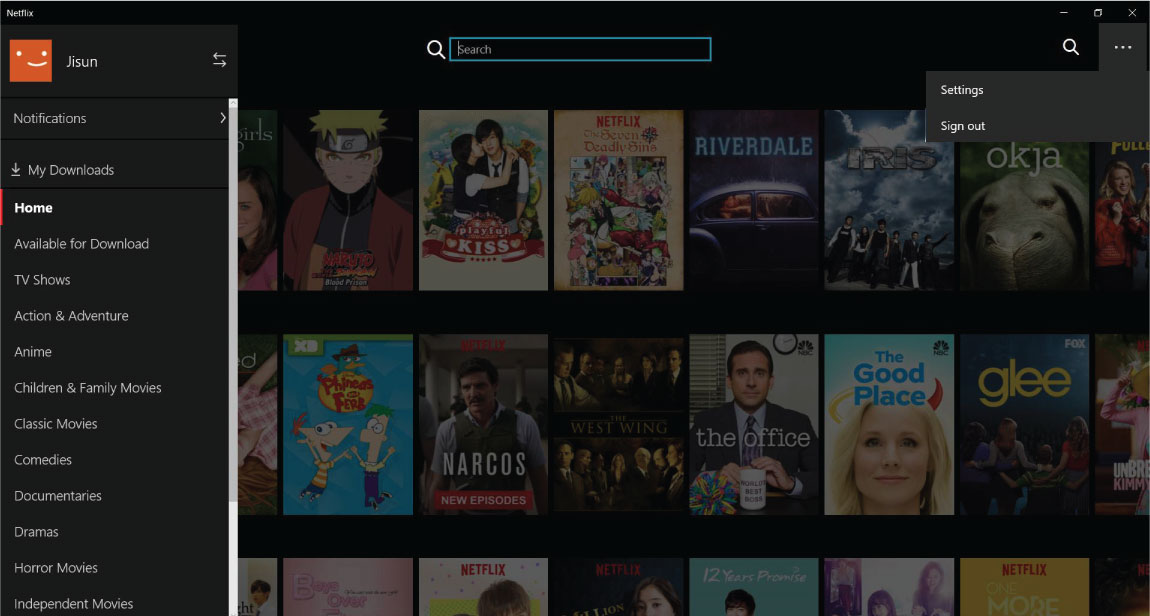
Fig 1.3 – Shows what each icon does
Searching: Good Constraints and Feedback
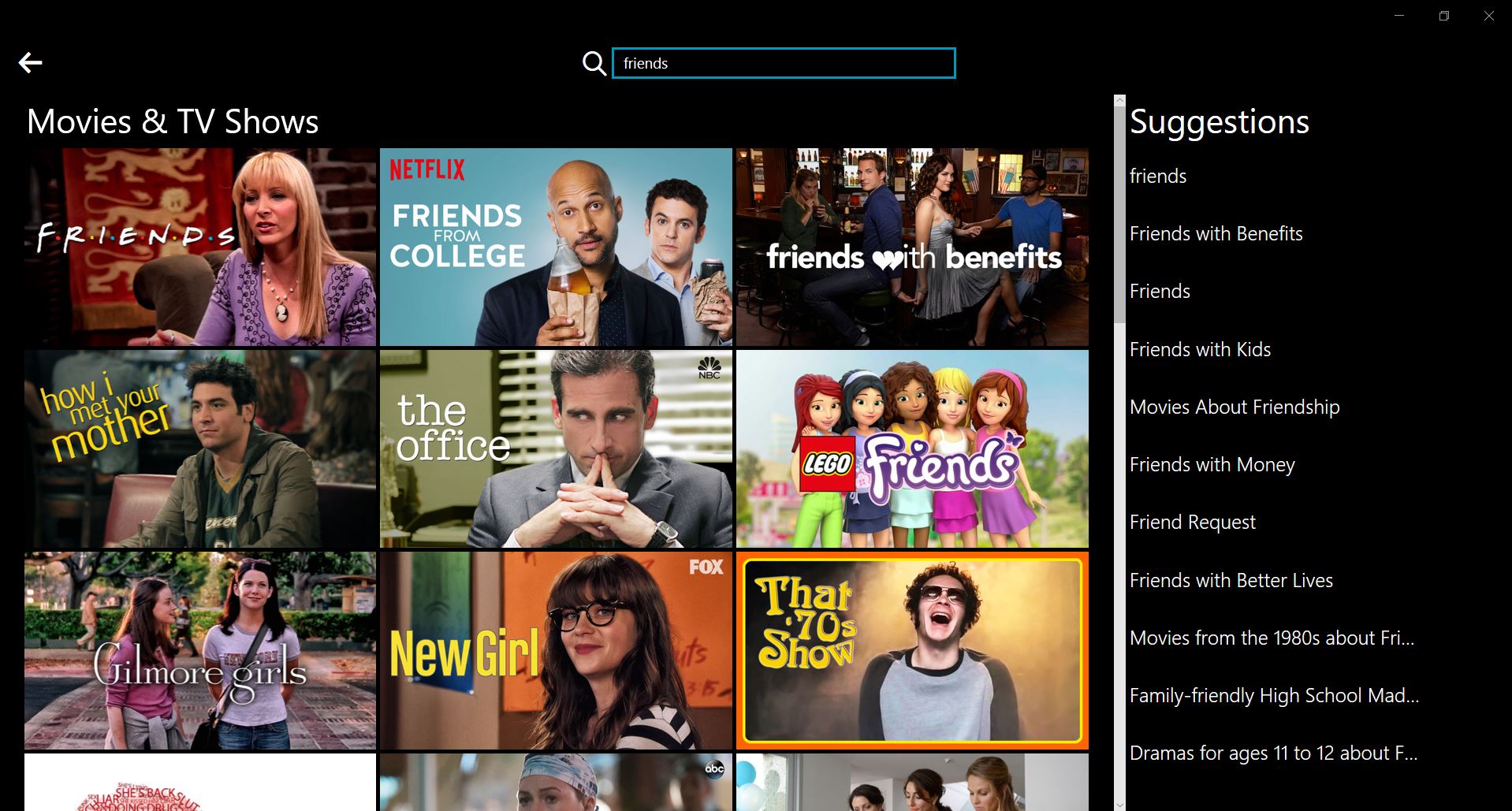
Fig 1.4 – Searching for shows
The search bar allows the user to search for a specific show they want to watch instead of going through a massive list. Netflix does a great job using constraints when searching for specific shows by using keywords or the name of the show. When the user types in each letter, it gives them immediate feedback by displaying shows significant to that keyword. An example is shown in Fig 1.4, the key word “friends” will display shows that are significant to that word and will give more suggestions related to that keyword. Not only does it give the user images, but it also gives them a list of suggestions on the right. Personally I feel that the suggestion list on the right is unnecessary because the images shown to the left are equivalent to the list displayed on the right. Users love images more than words, therefore I believe excluding the list would be better and suggest adding more images pertaining to the keyword.
Watching Shows: Good Signifiers
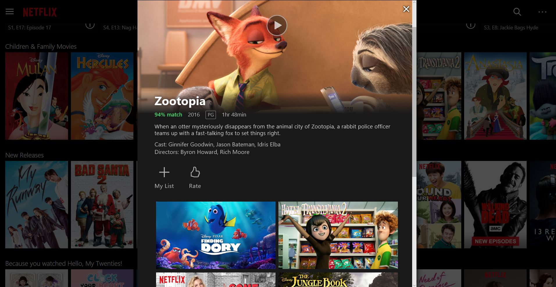
Fig 1.5 – Watching a show
When the user decides to click on a movie to watch, a sub-screen will pop up as shown in Fig 1.5. This will allow the user to read a brief about the movie before deciding to watch the movie. If the user is interested, they can go ahead and click on the play button which clearly signifies that the movie is playable and they can watch it when clicked. If the user decides to watch it later, there is an icon labeled “My List,” where the user can add it to their list to watch later. They can also rate the movie after watching. Below the brief of the show, there are suggestions of shows that are similar to the show that the user is interested in. Netflix does a great job in suggesting shows everywhere.
Overall, I find that Netflix is a very user friendly app and it is easily understandable. I use it on a daily bases and it has been great for me. After using this app for so long, it’s basically second nature and I click on the Netflix app when I turn on my computer. I believe minor changes may be needed for the best experience, but after reading Norman’s design guide, it’s clear that the Netflix app makes great use of Norman’s principles.