
About a year ago, NYSC renewed their brand. Part of their brand strategy included the re-design of their iOS Application. The App allows users to plan their work out by searching and signing up for classes, setting up their goals, and checking into the gym with their phone. This article analyzes some features of the interface of the NYSC app and discusses if this represents good or bad design according to Norman’s concepts in The Design of Everyday Things.
(Fig. 2)
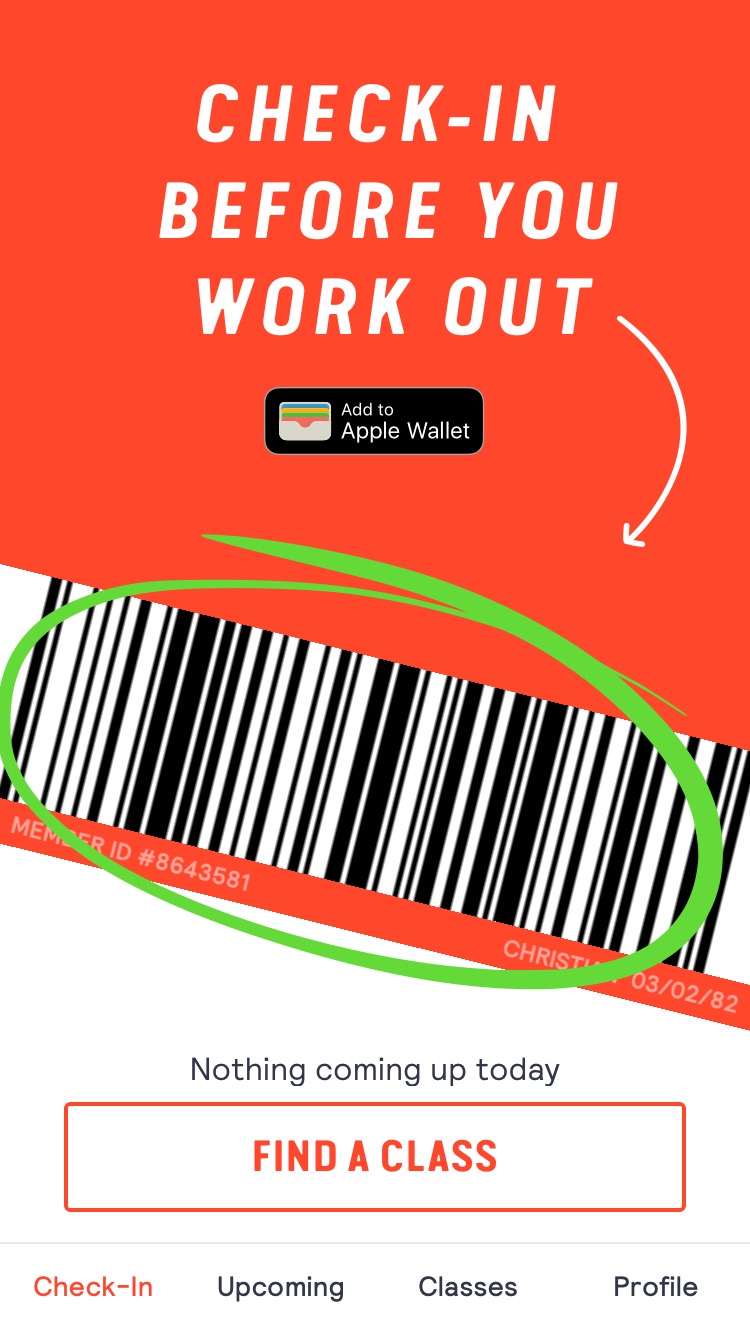
When the user opens the app, it takes the user to the landing page which is the Check-In page (Fig. 2). This page displays a barcode in the middle of the screen which allows the user to check in into the gym by scanning the phone at the front desk. This represents a good affordance because it is understandable what can be done with the the barcode and it has good signifiers that explain how to do it, such as the text on the top of the screen “CHECK-IN BEFORE YOU WORK OUT” and the arrow pointing to the barcode. It is very clear what can be done and how can be done.
 (Fig. 3)
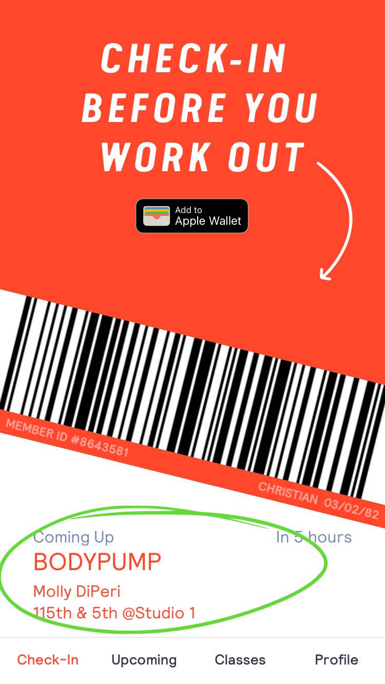
Also, the Check-In page has a feature that lists the upcoming class the user has signed up. This will be listed at the bottom of the screen. The upcoming class feature works together with the scanning of the barcode. Once the barcode is scanned at the front desk by the receptionist, he or she sees in the system the member has a class, so the receptionist proceeds to give a class pass to the member.
The barcode has the perceived affordance of being scanned. This is something that people have learned. Norman calls this interpretation as a cultural convention which is also a special cultural constraint, meaning people in some cultures use some things in certain ways. Here in the US, we see barcodes on products, ID cards, pharmacy cards, grocery cards, gym key tags, etc that are scanned. The barcode is an innovative feature incorporated into the app. Designers must have used a root cause analysis to introduce this feature where they designed and digitized it, so they don’t need the common physical tag to check-in into the gym.
(Fig. 4)
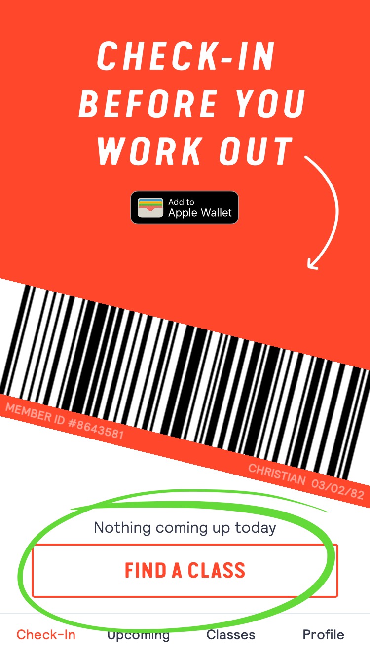
If the user hasn’t signed up for a class the Check-In page will show a feature to find a class instead (Fig. 4) which is linked to the Classes page on the navigation bar at the bottom of the screen. This is a good representation of the seven stages of action which provides the designers a useful framework in the design process to make this feature is understandable and discoverable to the user. Norman explains that there are two parts to an action: executing an action and then evaluating the results which needs understanding. Here the goal of the user is to work on his goal to be fit and healthy, so they go through the gulf of execution and the gulf of evaluation. The signifier of the tab “Find a Class” helps the user to bridge the gulf of execution and getting the feedback of having reserved the class in a notification, creates a emotional state of satisfaction.


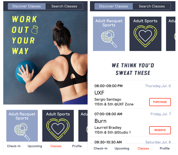
(Fig. 5) (Fig. 6) (Fig. 7)
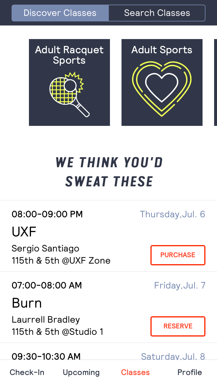
On the Classes page, there are two tabs on the sub-navigation at the top of screen: Discover Classes and Search Classes. The default screen of the Classes page is Discover Classes. This is understandable and discoverable to the user because of the good signifier on the Discover Classes tab which is highlighted with a light blue color. On this page, there’s a full screen image which is confusing and difficult to discover how the user can possibly perform the action of looking for classes (Fig. 5). This is a representation of bad signifiers. However, because the screen affords to be touched the user can discover that the page is scrollable and there’s more content and information by scrolling down the screen (Fig. 6). At the end, there’s a carousel to scroll through the categories of classes offered. By selecting one of them, the classes in that category will be listed at the bottom (Fig. 7). This part is also confusing and difficult for the user to figure out how to find classes. There are no signifiers that suggest that the carousel of the categories is scrollable. The way the third category is introduced on the right side of the screen is not clear. It looks more like a bad design decision. Also, when selecting one of the categories, it doesn’t indicate which category of classes the user has chosen. This is a representation of bad feedback.
(Fig. 8) (Fig. 9)
My recommendations to improve the interface of this page are detailed in this mockup. The image shouldn’t take the whole screen, instead it should take only a part of it, leaving space to show more of the content at the bottom. This would be a good affordance and signifier for the user to understand that there’s more content to be discovered by scrolling down (Fig. 8). When the user scrolls down to the categories and list of classes section, there’s already a category highlighted which indicates to the user that they are seeing the list of classes of the chosen category (Fig. 9). When the user selects another category on the carousel, the user receives a good feedback of their action by the category being highlighted. Finally, the position of the carousel should be adjusted, so the third category can enter the frame of the screen. This will be a good signifier to the user to understand that there’s more to see and scroll. These screen layouts will help the user to bridge the gulf of execution with no errors, knowing what action can be performed and how.
Overall, the new NYSC App has a good design. It has innovative and effective features from which the members of the club can benefit by using the app. However, there are still some gaps in the principles of good design within the interface. I believe making these improvements will make the interface of the app more robust which will enhance the experience of the users.