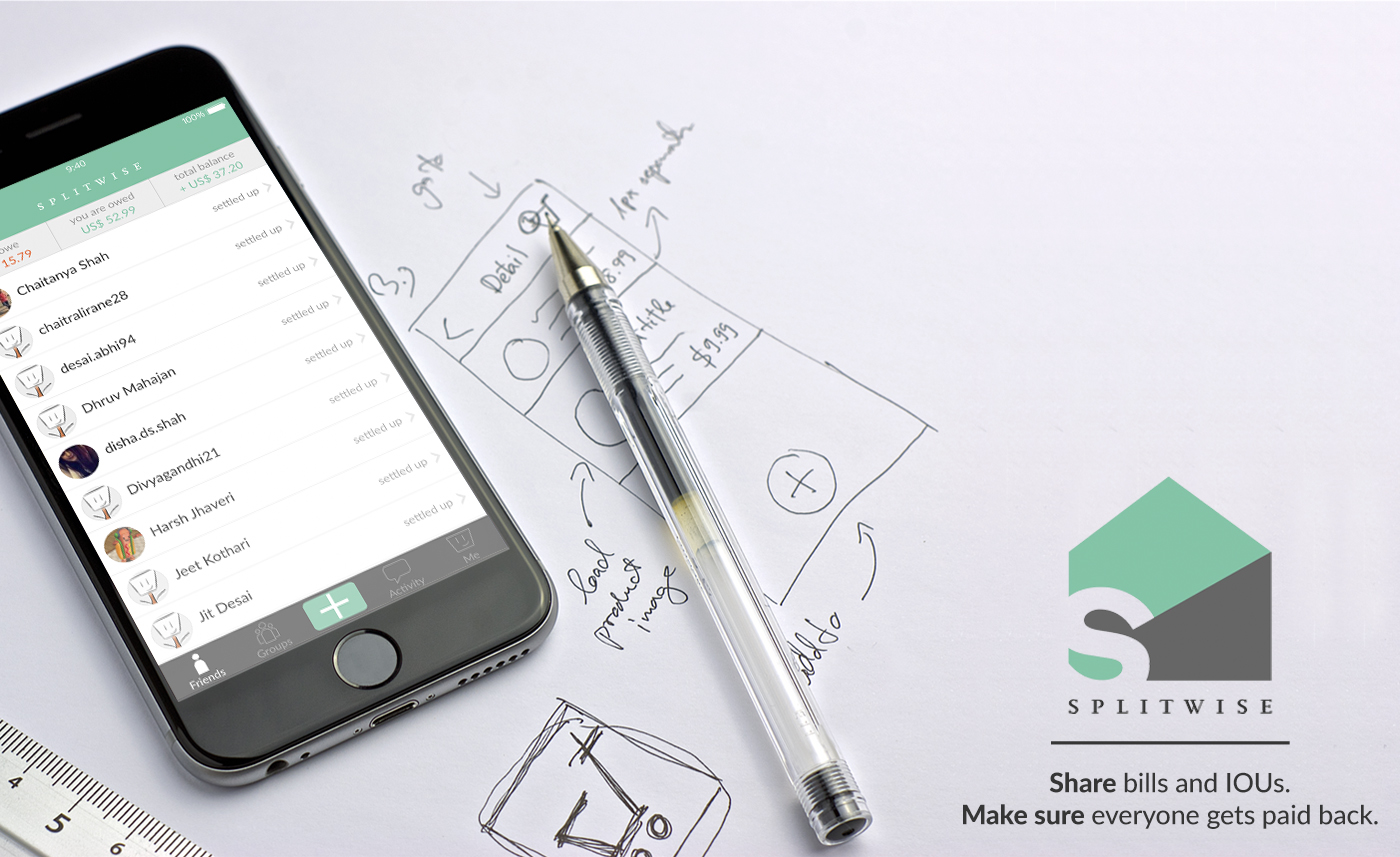
Splitwise is an IOU managing application providing its users a hassle free method of splitting their expenses with family and friends. This cloud-based application eliminates the need to keep paper bills and helps in keeping a track of your debts in a simple ledger format.
Based in Rhode Island, Splitwise makes the life easier as it lets the users pay their debts via PayPal or Venmo.
Don Norman once said, “Knowing how people will use something is essential.” Following his guidelines, Splitwise has perfectly used two of the most important characteristics of good design: Discoverability and Understanding. On signing up, the application clearly indicates what are the possible actions and how to perform them.
Simplified User Interface
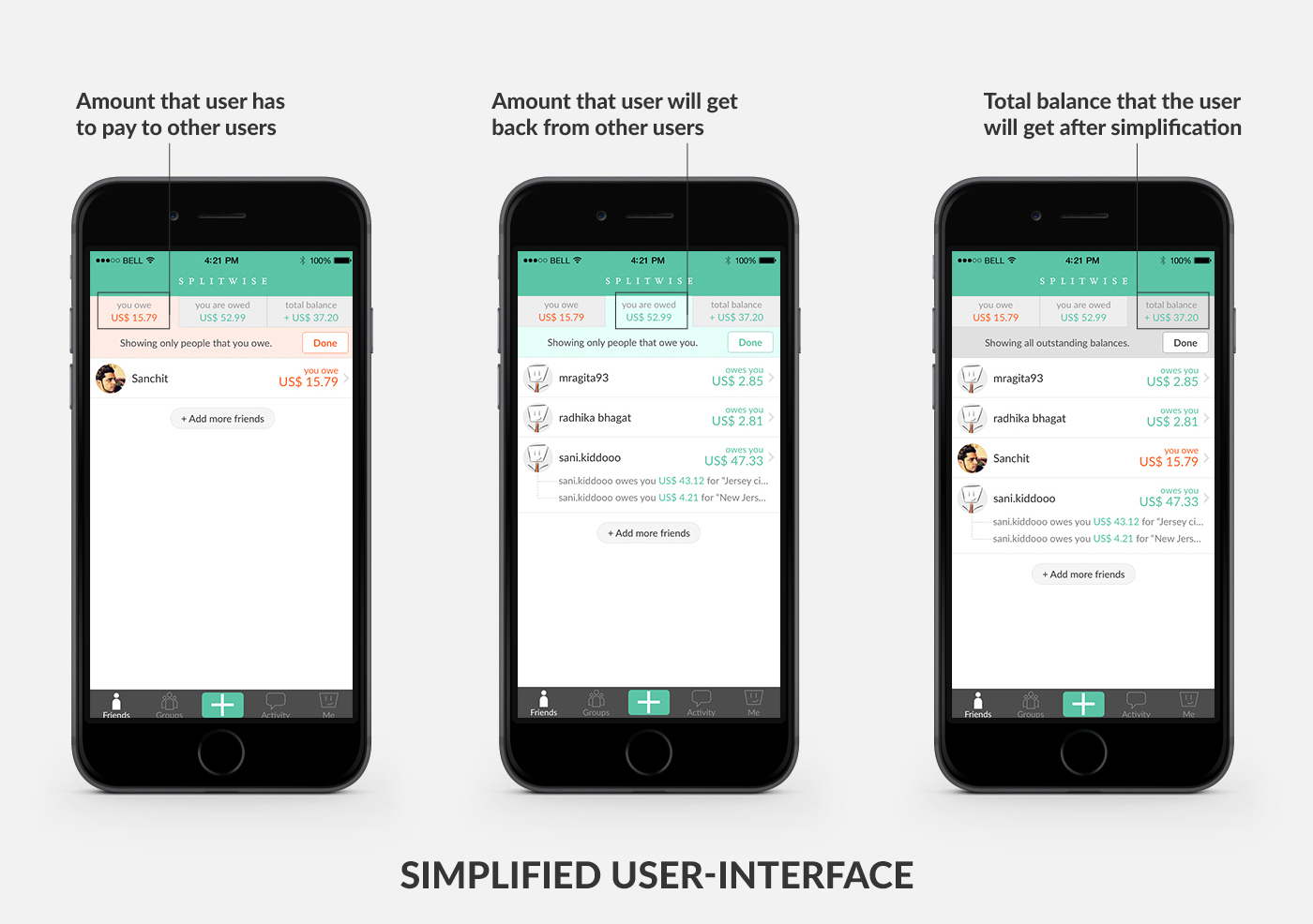
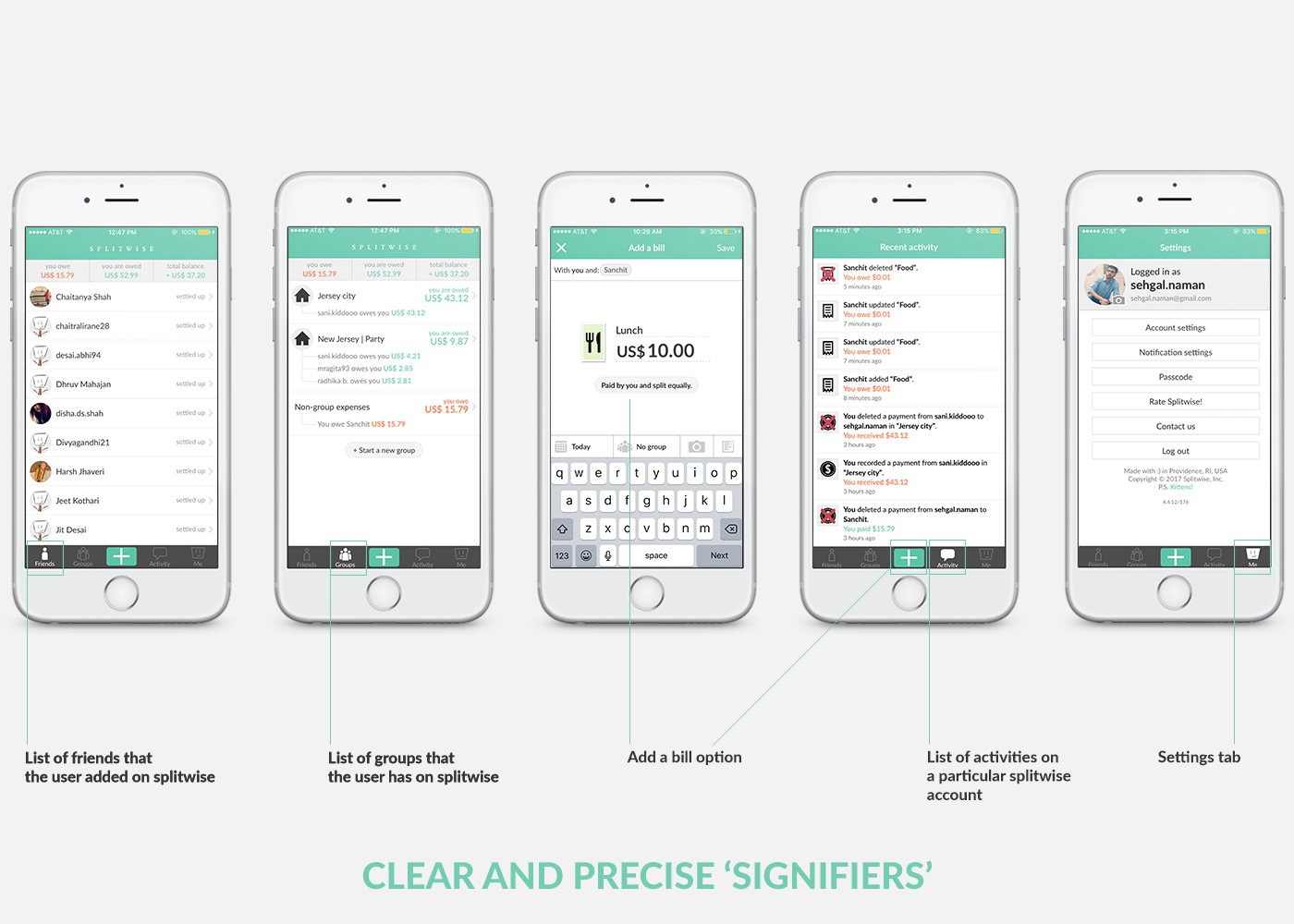
Splitwise has a very simple user interface which is very easy to use. The home screen of the application has three tabs: you owe, you are owed and the total balance which helps the user in keeping a track of their debts. Following Norman’s Design Principles, this application has clear and precise ‘Signifiers’ for the navigation options wherein the user can browse the list of friends, make groups, track activities, add a bill and can access the settings of the application. Splitwise has also adopted Apple’s 3D Touch feature in order to enhance the user experience as they can simply view the balances or can add a bill using the 3D Touch feature.
While going through the app, I think the user has to scroll all over the friend list in order to search for a friend whose name starts with ’S’. This can be a little frustrating if he has a long list of friends on Splitiwise. To avoid this, I would recommend them to have a search option for a better and enhanced user experience as it will be more convenient for the users to navigate to a particular account.
Above Video shows the recommended search icon
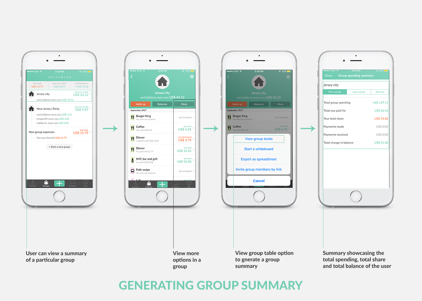
Group Summary and Spreadsheets
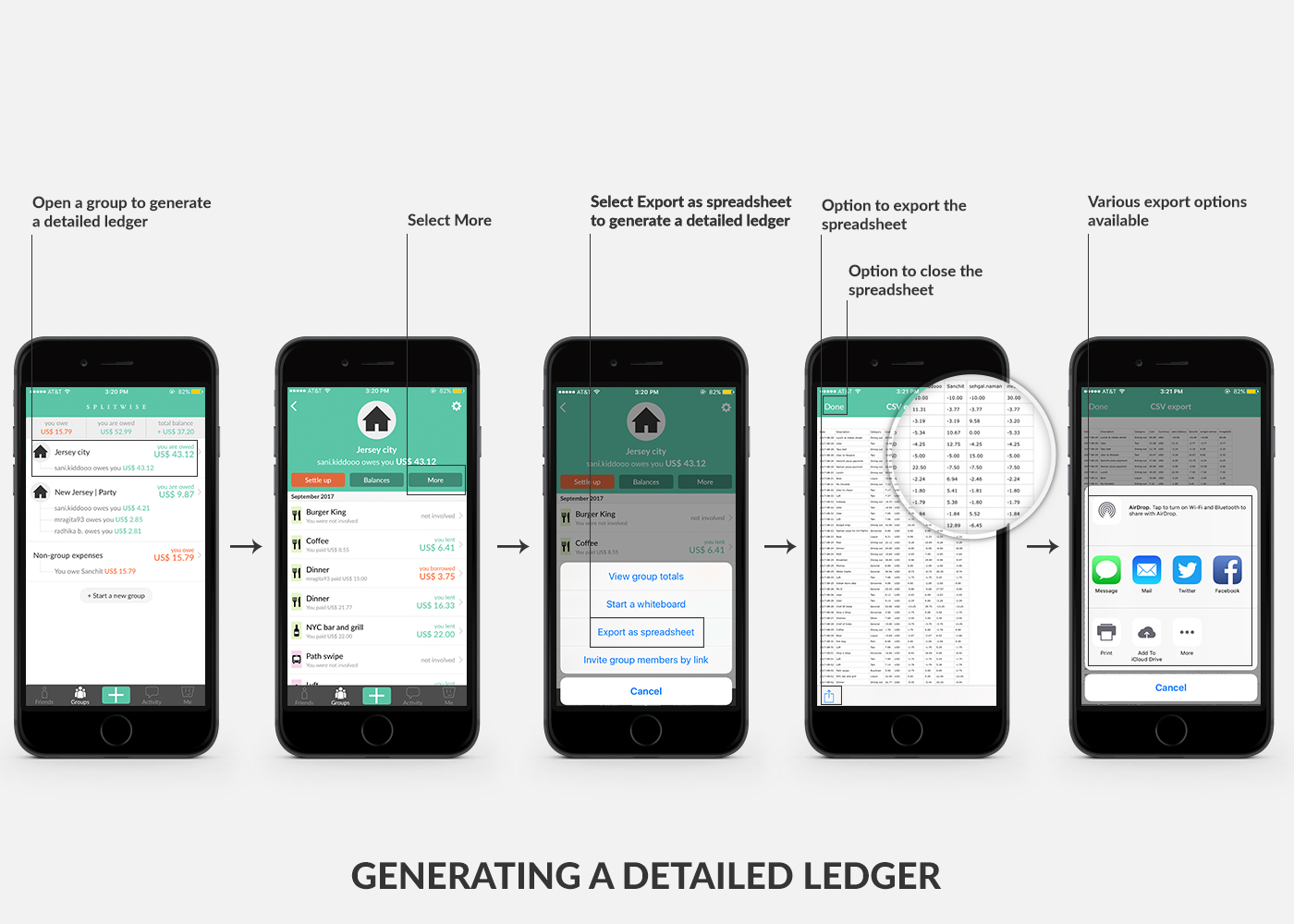
As I said before that this application helps in keeping a track of your debts in a simple ledger format. It allows the user to generate and export a detailed ledger so that the users can keep a track of all the activity with date, description, total cost, etc. It also provides an option for generating a group summary wherein the user can track the total group spending, total amount user paid, total share and remaining balance.
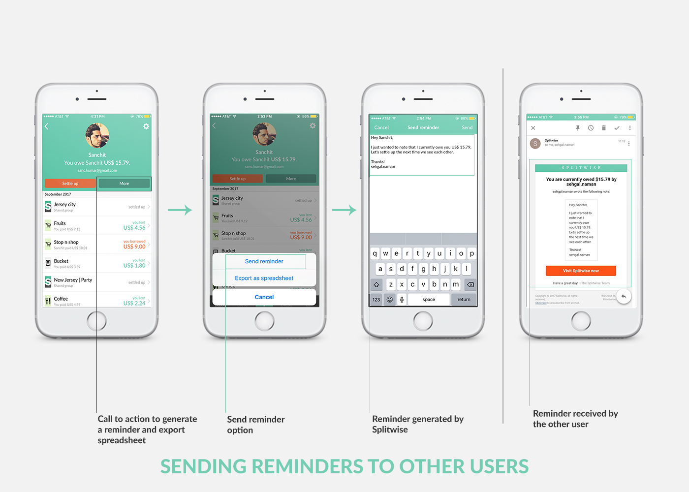
Push Notifications and Reminders
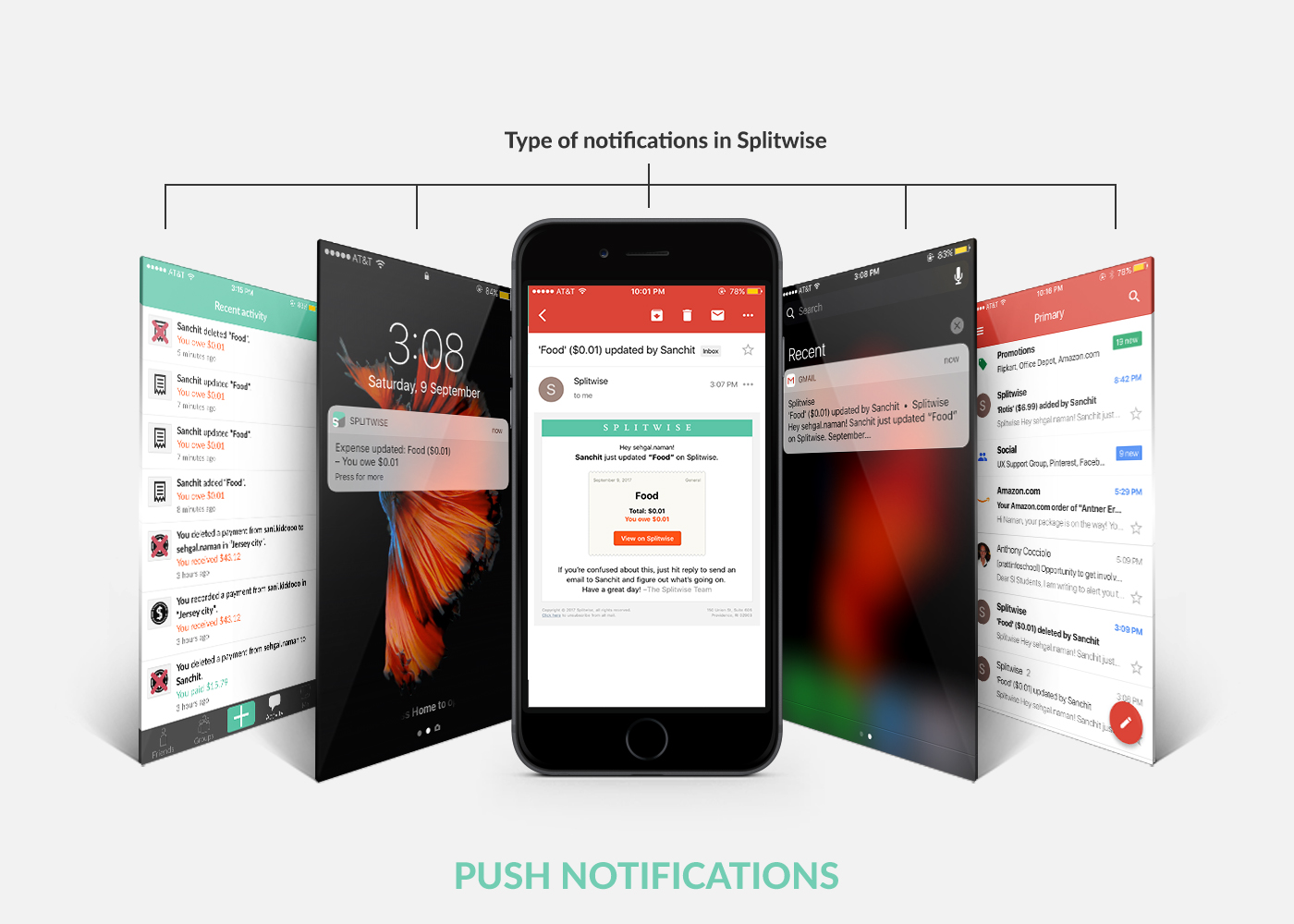
I think Splitwise has done a wonderful job when it comes to following Norman’s Design Principles. This application is magnificent in providing Feedback. It sends push notifications and emails to the user whenever any activity is added or deleted. It has an activity tab wherein the user can keep a track of all the activity with any other user. Splitwise also has an option for sending reminders where the user can generate gentle messages for due payments.
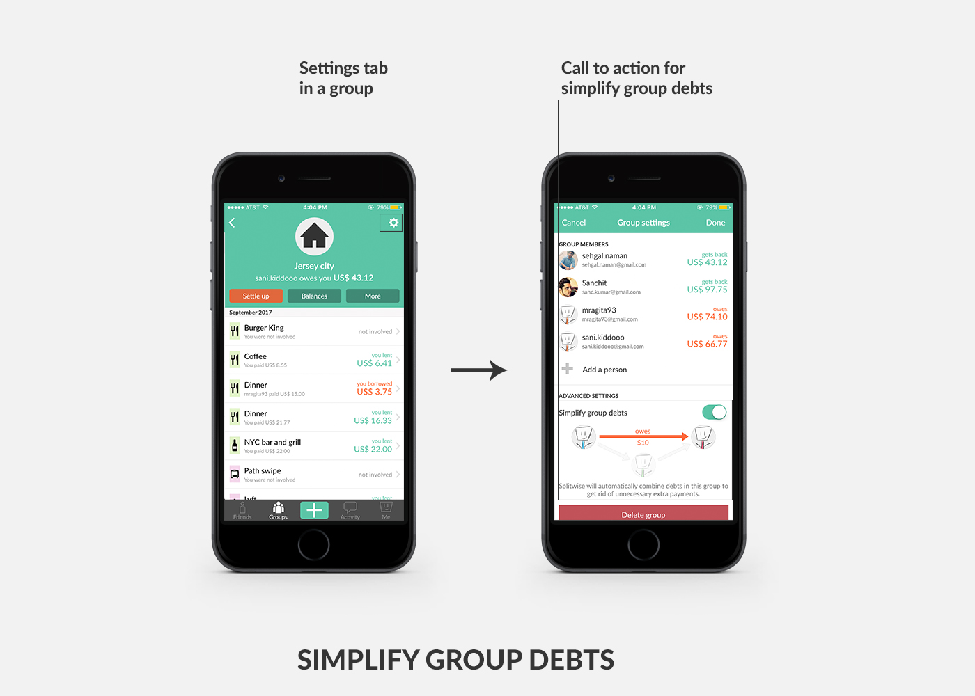
Simplify Group Debts
As the application’s main objective is to help users simplify their debts, Simplify Group Debts is one of the best features of Splitwise wherein the user allows the application to restructure debt within groups and across friendships.
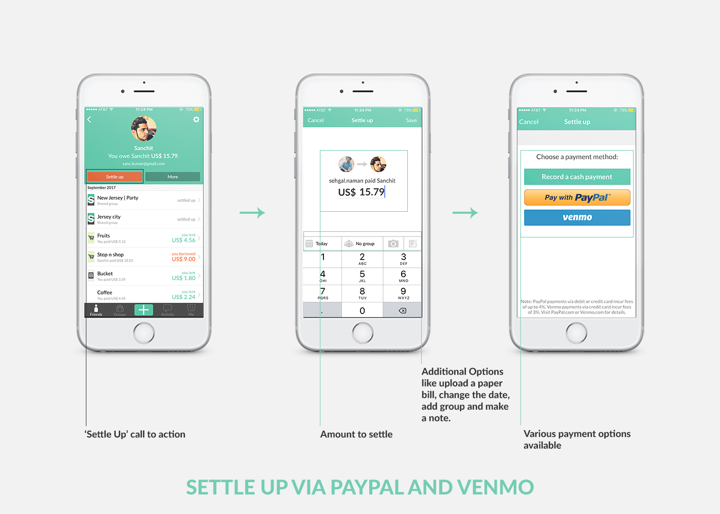
Settle Up and Payment Gateways
Splitwise users have an option of ‘Settle Up’ wherein they can settle theirs accounts with other users using PayPal or Venmo. I believe this is a Constraint as it restricts the users to use these two payment gateways in order to process payment for Splitwise accounts. I would recommend them to add more payment options so that it is easy and convenient for the users to process payment for Splitwise accounts.
Considering all this, Splitwise is a user-friendly application which provides its users with an easy and systematic way of maintaining accounts for various expenses incurred with friends or family. I firmly believe that it has followed the various design principles in the best possible way. However, some improvements in the application can enhance the user experience but as Don Norman said “In my opinion, no single design is apt to be optimal for everyone.”, It is really hard to fit everyone’s need.