![]()
Splitwise (version 4.4.12 for iOS 9.0 or later) is an Apple iPhone application designed to “split bills and expenses the easy way.” This app functions as a bill splitting and record-keeping tool for roommates, friends, or any group of individuals with shared or borrowed expenses. Splitwise provides an appealing and simple digital interface that makes bill creation quick and easy but requires some additional work to be an effective record-keeping app for bills. This review examines the usability of the homepage layout, bill creation process, and bill history function of Splitwise using Don Norman’s concepts, principles, and terminology included in his book, The Design of Everyday Things.
The Homepage
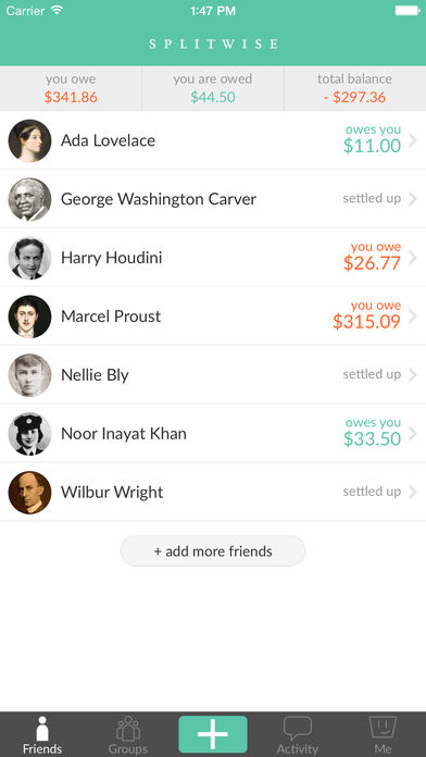
Figure 1: Splitwise homepage.
The homepage of Splitwise provides excellent discoverability. As seen in Figure 1, the homepage of the app provides a small number of clear options for the user to choose from. Placing the most common function of Splitwise, bill creation, at the bottom-center of the screen right above the iPhone’s home button, makes it easy for the user to discover it. A simple “+” provides a well-known signifier that a bill can be added without requiring much knowledge in the head. The app draws additional attention to this button by making it green while nearby buttons are gray. Other options, “Friends,” “Groups,” “Activity,” and “Me,” are labeled plainly around the bill creation button and they open pages that map logically to the label names. Money owed to and from the user, as well as the user’s total balance, are displayed prominently in a banner near the top of the page – all data that the user would likely want to know before creating a bill. This system image reflects what information the user would like (and might expect) to be included on Splitwise’s homepage.
Bill Creation

Figure 2: Bill creation page 1.
Bill creation is initiated by clicking the “+” button. As seen in Figure 2, the user is prompted to enter names or contact information (either as phone numbers or email addresses) of other participants included in the bill. Splitwise’s integration with a user’s iPhone contact list permits the user to start typing and have a suggested contact appear at the top of the menu, allowing for quick selection with immediate feedback. This mirrors the searchability of the contact list on the iPhone’s default Phone app, so a user will likely be familiar with this process. If not, default faded text in the top banner, “Enter names, emails, or phone #’s,” provides additional knowledge in the world for simple discoverability to novice users.
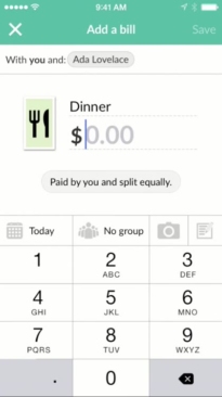
Figure 3: Bill creation page 2.
After selecting at least one person or group, a new screen appears (as seen in Figure 3). In this new screen, users must enter a bill description and amount. The bill description and amount fields include faded text above a dark underline – a standard digital signifier indicating that the user can enter text. The default faded text for the bill description, “Enter a description,” provides instructions that will assist novice users. Additional options* to change who paid for the bill and how it should be split are indicated by a gray bubble underneath the bill amount. This gray bubble is a poor signifier since it is inconsistent with the simple bill amount and type signifier of underlined faded text; matching them would provide greater discoverability to its function. Once the user completes the required description and amount sections, the bill creation process can be completed by clicking the “Save” button at the top-right of the page. This “Save” button remains inactive until the required information is completed, providing a physical constraint that forces the user to enter key information. Only two pages for bill creation with three required data points makes this process simple for a user to navigate and limits opportunities for slips and mistakes.
*An additional bill type image option will be discussed in the Bill History section below.
Bill History
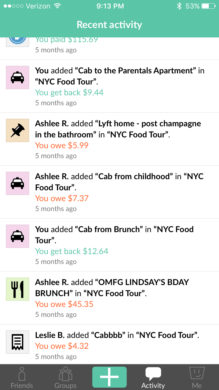
Figure 4: Activity page.
Previous bills that are created or paid are added to the “Activity” section of the app (as seen in Figure 4). Bill type images are included on the left-hand side of each item, but there is no way to sort or search by these bill type images. The existence of a bill type image in Splitwise is confusing: it signifies some purpose, but is not mapped to any existing affordance. Furthermore, there is no indication during bill creation that a bill type image can be assigned. The user must click on the default bill type image to the left of the amount field (as seen in Figure 3) during bill creation to open a selection menu, but the app provides no clear signifier for this functionality. Even without bill type images, the app provides no way to search through the Activity page by text. A spreadsheet of bill data for a specific friend or group can be exported, but no searchable in-app functionality exists. To remedy this, scrapping the bill type image option and including a text search function on the Activity page would eliminate confusion about the bill type image’s purpose and provide the user with a simple bill history tool that mirrors the contact list’s searchability.
The Verdict
Splitwise provides an efficient, usable tool for splitting bills. The homepage is simple to navigate and bill creation is a short and painless process. Splitwise’s bill history capability is lacking, providing a confusing bill type image functionality and no in-app way to search through a user’s history. However, getting rid of the bill type image option and adding a text search function to the Activity page would fix this. Regardless, Splitwise provides a nearly painless user experience for bill splitting and continues to be one of the most popular apps of its kind.