
Sweat is a fitness lifestyle application created by Australian personal trainer Kayla Itsines. The app is based on her world-famous Bikini Body Guide (BBG) training program and her healthy meal guides. It provides workouts and meal planning all within a mobile device, acting as both a fitness instructor and nutritionist. This critique focuses on aspects in the “Food” and “Activity” modes of the app.
Strong Discoverability in “Food” Mode
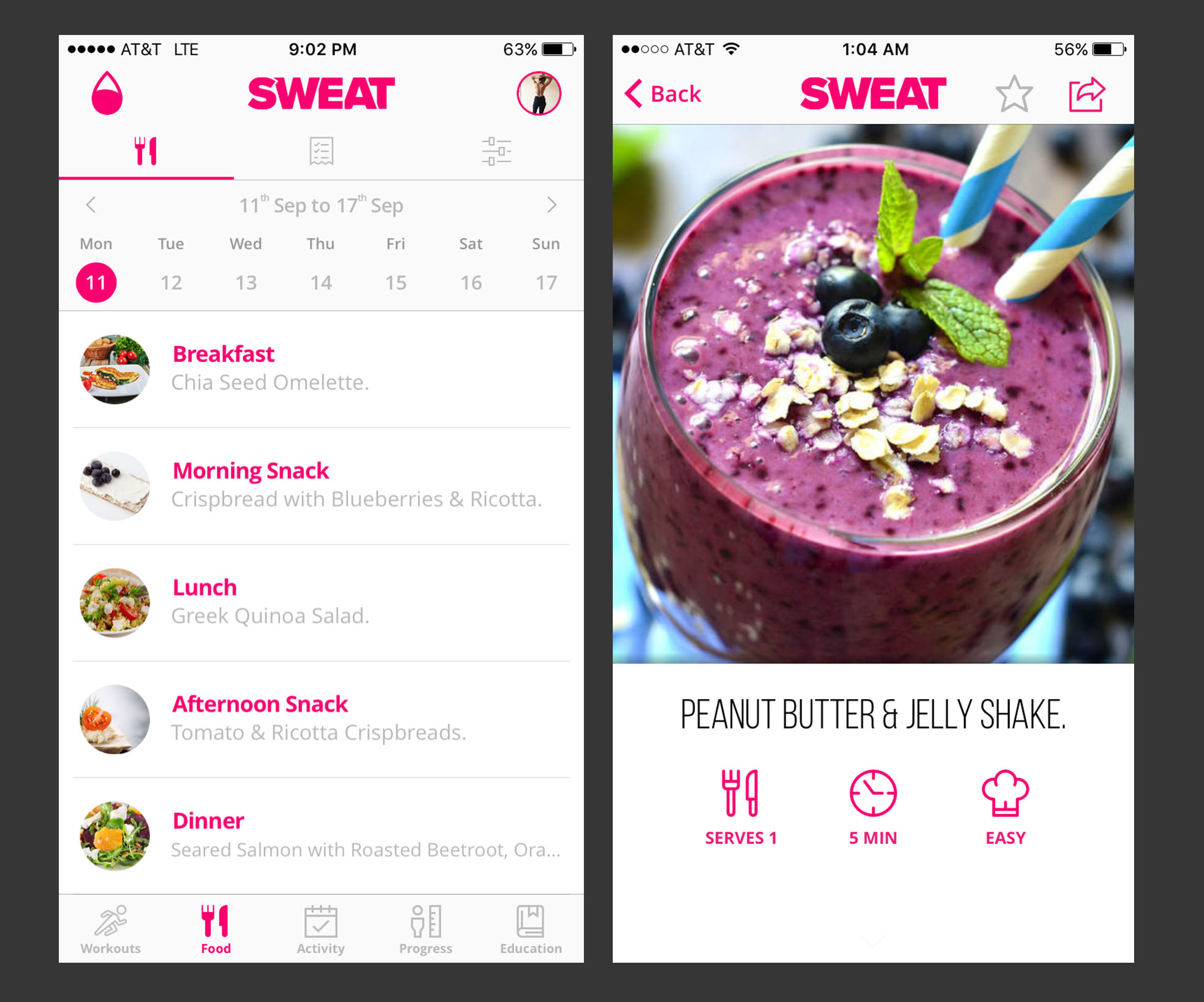
One of the most complex, yet well-designed areas of the app is the “Food” mode. The section employs strong use of signifiers, communicating where and how an action takes place, in this case by tapping and swiping. Meal options are available for each day of the week, and the arrows above the week signify that the user can view meals for previous or future weeks. To view a recipe, just tap on the meal.
Good Design in a Digital Grocery List
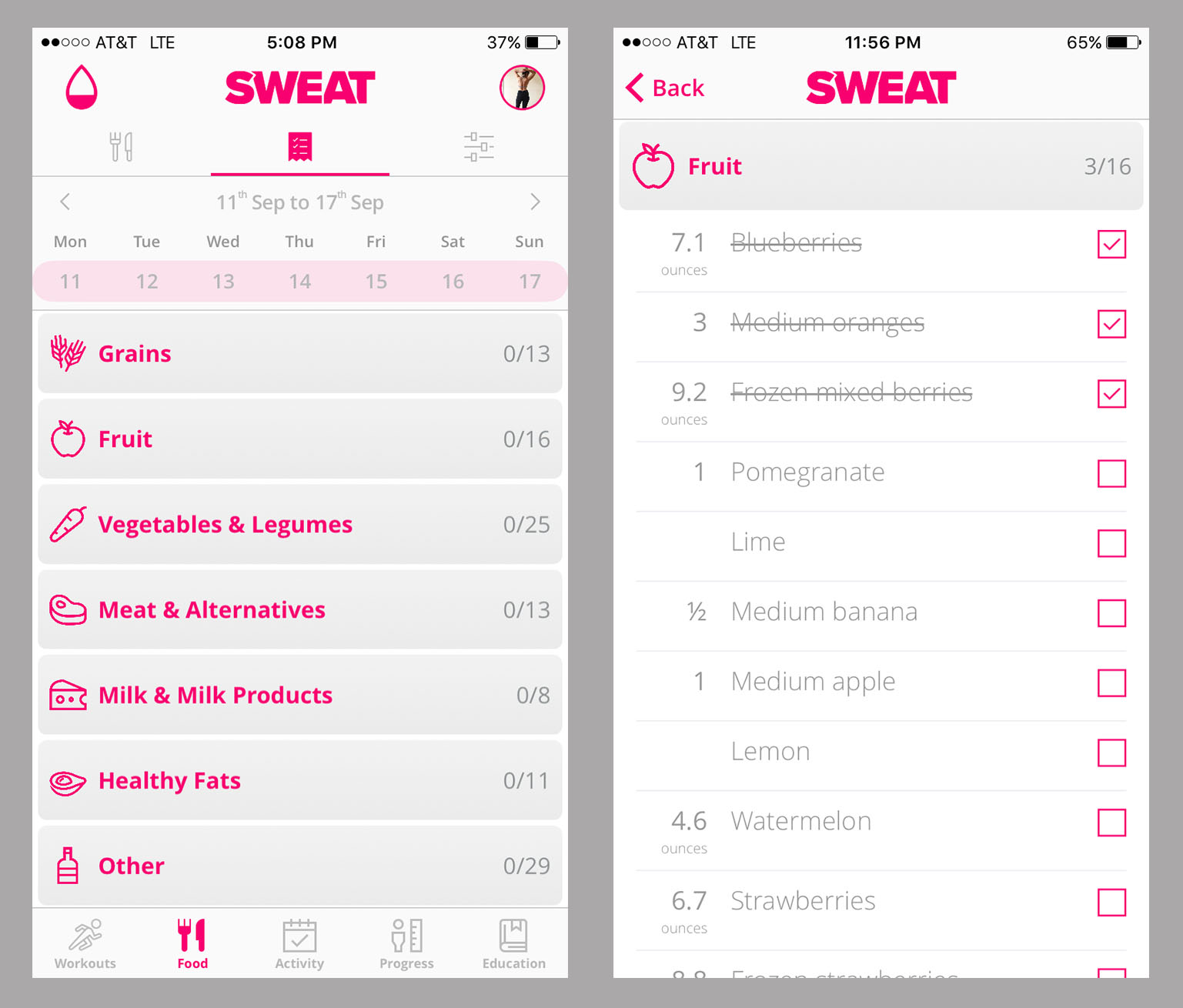
The checklist icon brings the user to an overview of groceries for the week. By tapping on a food group item, a detailed list appears for that group. Checkboxes to the right of the list signal that tapping one will fulfill that requirement and the user receives feedback with a checkmark in the box and a line through the list item. A conceptual model is formed by this grocery list layout, and in providing the knowledge of what is needed for each meal, the app reduces the need for knowledge in the head.
Flexible Settings
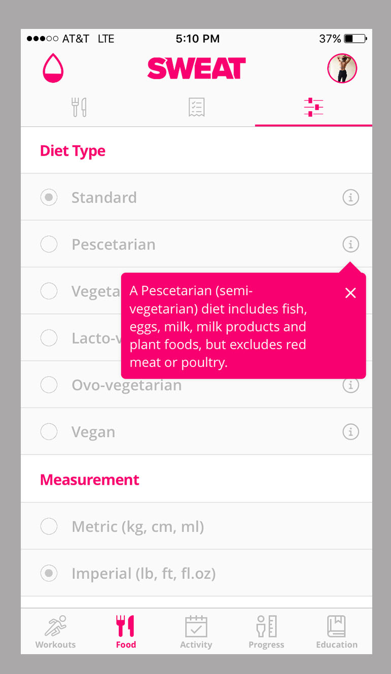
Another component of “Food” mode is the settings option. The settings provide flexibility for the user’s diet and their measurement preferences. This would be considered an inclusive design, in that many users can benefit from this section.
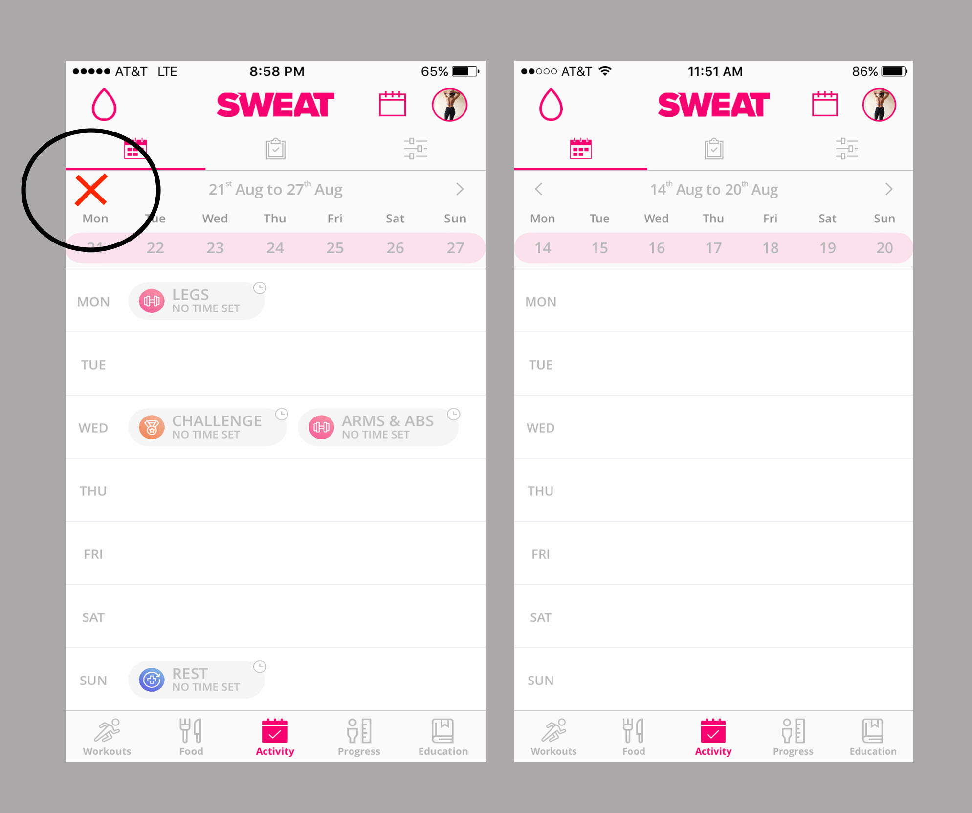
Confusion in “Activity” Mode
The app’s design is complex with many functions, offering instruction from how to do a push up to how to make a chia seed omelette. Most of the app deals with good complexity. As Don Norman argues, “complexity is essential: it is confusion that is undesirable.” An area of the app where complexity turns into confusion is in “Activity” mode.
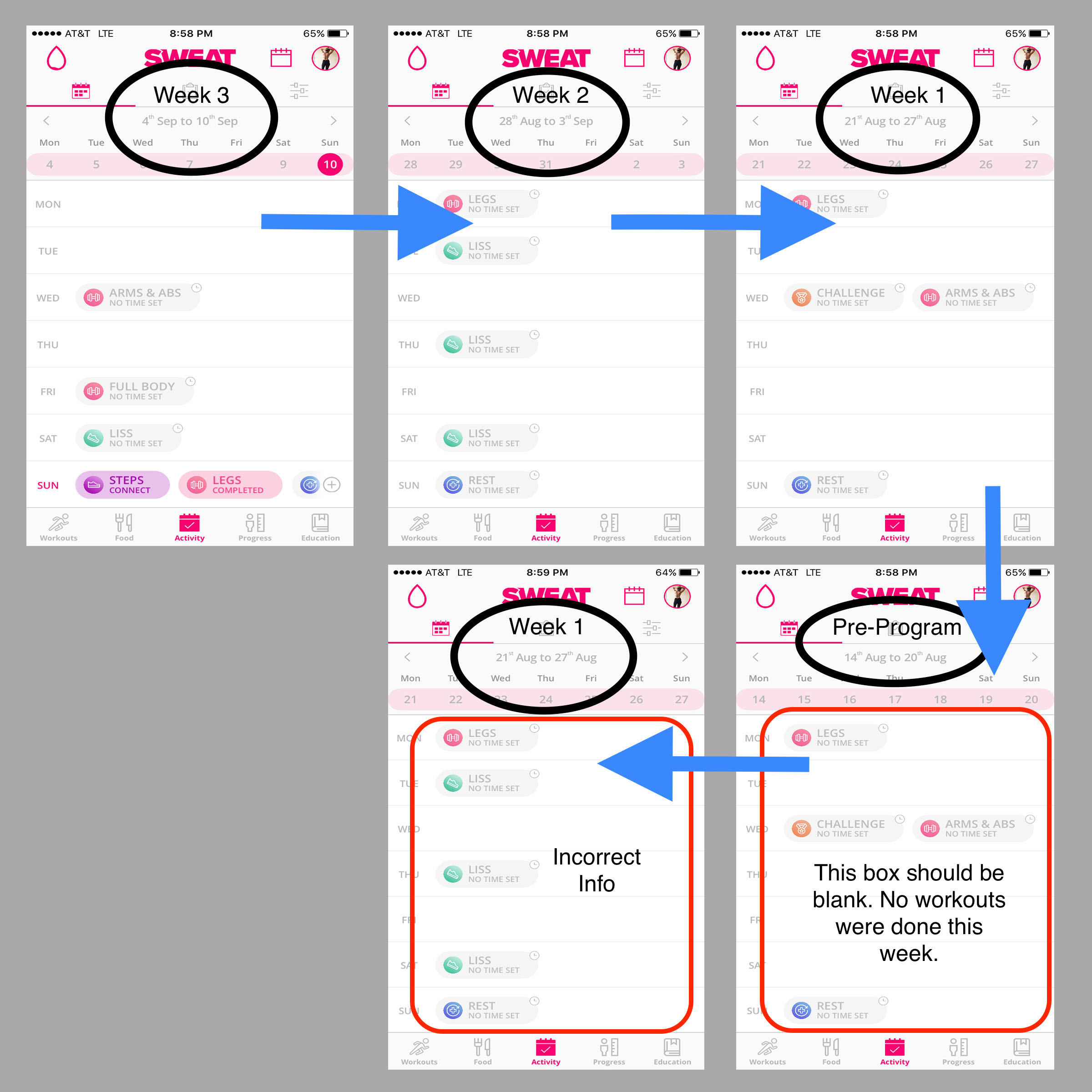
“Activity” mode lets users view their workout history and affords planning future workouts. I’m going to focus on an issue that comes up while viewing previous weeks. Say the user is in Week 3 of their program. If the user taps the arrow provided at the top left of the screen next to the specified dates, the app will show the previous week’s history. Say the user goes back before week 2, before week 1, and enters into the history for the week before the program started, this is where the app’s design fails. If the user views a week before they started the program, the app mistakenly transfers the information for Week 1 into what should be a blank week. This causes confusion for the user, so they try to backtrack. Now if the user tries to go forward in time (to Week 1 of the program), the app will show Week 2’s info on Week 1’s page. This causes the user to feel frustrated while trying to remember what exercises they did that week. A gulf of evaluation is formed when the user is confronted with inaccurate and inconsistent information.
Solutions
One solution can be to place a physical constraint, a forcing function (e.g. notice alert), if the user tries to view weeks prior to the program’s start week. This forcing function can be a pop-out box notifying the user that they are about to view weeks that are before the user’s start date of the program.
Another solution is using a physical constraint to block the user from even viewing any weeks prior to Week 1 of the program. Make it so that the left arrow is absent on Week 1’s page, making it no longer a possibility for the user to go further back in time.
And yet another solution is to keep all weeks prior to Week 1 completely blank, eliminating the user’s need to look further back.

Through the use of signifiers, feedback, and conceptual models, the app’s discoverability and understandability is strong, but can be greatly improved with the use of constraints. Overall, good outweighs the bad for Sweat, but there’s room for upgrades.