About the Project
This project was done in Pratt Institute’s Information Architecture and Interaction Design taught by Craig MacDonald. For this project, my group and I were given the task of redesigning the information architecture for Sesame Workshop (www.sesameworkshop.org) that would make the site’s interface much more user friendly, increasing its usability through improvements of its navigation, layout, and how its contents were displayed.
My Role
The work was distributed evenly between the 4 of us. We worked together as a team in performing research, analysis, and paper and digital prototyping. The only unique role that I played in our team was that of “Manager” in which I was in charge of managing our time, collecting all pieces of assignments and making sure everything was submitted in a timely manner.
First Impressions
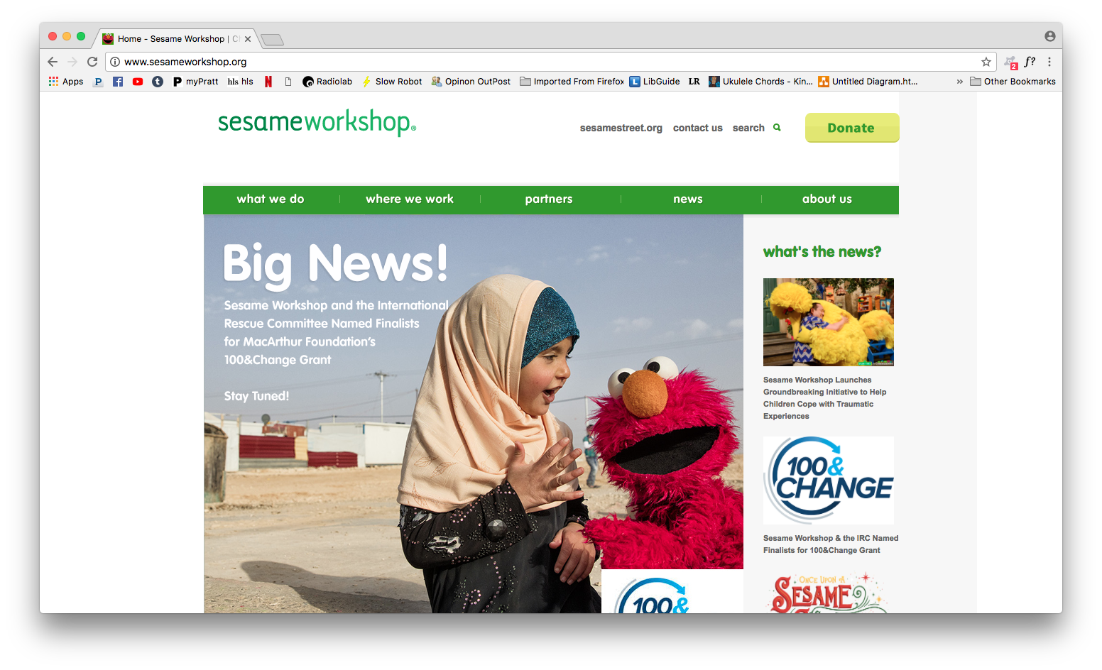
Here is the site we worked on. At first overview of the site our team was quite confused as to what this website was about in the first place, and felt that there was so much information that was scattered all over. We needed to figure out what users needed and preferred. What do users normally expect from a non-profit website like Sesame Workshop?
Figuring Out What Users Expect
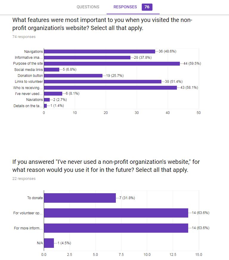
In order to understand the users we each Interviewed 2 users from different demographics and also sent out a questionnaire which collected a total of 76 responses. My user demographics focused on parents.
Key Interview Responses
User 1: When asked how would they improve the last non-profit website they’ve visited. “I did have to go to Charity Navigator in order to figure out if they were credible.”
User 2: “I would say their donations page (is the most important feature), because they are non-profit and would depend on donations to keep themselves supported.”
Our user research showed us where to focus our attention.
- Users want to know what the organization is about.
- Users want to know who is receiving the money from donations and how its used.
- Users want clear navigation with image driven content.
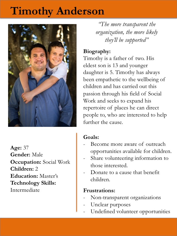
As a result of this user research, I’ve created the above persona to help solidify the idea of who we will be designing for.
Organizing the Content
Card Sorting
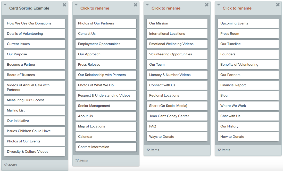
Reviewing the content of Sesame Workshop, we pulled out 50 cards to represent items from their site.
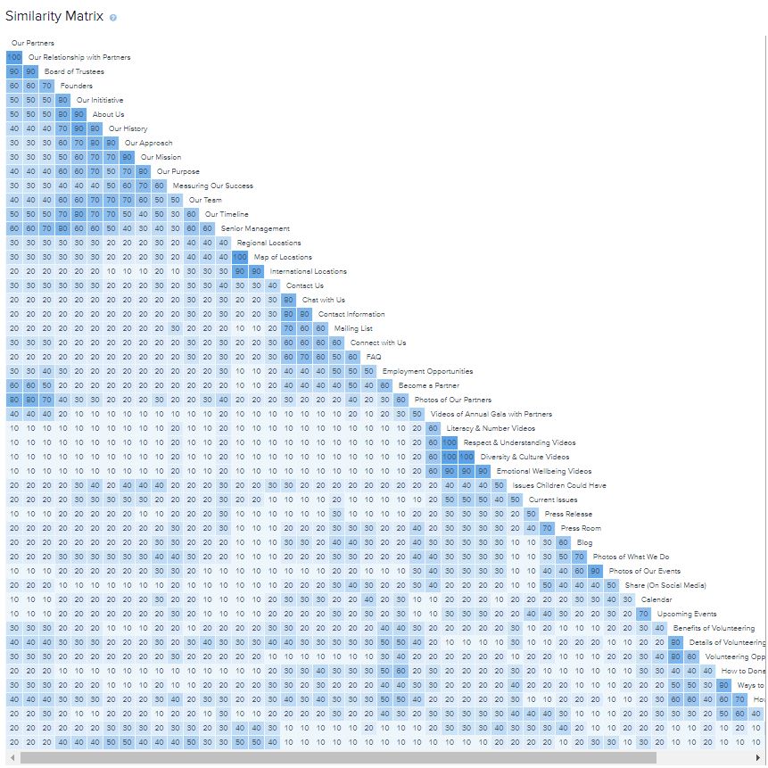
Using both virtual and in-person users, we had users sort these cards into groups they felt should be together. OptimalSort provided the tools needed to analyze this data and see how users as a whole grouped our cards.
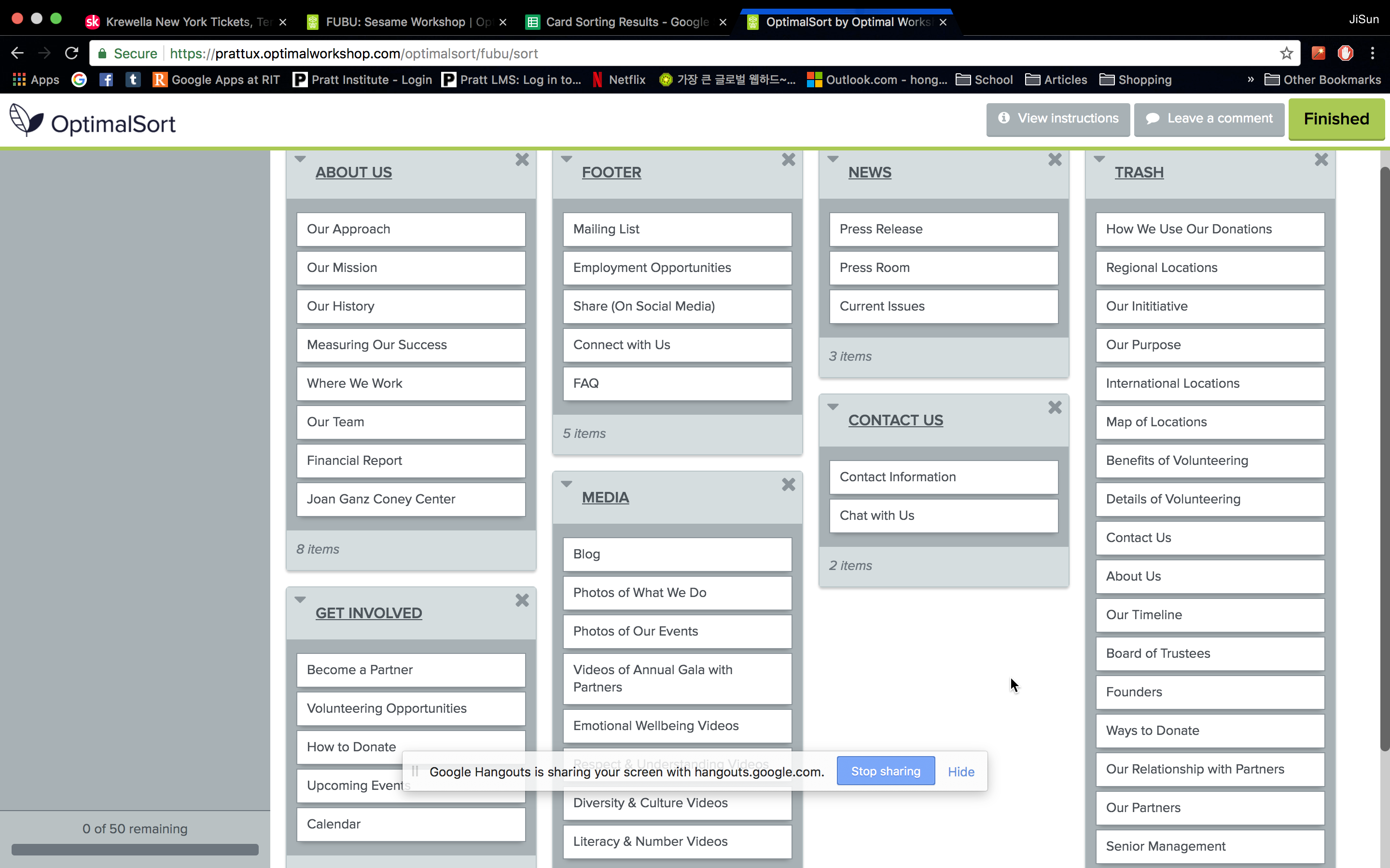
It turned out that we used far too many cards. As a result, we grouped items together using the data we got from users and removed 17 cards that users found redundant or unnecessary, resulting in the 6 final groups of cards in the image to the right.
Tree Testing
In order to further test our resulting groups, we had to recruit more users to performing tree testing on our categories. This allowed users to follow paths that will later be optimized for navigating the new IA.
Users were given 5 tasks.
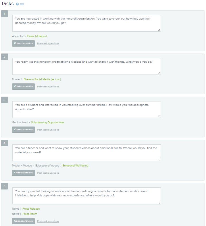
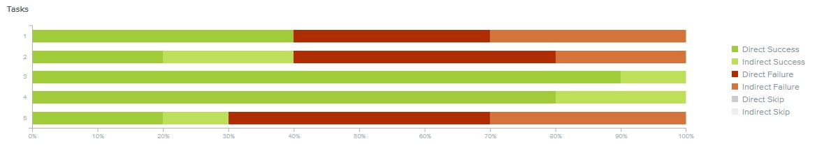
Users had the most difficulty performing the final task in which they were confused about the differences between “Press Room” and “Press Release” found under “News” and often times would look for it under “Media”. This suggested that users were also confused between “News” and “Media” as both can mean the same thing depending on the context.
Final Site Map Concluded From Card and Tree Testing
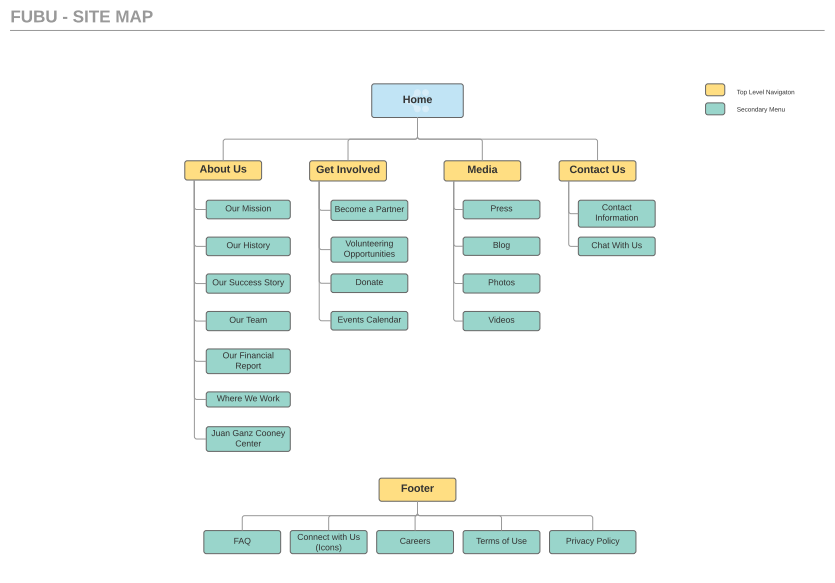
User testing help us to flesh out our site map and finally condense it into a much more intuitive way that made the most sense for our users.
- We removed the News category, and meshed into contents into Media.
- We condensed Press Room and Press release into one tab.
What Are Other Websites Doing?
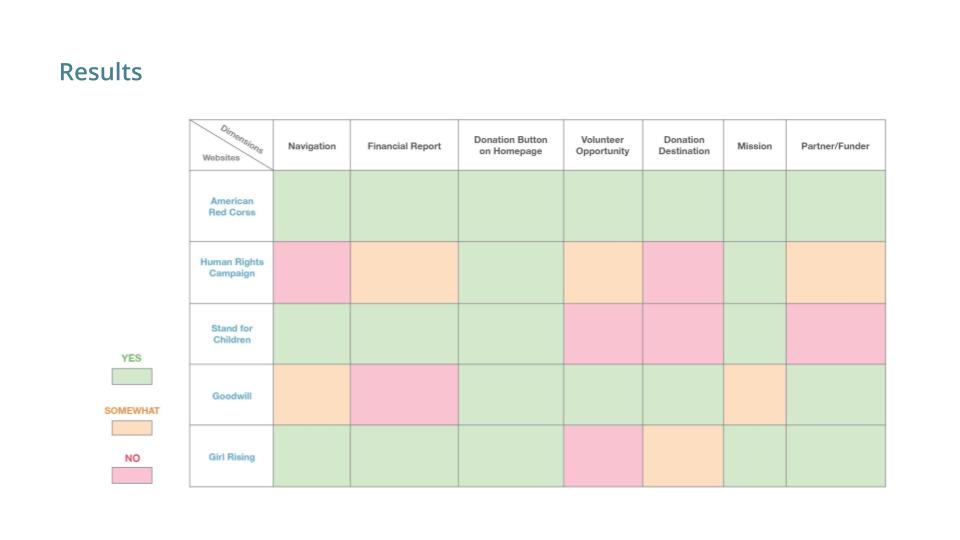
We reviewed 5 other non-profit websites based on 7 different dimensions.
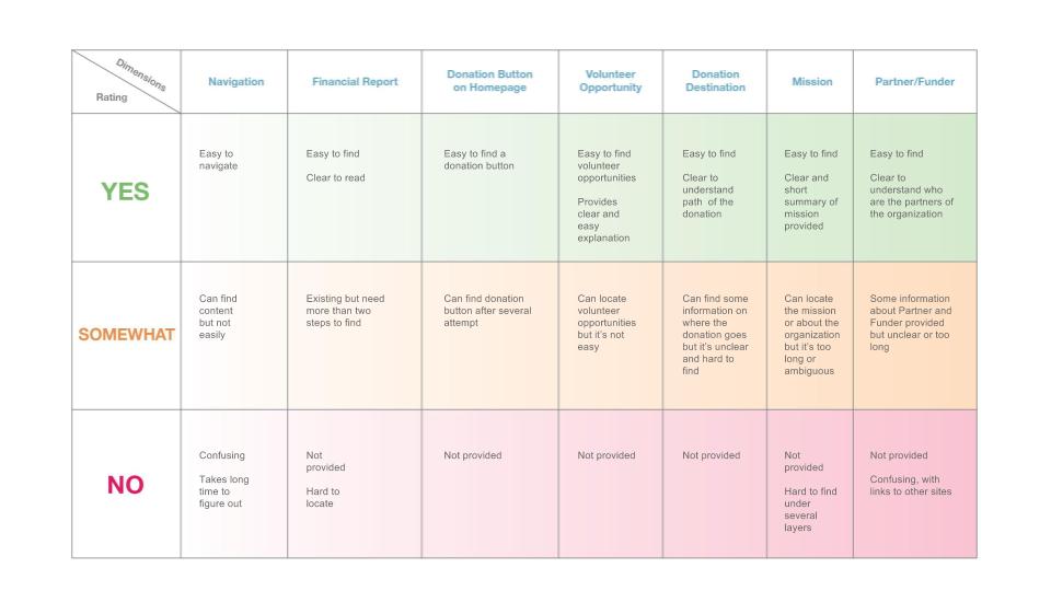
Our review led us to the follow major insights that we wanted to implement into our newly designed site.
- Navigation: visible, not hidden, and concise
- Financial Report: easily accessible, and easily digested of in depth report
- Donation button on home page: fixed on top of the navigation bar where it is easily accessible
- Volunteer Opportunity: clearly listed, easy to view list of volunteer opportunities on page before user clicks to sign up
- Donation Destination: clear description of where the money is going and how it is being use before collecting money; visualize information to allow users to understand easier and faster
- Mission: clear, one sentence summary on homepage and easily discoverable on main navigation
- Partner/funder: easily discoverable under a reasonable tab with a clear label; should not have to dig on page
We’re Ready for Prototyping
Paper Prototyping
We devised a low fidelity “paper prototype” using our findings from all our user testing up to this point, then finally reviewing our competition to see what has worked and what does not work. We later implemented our prototype on an app called Marvel in order to have users test our first rendition of the IA.
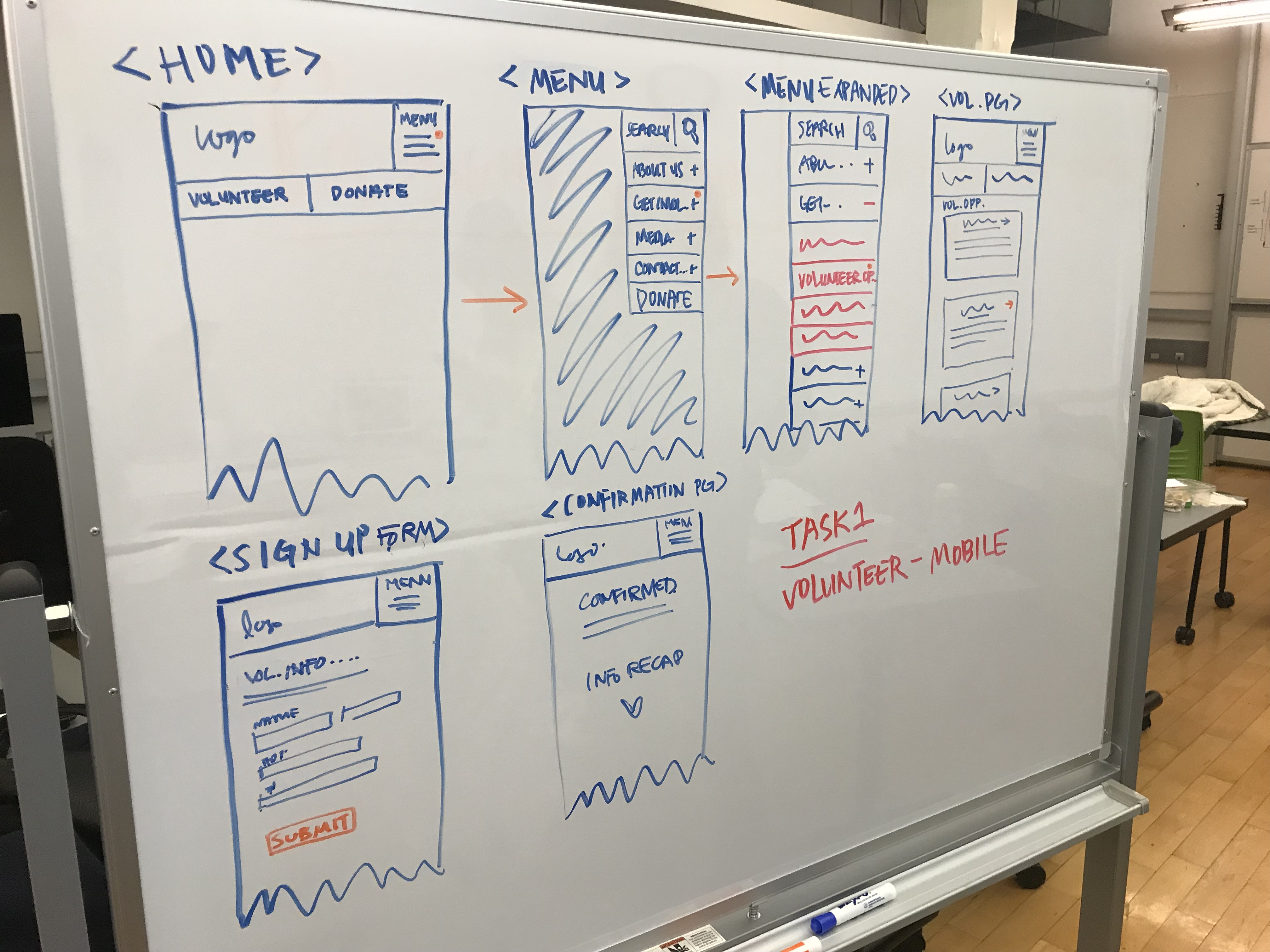
First task: “You want to offer your time to sesameworship in a meaningful way.”We wanted to volunteer for something, in which there were two ways of accomplishing this goal.
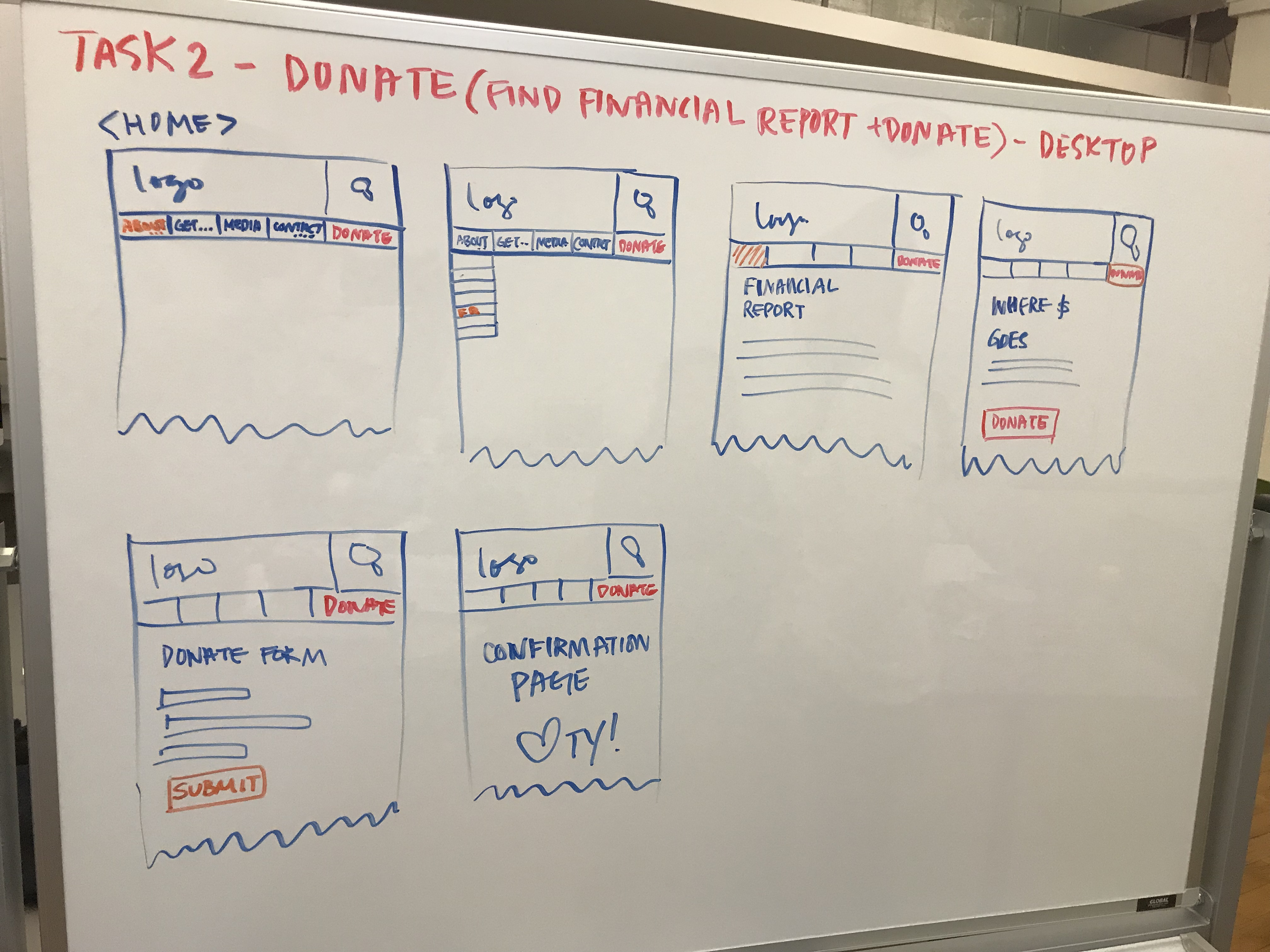
Second task: “Find out information of how the organization uses its funds. Then, financially support the organization.”
This task was split into two parts, but all fell into one category of dealing with money. Previous user testing mentioned earlier was clear that users preferred to donate to a transparent organization so we wanted to make sure that our financial report were easily accessible.
Key Findings
After testing this on users, the following were feedback we’ve received.
- Volunteer information box should be larger.
- Confirmation page should include feedback of what to expect next.
- Homepage should show short but concise information about what the organization is about.
- The use of the word “our” in our tabs were redundant and unnecessary.
- Juan Ganz Community Center did not fit under “About Us” so we moved it into the footer.
Final Design
Desktop: https://projects.invisionapp.com/share/G4EVZ6UU5#/screens
Mobile: https://projects.invisionapp.com/share/ZPEW6J84U#/screens
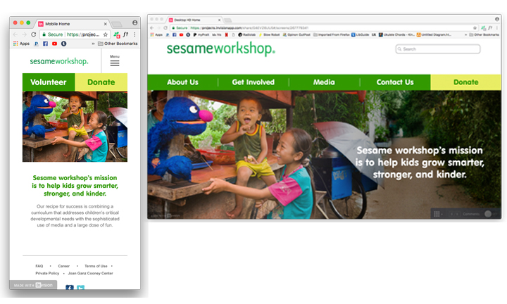
Homepage
For the homepage, we organized our navigation in the format that we derived from our previous user testing. We also made sure that the content was picture driven, simple and straight forward. We made sure that the homepage included short statements of the mission of Sesameworkshop as users found it important to know right away who the organization is.
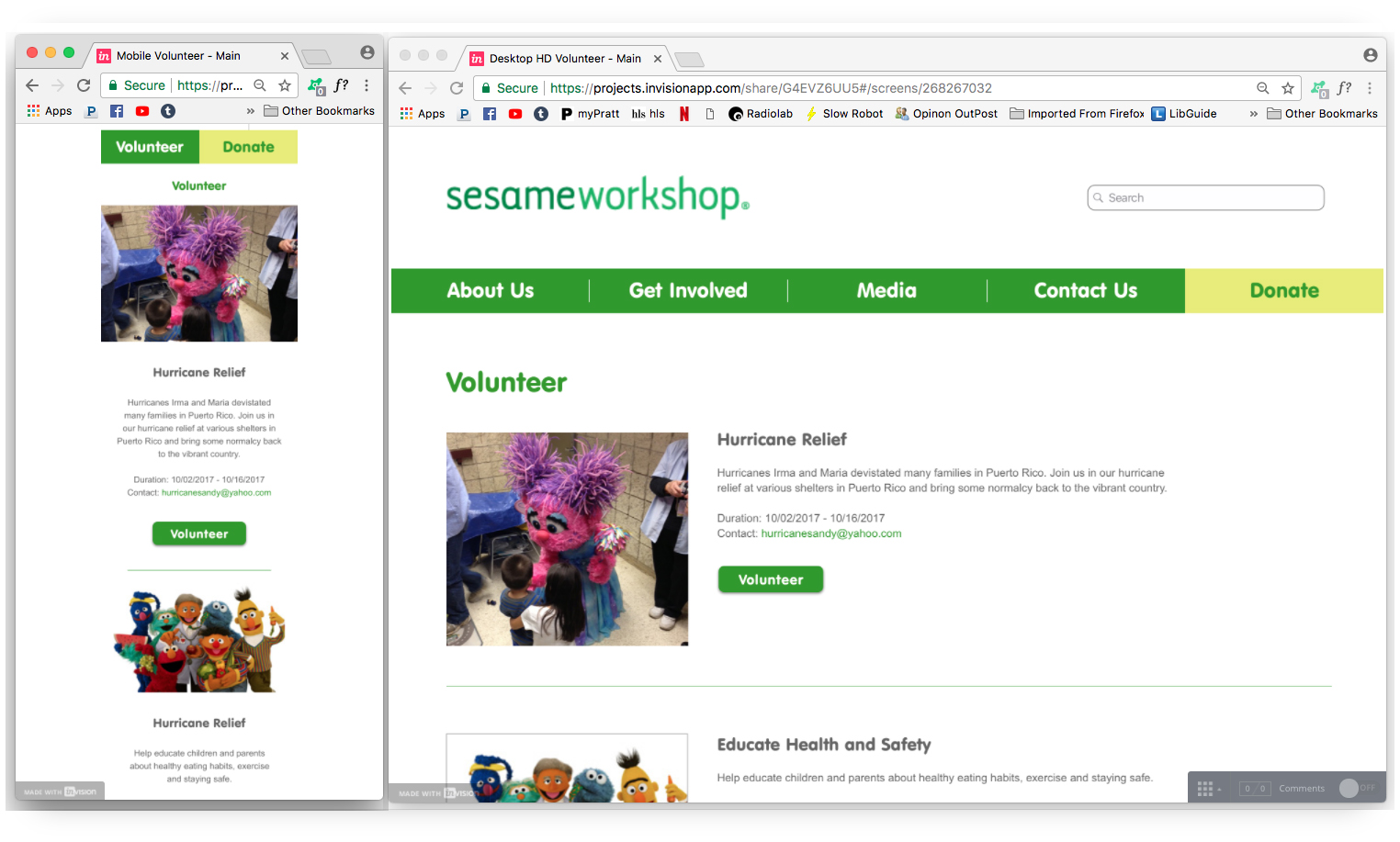
Volunteer Page
The volunteer page was optimized to showcase different volunteer opportunities which allows users to see what they are getting into before they sign up for volunteering like many organizations do. Users prefer to know what their options are before signing up for anything. We also kept our theme of concise information, but enough to let users know what it is about, when it’s happening and who to contact for more information.
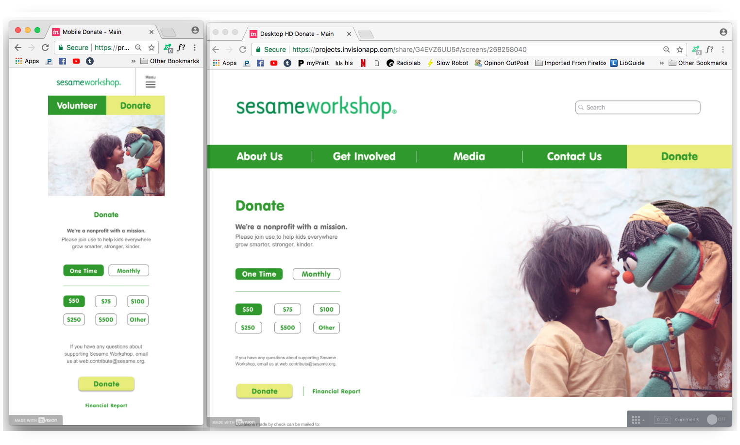
Donate Page
Our donation page wasn’t changed too much from Sesame Workshop’s original idea, however we sure the details were not obscured by the background image and most importantly, to keep with the transparency of the organization, we’ve included a link to the Financial Report because users want to know how these organizations distribute their money so they know if this is something they’d like to contribute to.
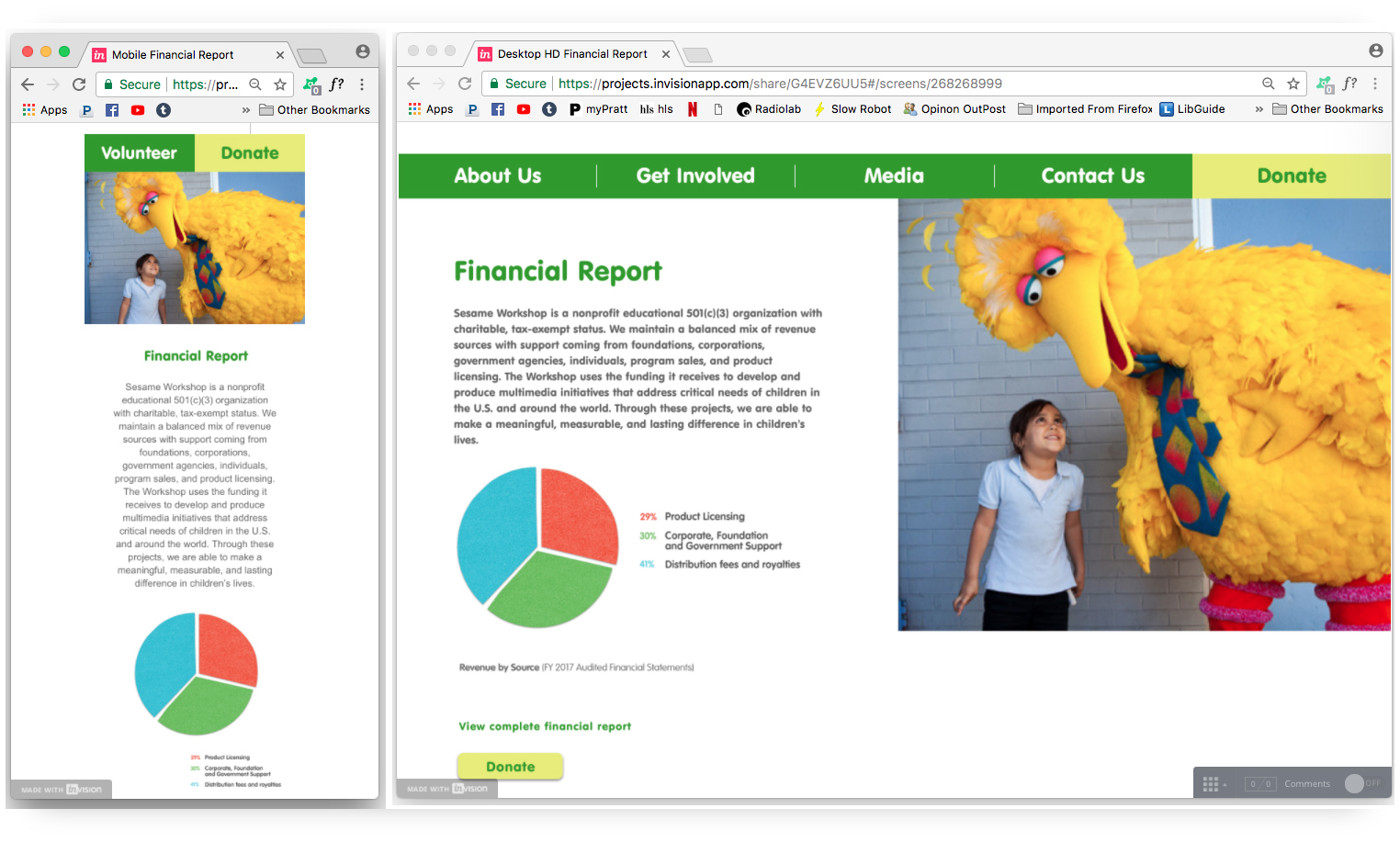
Financial Report Page
Another vital change we’ve made is Sesame Workshop’s Financial Report. Because our user research revealed how important it is to users that non-profit organizations are transparent we wanted the Financial Report to not be hidden, but be clearly visible and found easily. We linked both Donation page and Financial Report pages together, this way users see that Sesame Workshop is not trying to withhold information from them and users will be more likely to support their cause. We also made sure that data visuals are shown so users can get a quick overview before seeing the full report.
Success
I believe our final product tackled all the issues we learned about through our user research and testing. With the limited timeframe that we had, we were able to design this new IA for our users. This is far from perfect however. I believe that if given more time, I would have done more user testing after concluding each step in order to further tweak our decisions. But I am pretty satisfied with our conclusions! Without the help of our users and consulting them we would have never gotten to the user centered design that we’ve come up with.