Design Critique: Blizzard Entertainment (Portal Website)
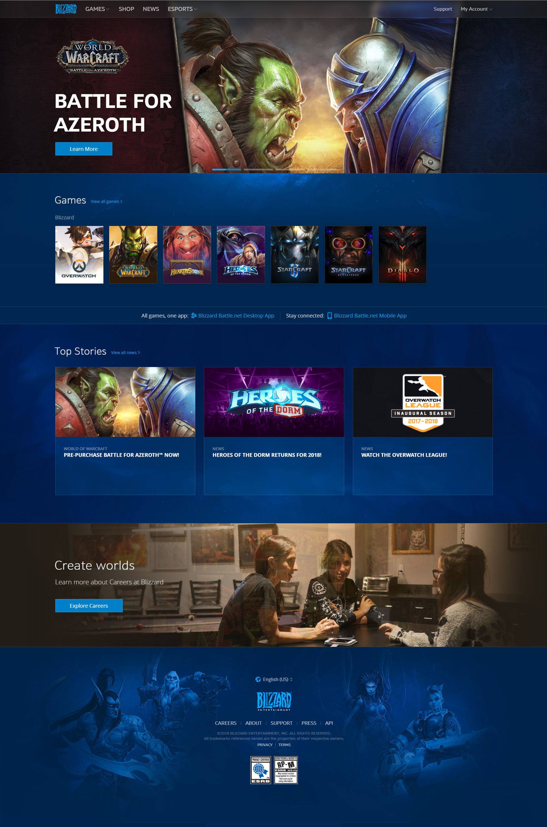
Fig.1
Introduction
This website is the homepage for the entertainment company Blizzard. This website is mainly to generally introduce their products, exhibit what they already have, arouse people’s interest to take their products. And leave an entrance for their users to sign up or log in an account. What’s more, it also contains the careers link as other enterprise homepage during, to share their requirements.
Critique
I have been the user of the Blizzard’s game for around 10 years and have pass through the change of the website we are going to talk about here, https://www.blizzard.com .
First of all, I think this website is a good example of well design, the discoverability works well with the signifiers. Based on the Fig.1, use the homepage as the example, the website has an align left structure, and we could easily find the separated sections. Include the footprint, their are 5 sections there. From up to bottom, the first section is the advertisement part with the navigation bar. And then, three sections based on their contents. Game, Top Stories, Career and then the last one footprint. What’s more, they utilize the different background to separate the career part with other part, this lead the experience that the first two section are talking about the similar contents, they should be considered as one group, indeed it really is.
Then, I would like to critique this website from up to bottom, left to right this is based on the natural reading orders.
Fig.2
The first interactive and functional element on this page is the navigation bar, which is fixed on the top of the page. Each label here, includes the Company icon meets the rule of the signifiers (Norman, 13). Exactly offer the clue to help user understand how the button here mapping with other pages, in addition, nowadays there is the knowledge in our mind that the company icon will link to the home page. And the downward arrow here near some of the button, like Games, Esports, indicates the clue that there are two types of button here. The button without the arrow will just lead you to another page, and the other one will show you a dropdown list to offer more options. Users could expect this kind of response. Users could build the right goal before the start their actions, and after they finish their actions just as the concept of 7 stages of the action saying (Norman, 41). And finally, when they compare the action result with their goal, this part offers the correct response. This kind of design is good, simple, clear and has been widely used in the portal website for their navigation bars. What’s more, their designer separates those buttons on the navigation bar into two parts by giving them different alignment ways. The left part, all of those five buttons are about the company themselves, about their games, their news, their products. And for the right side, this part is designed for their users. They keep this kind of design for several years, and I also checked other websites, like Google, Amazon and so on. All of them have put the sign in button on the rightest corner of the navigation bar. I’m not sure when this design started to be used and for what reason, but I think based on Norman’s theory, for such a long time, this kind of design already build the reflection for users. Utilize the subconscious of human beings will help us meet the good design, and reflection is the only level which could be trained (Norman, 56). In my opinion, this kind of design may cause users get the reflection that they will try to find their login method on the right corner of the navigation bar.
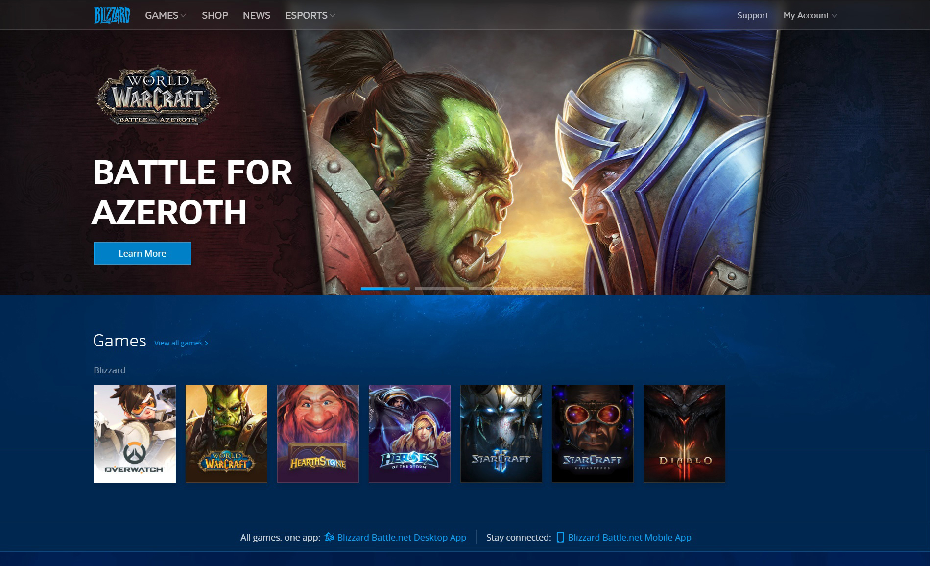
Fig.3
Then the second part, which takes the most space to talking about, is their games, their main products. The hierarchy for this website is super clear, their designers use the repeat method to let their users understand what they are really trying to talk about. We can find the game relate content three times on this page. As following images showing.
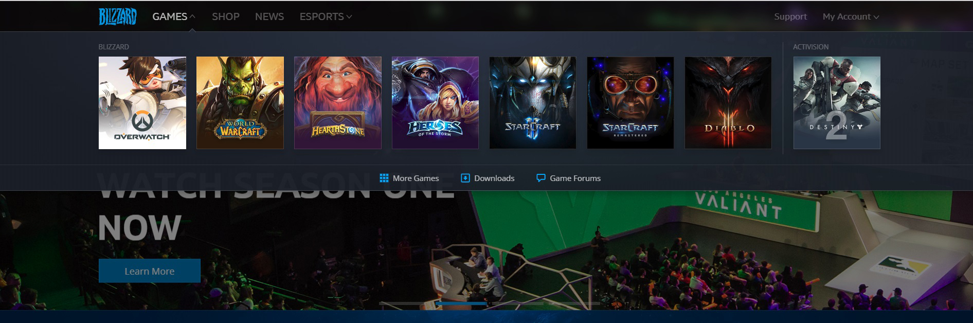 Fig.4 After clicking the game button on the navigation bar and this is the dropdown list.
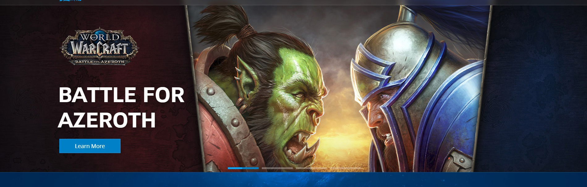
Fig.5 The biggest advertisement part for their games
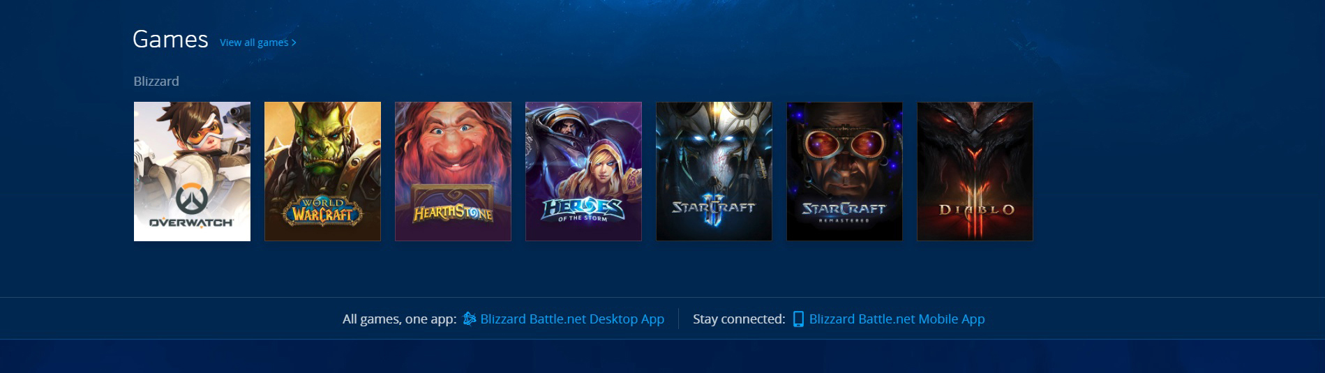
Fig.6 The game section for their games.
There are totally three parts of the website have the same contents, and same functions. Each learn more button, and the game cover will link the clicking user to the corresponding games’ homepages. The relationship here between the game posters, and buttons with their target websites correctly and easy to understand. Like the switches and lights, you know which switch relate to which lights. They follow a one-to-one principle, so if the users know what games they want, they will not get to the wrong place. And to list all of their games simply like this, this be considered as follow the rules of lock-ins as Norman mentioned (Norman, 143). They list all of the options therefore, user need time to check the options, this could help keeping user stay in this page, and they are actions are limited by those options. But, one thing confused me here is the different order to list their games in different place. Based on my knowledge to this company, I understand that they have their culture conventions to put the World of Warcraft at the most conspicuous place. When you open the page, you will find the World of Warcraft’s advertisement at the first time. But in the Game section, and the dropdown list, their products Overwatch come at the first of those games. Overwatch has done the most impressive achievement in recent years among their games, I guess this is the reason they put them first, but when I open the page, I see the Warcraft first, and understand the reason, then I find the order is changed, also reasonable, but kind of confused for me, I would prefer the same order, unless there have some other reasons for this arrangement.
Fig.7
And ignore the Top Stories part, this part is also similar to the game part, but when you open them, it is mainly the text document to introduce their games and game news. The last part, is the bottom career part and the footprint. This part is clear with limited labels and offer the clue of interaction.
What’s more, the whole website based on their company culture blue, and they show the strong information that this website is focus on their players, and their players should be teenagers to younger adults, because their art style contains the feeling of serious and heavy.
Generally speaking, this is a website hit the good design principles as Norman mentioned in his book. The designer of the website uses the game image to create the strong and easy understanding clue for their users for mapping their button to the target pages. The website gives the feedback quickly, that the users will not easy going to lose their focus. The art style follow their company culture, use their company color they used for serval years which is the most direct way to infect the users emotion, users could get the impression that this the company, Blizzard.
Reference
Norman, Donald A. The Design of Everyday Things. Basic Books, a Member of the Perseus Books Group, 2013