Introduction:
I want to explain my experience by using new launched IOS 11 human interface lock-screen part, analysis the subtle changes of this time, and some specific user-friendly design and suggestion of IOS 11 lock-screen. My interactive device is iPhone 7plus. This blog only represents my self’s point of view, please offer any suggestion and judge me when you think it’s not appropriate.
In What’s new in IOS 11, we could find out the basic changes. I will critique these items and some extra design beside it.
Goals for Lock-screen:
Depends on 7 stages of action as design aids, I first write down my behavior goals of using lock-screen.
- Allow users quick and intuitive view information (primary notification and recently notifications; time)
- Satisfy basic functions of widgets for users (central control; time control; light value and mode; screen lock; camera; flashlight; weather; news…)
- Keep privacy and safety (second step of use, flashlight)
- Emergency reflection (search; call)
Wireframe of Lock-screen Usage:
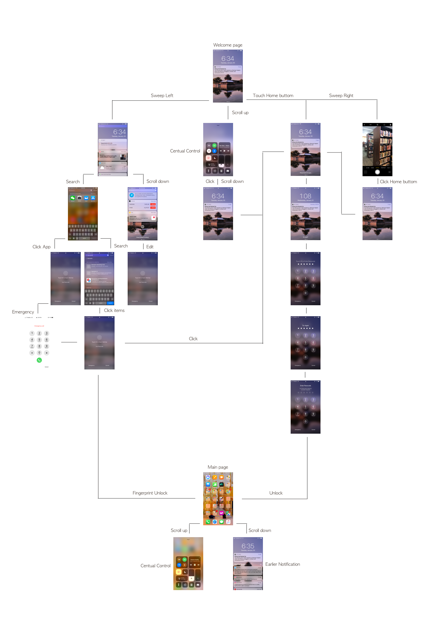
I draw a wireframe from the interaction of lock-screen.
From the wireframe, we could know the affordances of lock-screen. I will explain depends on these six parts of using lock-screen.
Welcome Part
When I first click the Home button, I could see the welcome page. This part satisfies my request for time information, priority notifications.
Great Design:![]() The signifier of setting icon which is the part I like shows where should I track if I choose not update immediately. This also gives users a knowledge of the world (external information) in a memorable way.
The signifier of setting icon which is the part I like shows where should I track if I choose not update immediately. This also gives users a knowledge of the world (external information) in a memorable way.
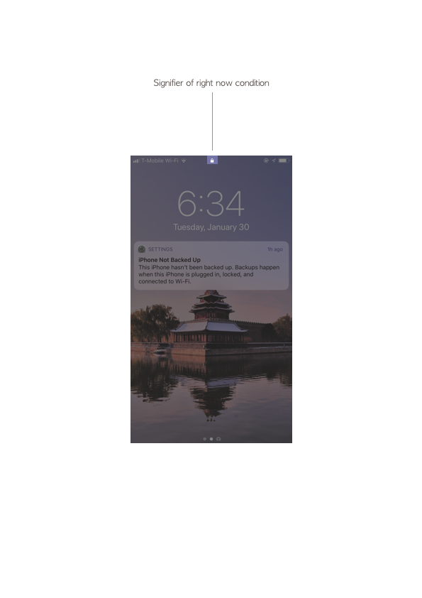
The little lock sign also could be a signifier for showing the current condition of this page.
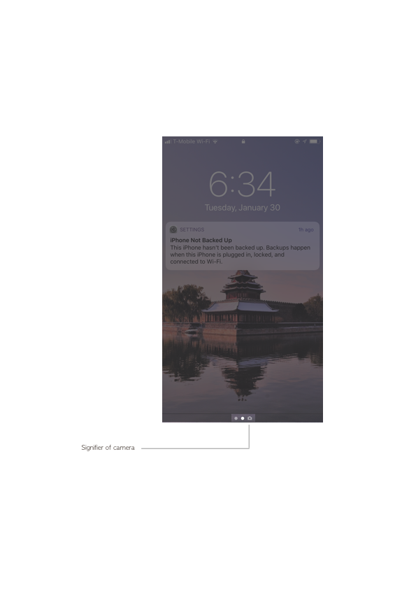
On the bottom of this page shows navigation points of lock-screen, lock-screen mainly has 3 pages, the color density of middle dot shows I am on the middle page. This part gives me a good conceptual model of where I am and what could I do. At the same time, the feedback of dot color changing and page changing would confirm my thought.
Suggestions:
The primary notification’s description seems too much for me, I probably will not read them.
At first, I did not notice I could use the camera in this way, I think the visibility of navigation part still could enhance, maybe use low-value dark color in the icon or subtle change the size or shape of camera symbol.
Notification & Info Part
If I sweep left, I will enter the notification and information part, which shows me the blocks of information I want to read: Calendar; News; Weather…
Great Design
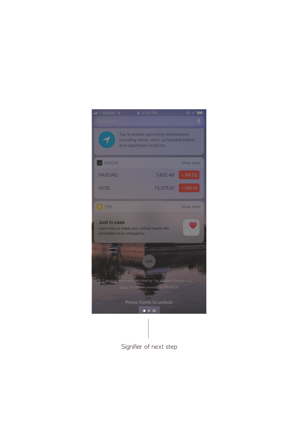
I notice the change from IOS10 to IOS11, in the bottom of this section it was no navigation dots which could cause an error of loss activation, users may do not understand how to back to welcome page. This changing give users more guidance.
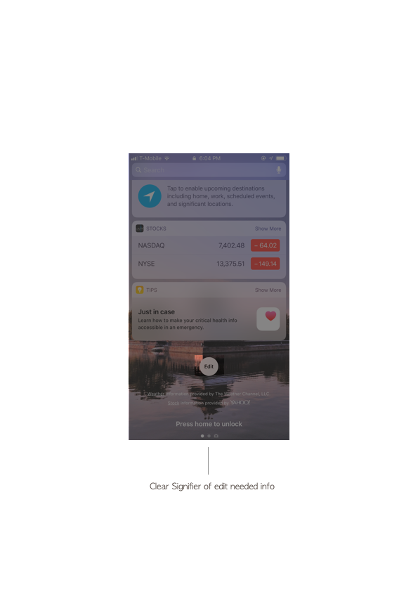
When I scroll down, I could see a button for edit information sections. I believe this corresponding to logical constraints that if I even do not see information from lock-screen, I will not necessarily change the information structure. So, this part of the design well to meet the needs of users, without causing additional confusion.
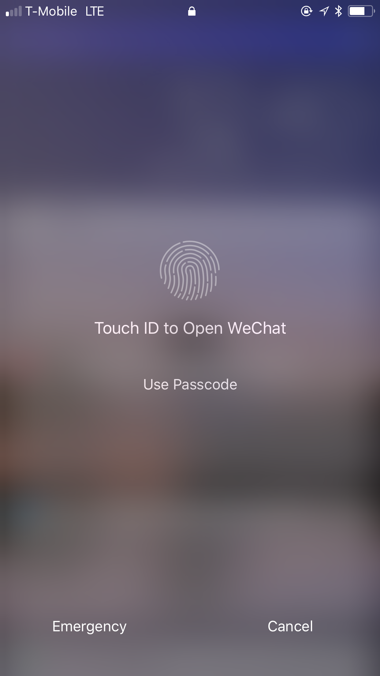
If I choose to search information, one constraint is I need to unlock the page to see. It satisfies the privacy of users. The instruction of use touch ID (use icon)or Password is very clear. Also, I like the emergency part, since, in urge time, users may not have time or capability to unlock screen.
Suggestion:
One confusion for me is if I could not get any answer by using search in lock-screen, why it has search section? For me, I suggest deleting this part.
Central Control Part
If I scroll up from welcome page, I will get into central control section, this part serves users some basic widgets like camera, flashlight, screen light value, sound value, music, wifi, modes…
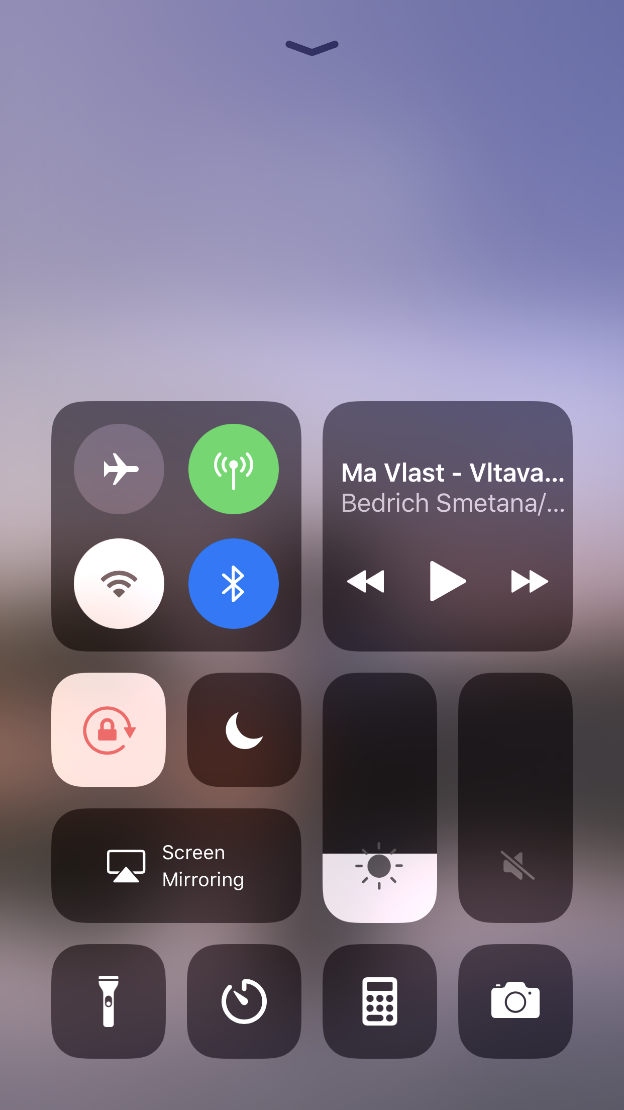
Good Design:
The change of central control from IOS6, now I think it’s very successful, especially for the light, sound value part, I remember when I first use changed type of central control, I could directly control it by scroll up and down, I think this is because a good conceptual model and good mapping.
At the same time, when I finish using this part, the up arrow is clearly telling me how to do, a good conceptual model and mapping again.
Suggestion:
The whole part is elegant and simple, easy to look. However, I think the “screen mirroring” is the section I merely use, If I could change the position of central control page like change app position in the main page, I will be glad to do that.
Camera
Sweep right, enter the camera page.
As I just said, the icon of the camera is not very clear, someone may open camera in lock-screen from central control part, I would say this is a good plan to reverse the errors and make it easy to correct.
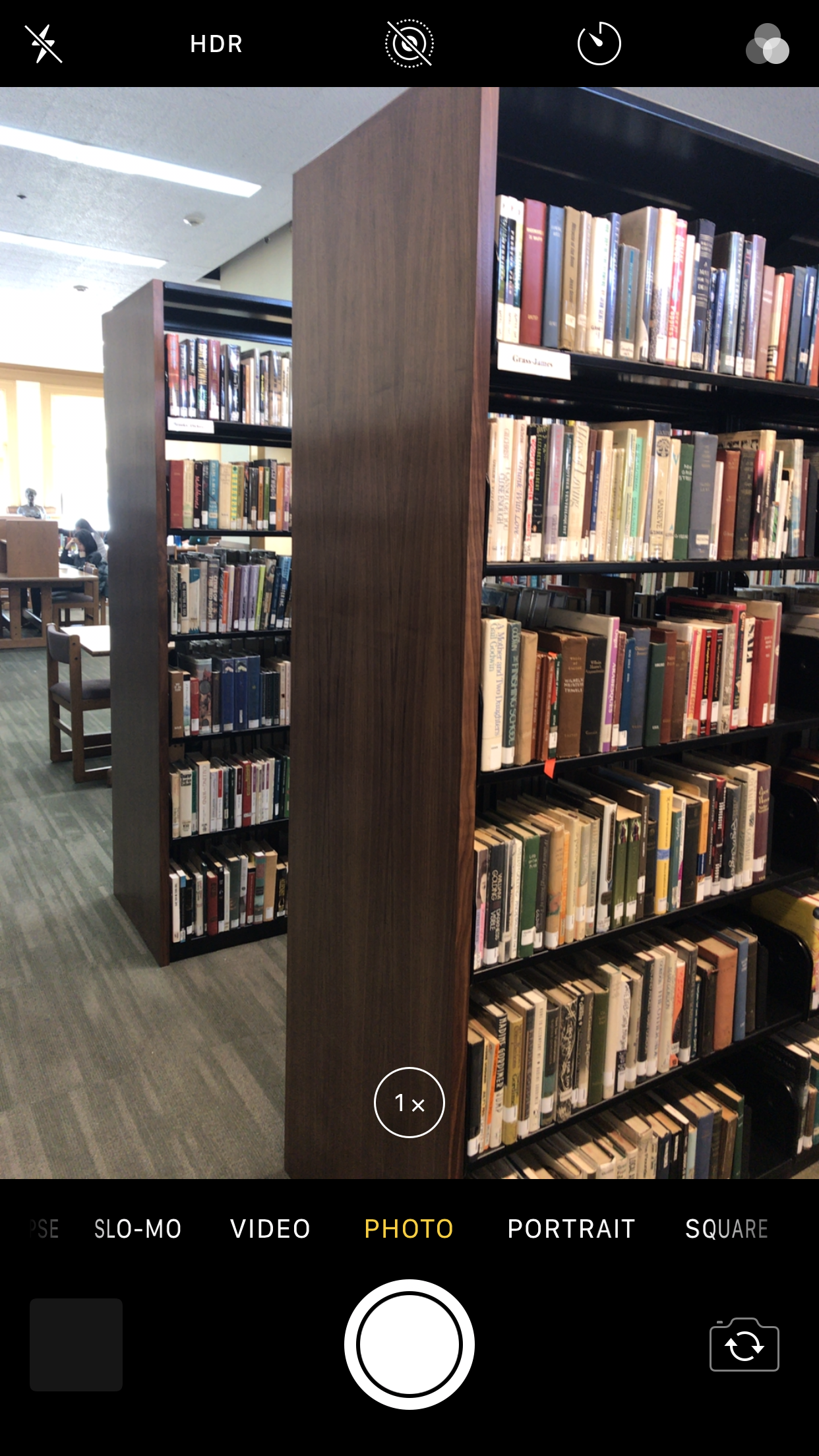
Suggestion:
I think the camera part needs to consider again. normally, the designer could cultivate users to use this function, but there is a huge flaw is users do not know how to come back to welcome page. Naturally, I will choose scroll left to come back(since when I in notification & info page, I scroll right to come back, that could be knowledge of my head which taught by used IOS), but I fail, in this way, changed the choice of camera types. I think on the left downside of camera page, should set a button for coming back.
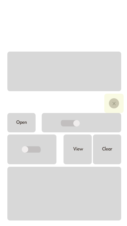
Earlier Notification
If unlock the screen, enter the main screen, then scroll down, users could see the earlier notification page. Sweep left shows two options: View and clear, people could clear single notification by scroll left. Scroll right means open the information page.
Great Design:
I create a prototype of earlier notification page, in the front part is primary notification which also shows in welcome part. Then, we could see a gap separate primary notification to earlier notification part, using the little delete icon, users could delete information by time(specific day). I think the feedback of vibrate of iPhone is obvious.
Suggestions:
The “View” and “Open” option seems same, users may confuse about why shows two options when sweep left. My suggestion is get rid of “View”, constrain people from errors.
Summary:
Overall, IOS11 is user-friendly and concise. However, for gesture constrain and give people conceptual model in camera and notification part, still have much space to improve. Maybe create more naturally gesture ways, give feedback like: try…. encourage user use external knowledge.