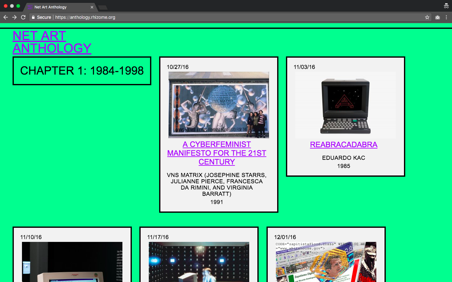
Figure (a). General screenshot
Introduction
Rhizome, the New Museum-affiliated born-digital art organization behind Net Art Anthology, describes this dedicated microsite as a “two-year online exhibition presenting 100 works of restored and re-performed net art” [1]. Since its launch in October 2016, Net Art Anthology aims to restage and contextualize one project each week by uploading original or emulation-based artwork, essays, and primary source documents to the site.
Net Art 101
Net art, a portmanteau for internet art, is used to describe artwork made in the 1990s through the early 2000s that uses browsers, scripts, search engines, and various online tools as primary media. Not only does the Anthology offer a potential canon for net art, it also is an impressive display of digital preservation best practices through a powerful combination of browser-based emulations and web-archiving tools. Despite the use innovative archival technology, the site design creates a raw user experience that eschews many of Don Norman’s fundamental principles of interaction [2]. Rather than bridging the gulf of execution to engage with net art in-situ, users may be left treading the opaque waters of seemingly endless scrolling. This critique focuses primarily on design attributes of the long-form landing page, since it is the first thing most visitors will see when they arrive to the exhibition site.
Global Navigation
In its present state, the only global navigation elements on the landing page are a link with a transparent background to reload the page and the browser’s vertical scrollbar. The former has to continuously fight for the spotlight with other content, often either overlapping text (Figure b) or hiding behind artwork containers (Figure c).

Figure (b). Link to reload “Net Art Anthology” overlapping text.

Figure (c). Link to reload “Net Art Anthology” hiding behind artwork.
Discoverability could be easily improved by adding affordances and signifiers for navigation, such as a permanently visible header with a solid background and prominently labeled buttons linking to the distinct chapters in the exhibition chronology or including obvious breadcrumbs at the top of every artwork page. Even including the hotly-contested hamburger menu-icon [3] would provide users with hints of a basic navigation structure.
Recommendation: Add a permanently visible header and prominent links for aiding global navigation.
Continuous Layout
Net Art Anthology uses a long-form structure for its landing page. If it weren’t for the browser’s vertical scrollbar, it would be impossible for users to anticipate the effort required to reach the bottom of the page. Replacing the continuous layout with pagination or chapters or filtering, would alleviate the psychological consequences of endless scrolling, like exhaustion or frustration, for task-driven users looking for specific information quickly. Just as eliminating consumer choices can greatly reduce anxiety for shoppers [4], content on smaller pages may be less overwhelming for users to evaluate because there are fewer options [5]. Coupled with naturally mapping artworks and chapters chronologically (Figure d), users would have a clearer understanding of the what the information possibilities for search.
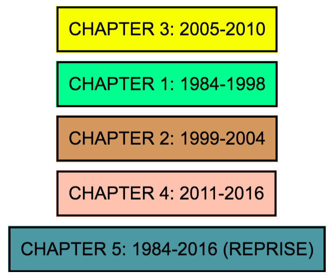
Figure (d). Screenshots illustrating the current order of chapters. Natural mapping by chapter number (i.e. 1, 2, 3, 4, 5) would be one solution to improve the layout.
Recommendation: Add filtering or pagination and order content chronologically to combat information overload.
Color Palette
While not the most traditionally user-friendly, the constantly changing background color is quite delightful at the visceral level. Based solely on observation, it appears that each artwork container link triggers a unique color transition when users hover over the element. At the behavioral level, this ever-changing color attribute creates may give rise to feelings of annoyance or confusion in visitors. By leveraging a consistent a color palette throughout the experience that is informative rather than merely cacophonous (e.g. assigning the same background color to artworks featured in the same chapter), users would be provided with positive reassurance, thus encouraging a positive affective response.
Recommendation: Make feedback clear, consistent, and informative for positive reassurance.
Final Thoughts
Perhaps the unforgiving style of Net Art Anthology is an intentional nod to Web 1.0 hand-coded HTML. It may also reflect the rising popularity of “web brutalism,” a design trend that derives its philosophy from its mid 20th century architectural movement namesake, eschewing artificiality and lightness in favor of modular, raw, and unpolished aesthetics [6]. However, the author is confident that many, if not all, of the aforementioned recommendations could be implemented while still maintaining a brutalist or web-nostalgic style.
References
- Connor, M. (2016, October 27). Net art anthology launches today. Rhizome. Retrieved from https://rhizome.org/editorial/2016/oct/27/net-art-anthology-microsite-launches/
- Norman, D. (2013). The design of everyday things: Revised and expanded edition. New York, NY: Basic Books.
- Bawcombe, L. (2014, August 27). The hamburger menu-icon debate. The Atlantic. Retrieved from https://www.theatlantic.com/product/archive/2014/08/the-hamburger-menu-debate/379145/
- Schwartz, B. (2004). The paradox of choice: Why more is less. New York, NY: Harper Perennial.
- Loranger, H. (2014, February 2). Infinite scrolling is not for every website. Nielsen Norman Group. Retrieved from https://www.nngroup.com/articles/infinite-scrolling/
- Meyer, K. (2017, November 5). Brutalism and anti-design. Nielsen Norman Group. Retrieved from https://www.nngroup.com/articles/brutalism-antidesign/