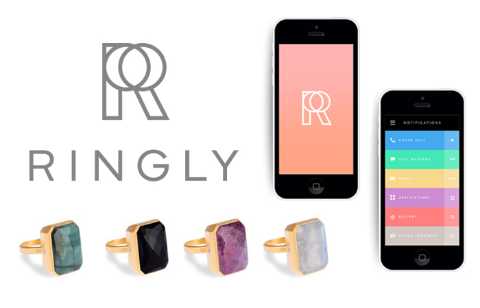
Ringly is a smart ring created with the purpose of helping women lead a healthier and more balanced lifestyle, combining innovative technology with well crafted jewelry. The device consists on a ring with a sensor that is paired with the Ringly app on the user’s phone, allowing the notification of mobile alerts without the need to look at the phone as well as tracking the user’s physical activity throughout the day.
DESIGN + SYSTEM
Ringly was designed as a stylish ring, where beauty meets technology, by combining a piece of jewelry with a light and vibration system, as well as a sensor that exchanges and receives information to and from the Ringly App. The device allows the user to stay connected with mobile alerts without having to resort to the phone itself, by flashing a light installed on the side of the ring as well as vibrating every time there is an action on the phone (such as a phone call, text messages, emails and social media notifications). That is made possible by Bluetooth technology that syncs the ring with an app that allows the user to customize the notifications received, as well as offers a customized section on the app for the user to record physical data (such as weight and height) and set a specific fitness goal by tracking daily steps.
According to Norman’s principle of Discoverability, both the device and the app follow through with the design by being simple, straight forward and clear on what it can do as well as being easy for the user to figure out how everything operates (e.g. through a “help session” with step to step guidance on the app).
These allow for a positive user experience when it comes to psychological and emotional responses, such as the anxiety to leave the phone away and miss important phone calls and emails, and the possibility to stay discreetly connected in places where phones are not allowed. This peace of mind is possible by allowing the user to stay focused on the environment and only checking the phone when it’s urgent (there is a customized setting experience for the user to choose what notifications should be displayed on the ring).
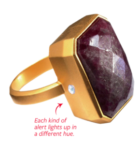
The designs also offer good mapping by linking what the user wants to do, with what it is perceived as possible, for example, by linking which color flashes on the ring with the colors available on the app, arranging the controls on the app to properly control the ring. Also, the outcomes are predictable and are not deceiving to the user, by clearly suggesting what the object does and doesn’t do, based on some of the constrains attached to it.
The first couple of constraints are physical and digital, since the user can only choose from 5 available colors, minimizing the options of the number of notifications with one specific color, as well as the necessity to keep the phone in a certain range not to lose the Bluetooth connectivity. Another constrain that can directly affect the user’s psychological is the fact that, even though there are customized settings, the user can connect a light color with an alert, but it doesn’t tells who is that alert from, which can play against the peace of mind state, by generating anxiety due to the fact that the user knows there is an incoming action but doesn’t know who is it from or can’t look at the phone depending on the environment.

GOALS AND SUCCESS
One of the goals is to give a solution through a root cause analysis, in this case, the fact that technology doesn’t blend seamlessly, not being elegant nor discreet, becoming wearable on a daily basis (by being tech without looking tech, like Norman said on one of his TED talks, the engineering is simply not enough, there is the necessity of good design also).
Before design could only be considered for usability, but now it needs to be attractive, efficient and durable (in the case of Ringly, it has a long battery life and it is also water resistant, while maintaining a modern design). Ringly is responsible for innovational design by enhancing already existent products, but introducing a new category in the market place (by adding only a small piece on the device that flashes colors and it’s visible).
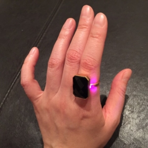
Ringly is also very successful when it comes to feedback and visibility, achieving good conceptual model. It allows the crucial parts of the ring to be visible, making it easier for the user to determine possible actions, which allows for natural mappings (between the information that is visible and the interpretation of the system). The feedback is also instant and delayed. The instant is the vibration and color flashing on the ring, so the user knows that it is working properly, knowing what happened. The delayed feedback is to check the physical activity progress, the user need to open the app and use the phone.
This delayed feedback can result as a subgoal, as Norman brings to attention when he explains the 7 Stages of Action, where there is a main goal (in this case achieve the daily steps) and to reach that goal the user starts planning the necessary actions on how to be more active (by exercising, for example) to achieve that one main goal. Ringly allows the user to execute and evaluate the results by being always connected.
Lastly, Ringly bridges the Gulfs of Execution and Evaluation by being user centered, where the system have actions that match the user’s intent, but it doesn’t take away the control of the user. The user chooses where and when to use it, the user chooses to personalize the colors and the notifications they are attached to and let’s the user set their own personal goal. Overall Ringly designs on both the app and the device are successful for being able to handle a lot of information and control it with more ease.