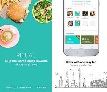
Ritual is a restaurant ordering app that allows the busy professional to be more efficient with their lunch break by allowing them to skip the line and order ahead. They can order their meal before they leave the office, pay for it, get updates, get directions, and skip the line all on one app.
Ritual – Main Page
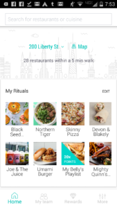
After selecting and loading the app, the main page offers discoverability through restaurant logos, icons, and search bars. As defined by Don Norman, in his book The Design of Everyday Things, discoverability is successful when people are able to figure out the possibilities at a glance and is supported by the app’s signifiers. These images and icons provide clues to correctly operate the app. Here the images representing the restaurants signify that you can find their menus, the ‘search’ bar signifies to users that they can search for their favorite food and the menu at the bottom has icons highlighting that you can find information on the home page, your team, points and more. However, these signifiers have poor mapping qualities, they do not necessarily lead users to where they want to go or think they are going. But this will be discussed further, down below.
Ritual – Favorited Meals and Restaurant Menus
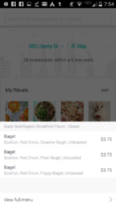
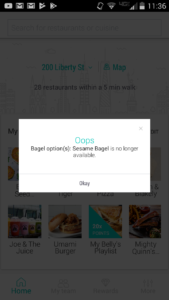
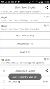
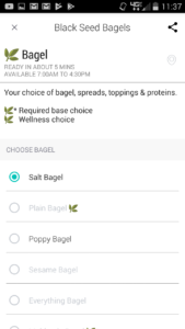
After the user decides on a meal, they probably would assume that the restaurant image on the home page will lead them directly to the menu. But – if they have used the app before – the image will take them to a list of favorites. However, this is only determined by whether this item was ordered in the past and not by frequency or preference. If this mapping had good design, the first figure in this section would be deleted and the user would only be sent to the third image – the main menu. In other words, the third image in this section is of the favorited food items and the menu combined. Ritual only needs this section. Similarly, this app does employ constraints when items are sold out. In the first image – when the user wishes to reorder a meal – there is no signifer for the availability. Instead this feedback is only obvious after the item is selected. In place of disappointing the user via a error message, Don Norman suggests that this is not the person’s fault it’s the design’s so we should “eliminate all error messages from electronic or computer systems. Instead, provide help and guidance.” This could be done by suggesting another bagel type as an alternative to saying its just not available. This supports his idea because it allows the user to continue their task instead of making them start back at square one. In summary, the creators of the Ritual app need to reduce error and frustration by clearly mapping their icons and decreasing negative feedback by replacing them with suggestions.
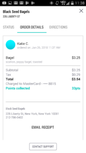
Ritual – Check-out and Pick-up Options
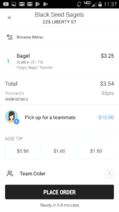
One of the most striking negative features of Ritual is the inability to cancel your order. It is possible to accidentally select the wrong bagel type, or order too many bagels or change your mind. Maybe they have an allergy to a certain ingredient and only realize they ordered it after the fact. However, a system is not in place to cancel or undo a mistake which makes the error worse. But this is still not the user’s fault but the design’s. What Don Norman suggests is to have the option to “undo – Obviously, undoing is not always possible. Sometimes, it is only effective if done immediately after the action. Still, it is a powerful tool to minimize the impact of error.” Even though there is a required confirmation to execute the order it could still be a mistake. Maybe including a grace period of a minute or two – that the user agrees to while signing up for the app – to give each order a safety net. After that one to two-minute window where the user can cancel the order, only then will the order reach the restaurant making it easier to cancel for the user and avoiding any cancelation issues on the restaurant side of things that might make this not possible.
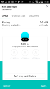
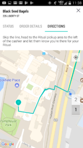
Ritual – Progress, Summary & Directions
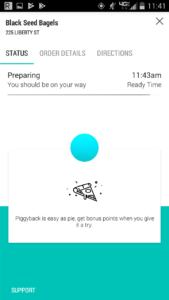
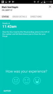
The feedback system Ritual utilizes is helpful to the user because it tells the user that their order has been received, it is being prepared and when it should be done. However, to know all these things your phone needs to be in your hand. Most of the time your phone is in your pocket while walking to the restaurant on the busy streets on New York. The user might not know their order is ready so they might dilly dally. Sound could be helpful here because the user’s phone could ring or buzz when their order is done. To Don Norman, “sound can tell us that things are working properly or that they need maintenance or repair.” In this case, sound can be the feedback to let the user know their order is ready even before they get to the restaurant.
Conclusion
Overall, Ritual’s interface allows busy professionals to make the most out of their lunch break. It supplies them with options in their area, order ahead and skip the line. It even gives the user access to the progress of the meal, a receipt, and directions to the restaurant. However, this does not mean the app is perfect and easy to use. But, as Don Norman states, this is not our fault it’s the design’s fault. If the mapping better reflects what the user assumes it will do and the feedback is more defined and supportive of the user experience, then Ritual can increase its reach and help fill more empty stomachs.
Works Cited:
- https://www.apkmonk.com/app/co.ritual.app/
- Norman, Donald A. The design of everyday things. New York: Basic Books, a member of the Perseus Books Group, 2013.