Spotify is a music, podcast, and video streaming service that was officially launched on 7 October 2008. Its basic features are free with advertisements or limitations, while additional features, such as music downloads, are offered via paid subscriptions. Spotify is available in most of Europe, most of the Americas, Australia, New Zealand, and parts of Asia. It is available for most modern devices, including Windows, macOS, as well as iOS, Windows Phone and Android smartphones and tablets.
#1 Removing a song from a playlist vs removing a song from your library
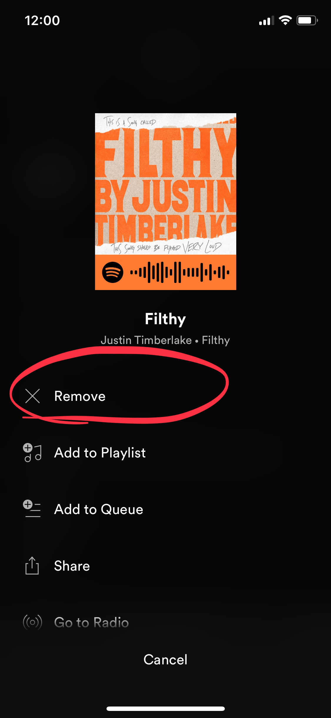
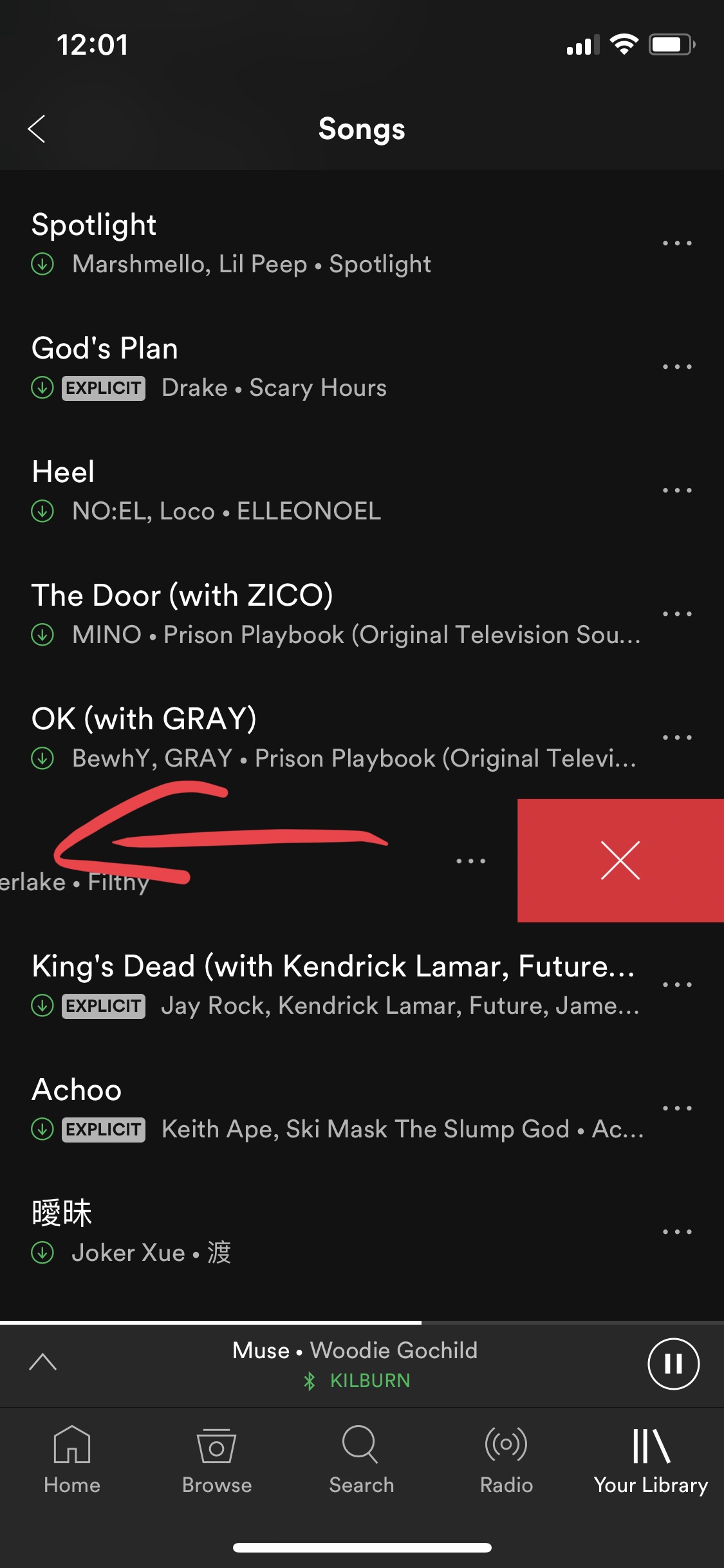
For user’s “library”, removing a song is a task that is very easy to complete. There are two ways. One is to click the “…” button and choose remove; the other is to simply swipe the bar to the left.
Way 1: Shortcut:
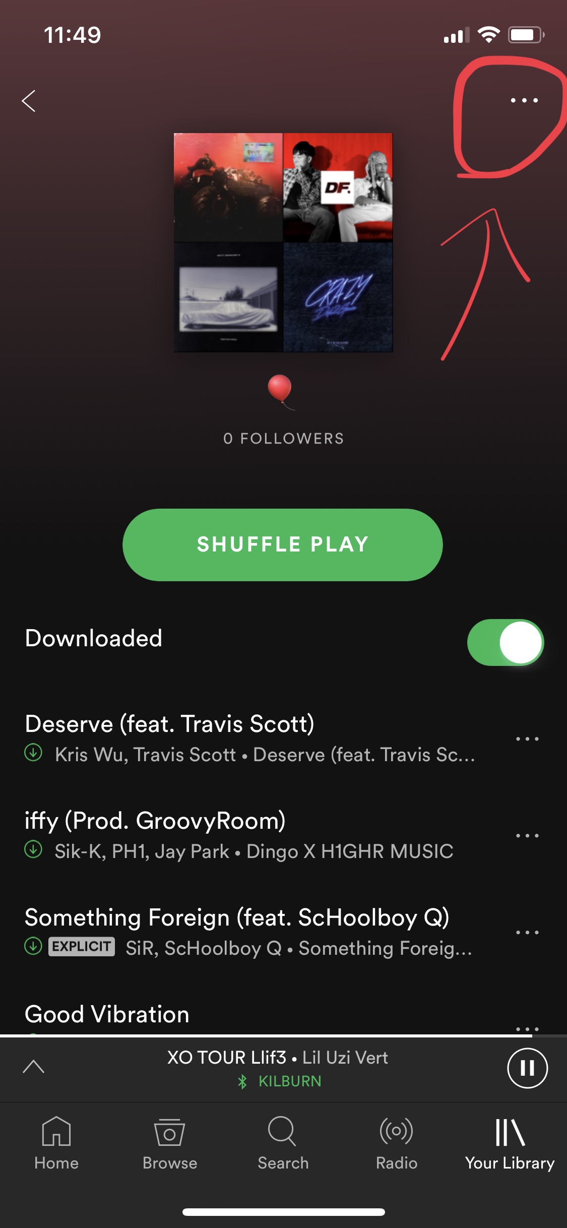
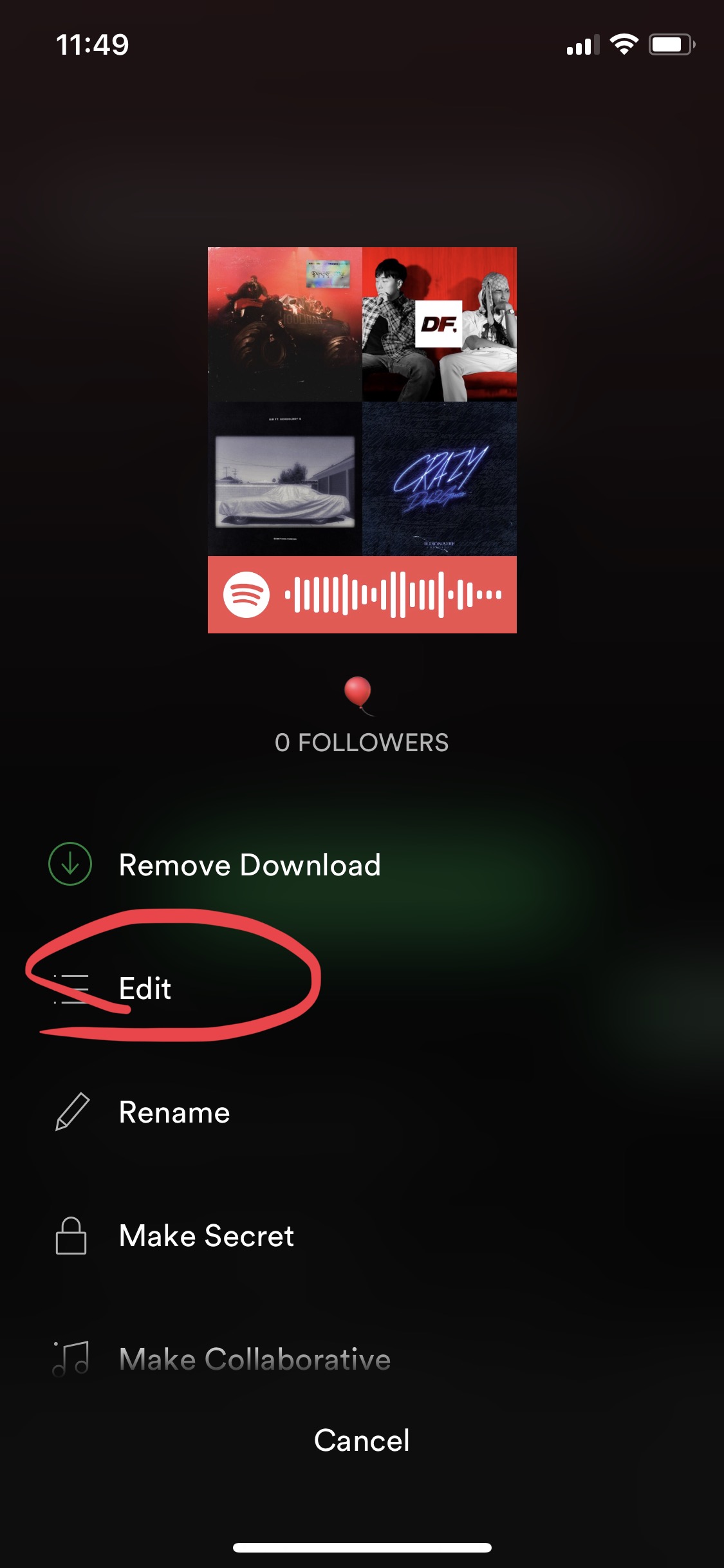
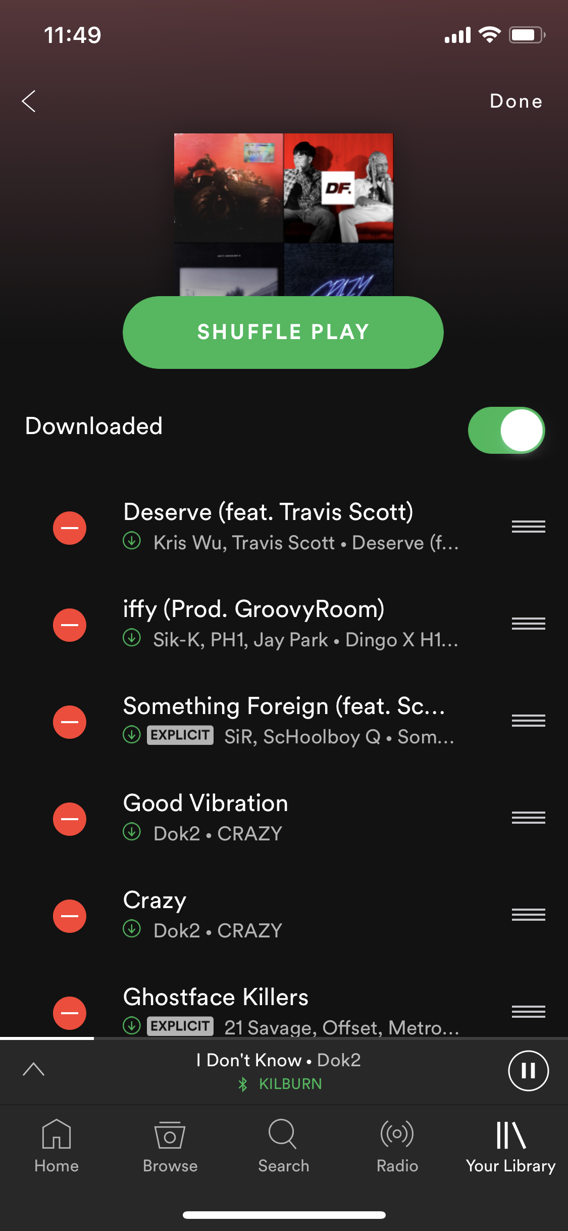
For user’s personal playlist, there’s only one way to remove a song, which is a rather protracted and is nothing like how you remove a song from the library. It’s a 3-step procedure. Users would have to go to the top right signifier, then find the “edit” button, and finally be able to remove one song.
If users try to apply the same routine they’ve done with the library in their playlist, they would be disappointed. If one clicks the “…” button, they would not find the “remove” signifier.
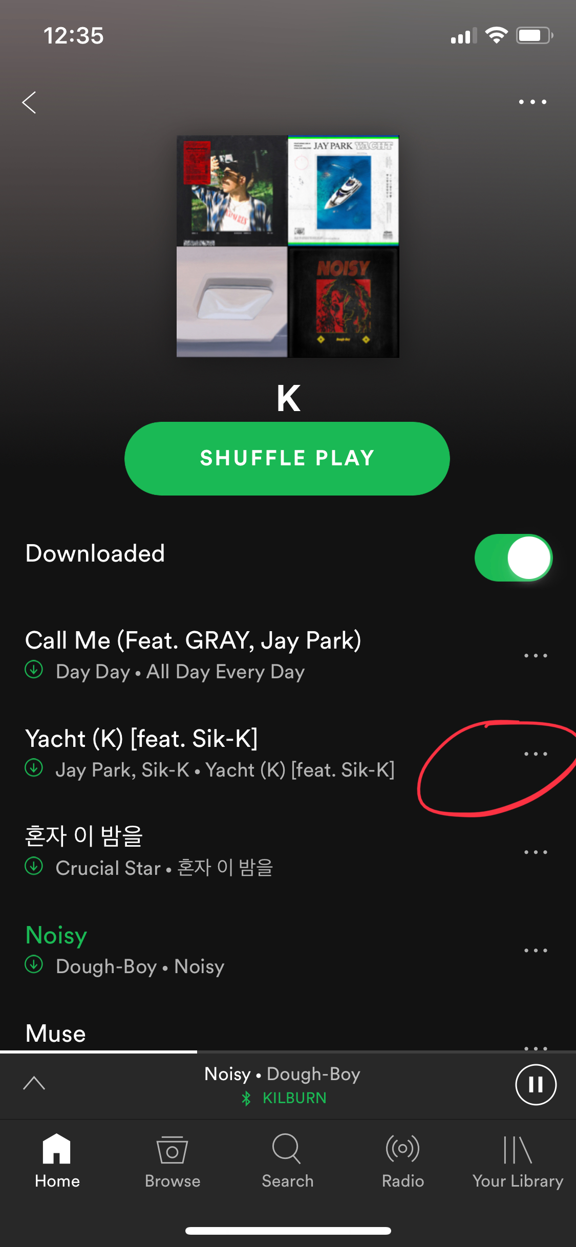

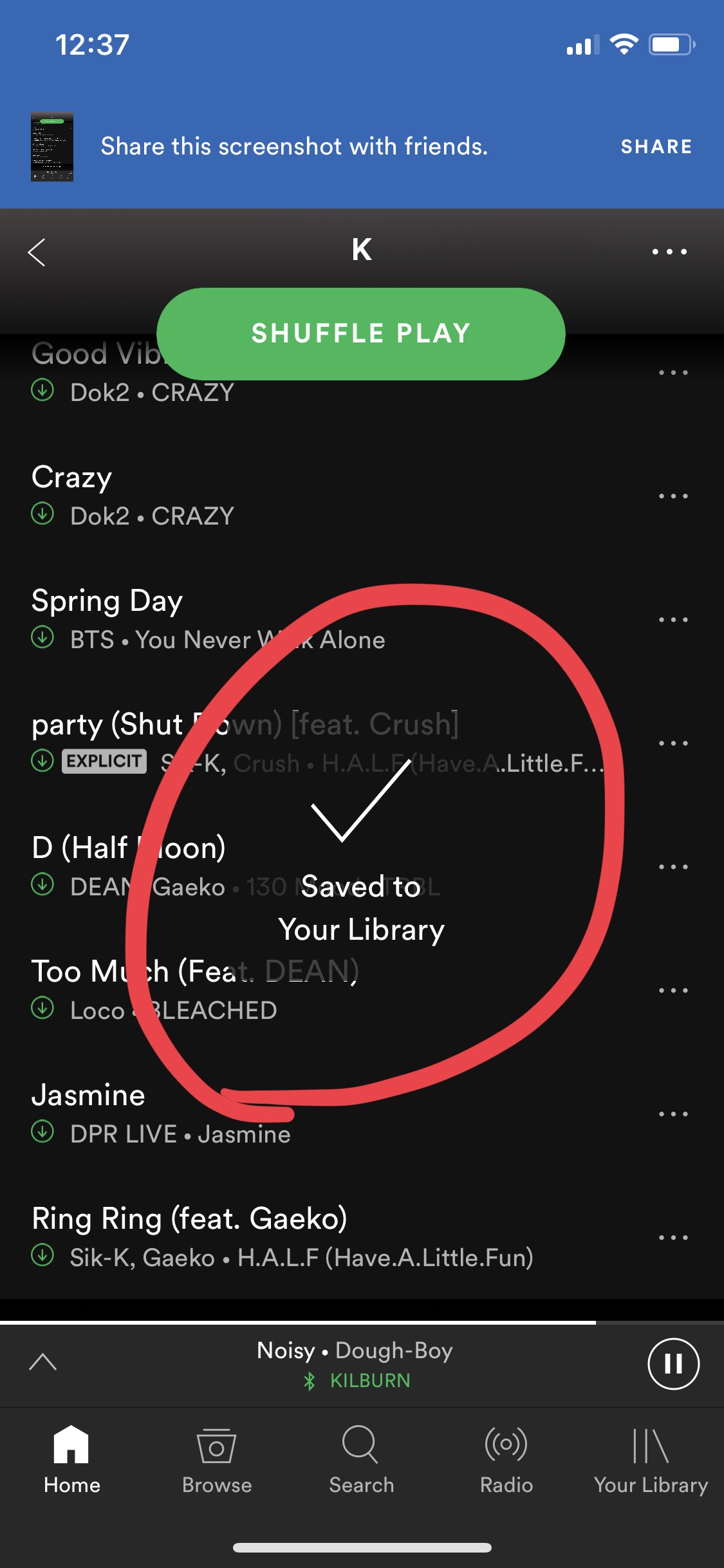
If one tries to swipe left, there would be two scenarios. If the chosen song is already in the library, the red remove button would show up, but the song would not be deleted in the playlist as one would expect, instead, the song would be removed from the library. On the other hand, if the song is not in the library, the “swiping left” action would only add the song to the library. Either way, the results from the actions have no effect to the playlist, where the actions are taken.
If the song is in library:

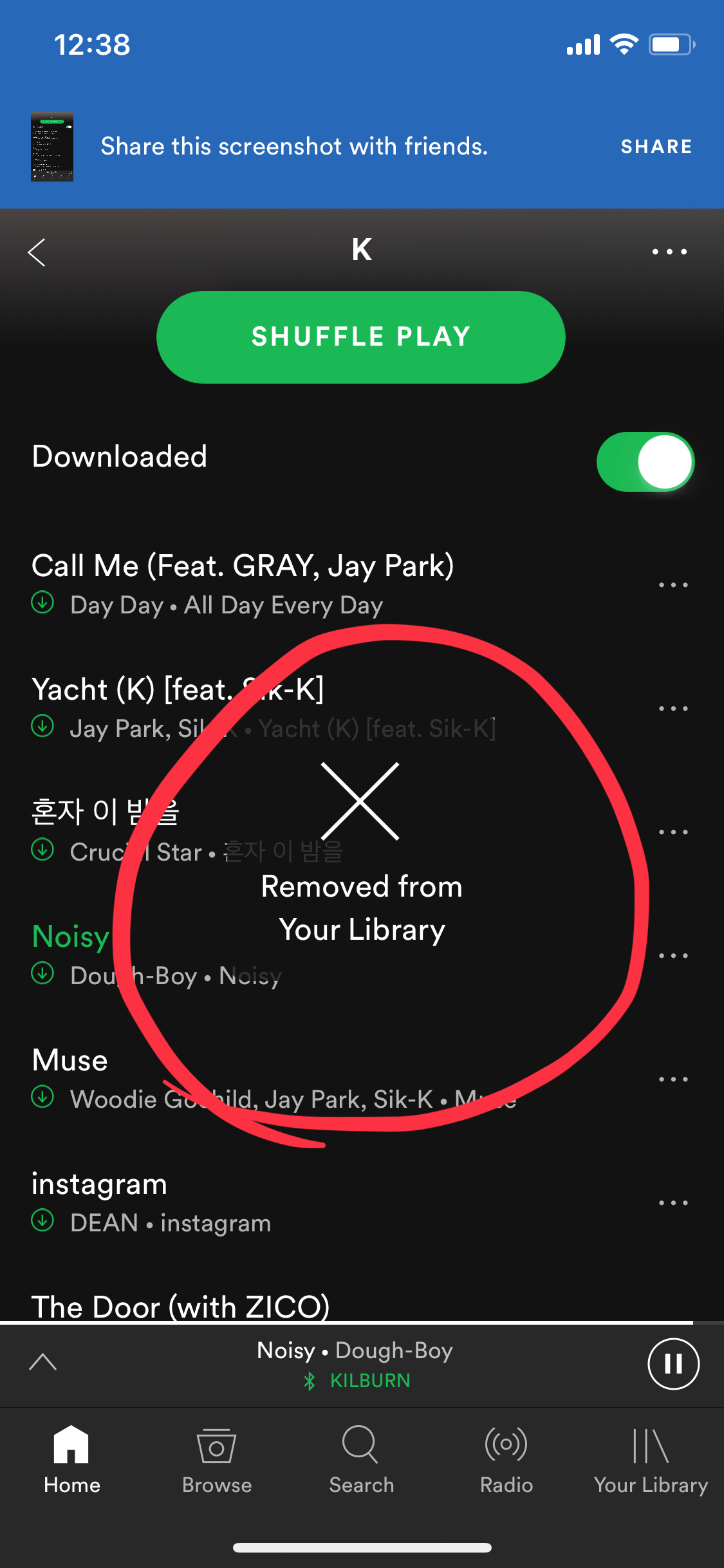
If the song is not in library:

The fact that different mappings are designed to remove a song within the same application is very confusing to me. As Norman has mentioned in the book that “consistency in design is virtuous” and that “mixed systems are confusing to everyone”. Though when the merits of change outweigh the difficulty of change, designers should try different things, but in this case, I’ve seen no need to apply these different mappings to remove a song.
My suggestion would be apply the same shortcut mapping in the playlist. When user swipe left, it would mean removing the song from the playlist, instead of the library. And also add the “remove” alternative to the “…”menu, same as the design of the library section.

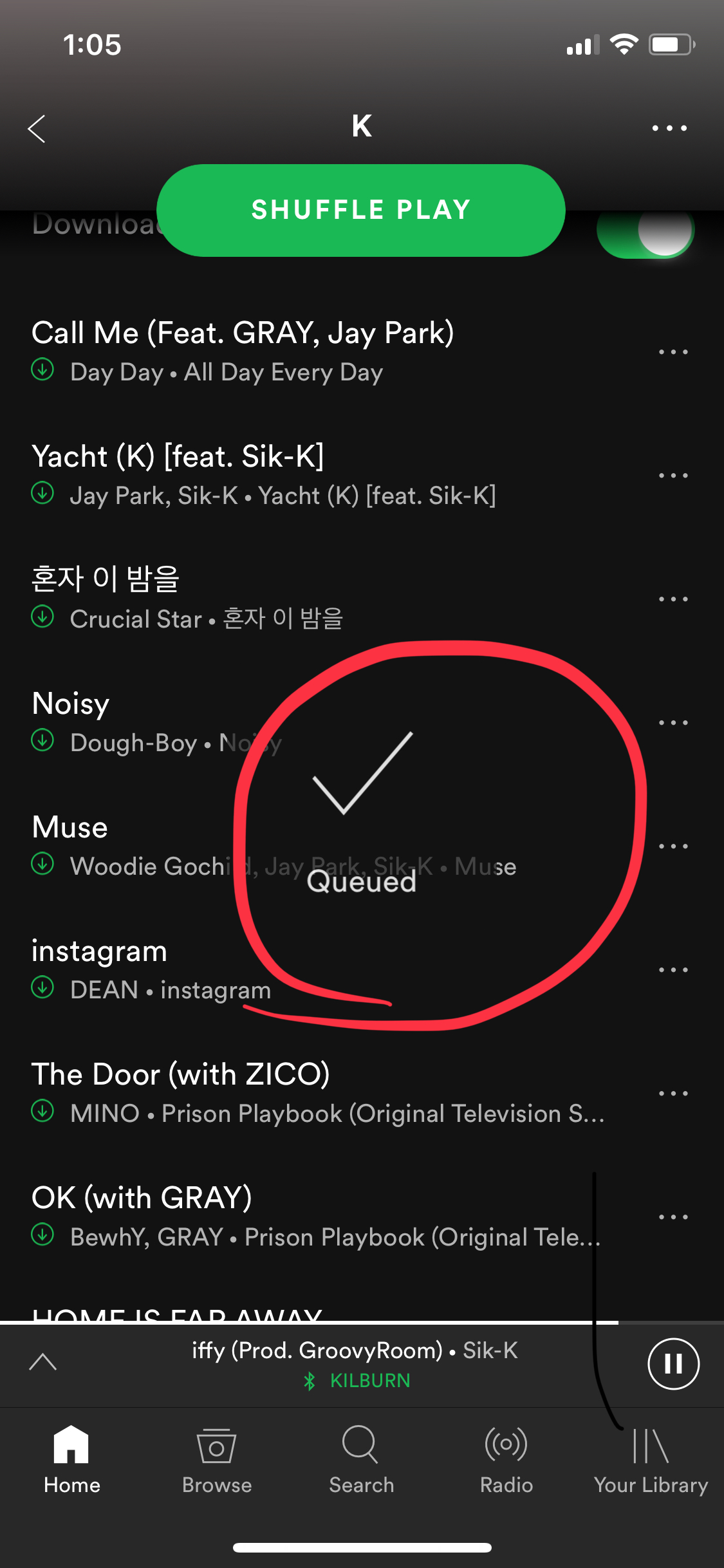
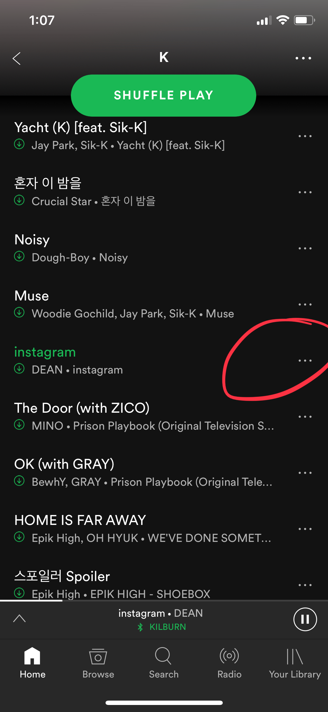
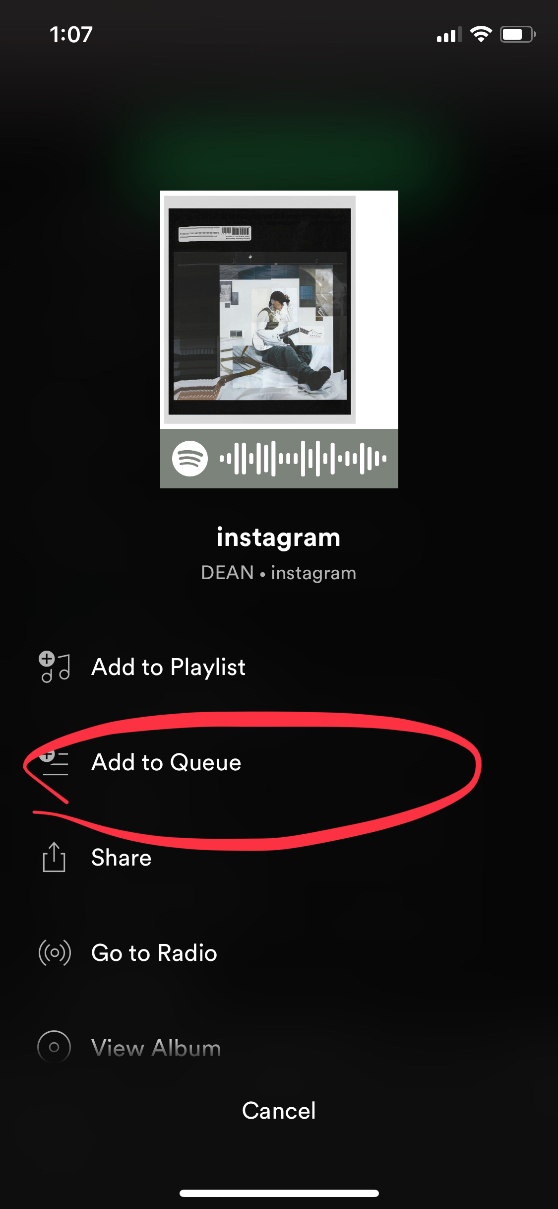
#2 Adding to queue
There’s one affordance that I really like about Spotify is the shortcut to add a song to queue. It’s so easy, one just needs to swipe right and then it’s queued!! The only problem with it is its discoverability. I accidentally found out about this feature about two weeks ago, I didn’t know if they had just improved it or it’d been existed for a while. I think it needs a better signifier or just a reminder when a users first updates to the new version of the application. For example, when a user first enters his/her playlist, and tries to add a song to queue in the “old-fashioned way”, there could be a notice popping up in the middle of the screen, reading “Try to swipe right next time when you want to Queue a song!”
Short Cut :

Old fashioned Way:
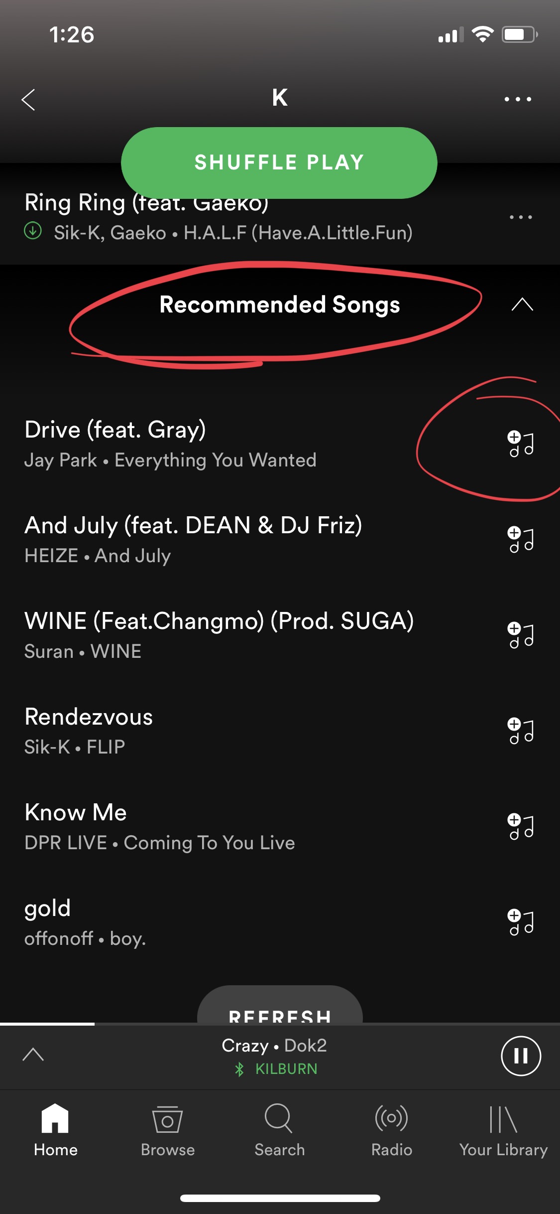
#3 Recommended songs for playlist
The “recommended songs” is also a great feature on Spotify app that I really appreciate. First of all, the affordance itself, which is to recommend similar songs in user’s playlist is very human-centered. And not only the goal of this feature has lived up to user’s need, the execution is apparently successful. 80% of the songs Spotify has recommended ended up in my playlist. The “recommended songs” section is at the bottom of the playlist with bolded letter. I think it’s avery clear signifier and is easy for users to build a conceptual model.
Besides, on the right end of each song, its a graphic signifier of a music note as well as a plus sign, which I think it’s also a very successful signifier. Users could also easily understand what they could do (adding the song to this playlist), and how they could do it (by clicking the icon). Again, the affordance itself is very human-centered. Personally, this feature is exactly what I need, I want to listen to songs of same genre without finding them myself, and I want to add the ones l like to my playlist with the least effort. I believe the develop team must have done the design research very well and probably used the interactive design method, and thus have this very humane feature on their app.