
What is Texture, and Who Is It For?
Texture is a subscription-based mobile reading app that gives its users unlimited access to a broad range of select magazine titles. It provides useful features such as offline reading, the ability to save magazine articles for later reading, and “subscription” to favorite publications. For mobile readers, Texture is space and cost effective in comparison to maintaining subscriptions to multiple physical copies of numerous magazines.
Texture is available for mobile phone as well as tablets, but for the purposes of this critique, I will focus on its interface as seen on popular e-reader style digital tablets. Also omitted is the reading mode, as many magazines pre-format their e-publications differently, resulting in varied displays of content.
Texture’s System Image and Aids to User Mapping
The default landing upon opening Texture is the Highlights screen. The Highlights screen shares the same top bar for wayfinding and a bottom navigation bar with the three other screens outside of the reading mode — My Library, Categories, and Settings. The user’s location in the application is indicated in the top bar heading, as well as by the cyan color used to signify interactive elements within the content (Fig. 1).
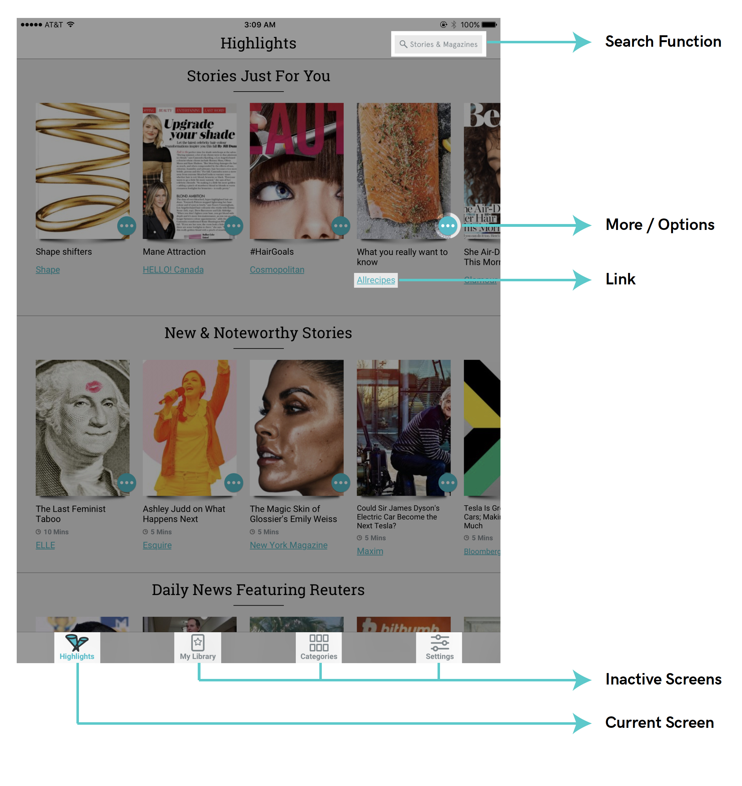
Browsing magazines is more activity than task, but the search function present in the top navigation throughout the application affords the user a path to seeking more specific information, or further information inspired by previous browsing. The shift between browsing and searching can be made easily and without interruption. Once selected, the feedback of a blinking cursor is immediate and straightforward. Although the search is a particularly useful feature, it is camouflaged in the same grey as the rest of the top navigation. Its visibility could be improved by highlighting the magnifying glass icon in the same cyan accent as many other features are cast.
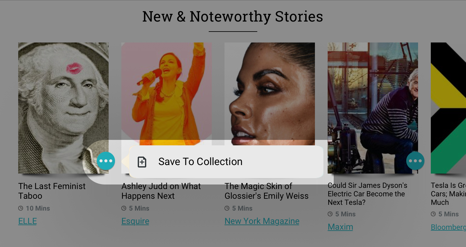
The More / Options icon follows the current navigation convention of the ellipsis to indicate further options. When selected, it displays possible action(s) in relationship to the thumbnail with which it corresponds (Figs. 2, 3). The natural mapping through proximity is intuitively understood. The use of the ellipsis icon (much like the use of the hamburger icon) is effective with many users, but could benefit from a text-based label to make sense to all users.
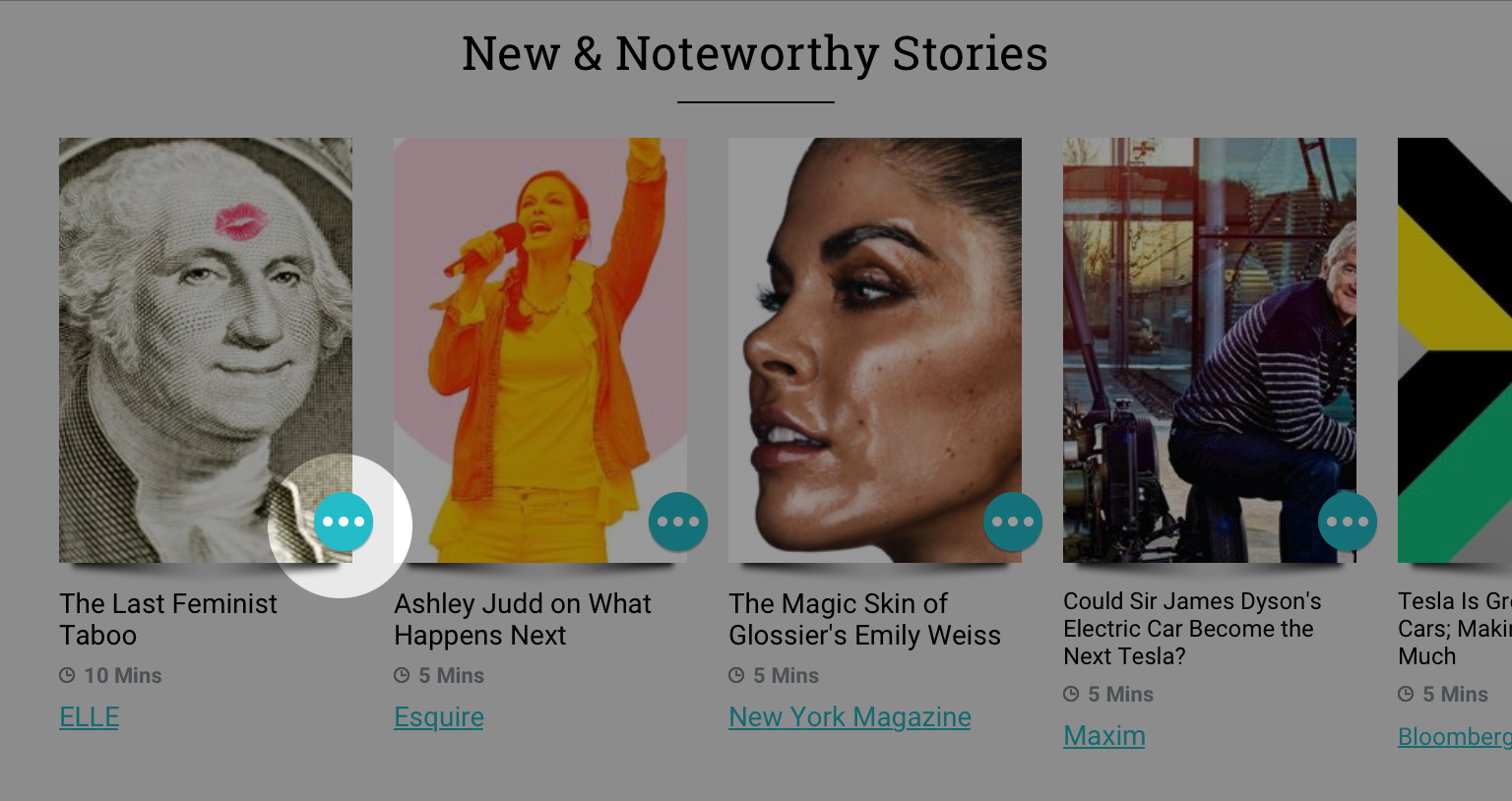
Further articles within categories such as New & Noteworthy Stories can be browsed by scrolling horizontally within the category. The use of horizontal scrolling is repeated elsewhere in Texture, most notably in the Categories screen. Horizontal scrolling solves one problem — the problem of screen space limitations — but in Texture, it also poses another. Texture’s implementation of the horizontal scrolling function is not apparently discoverable. The user can infer that scrolling horizontally is possible by noting the only partial display of some of the article thumbnails, however, this possible action should be more clearly indicated with an arrow or other symbol (Fig. 4).
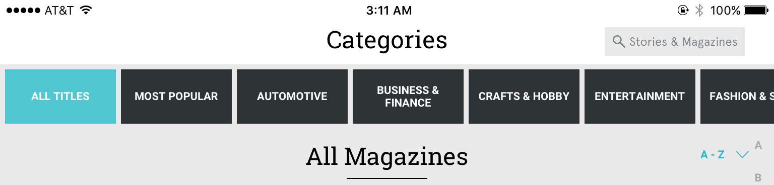
Also visible in Figure 4 as well as Figure 1 is the size ratio between the primary headings in the top navigation bar (which indicate the user’s current screen) and the category subheadings within the content (in fig. 4, All Magazines). Both headings are identical in size and weight, and on most screens (as in fig. 1), separated only by a thin dark line. Greater visual and spatial differentiation between headings and subheadings would improve Texture’s system image, creating a clearer hierarchy. If a user were scanning through content quickly, the building of their conceptual model is slowed by such identical formatting of differing levels of information.
Visual Space vs. User Wayfinding
Digital reading interfaces have made great advancements in usability, and Texture has skillfully maximized the use of its presumably limited screen space — it need only improve its design with some small changes that seek to service the user rather than conserve screen real estate.