JAMIE RAYMOND
DESIGN CRITIQUE: UBER iOS APP
INTRO
Having recently moved to New York from New Jersey, where everyone drives to their destinations, I have found myself using the Uber app more than ever. The convenience and navigational elements help me understand exactly what is going to happen during my trip (or at least make me feel like I do).
CRITIQUE
Home
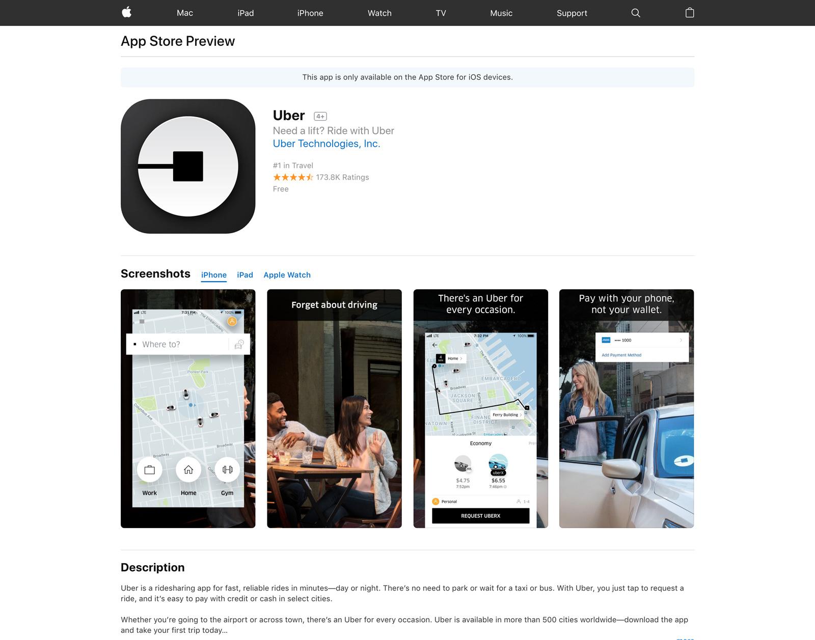
Opening the Uber app on your iOS device will bring you to a home screen where you will find a live virtual map. Here you will see small cars, which look like toy moving around a map from a top view perspective. There are a few of Norman’s principles in action here, which make this a well designed home screen. By looking at the screen you are given a visual that easily translates a conceptual model of how the app works. The can understand that one of the cars on the map will drive to their location and give them a ride.
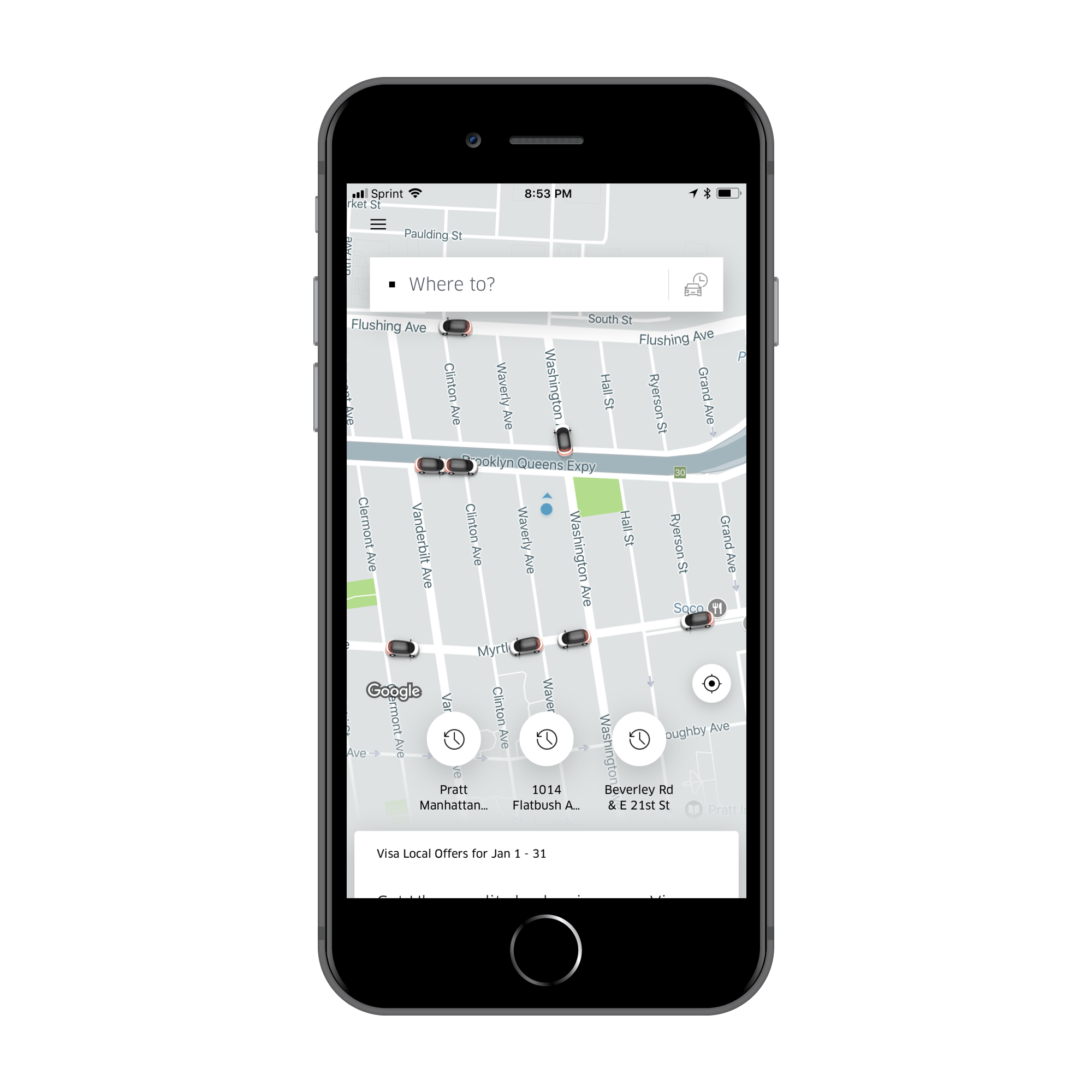
A small Google logo on the bottom left of the screen tell users this is a map they can trust. Uber is an example of radical innovation, described by Norman, started from an existing product and is changing the landscape of the transportation industry.
Ordering an Uber
Step1
The user must be able to find a way for the Uber driver to come to their location and pick them up. The mapping of the input field is in a good location at the top of the screen and is clearly marked in terms users will understand “where to”.
Step2
Upon clicking in the “where to” box you are able to enter a destination or choose a recent location from a dropdown field. This box uses a blinking blue line as a signifier, which affords the user to input their location. You will also notice the “home” field is auto generated to your current location.
The constraints of the input box are not clear. Users are able to input any destination around in the globe and have the option to confirm this ride, though I am unsure what will happen if you click confirm. Perhaps if the designers follow Normans advice to “solve the correct problem”, they may discover exactly how far most users travel when ordering an their Uber and gear their design towards this audience or people.
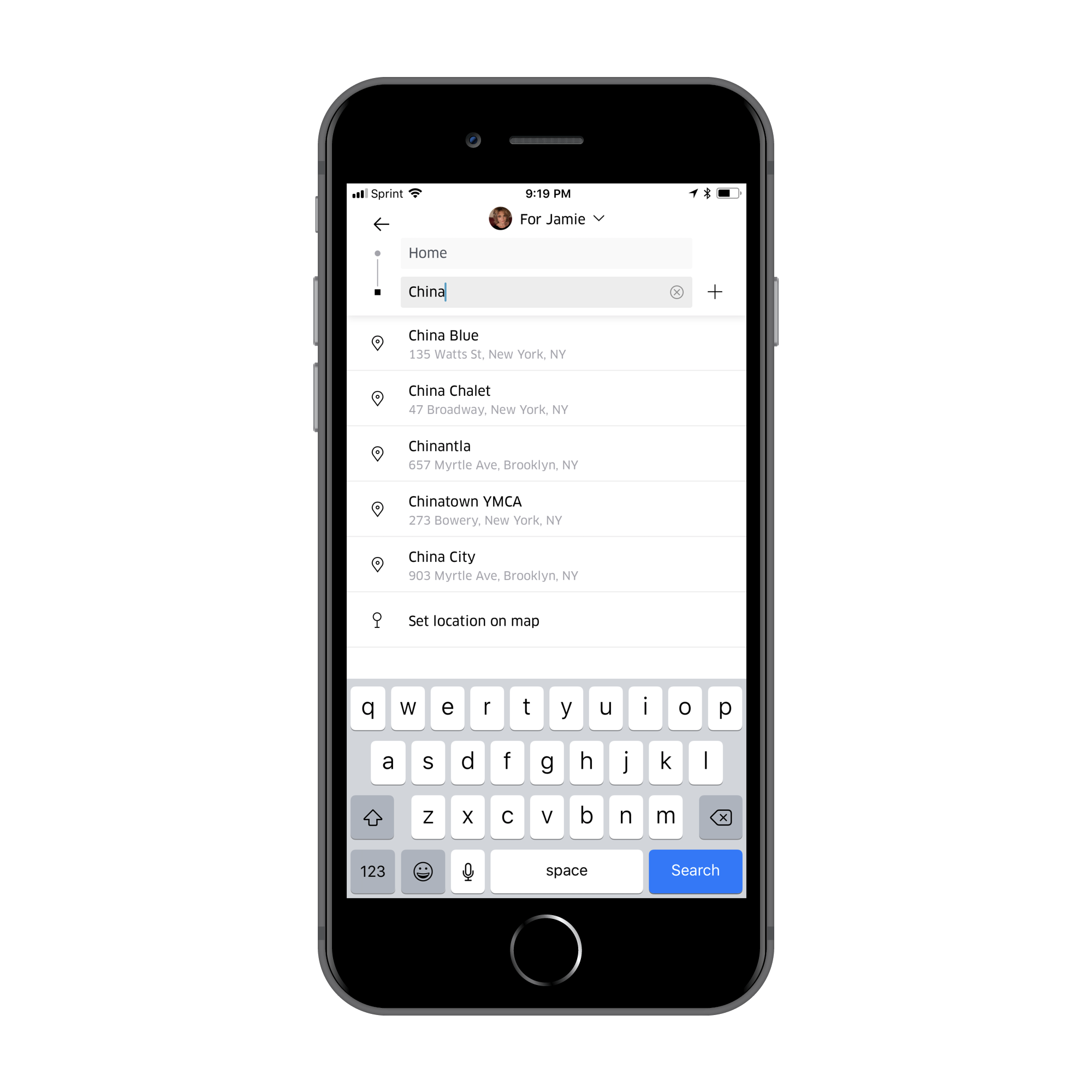
For example if users mostly traveled between 10-20 miles from where they live, then why give them the option to go across the country so easily? Perhaps providing a popup stating what will happen if you try to order an Uber from NY to LA could provide clear feedback and formation of a conceptual model. I am curious if I am able to order an Uber to bring me to LA, but many questions are left unanswered as to what will happen if I try to do this.
Step 3
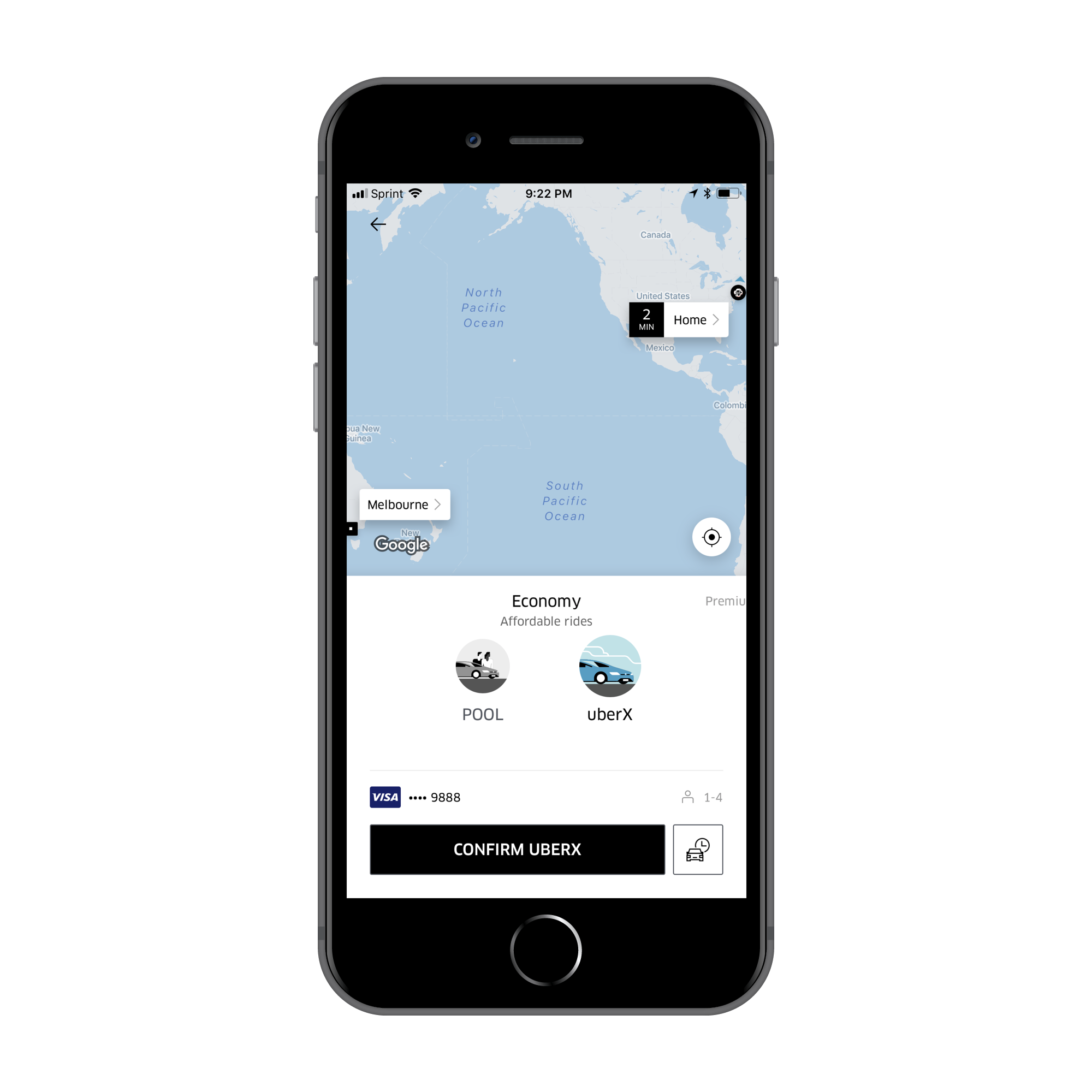
If you input a reasonable location, such as my commute from the Pratt campus in Brooklyn to the Pratt Manhattan gallery you will get immediate feedback with a screen that maps your intended ride. This visual conceptual model of your uber ride affords that if you click confirm you will get picked up from your current location and brought to your destination.
CONCLUSION
You may notice that the Uber maps give a nice visual of a straight line, giving the user an impression their ride will be this straight and simple. It leaves out much information, such as roadblocks, traffic, mechanical issues with the vehicle, driver communication, etc. This visual provides a stress free conceptual model of the app. This will make the marketers happy if more people are using the app and sales increase because of the perceived ease of use, the design is not going to change.
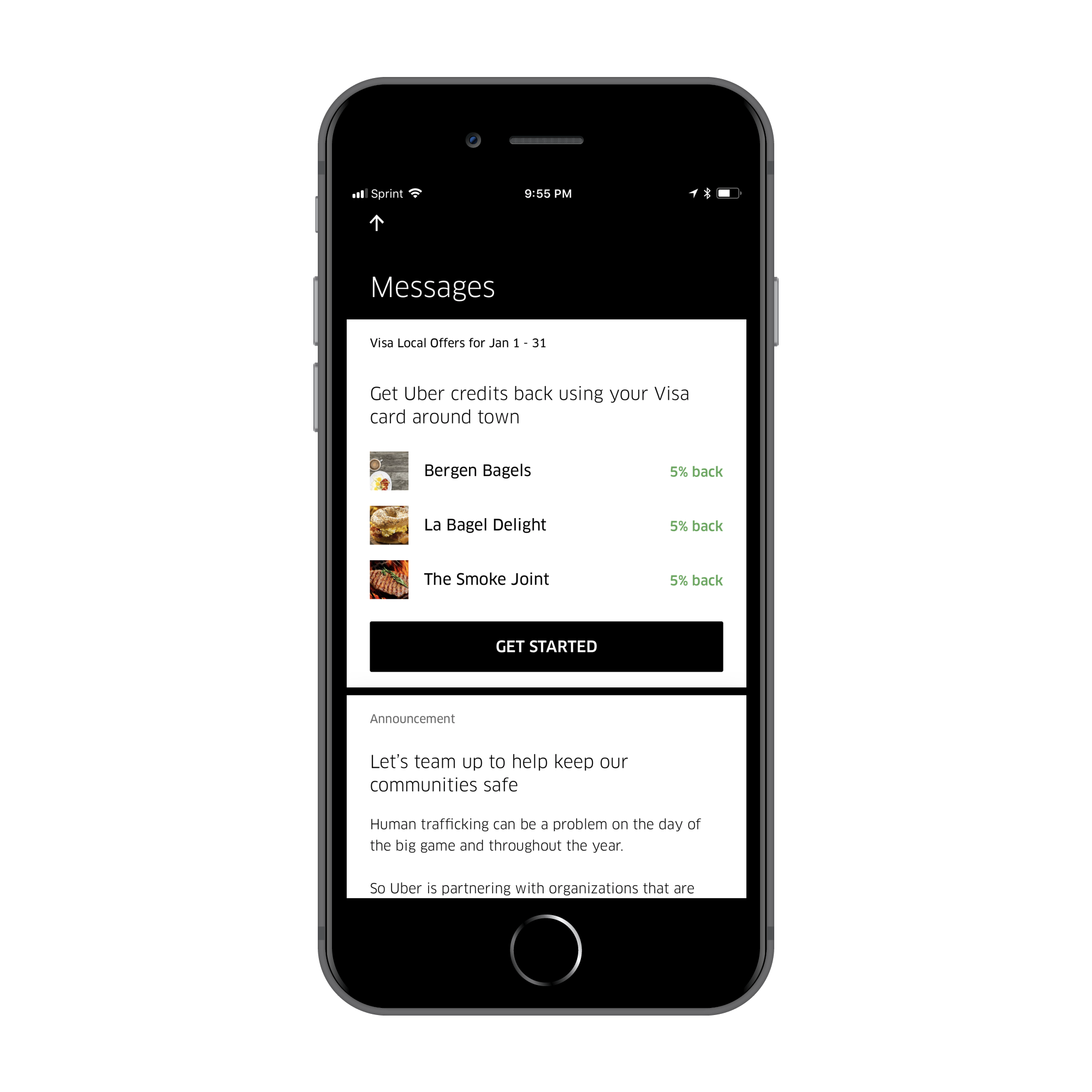
You may also notice that Uber has started adding more features to their app, including Uber eats and Visa offers. This could be the start of what Norman calls, “featuritis” for Uber. In his book, Norman points out “when companies try to increase sales by matching every feature of their competitor, they end up hurting themself”. We can only wait to see the what the future holds for Uber.