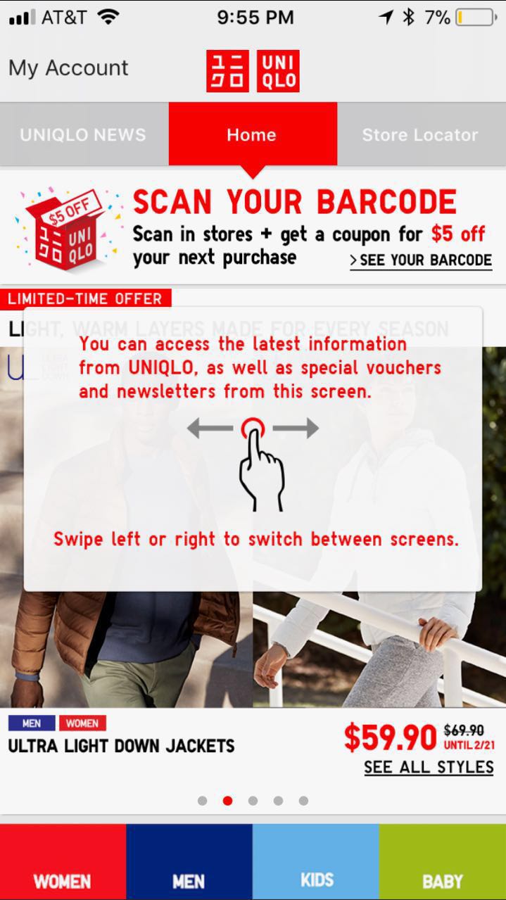
Uniqlo is a popular casual apparel brand, they recently developed an APP to support their online retailing market. As most functions of the app directly linked to their responsive web so that it can complete their basic goals–purchase items online, generate guests’ own digital barcode of their member accounts, get coupons and alerts, etc.
However, the APP still needs some improvements regarding the user experience. According to concepts and principles in Donald Norman’s book “Design of Everyday Things”, I will give some critiques of this app from both positive and negative sides.
Positive:
constraints of item selecting function

As Norman said–“Forcing functions are a form of physical constraint: situations in which the actions are constrained so that failure at one stage prevents the next step from happening.”, the APP can automatically enable certain “size”,”color” or “quantity” by turning them into grey color and unclickable when selected items are out of stock, it is a widely used function applied in online retailing stores, it can effectively prevent people from selecting items that they want but actually out of stock, and then be realising those items are unavailable when they try to purchase at last step– it could cause anger and frustration. It’s a smart and necessary “constraint” which can prevent inappropriate operation.
Negative:
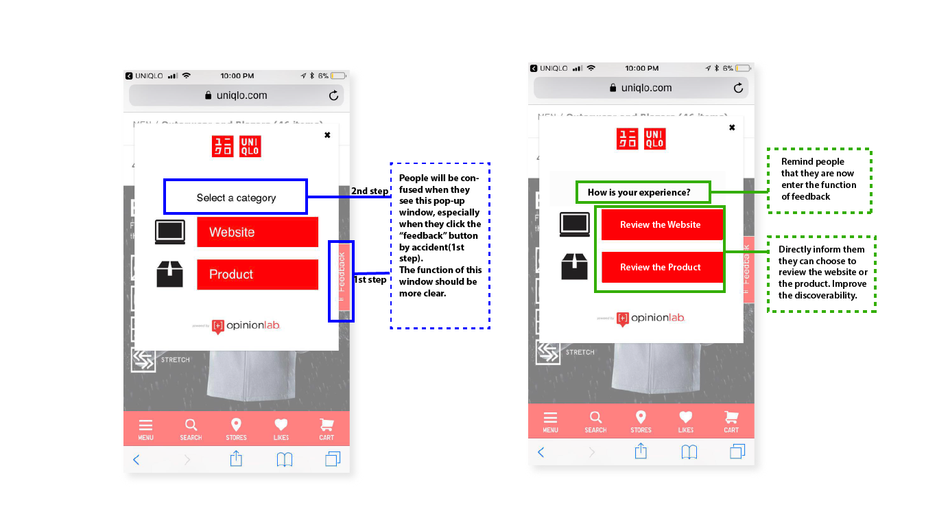
1)Discoverability of “Feedback of web/product”&”view module”
-
Feedback on products and web
According to Norman’s concept, the “Discoverability” means if It is possible to determine what actions are possible and the current state of the device.
In this case, people might be confused when they see this pop-up window at the first time–especially if they click it by accident (It is placed at the side of the screen and easy to be clicked). In my experience, I realized it was a feedback window until I actually selected one of the buttons and saw the rating bars. According to Norman’s seven fundamental principles of design: Effective use of signifiers can unsure discoverability. I suggest using some signifiers such as 1. Replace “Select a category” with “How is your experience?” 2.Add “Review the” in front of each category to remind people that they can write their reviews here thus to improve the discoverability.
-
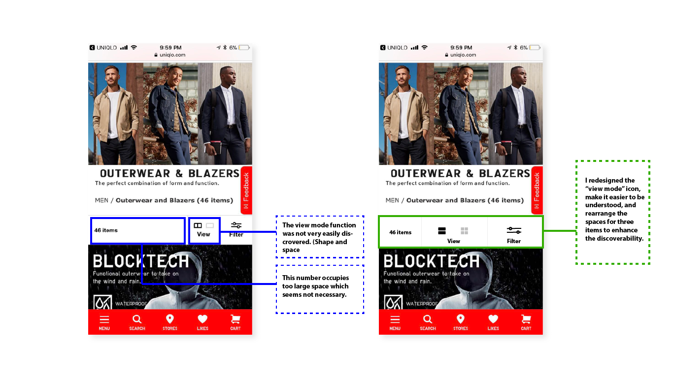
View Module
The discoverability of the “View Module” was relatively low, one reason is the use of Icon can hardly indicate the layout of the pictures. It looks more like a “book” and a “screen”. The other reason is the spaces were too small compared to the item number. The item number may be important but it is not operatable, it does not need such a larger space than “view module” and “filter” which allow people to click and actually operate.
Above all, I redesigned the “view module” icon which more related to pictures’ actual layout and also rearranged the spaces for three items to enhance the discoverability of too operatable functions.
2)Mapping of Text corresponding to the image.

“Mapping is an important concept in the design and layout of controls and displays.” A good use of mapping can make it easy to determine how to operate it. In this seasonal picks’ section, Although the staggered layout makes it looks beautiful and reduced the boring, unfortunately, it increased the confusion– when consumers tried to select one item, she/he might hesitate, especially when there are two items have similar features, such as “tops” and “shirts”.
I suggest to divide these items by card element, put each image and their corresponding words into an individual card, so people can clearly understand which label belongs to which image.
Conclusion
Norman said, “Good design requires stepping back from competitive pressures and ensuring that the entire product is consistent, coherent, and understandable.” As I was a former designer of Uniqlo’s product, I certainly know that the difficulty of designing an online store APP for a brand which has such countless items to sell and replaces their items so fast. Considering it’s relatively bad user experience, besides the drawbacks I mentioned above, the APP still needs a lot of improvement, designers need to consider more from users’ side but not only designers’ taste, make it more user-friendly by using good signifiers, mapping, and consistent layout, I believe unlike now–it has only two stars rated on the APP store, with more and more improvement, Uniqlo APP can be a popular and easier APP to use, thus to attract more people to shop their items on mobile phone.