
According to WHO, about 15% of the world’s population lives with some form of disability, of whom 2-4% experience significant difficulties in functioning. When a product is being created, the usability and accessibility for all potential users are important. However, most products are needed by not only abled people but also disabled people, that is why the accessibility should be brought to a high priority when designing the product. Especially for UX designers, the accessibility should be considered more carefully when making websites.
There are a lot of accessibility principles around the world including laws and policies of different countries. For example, the section 508 of the US, which was issued in 1973 and lately revised on January 2017, is a law applying to all Federal agencies when they develop, procure, maintain, or use electronic and information technology. Under Section 508, Federal agencies must give disabled employees and members of the public access to information that is comparable to the access available to others. A lot of laws and policies related to the web reference the standards of Web Content Accessibility Guidelines (WCAG) which is published by World Wide Web Consortium (W3C) with its Web Accessibility Initiative (WAI) endorsed by The White House and W3C members.
WCAG 1.0 which was published on May 1999 is a set of guidelines for making web content more accessible to people with disabilities. The latest version WCAG 2.1 was updated on January 2018 based on WCAG 2.0 published on December 2008.
In WCAG, three levels of conformance are defined that are A (lowest), AA, and AAA (highest) in order to meet the needs of different groups of people and different situations. I am using a simple example to demonstrate these three levels. If a time-based content (video & audio) is only video and only audio, it is considered a level A (Fig. 1); if the content has a prerecorded caption, it is still a level A (Fig. 2); if the content has live/in sync caption, it can be considered a level AA (Fig. 3); if the content has prerecorded sign language along with it, it can be considered a level AAA (Fig. 4). One thing worth mentioning is that even the content that conforms at level AAA will not be accessible to individuals with all types, degrees, or combinations of disability, particularly in the cognitive language and learning areas.


WCAG has very detailed principles of accessibility. For UX design, these key points of WCAG below are useful for making the content on the web more accessible. I try to use examples to explain each principle.
1. Perceivable information and user interface
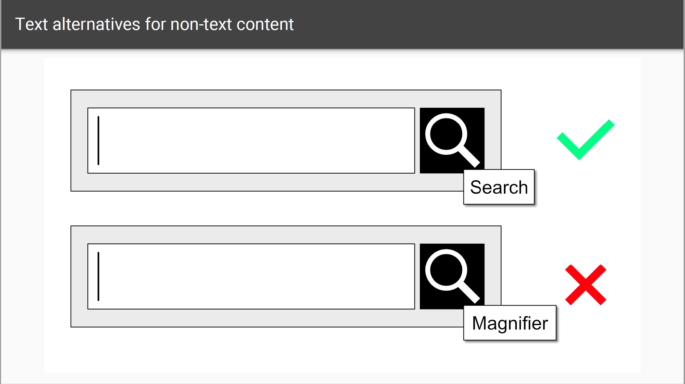
a. Text alternatives for non-text content
The purpose of the text alternatives is to provide an equivalent user experience for disabled people. The text can be presented in varieties of ways such as being read aloud or displayed on braille devices.
For example, an appropriate text alternative for a search button would be “search” rather than “magnifier” (Fig. 5).
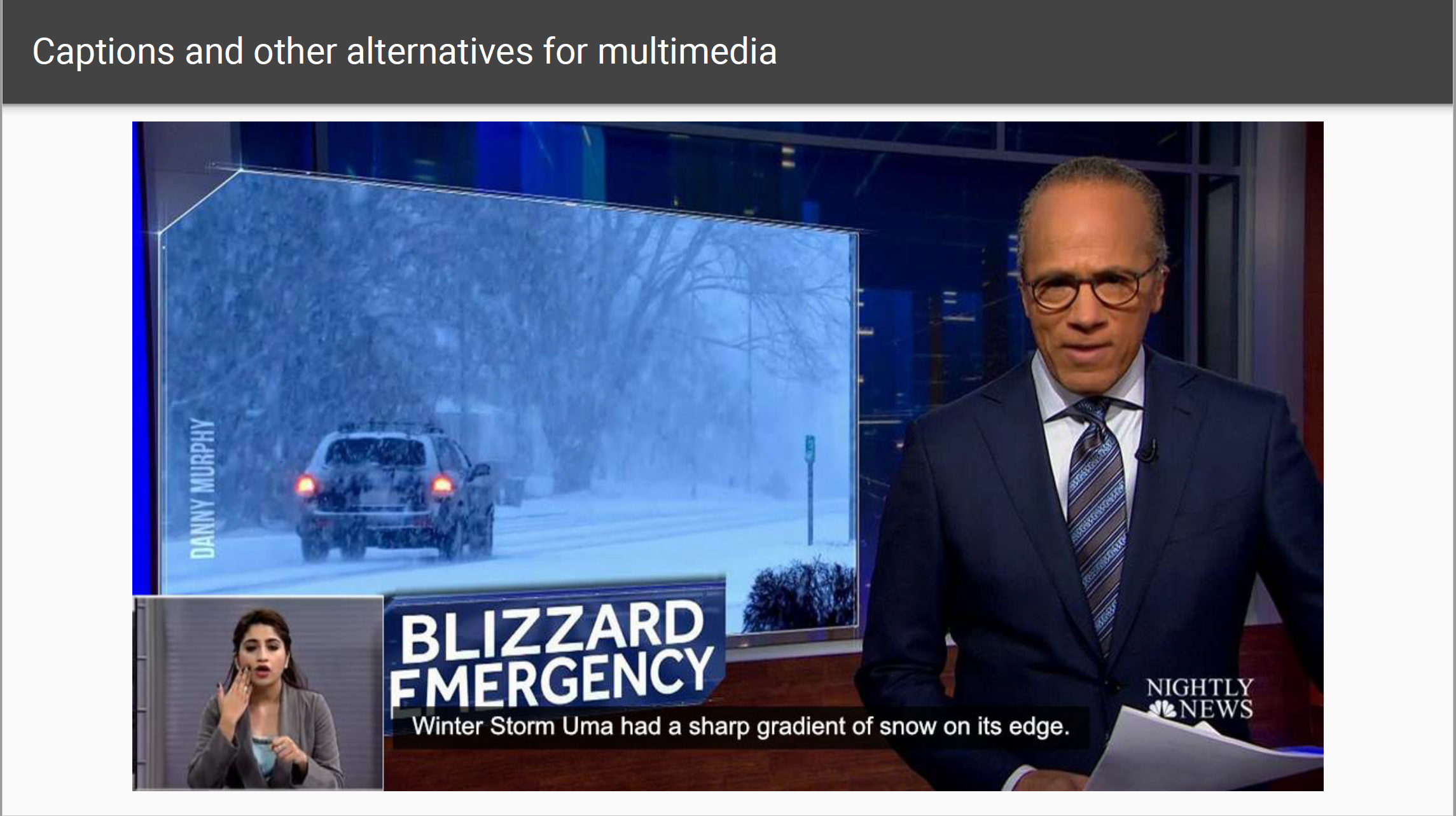
b. Captions and other alternatives for multimedia
The text transcripts, description, or sign language can provide an alternative to the audio content.
The caption or sign language in the video is a good example (Fig. 5).
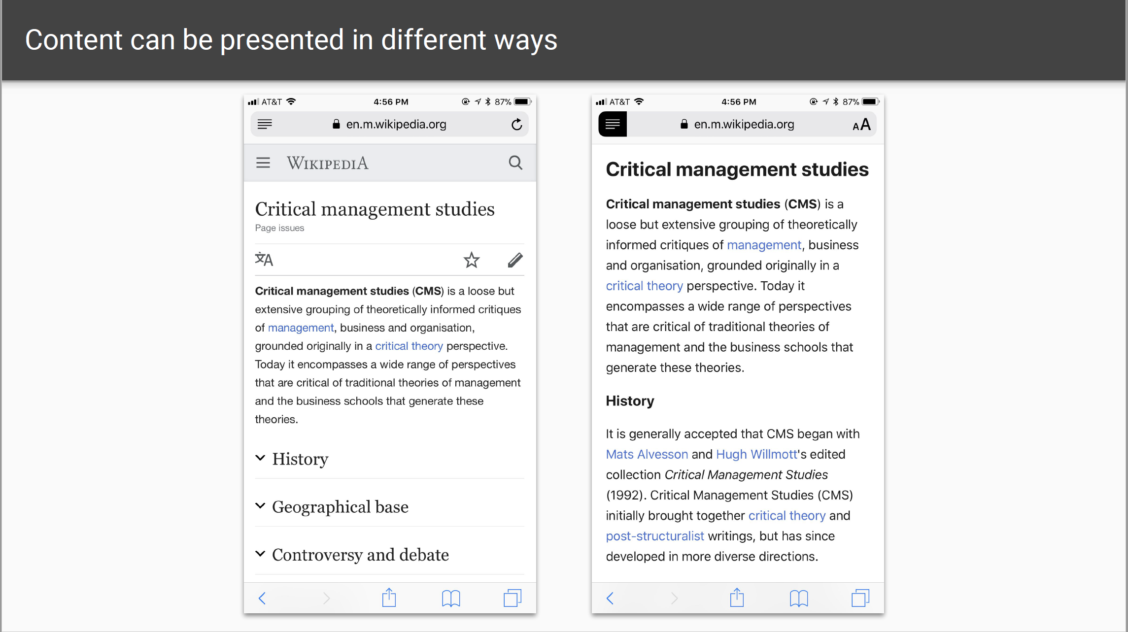
c. Create content that can be presented in different ways.
The structures in the content shouldbe marked-up properly; the sequences of information or instruction should be independent of any presentation; browsers should provide settings to customize the presentations.
The automatic reader mode on Safari of iPhone is a good example of the different ways of presentation (Fig. 7).
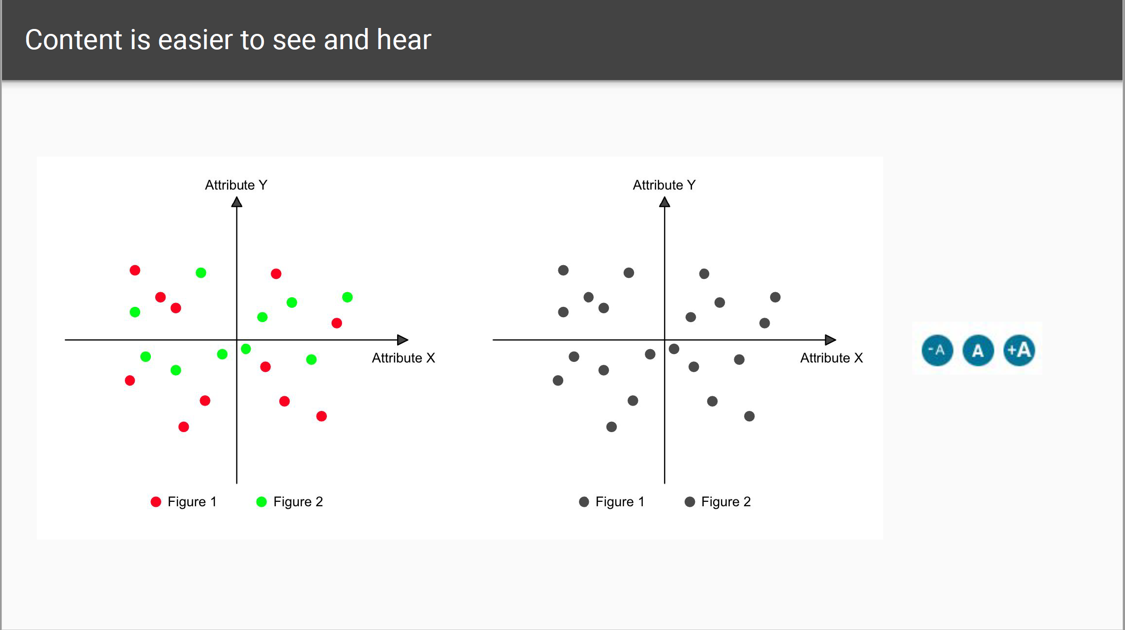
d. Make content easier to see and hear.
Do not use color as the sole way to convey information; use sufficient color contrast; use resizable text up to 200%; make audio and video pausable and make volume adjustable.
I created a heat map as the example. People with normal eyes can easily distinguish different colors on the map. But for people with color blindness, they may see red and green as the same color (Fig. 8).
2. Operable user interface and navigation
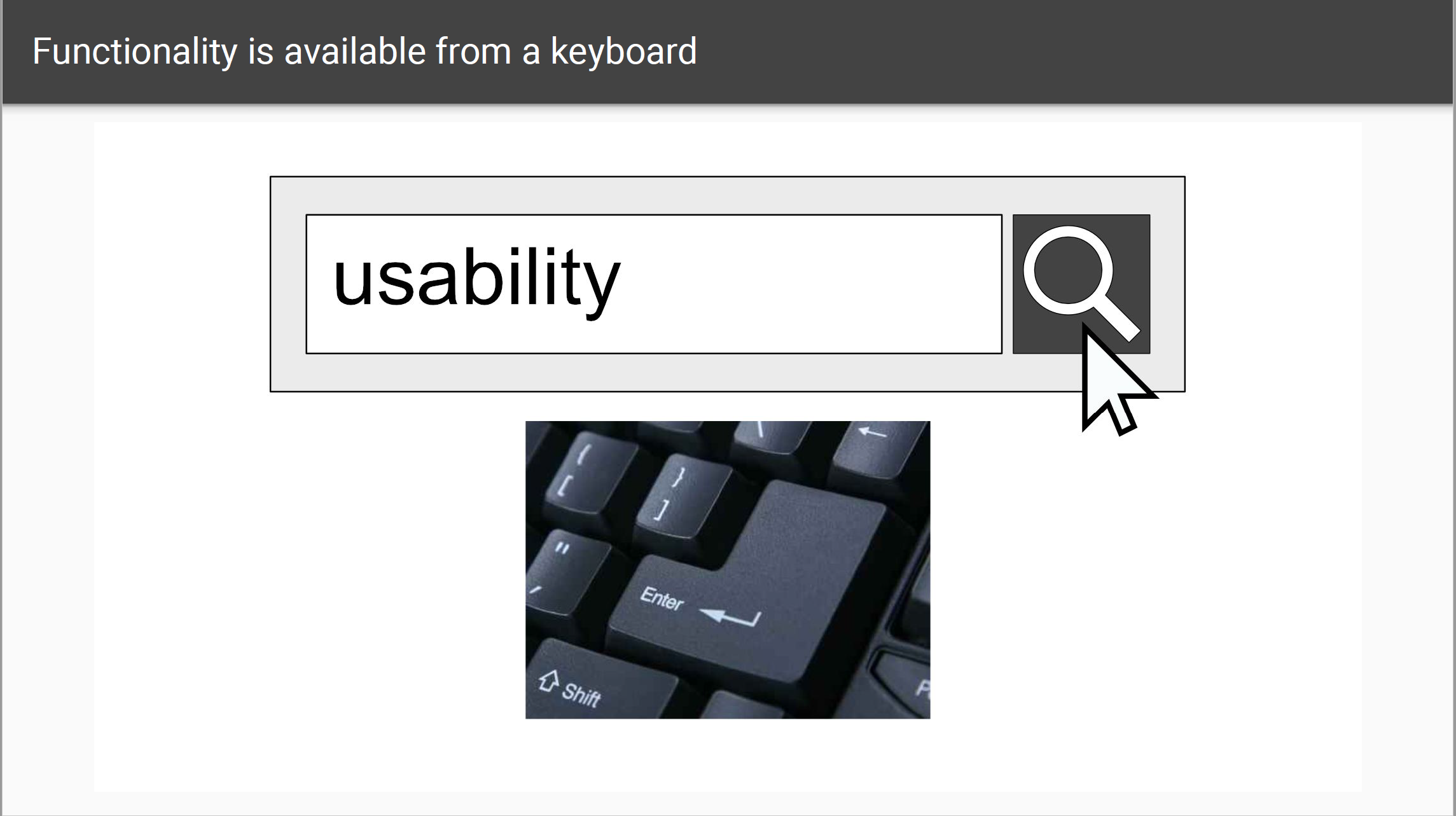
a. Make functionality available from a keyboard
All functionality available by mouse should also be available by keyboard; browsers should provide keyboard shortcut support.
For example, if users want to confirm the text they typed in, they can either click on the button on the website or push Enter on the keyboard (Fig. 9).
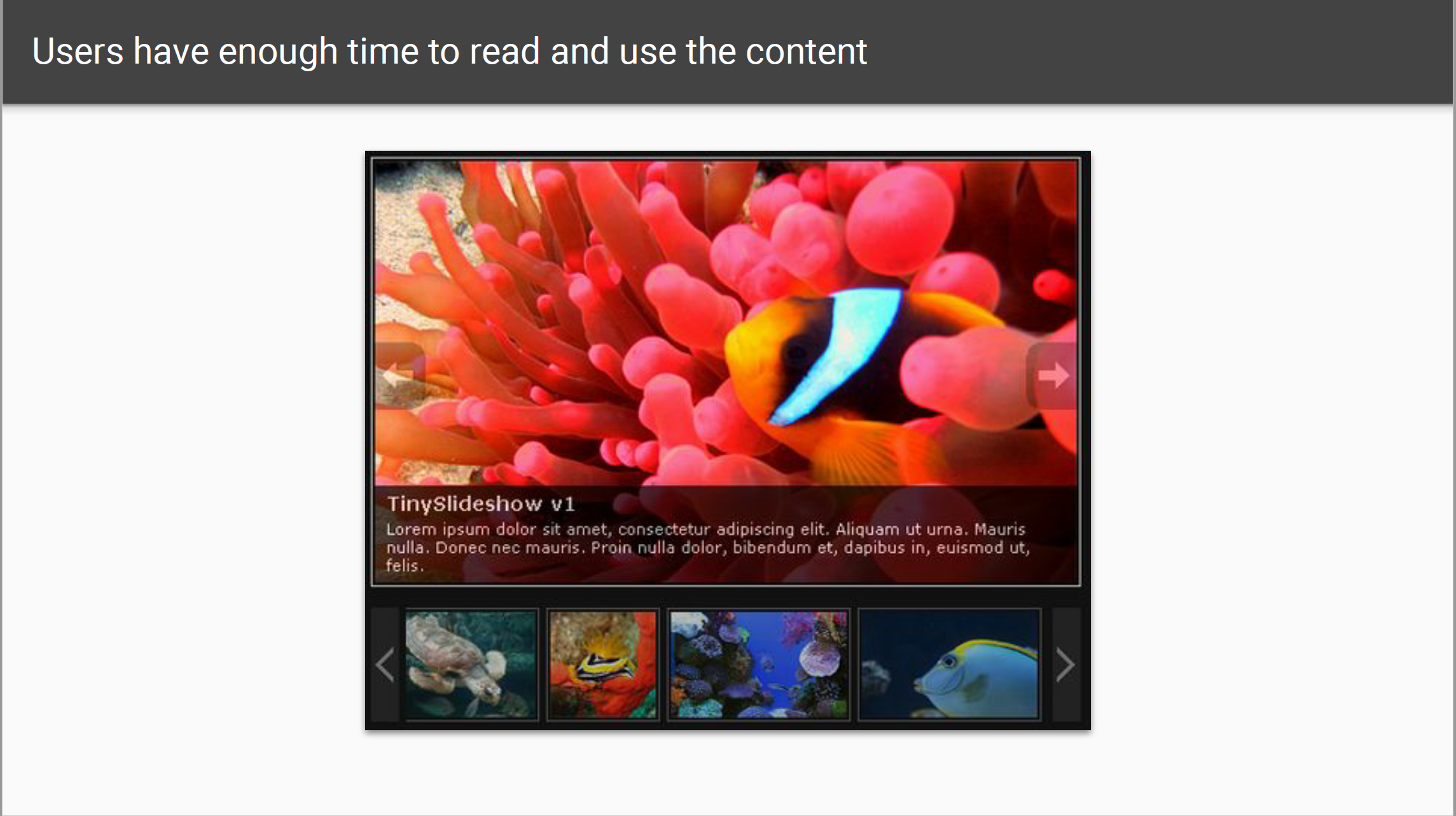
b. Give users enough time to read and use content
Some users may need more time to read or type the text, understand instructions, operate controls or complete other tasks on the website.
It is important to provide mechanisms to adjust time limits, pause the scrolling content, postpone interruptions, re-authenticate when a session expires without losing data.
The example I use here is the slideshow on the websites. Usually, the slideshow is rolling automatically. Some users may have difficulty to finish reading the text on the slide before it changes. When hovering the image, the rolling will stop, then the users can have enough time to finish reading (Fig. 10).
c. Do not use content that causes seizures
Content that flashes at certain rates or patterns can cause photosensitive reactions, including seizures. The flashing content is better avoided or only used in a way that does not cause known risks.
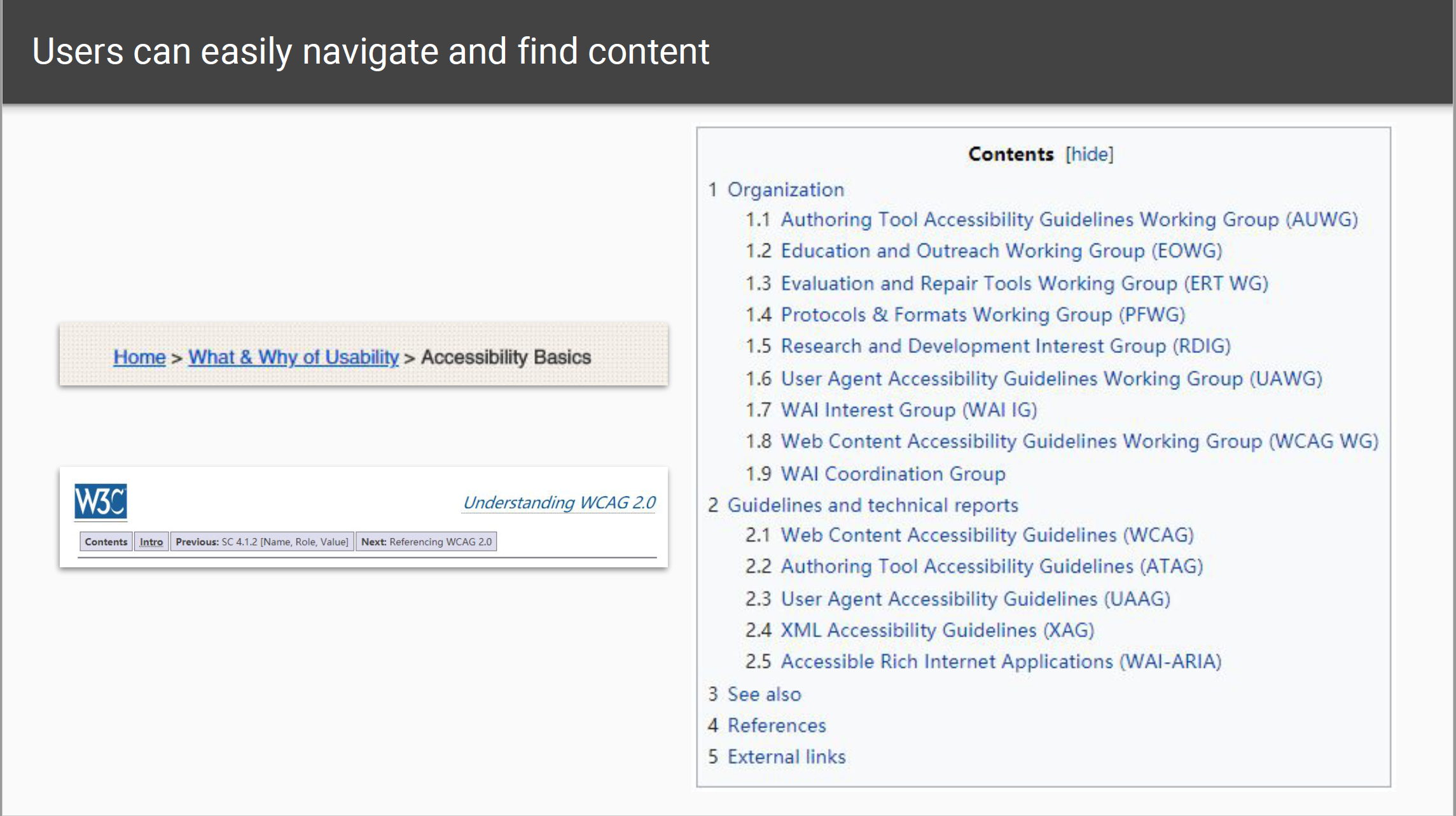
d. Help users navigate and find content
The clear titles and organization should be provided; there should be multiple ways to find relevant pages; users should be informed about the current location on the website; users should be able to bypass repeated content.
The breadcrumbs navigation is a good example. Users can know where they are and go to the previous pages at will (Fig. 11).
3. Understandable information and user interface
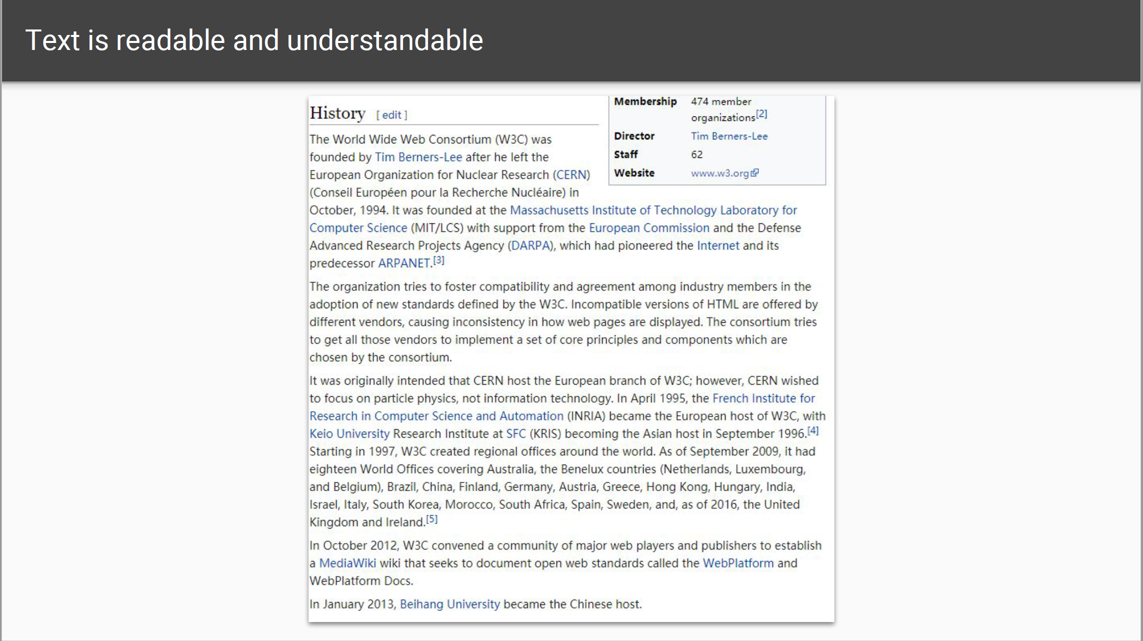
a. Make text readable and understandable
There should be a primary language of a web page and consistent language of a paragraph; the unusual words should be defined; the use of language should be as simple and clear as possible.
For example, on Wikipedia, the unusual term always has a link to another page to explain the term. And Wikipedia always tries to use the simplest language to interpret things (Fig. 12).
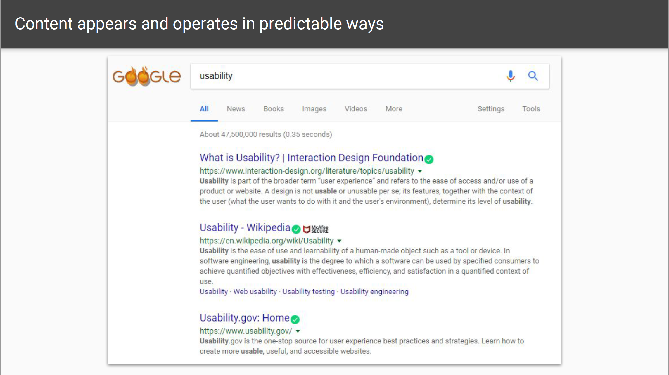
b. Make content appear and operate in predictable ways
The navigation mechanism should in the same place on multiple pages; UI components that are repeated should have same labels; there should not be significant changes on a web page without the user’s content.
On Google, the category bar is always under the search bar and above the search results. The search results are always displayed in the same layout (Fig. 13).
This is similar to the Neilson’s heuristic 2: match between system and real world and heuristic 4: consistency and standards.
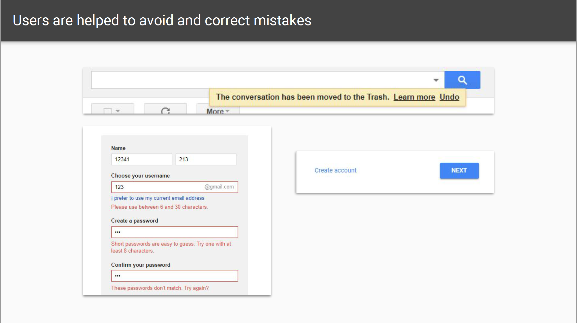
c. Help users avoid and correct mistakes
The descriptive instructions, error messages and suggestions for correction should be provided; context-sensitive help should be provided for more complex functionality and interaction; users should be free to correct, review or reverse the submissions.
For example, When deleting emails on Gmail, there will be a message with an undo button. When you enter the information that does not match the requirement on a registration form, the error message will appear.
This is similar to Neilson’s heuristic 3: user control and freedom, heuristic 5: error prevention and heuristic 9: help users recognize, diagnose and recover from errors (Fig. 14).
4. Robust content and reliable interpretation
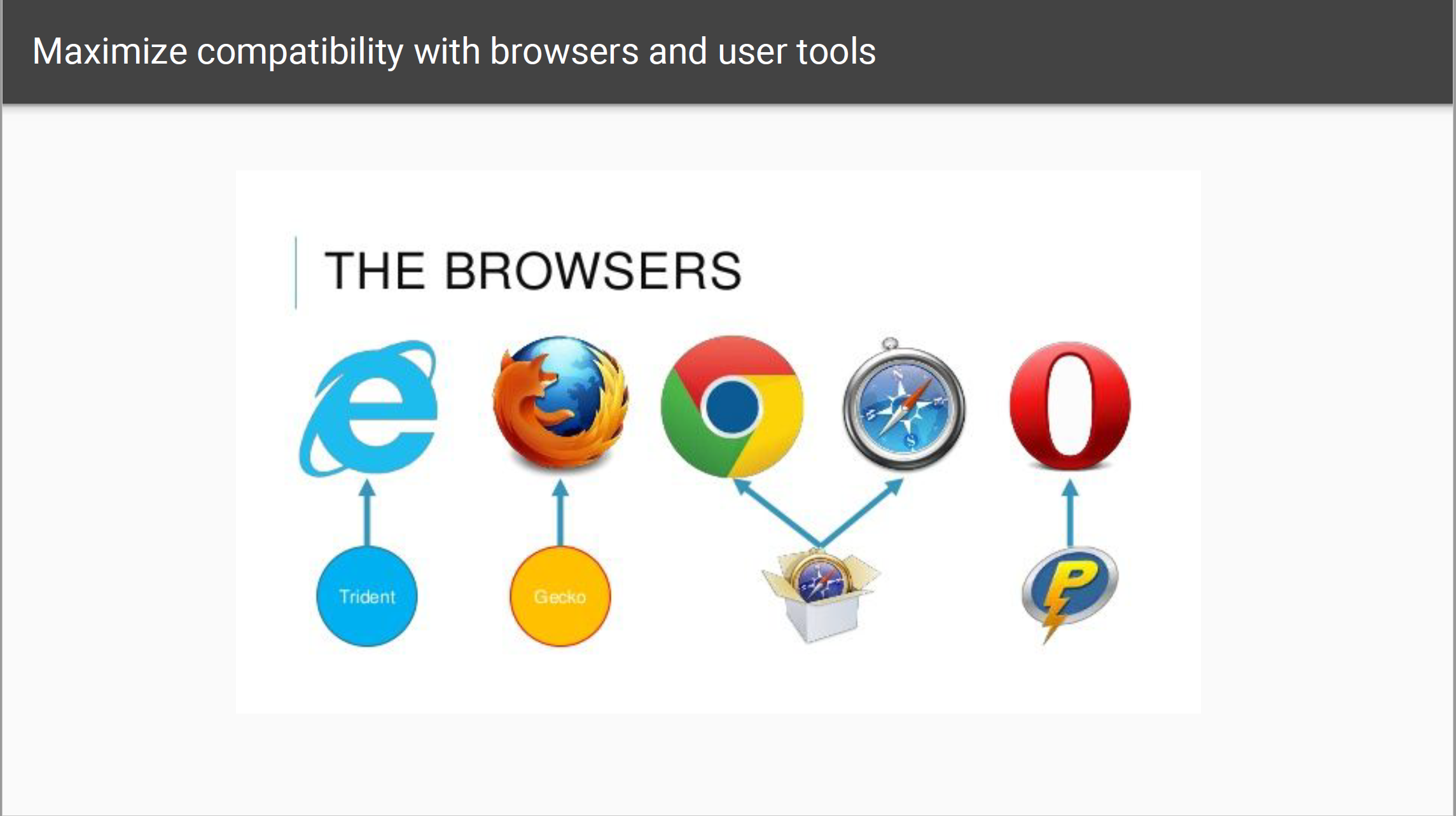
a. Make content compatible with current and future tools
Robust content should be compatible with different browsers, assistive technologies, and other user agents.
For example, the websites should be viewed on Chrome and Firefox. The text should be read by different assistive readers (Fig. 15).
By researching WCAG, I learned the importance and principles of accessibility. The U.S is doing a great job on accessibility, but it is not enough. However, in some regions, the accessibility is a serious problem either in the physical world or online. In conclusion, we should make more effort on the promotion of WCAG and other accessibility policies.
References:
Web Content Accessibility Guidelines (WCAG) 2.1: https://www.w3.org/TR/WCAG21/
Accessibility Principles – How People with Disabilities Use the Web: https://www.w3.org/WAI/intro/people-use-web/principles
Section 508: https://www.section508.gov/