This article is mainly focus on the examples for accessible websites. The author discussed about the text alternative and color accessibility as examples. In those cases, audiences can get to know the definition, effect, bad and good use cases of these two examples.
When the internet comes, we live in a life with full convenience: We shop easily on the internet by just one clicking with the mouse; We search various resources for a report by pressing the keyboard. But there are amount of people who might not see, hear, even click by hands. We expect computer can make a better life for all people, including people with disabilities because even a small consideration means a huge step to them.
Above all is the original of web accessibility. Gradually, accessibility has a broader scope: besides the traditional advantages for disabilities, people without disabilities also get benefits from it. For example, an appropriate button size makes it easier for people who has a big thumb to click when they are using a cell phone. The overall goal of accessibility is to deliver effective and efficient interaction with digital products for all people.
The definition of web accessibility means people can perceive, understand, navigate, interact with and contribute to Web.(W3C)
And it is summarized into 4 main rules:
-
Perceivable information and user interface
-
Operable user interface and navigation
-
Understandable information and user interface
-
Robust content and reliable interpretation
From the horizontal range, almost every industry uses digital products to serve different needs in people’s daily life. From the vertical range, in the technology field, designers, engineers, product managers, have the same goal to develop a better product. No matter from horizontal or vertical range, accessibility plays an important role. Let’s see the following exact cases based on that.
In many web pages, images brighten content up. But in many situations like when encounter internet errors, it might create problems. In order to make sure people can understand images in any situation, text alternative is a frequent take away. Text alternative means when the users can’t see the image, alternative text should be displayed. And text alternative can be categorized in to the first accessibility rule: Perceivable information and user interface
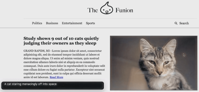 Figure-1/ picture by google develpoer
This is an image from Google Developer website(Figure-1). Through inserting a section of code, a line of text which explains the image would displayed beside the image. Users who encounter difficulty in capturing images can understand the content by reading the text. Text alternative is a standard coding process which has been possible since HTML2 in 1995, and was part of the original WCAG1 guidelines in 1999 (Julie Grundy, 2.4.2016).
How to add useful text is also an art. Sometimes, the beginners just use the literal name like 13278217812.jpg as alternative text. It is accurate but it means they forget the aim of alternative text is to improve accessibility, to let users understand content in unstable situations. So, accessibility is not only designers’ job but also engineers’.
The second case is about color accessibility. First, that’s see a comparison picture:
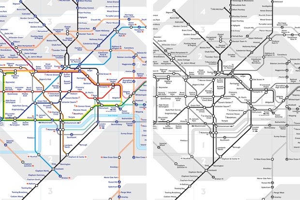 Figure-2 / picture by Alex Bulat
The left part of the image shows a vision from non-colorblind people(Figure-2). The right part shows a vision colorblind people. We can see that for those colorblind people, they can hardly distinguish each line. So, for those colorblind people, the traditional web design might decrease the readability and makes it difficult to use.
In order to solve this problem, there are many software for designers to test accessibility like Chrometric(Figure-3). “What you see is not what everyone gets”, designers should always remember that when you design for a product which be used for everyone (like Amazon), it is really very important to remember to apply accessibility in your design.
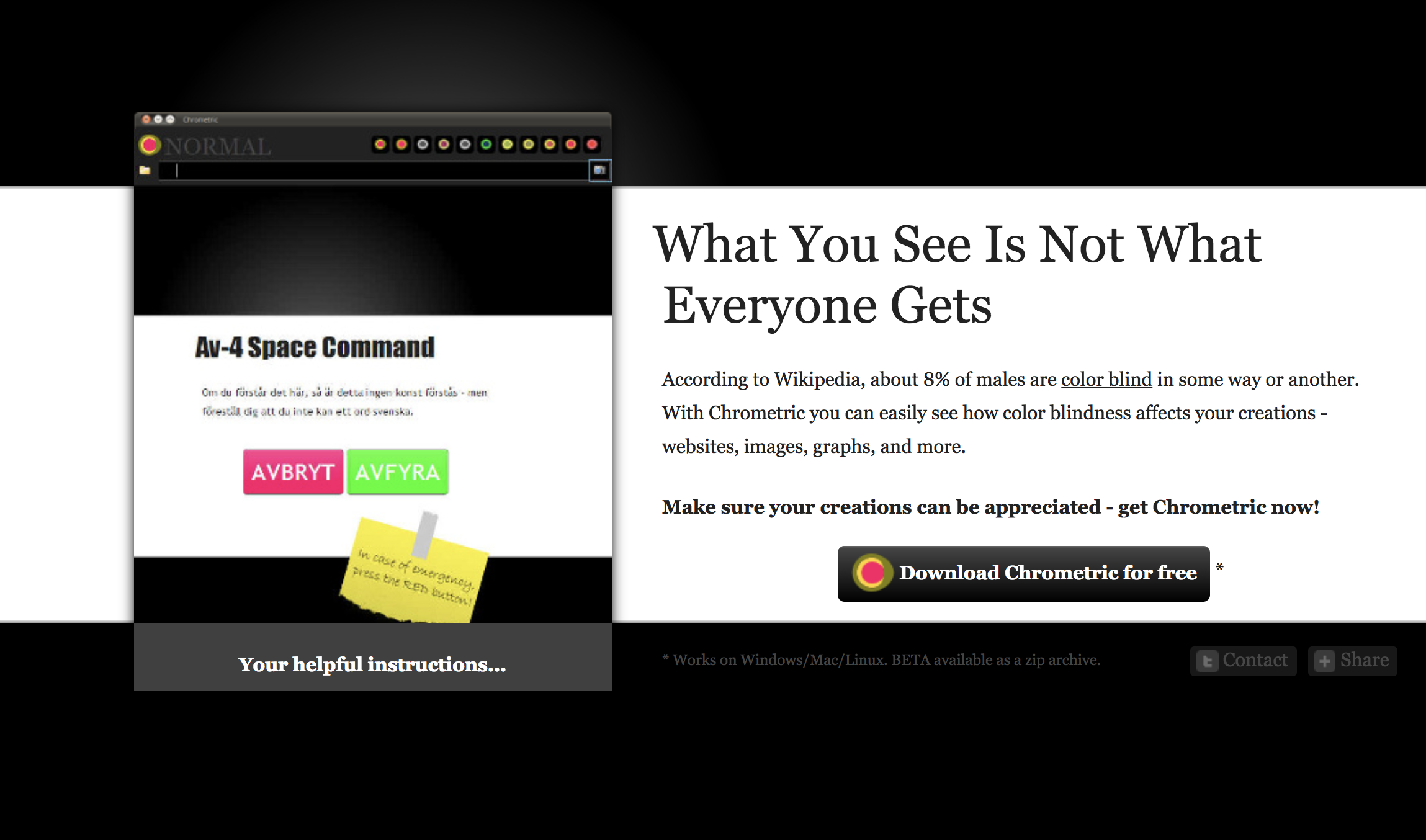 Figure-3 / picture from Chrometric
Sometimes, color accessibility will not only affect colorblind but also non-colorblind people. Below that is a bad example. In the picture, the text is in white and is very unclear in front of the image(Figure-4). In order to improve the accessibility, one way is to add a dark mask in front of the picture(Figure-5), it will make the text more solid and easier to figure out.
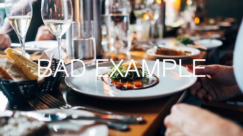 Figure-4 / picture from Jay Wennington
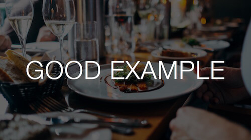 Figure-5 / picture from Jay Wennington
Some would argue that we all know that we shouldn’t put a white text on a colorful background. But devil is always in the details. Think of that, it is very common that designers use a very beautiful image with text on it as a banner in the prototype. The images might be very high-end and good looking. But if it is a UGC platform, all the content is generated by users which means the images might be very low-end, and the readability of the text can’t be controlled(Figure-6). Designer should always think beforehand about all accessibility problems.
 Figure-6 / picture from Qinsman
We have talked about the accessibility in both design and develop. From my own perspective, they all link together. Go back to the beginning, our companies in various industries want our developers, designers, product managers to work together to deliver good product. The logic and goals behind design or technology is the same, designer or engineers just use their own language to achieve that goal. So, accessibility should not only be limited in one scope, but everyone in this Industry should better understand and apply it to deliver better products for every user.
Reference:
Google Developer – Text alternative https://developers.google.com/web/fundamentals/accessibility/semantics-builtin/text-alternatives-for-images
W3C (web accessibility initiative) https://www.w3.org/WAI/intro/people-use-web/principles
Three common accessibility pitfalls for developers: text alternatives (Julie Grundy 2.4.2016) https://simplyaccessible.com/article/three-pitfalls-text-alternatives/
Improve the color accessibility for color-blind users (Adam Silver) https://www.smashingmagazine.com/2016/06/improving-color-accessibility-for-color-blind-users/