ABOUT THE PROJECT
Material for the Arts had discovered a declining usage of their website. They did not have a mobile optimized website and we were asked to propose a mobile-centered re-design. In this project, we designed a digital interfaces from a user-centered perspective based on user research, interviews and evaluation.
MY ROLE
I had volunteered as the “Project Manager” which was to make sure that we submitted the group assignments on time and organized the group materials. We also worked together as a team for creative ideas and ensured that the decisions we were making were aligned to the needs of the organization.
THE CHALLENGE
The biggest challenge of this project was to identify the insights by understanding our target audience. If we fail in developing what they were interesting in, we would fail in our project no matter how well it would be.
The second challenge was to consistently align the user goals with our insights, while ensuring that we could deliver them in the limited timeframe. We had to make sure that every decision we made would lead us to our goal. Sometimes, the new ideas was too attempting that it might make us shift our goal. And eventually we were able to stick with what we were aiming for.
THE PROCESS
Step 1: Understanding Users
To gain a deeper understanding of the website’s user, we conducted the interviews and observations with our selected participants. Then we came together and addressed our findings using the Affinity Diagram to create insights that support the project. For example, from one of the interviews, we realized that complicated payment process would decrease the donor’s intention to contribute the organization. Therefore, throughout the project, we always kept in mind to simplify the user path.
Our team clustered and bundled the research data using the Affinity Diagram.
The insights are as follow:
- Personal context drives initial participation but the organization can use tools to encourage continued participation.
- Users seek inspiration about particular themes through different channels to stay up to date and keep information fresh and new.
- Reward systems help motivate users because it is a more symbiotic relationship.
The second part of this step was to find a way to model and summarize about people who we had interviewed and observed. We created personas based on our user research data to represent groups of users in order to help us understanding the target users’ expectations and creating empathy with the end users.
Persona summarized research data and represented groups of users.
Step 2: Structuring Content
The next step was to gain a deeper understanding of our users’ mental models and proposed a revised information architecture for our site. First of all, we prepared the open card sorting study using Optimal Workshop by creating a set of contents that each represented a concept such as “who can apply to receive materials of MFTA” or “how donated materials are used”. Participants sorted the cards into categories that made sense to them, and label each category themselves. We then analyzed the data and proposed a new IA.
User testing using card sorting method.
After that, we designed a tree testing study based on the IA and recruited participants to conduct the test. We revised the IA after reviewing the results in the tree test. For example, we noticed that when participants were asked about the “Artist Residencies” where we had put under “Education”, several of them would look under “Opportunities” first. We had also changed “Education” to “Programs/Events” after we revised the goal of MFTA again.
A tree testing study is designed based on the IA.
Based on the result and finds from the user test, we built a content relationship and a site map.
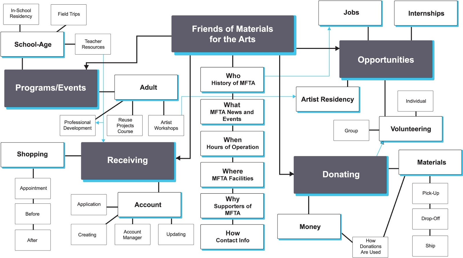
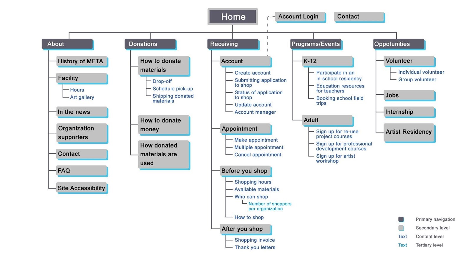
Content relationship and site map after the card sorting and tree testing study.
Step3: Understanding the Competition
In order to learn from our website competitors of how similar problems had been solved and get inspiration for our re-design, we conducted a competitive analysis by reviewing 3 competitors.

Analysis matrix of the competitors
The following were the major findings that we would like to implement into our re-design:
- Highlight the most recent news and need to know information on the homepage.
- Create a button for member account.
- Allow searching capabilities for sorting programs/events by category.
- Create selective options for donation amount.
Step 4: Prototype Evaluation
Based on the research data and evaluation of our competitors, we created a low-fidelity digital prototype for desktop and mobile using InVision.
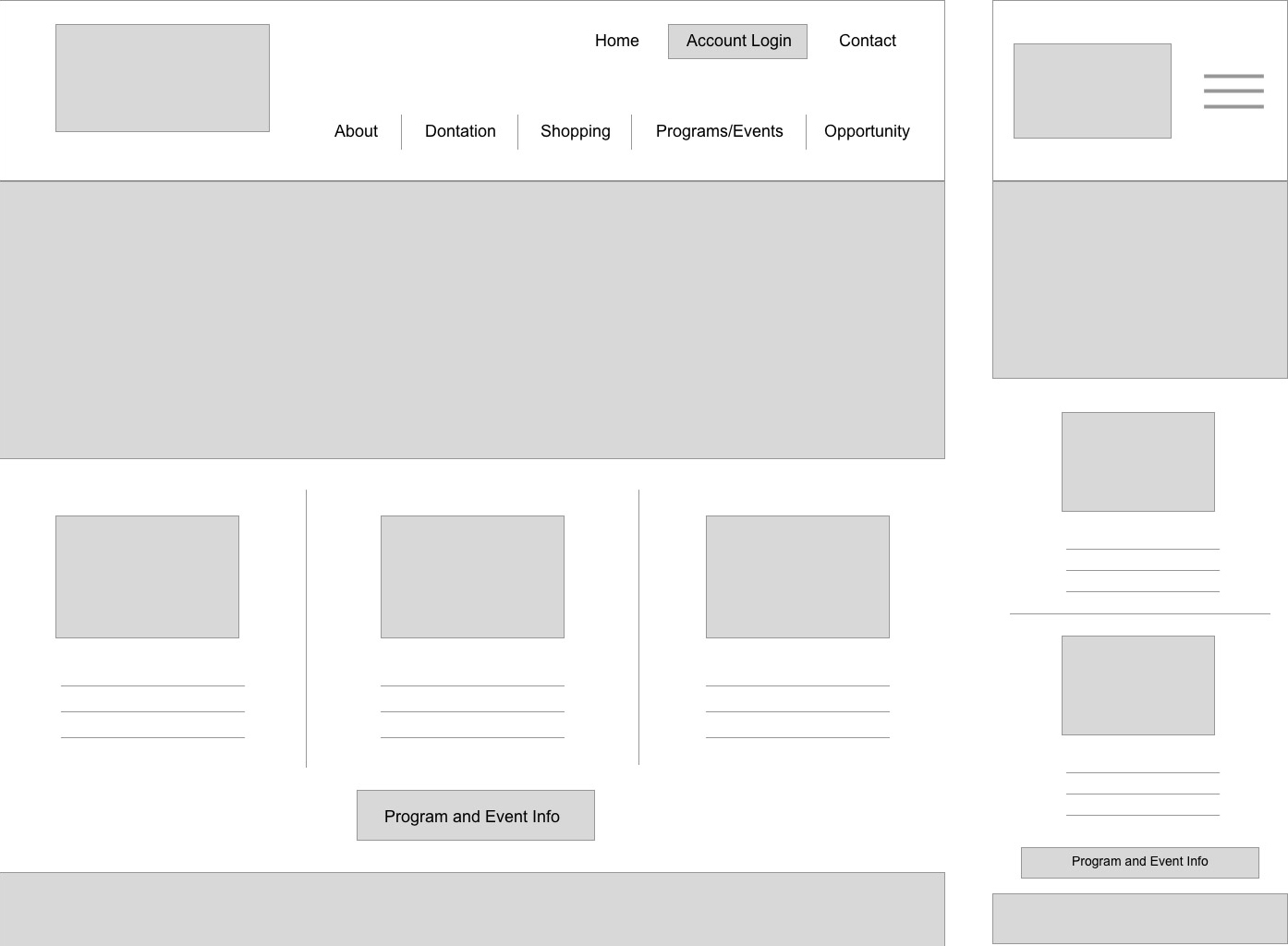
Homepage for desktop Homepage for mobile
We created 3 user testing tasks:
- Task 1: Complete a register for an event
- Task 2: Complete money donation process
- Task 3: Log in to change your account information
After conducting the user test, the following were the feedback we received:
- Highlight more program and event on the homepage
- “Learn more” is preferred than “More information”
- Tab bar instead of only hamburger button
- Include the shopping cart feature to increase shopping visibility
- Allow reviewing order and payment method before submitting the application
Step 5: Digital Prototype and Final Design
Based on our first prototype, we evaluated the feedback and created the final version of our Desktop and Mobile prototype.
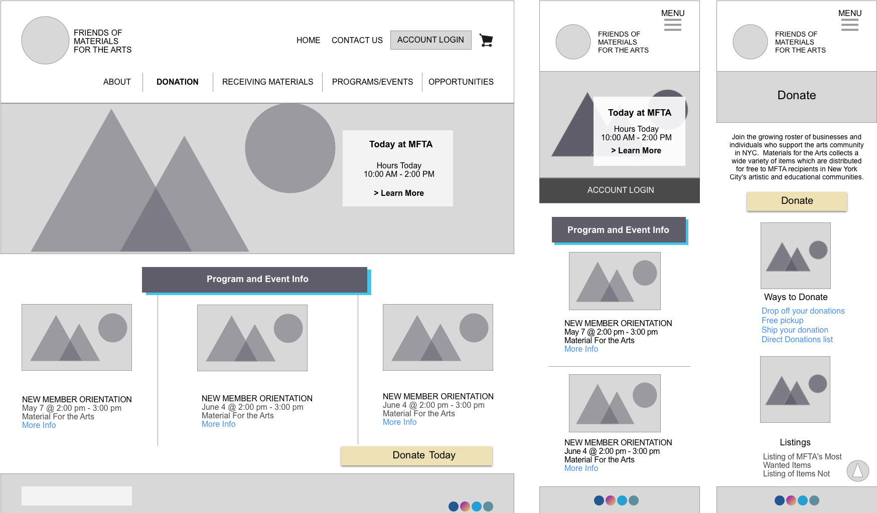
In the homepage, we added the social media buttons so that user could share the news directly. For desktop, we added and highlighted the donation drive and account login. For mobile, we moved the account login in the center to make it more visible, and the donation drive was also highlighted under donation.
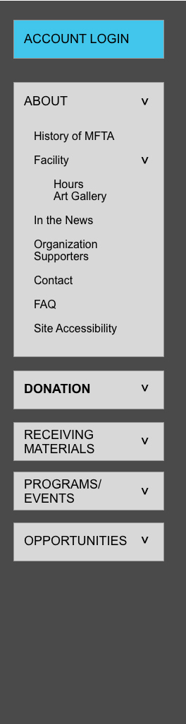
In the mobile navigation, we added and highlight the account login, and highlighted the donation.
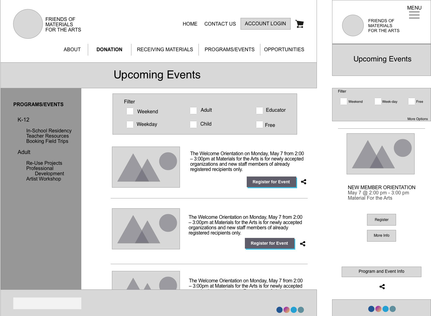
Both added a share button in the event page so user could share the event directly through social media. Filter feature was still available so user can narrow down their selection.
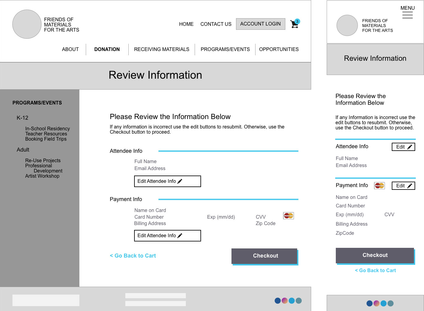
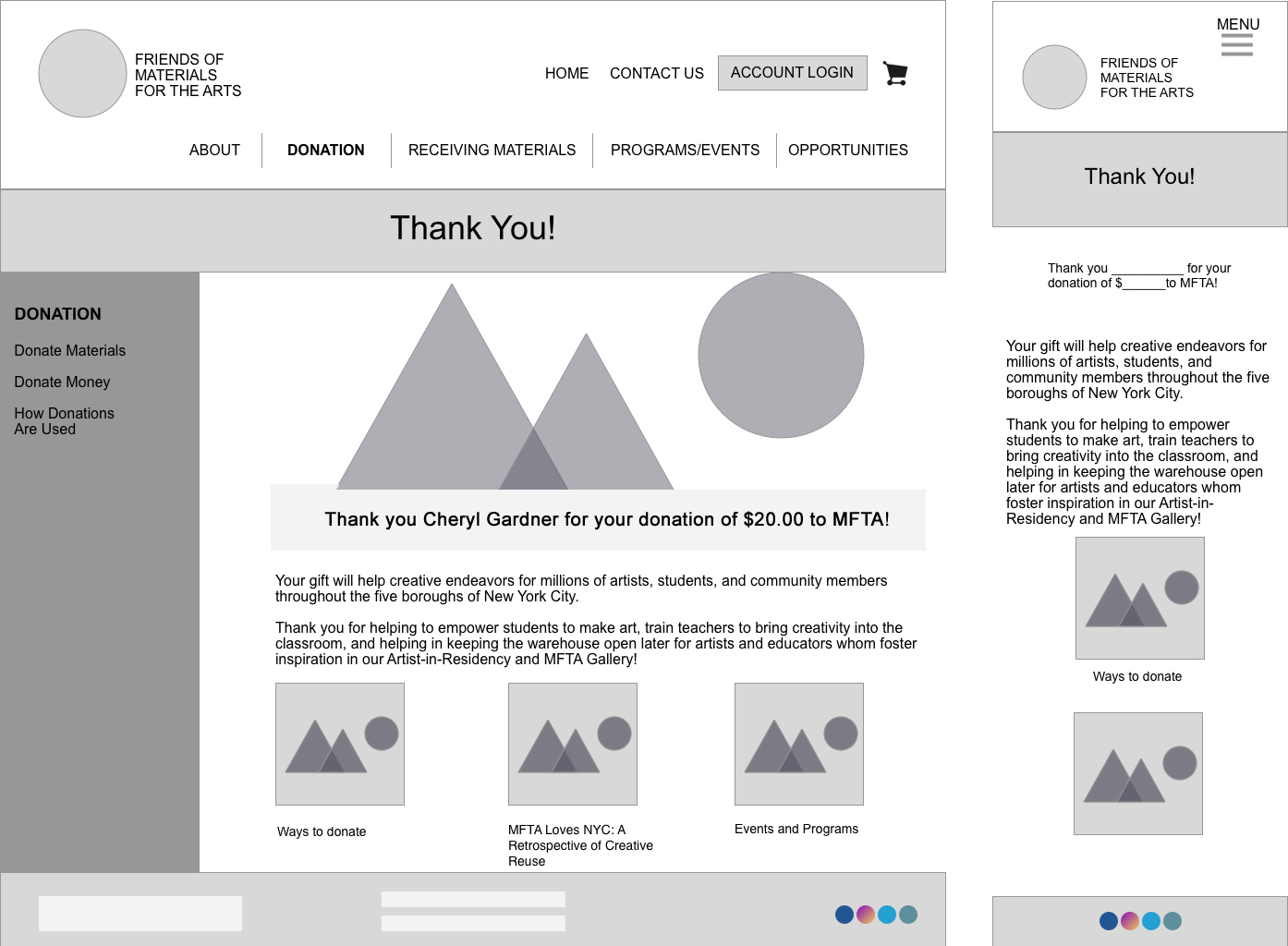
A review information page was added before the checkout for the event. For the donation, we also added the review information page as well before submitting the donation so that user would feel more secure.
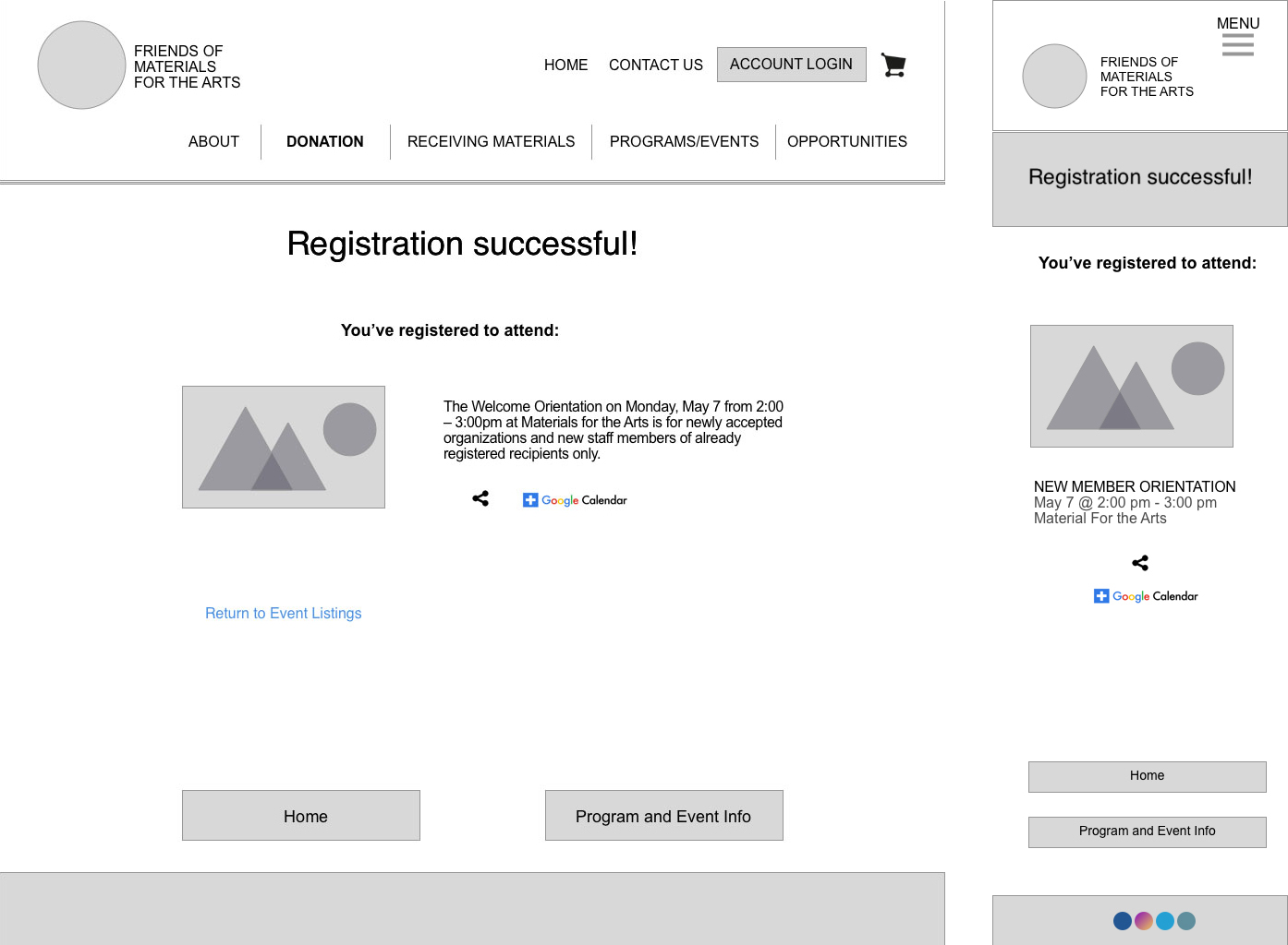
Share and saved to calendar features were available after completing the registration of the event.
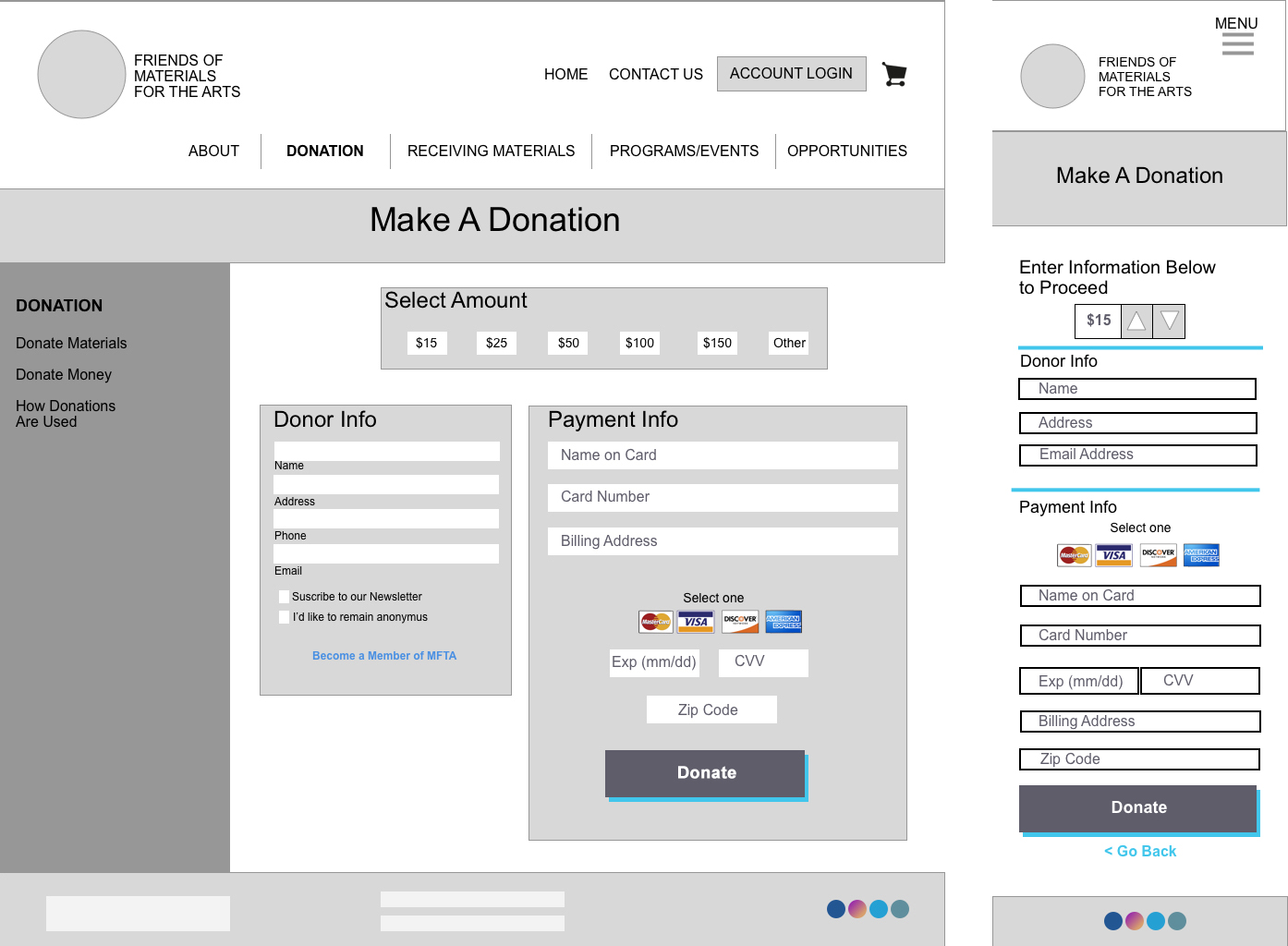
The donation process was kept simple. User could choose the donation amount, as well as entering the amount they wish to donate.
The donation process was kept simple. User could choose the donation amount, as well as entering the amount they wish to donate.
REFLECTION
This project provided a hand-on experience in designing digital interface from a user-centered perspective, from concept to prototype. During the process, I have learnt a varirty of design methods at understanding users and their contexts, and learnt to used tools to create a range of design deliverables that communicate design insights effectively. In the end, I have a foundation of knowledge and skills that prepare me to do practical design work in a varitey of fields.