Scope
Initial interviews with Materials for the Arts (MFTA) revealed the organization’s key goals in a website redesign. The organization would like its users to be informed of the different opportunities it provides beyond donations and scheduled appointments. In order to insure that prospective users are efficiently and effectively exploring the interface a series of user interviews and observations were performed by a Pratt research team.
Problem
Interaction with users is limited and lacks communication, preventing the organization from growing a user following.
Ask
Design a new responsive website architecture, using insights gathered from user research.
My Role
Our team was comprised of four researchers including myself. Within the team I served as copywriter, providing context and discussion around our design choices and user insights. Outside of this role I conducted user interviews and testing throughout the process, and offered input in all design choices.
Process
MFTA website redesign process consisted of six stages
- User Interviews & Insights
- Card Sorting
- Tree Testing
- Sitemap
- Competitive Analysis
- Prototype
User Interviews
We interviewed eight participants that illustrated MFTA’s key user demographic. Participants were artists, educators, non-profit employees, and previous MFTA users. The team developed a universal interview and observation guide to address the concerns of the MFTA, while also providing for targeted questions and tasks to be addressed while users interacted with the current website design. From these interviews we extracted common themes. We then created MFTA’s user personas and established user insights.
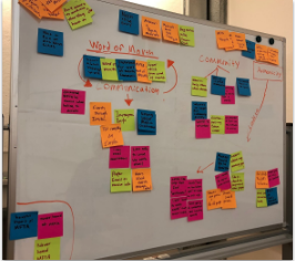
Affinity Diagram of User Feedback & Insights
Personas
In order to work with the user and not for the user, we created personas that reflect MFTA’s typical user demographic.
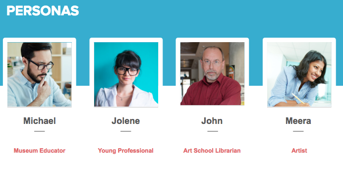 User Persona Overview
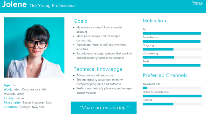
Detailed User Persona
Insights
- Users will engage if the process is easy
- People don’t want to schedule time for their generosity
- They will donate to organizations that are relatable
Our data implies that users care about causes like MFTA, but the process to engage is complex and requires that the user is already familiar with the donation and shopping procedure. At the MFTA, users need to plan an appointment in advance. Suddenly, a gift-giving experience, which should be free and easy has become a responsibility.Lastly, users have trouble relating to the organization as the website uses jargon that only those with MFTA experience will recognize. Our users want to belong to a part of community and support organizations of real people.
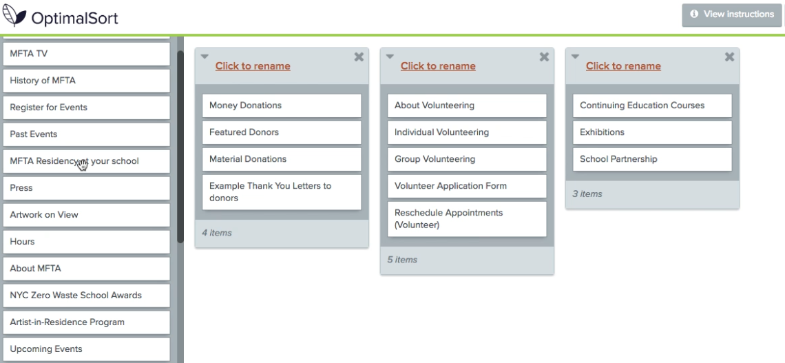
Card Sort
For this next stage, the research team recruited eight participants for an open card sort test. Participants were asked to place 42 different topics into groups (i.e. lesson plans, volunteer application, press, etc.), and to then label these groups.
User Participating in Card Sort
Most participants created similar groupings of topics, however participants exhibited placement inconsistencies with three topics:
- Jobs & Internships
- Artist Workshops
- Scheduling an Appointment
In step 3, the tree test, special attention was designated to these topic areas by the Pratt team
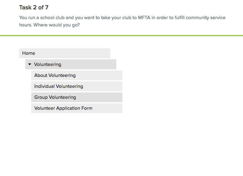
Tree Test
Based on the hierarchical structure and topic groupings created in the card sort, a tree test was created. The tree test is the proposed site hierarchy in its most basic form, without navigation or design elements. For this test, ten new participants were tested, two of which were recommended to the team through MFTA’s provided contact list.
Participants were asked to complete seven tasks, while navigating through the proposed site hierarchy, to discover usability. Task Example:
“You run a school club and you want to take your club to MFTA in order to fulfill community service hours. Where would you go?”
 User Participating in Tree Test
Participants displayed inconsistencies locating “Jobs & Internships” and “Artist Workshops,” so these were relocated in the final site map.
SiteMap
Content Structure
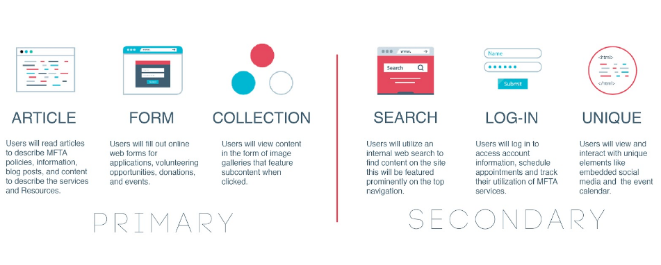
Based on the prior research from steps 2 and 3, the team broke down the website into primary and secondary ways in which users may navigate the MFTA proposed website.
Detailed Content Structure
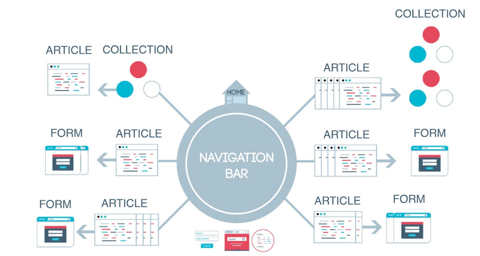
User Flow
After organizing the content categories of the site, we then visualized how the user would navigate MFTA’s redesigned website. Below is our spoke-style chart. An example user journey through the content would be: a page with “Article-style” content like volunteer information can lead to a Form to sign up to become a volunteer.
Sitemap Design
As mentioned previously, during step 3, tree test, participants displayed inconsistencies locating the pages “Jobs & Internships” and “Artist Workshops. Jobs & Internships had been under the About menu; it is now under Get Involved. Artist Workshops had been under a now-defunct Education & Workshops menu, it is now a category on the Events calendar.
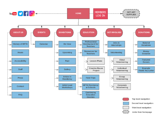
Detailed Sitemap
Competitive Analysis
Understanding the competition
We evaluated four non-profit organization websites based on their events, donations and volunteering web pages.
Museum of the City of New York
We placed these sites on a heuristics scale of 1-4 to test for clarity in design, brevity or ease of use and visual impact. Acquiring inspiration from these sites, and focusing on MFTA’s organizational mission we developed MTFA’s design principles.
Key Design Principles
Simplicity – Only highlight core tasks to the user. Limit text and photos as not to overload user visually
Aesthetics – Clear bold and colorful photos. Bring art forward and text back, and ensure a cohesive design across all pages
Relatability – Use language that is accessible and limit jargon. Create an empathetic approach to users and one that is unassuming, and show off the community
Brevity – Should be of the utmost importance on MFTA’s new website. Focus only on information that is informative to the user
Prototype
The scope of the prototype was built around three common tasks that users take on the MFTA website:
1. Finding and registering for events
2. Signing up to volunteer
3. Donating materials
These tasks were given emphasis because based on our research they are among the most complex tasks users will do on the website, and therefore require the most attention and care. MFTA specifically mentioned that they would like the mobile website to be as comprehensive as the desktop, because on the current platform, users were abandoning their search because of confusing mobile site.
Finding and Registering for an Event
In the initial interviews we had with users, they talked to us about how they search for events in New York City. There were many different entry points the participants chose (eventbrite, google, google maps, etc.). However, one thing stood out, users may be looking for a specific day to attend an event or a specific event and are flexible on the date. Thus for our events page we thought it was useful to have a small calendar along with the type of events. We also included a drop down menu, to showcase the three different events that take place at MFTA, eliminating the need for a user to have a mental model of what is on offer at the organization.
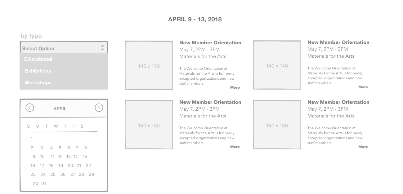
Desktop Events Page
Volunteering with the Organization
Volunteering is one of the many ways to give back to the community and MFTA. We broke Volunteering at MFTA into four categories: Individual Volunteer, Group Volunteering, Corporate Partnerships, School Partnerships. Currently just Individual and Group exist on the MFTA site. We wanted to showcase all the ways people and groups may volunteer their time. Once a user choses their ideal volunteer category, they are lead straight to a sign up form, as all the information they need to commit is up front on the site page. Final Prototypes can be viewed here: Desktop : Mobile
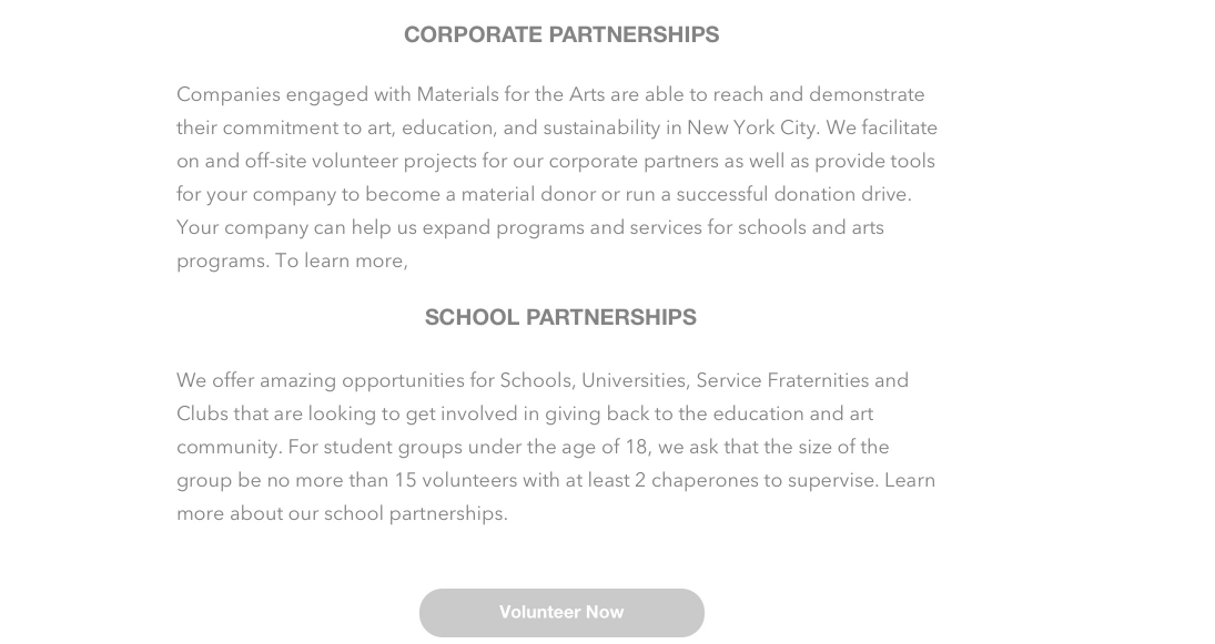
Desktop Volunteer Page
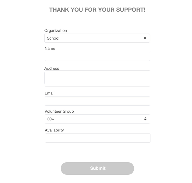
Desktop Volunteer Form
Donation Page
MFTA was upfront during initial interviews that they wanted more donors. And for MFTA donor means more than dollars it means things (art materials, electronics, fabrics, etc.) as well. They wanted to let people know how to donate and reuse materials in a clear manner. Therefore, when designing the donation page, we wanted the user to know how to donate, and what was possible to donate, eliminating the need for follow up phone calls to the already busy organization.
Desktop Donation Page
Reflection
Throughout the project we were grappling with the language to include on the site, as much of the site had an exclusive lexicon, and we felt we had to rework much of the language without MTFA input. Usually organizations chose words for a reason, but we were not able to work with them or their current users on this aspect, limiting our confidence in our word choices. Beyond limitations, I think we were able to pinpoint MFTA’s main architectural issues, into three main areas, allowing for an easy to manage presentation to the client, and limiting the clients from feelings overwhelmed.