Scope
The CUNY Graduate Center (GC) Library is in the process of revamping its digital presence. In order to do this in a way that centers the user’s experience, a careful examination of user behaviors, desires, knowledge, and expectations is required.
My design team, Team Buttons, set out to research the library’s target users in all of these aspects in order to provide the GC Library with the best possible high-fidelity prototypes to help guide the library’s website design process for desktop and mobile interfaces.
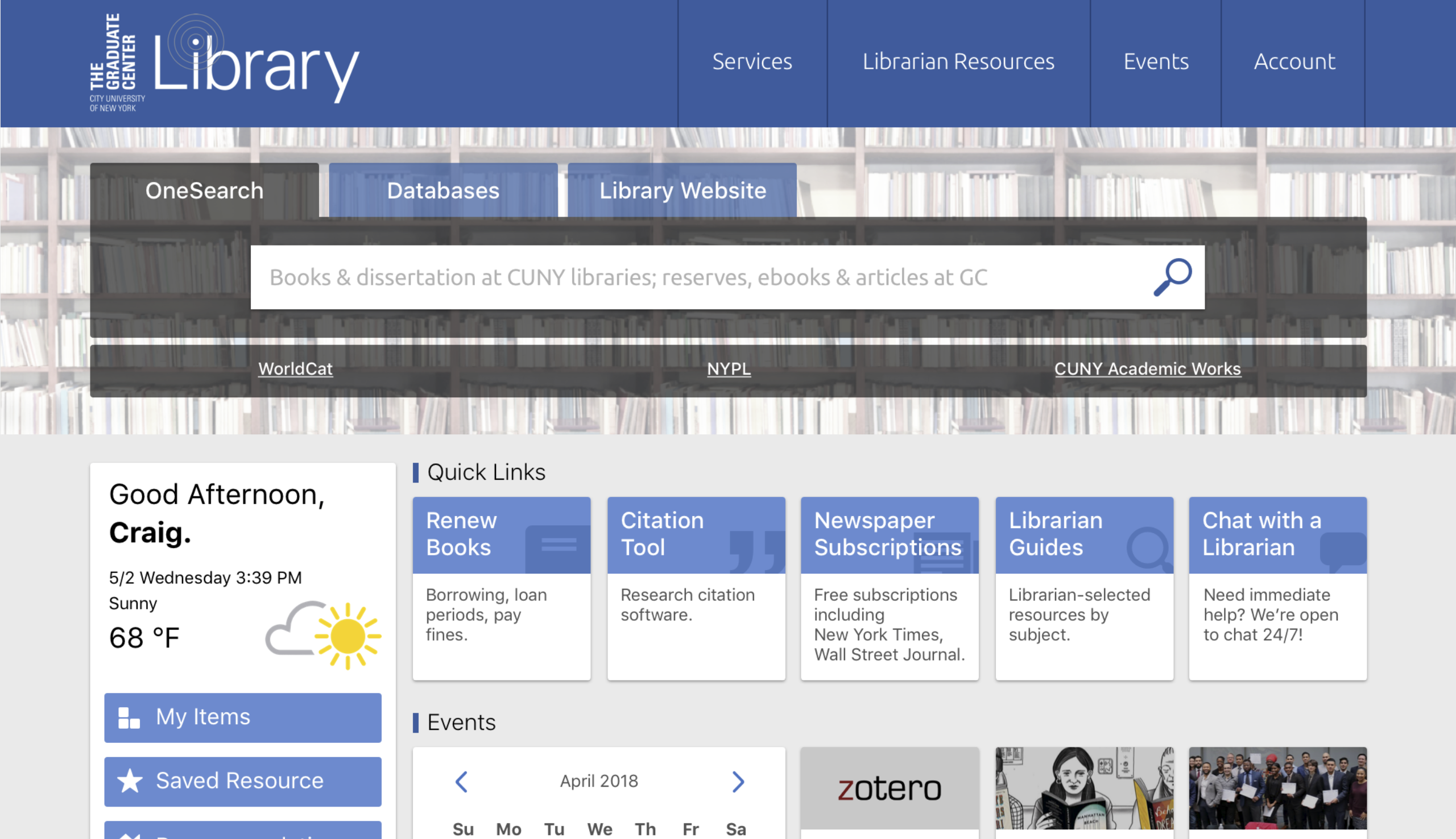
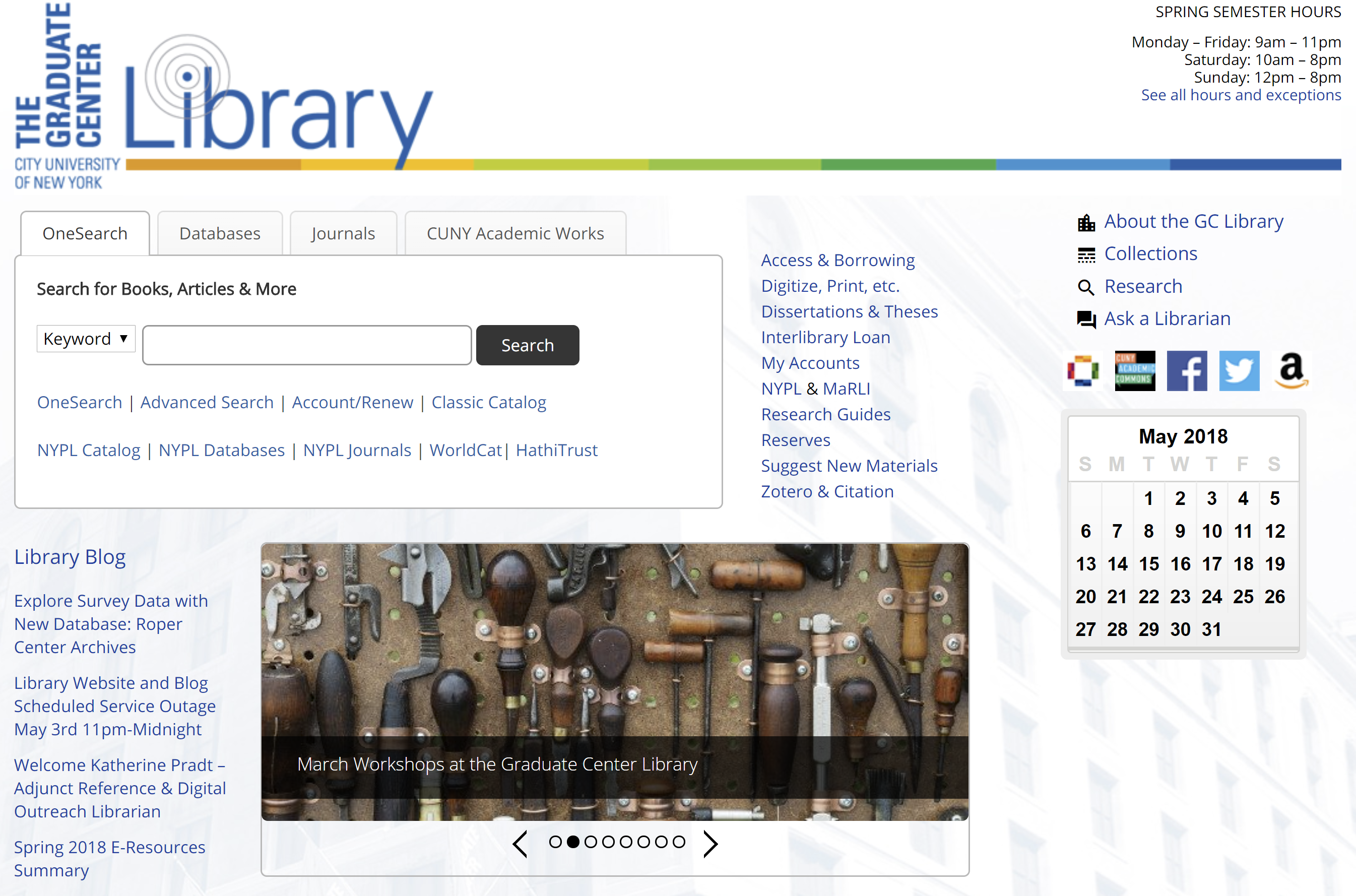
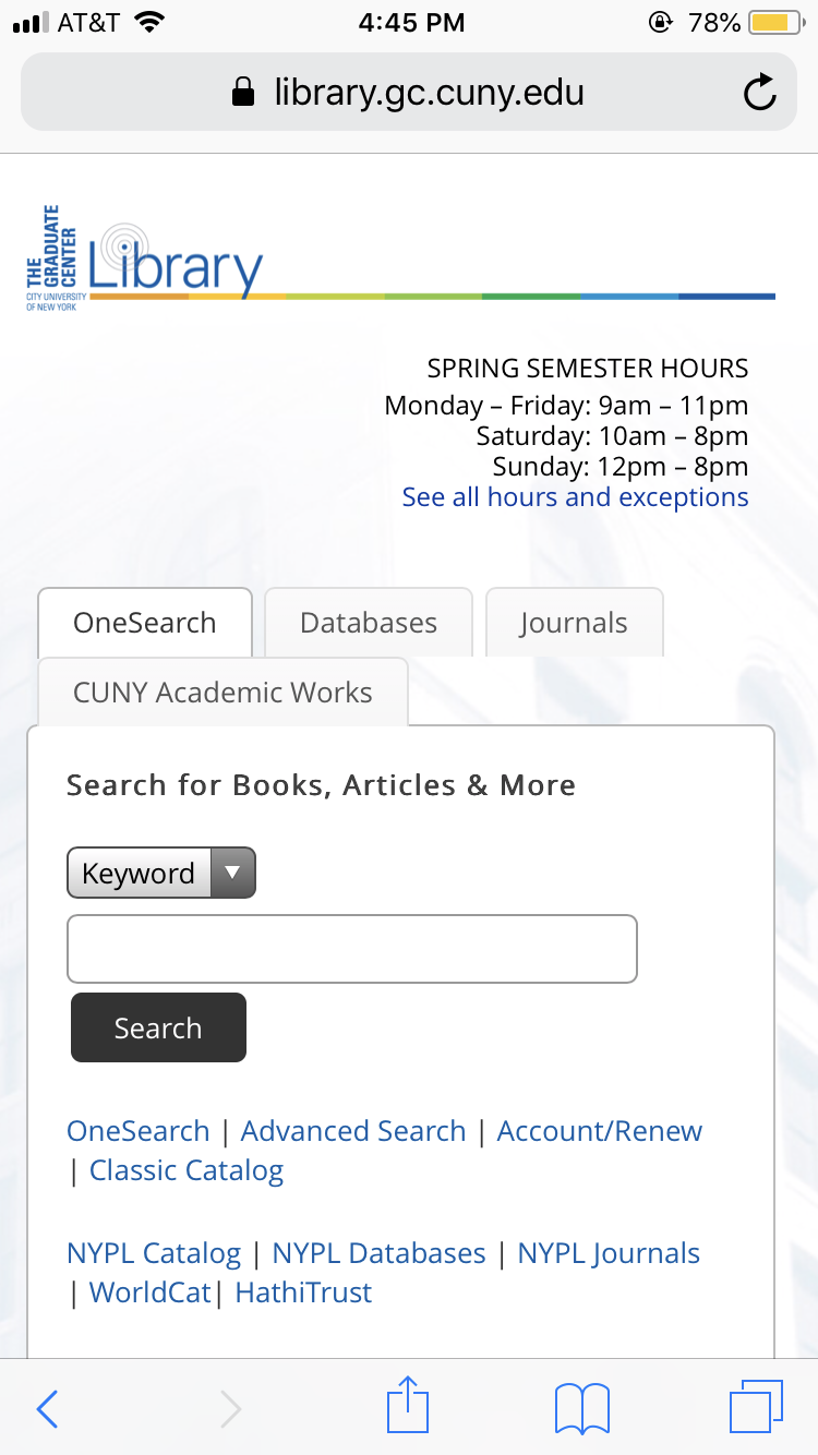
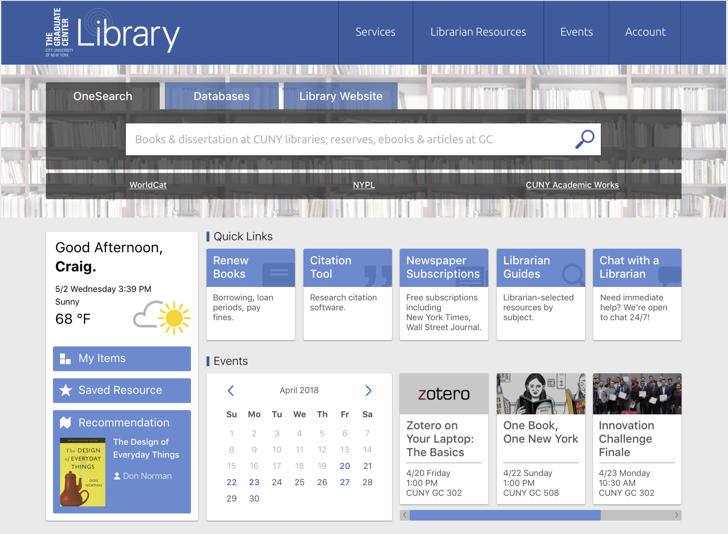
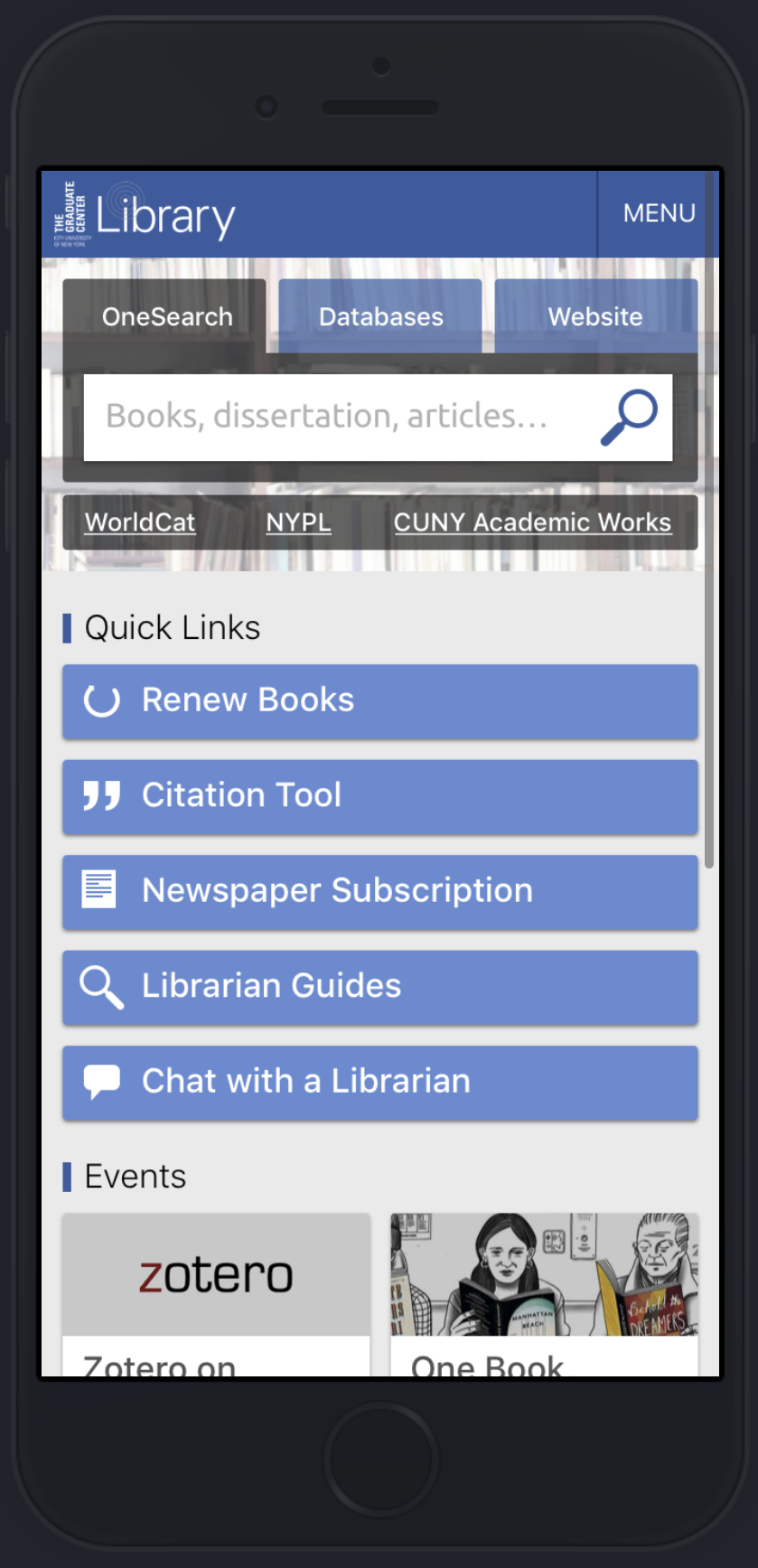
The images below depict the current state of the CUNY GC Library website’s homepage on desktop and mobile devices:
Process
In our effort to create the best possible high-fidelity prototypes, we carried out the following research methods, while utilizing key principles of information architecture and interaction design:
- User Interviews, Observations, & Questionnaire
- Card Sorting & Tree Testing
- Competitive Analysis
- Low-Fidelity Prototype User Testing
With the above research, we were able to create the following deliverable milestones, along with accompanying research briefs to guide our own high-fidelity prototype design process:
- Persona
- Site Map
- Competitive Analysis Review
- High-Fidelity Prototypes
User Interviews, Observations, & Questionnaire
To begin our user research, we collected data through interviews, observations, and questionnaire submissions from library staff and graduate students (current and recently graduated). For interviews, questions were asked of participants regarding library site use, preferences, and frustrations. Questionnaires included fifteen questions that also touched on library use and preferences but were more focused on gathering ratings regarding common library website activities. Observations were done by having participants carry out three tasks on the School of Visual Arts and Columbia University library websites. The tasks were divided among our four team members, and I conducted two interviews and two observations. Results were then collected and analyzed by the team in order to produce our user profiles in the form of personas.
Deliverable: The Persona
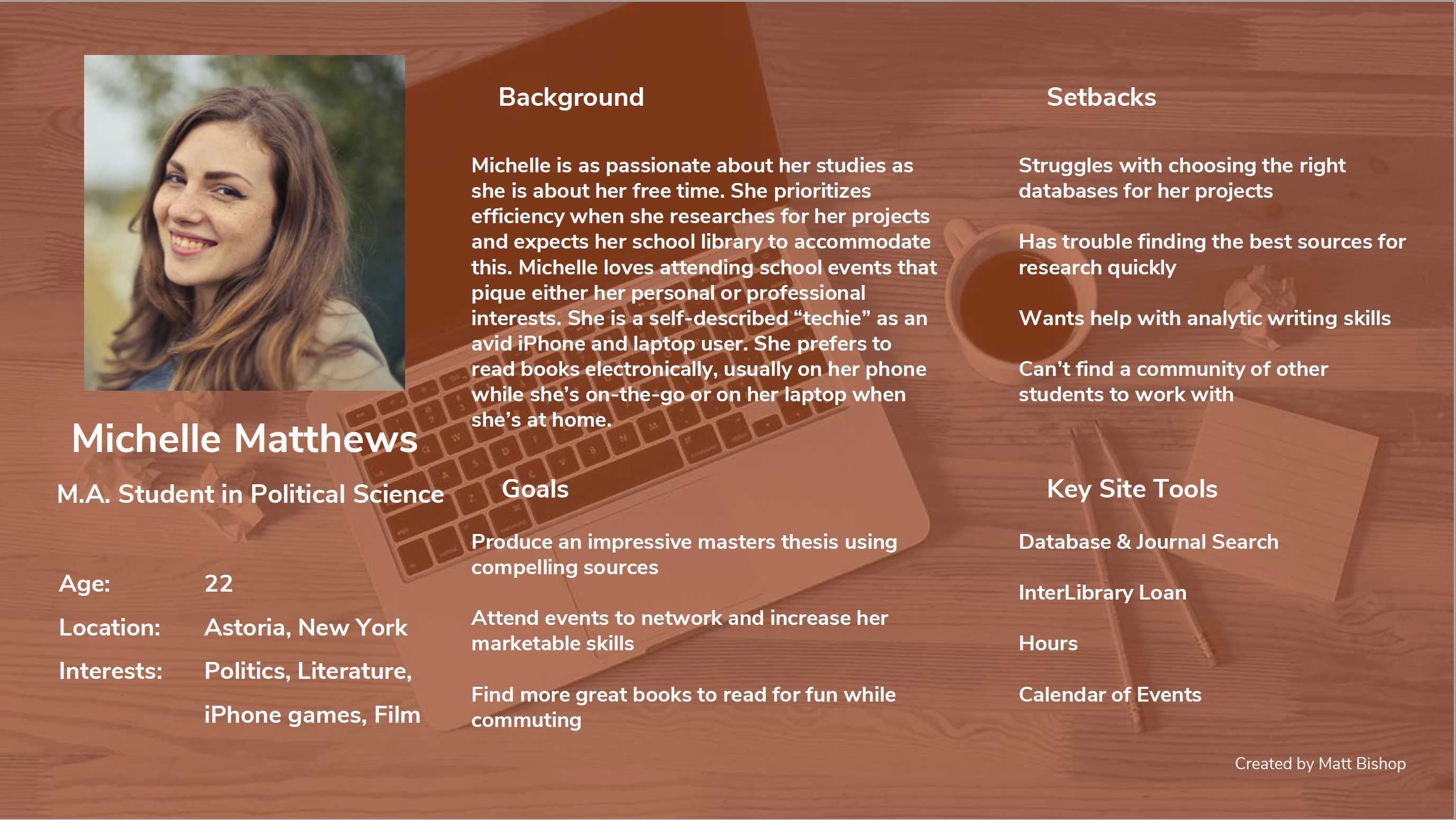
My persona is snapshot of a tech-savvy graduate student who wants to use the library and its online tools to conduct her research, enhance her writing skills, and attend events for professional and personal interests. This particular profile choice is meant to illustrate the needs and wants of a typical student user of the CUNY Graduate Center Library based on the results of my team’s user research. This is intended to compliment other personas that my team created, including a library staff member, a professor, and a PhD student.
Major findings from our user research:
- Site navigation is key
- Database searches are important
- Users like events, but are unaware of them
Card Sorting & Tree Testing
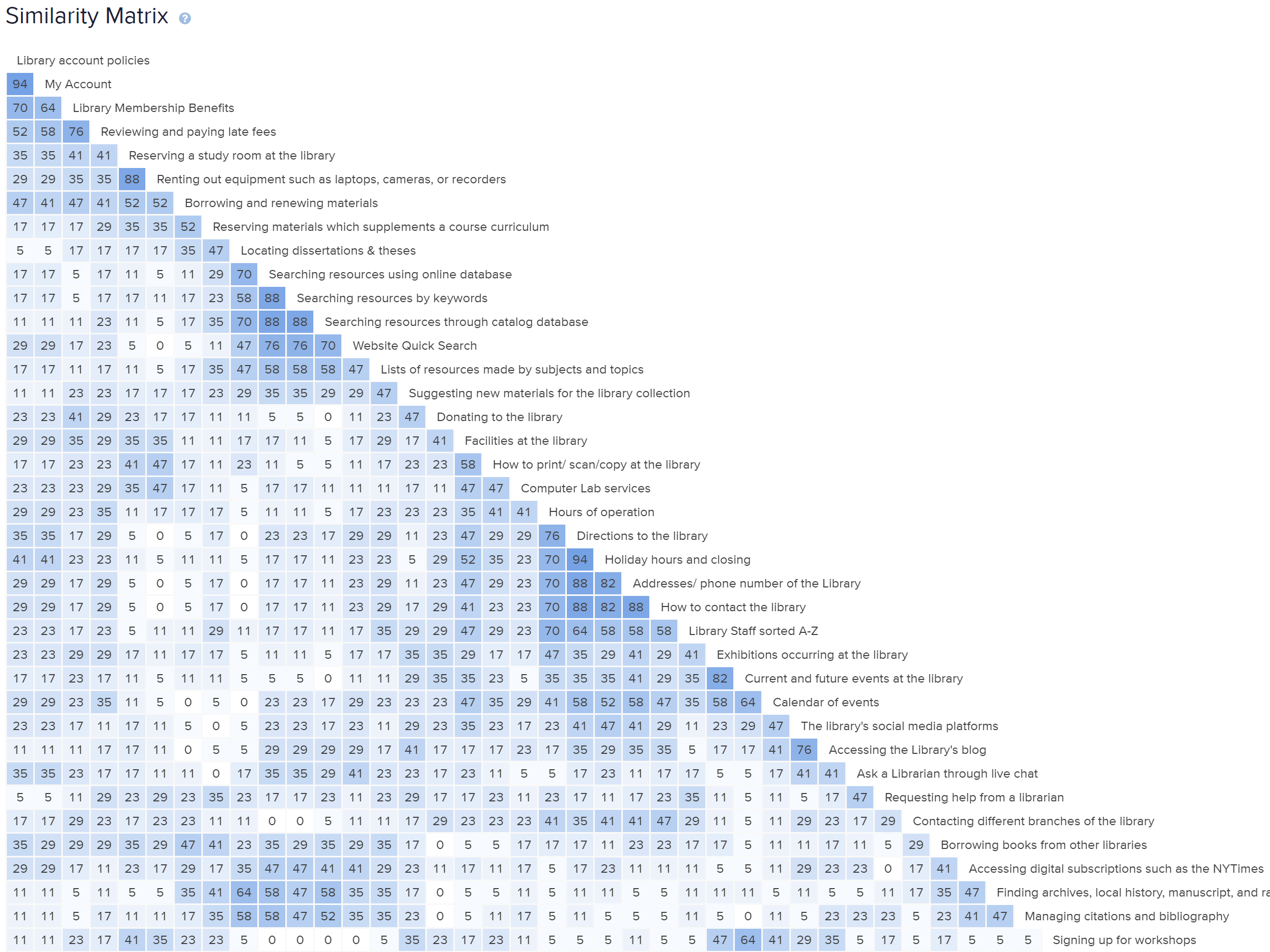
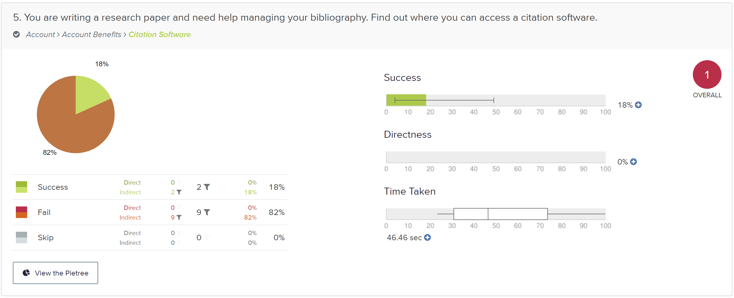
Our team conducted an online card sorting study of potential menu items informed by the “heat map” that we were provided with of the CUNY Graduate Center Library website’s homepage and from model websites suggested to us by the librarians at the GC Library. For items that we saw users had difficulty with in the card sort, we looked at model websites to see how they structured similar content.
The foundation of our tree test came out of this process. Major decisions in our tree test study came from group discussions about logical information structure and user interaction design, such as learning through repetition. The card sort and tree test were created using Optimal Workshop. The pics below are examples of the analyses that were provided on Optimal Workshop as a result of our card sort and tree test respectively.
Deliverable: The Site Map
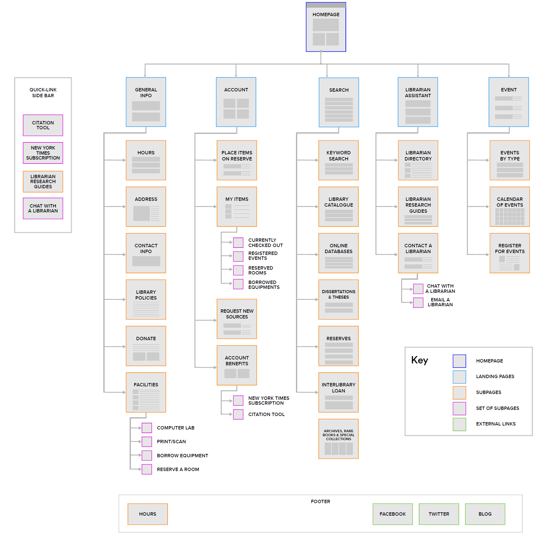
From our card sorting and tree testing, we found that useful resources which have proven particularly difficult to categorize could be easier to find when brought to the front of the interface rather than burying them deep in the navigation structure. We created the “Quick Links” sidebar to accommodate these hard-to-find yet important items. We added “Chat with a Librarian” to the Quick Links sidebar because of the tendency we saw for users in our tree testing to look in “Librarian Assistant” when searching for items on the website. We also relied on some information found during our earlier interviews, observations, and questionnaire when creating this site map (using Lucidchart).
Main findings of our card sorting and tree testing studies that contributed to our site map creation:
- Some menu items can be inherently difficult to find within a navigational structure – these should be highlighted for easier access
- Users categorized different ways of searching together into one group
- Placing the “My Items” section under “Account” was successful
- “Librarian Assistance” and “Search” should be high-level menu items
Competitive Analysis
For our competitive analysis, our team evaluated five websites that represented alternatives to the information structure and overall design of the CUNY Graduate Center Library’s website. These sites came from Google Scholar, Columbia University Library, Boston College Library, Duke University Library, and Cornell University Library. These websites presented similar content and functionality to the CUNY GC Library’s website with relation to the needs of graduate student researchers. We selected six dimensions to analyze and compare the competition: the homepage, site navigation, page organization, search, style, and mobile-friendliness. Each dimension was rated on a scale from 1 to 3, with 1 being low-quality and 3 being high-quality.
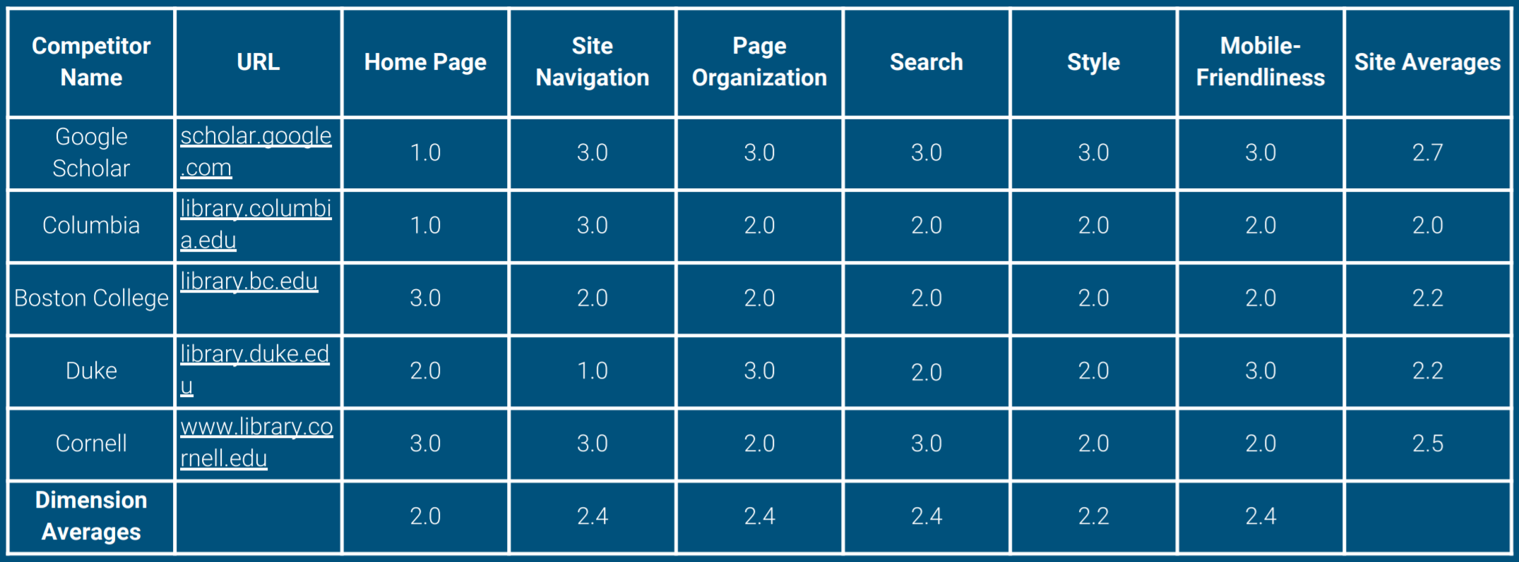
Deliverable: The Competitive Analysis Review
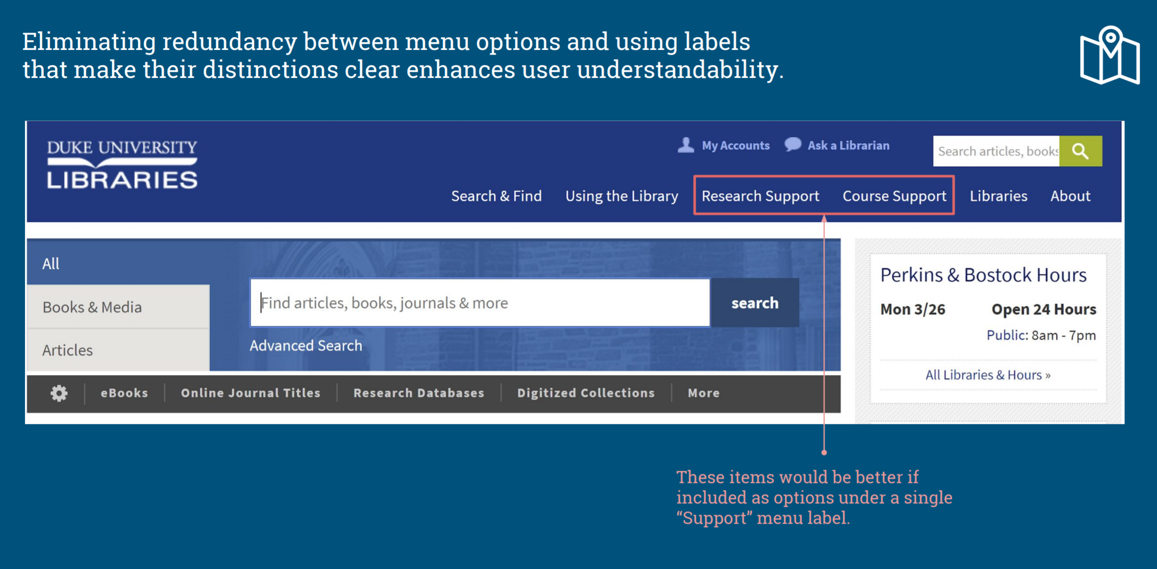
From our competitive analysis, we produced a complete report of our findings. In this report, we considered the following elements to be important when designing our new prototype because of user expectations defined by the competition:
- Consistent use of style elements across browser sizes
- An intuitive page layout
- A well-organized menu hierarchy
- Good search functionality
Low-Fidelity Prototypes: Creation & User Testing
Our team created two low-fidelity prototypes, one for desktop and one for mobile, and tested them on users via the completion of two important yet distinct tasks on the CUNY Graduate Center Library’s website. The desktop task asked users to find the “Chicago Manual of Style” online database and the mobile task asked users to request a book called “Lean UX” through Interlibrary Loan. Prototypes were built in Sketch and connected to InVision for interactive user testing. Each teammate conducted two user tests and results were discussed as a group.
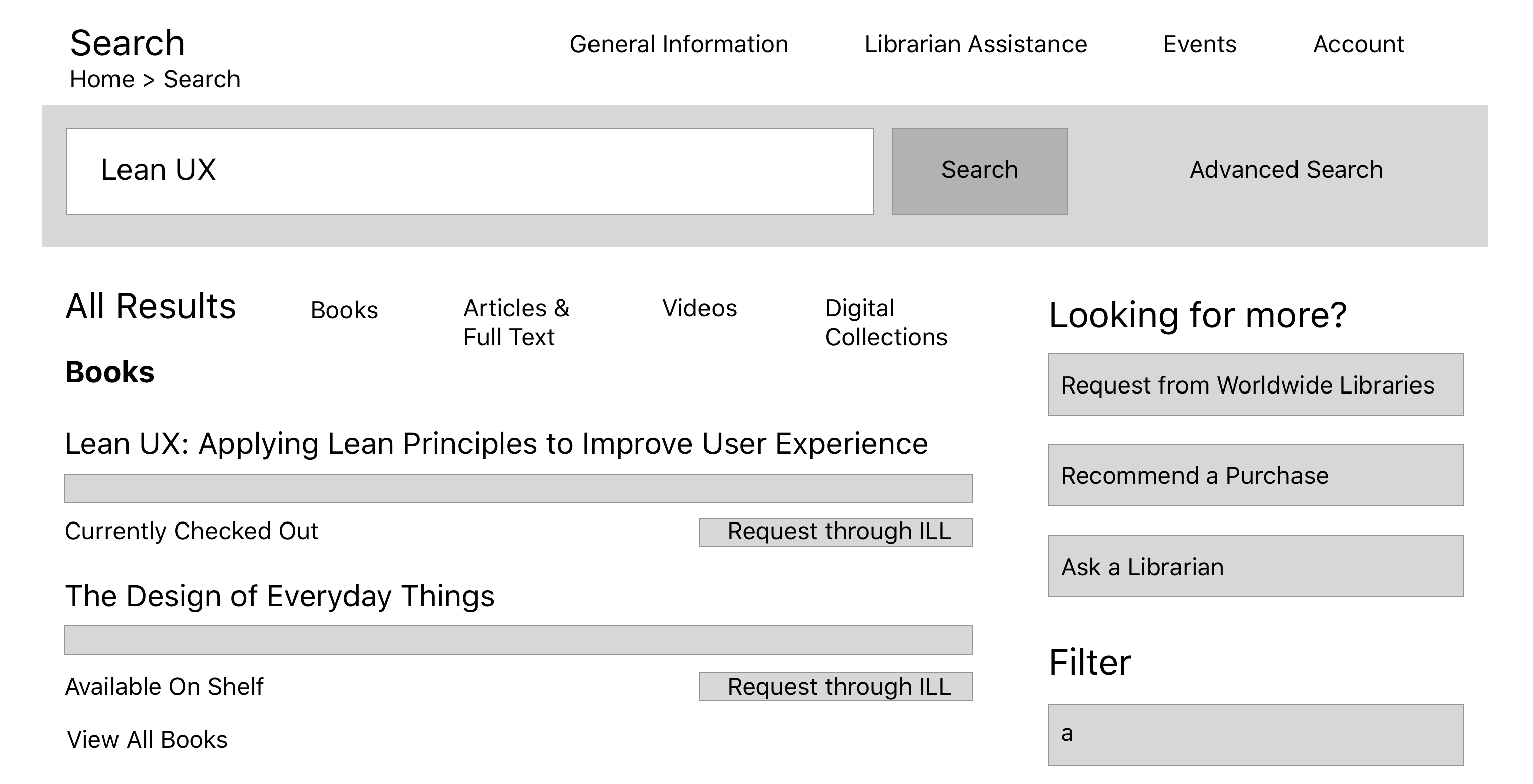
All of our users completed the tasks without much trouble, but important labeling and style issues were discovered in our testing. Some of the major recommendations that I found from this testing are the following:
- Use the full name of Interlibrary Loan rather than “ILL”
- The Interlibrary Loan process should be made transparent
- Make drop-down menu arrows face right by default, or get rid of them
- Increase the use of text styling elements to separate disparate information fields
Deliverable: The High-Fidelity Prototypes
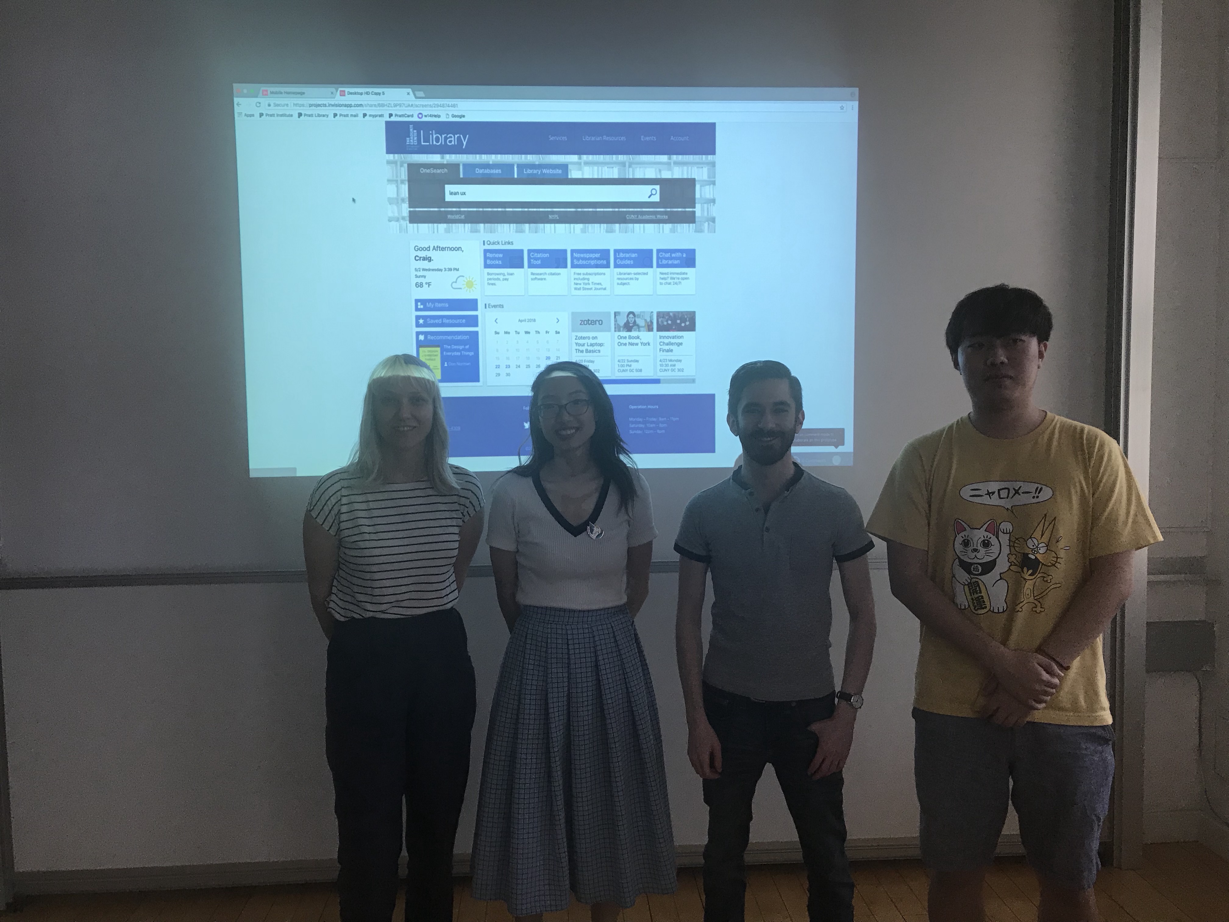
Synthesizing results from all of our earlier tests and research methods, we designed two high-fidelity prototypes, one for desktop and one for mobile, to demonstrate two important tasks on the CUNY Graduate Center Library’s website. We made sure to highlight user personalization, an intuitive menu hierarchy, easy-to-use search functions, a minimalist color palette, and positioning key information above the fold in our final designs. All team members created specific pages of the final prototypes in Sketch according to common themes and a style guide. After this was completed, we collaborated on how to best combine the pages into our final Sketch files that were then imported into InVision in order to add hotspots to the pages to make them interactive.
Review
Presenting our high-fidelity prototypes to the CUNY Graduate Center Library staff and viewing other teams’ prototypes allowed us to see if the products of our research aligned with the goals that we set out to achieve. GC Library staff were very responsive to the style and information hierarchy changes that we and other teams implemented. However, the use of user personalization features, such as book recommendations, should be implemented with caution. While our users noted how they desired personalized elements on their online experiences, library staff shared with us their concerns for data privacy when user behavior is being tracked by a site like theirs. An alternative to personalized book recommendations could be staff book recommendations or recommendations based off of user-selected categories (as an optional opt-in feature).
See Our Final Prototypes!
You can try out our final high-fidelity prototypes by clicking on the links below for the desktop and mobile tasks. I hope you enjoy them!
For your convenience, task flows for these prototypes are provided below.
Desktop Task Scope: Request the checked-out book called “Lean UX” from Interlibrary Loan.
1) Click anywhere on the text field on the OneSearch bar and click on the magnifying glass icon to the right of it.
2) Click on the second search result on the text that reads “Lean UX: Designing Great Products with Agile Teams.”
3) Click on the “Request through ILL” button.
4) Click on any empty text field and then click the “Submit” button to complete the task.
Mobile Task Scope: Register for “Zotero on Your Laptop: The Basics” event.
1) Scroll down on the mobile homepage and click on the “Zotero on Your Laptop: The
Basics” event advertisement.
2) Click on the “Register” button.
3) Click on any text field to populate Name and E-mail information and then click on the “Submit” button.
4) This task is now complete if you see a green “Registered” notice.
*Note: For either task, you can click on top-left logo or “Home” underneath it to return to the homepage.