
Dark Sky is a hyperlocal weather application for mobile devices, notable for its accurate predictions of upcoming weather at your exact location. Dark Sky also includes a 7-day general forecast and a weather map that scales from global to local, showing radar data over a timescale that varies based on the scale of the map.
The Forecast Page
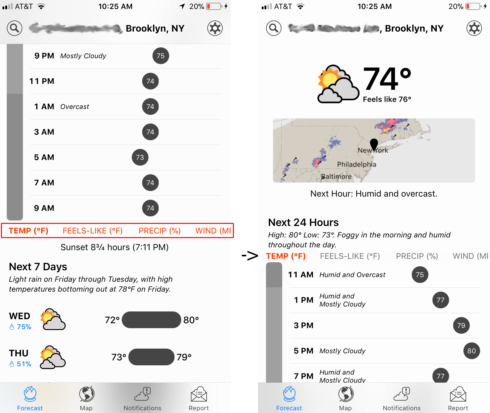
The forecast page, shown above, is what the user first sees upon opening the app. The current conditions at the users location is displayed in large lettering at the top, with a map preview just below. Further down from the map is an hourly forecast and written description of the weather for the day. The map is clickable, and takes you to the map screen. While the map preview is lacking any obvious signifiers that it is clickable, the designers of Dark Sky have relied upon cultural conventions associated with weather apps, and mobile app design in general, and embraced the perceived affordance that touching the preview at the top will enlarge the map.
A sticky toolbar is also included at the bottom of the screen, remaining in place whether scrolling or changing modes. The toolbar is an expected design feature, common to mobile applications, and the icons provide good discoverability for what other major actions are possible in the application (the same holds true for the search and settings icons at the top).
Further Down The Forecast Page
While not immediately discoverable, the forecast page of Dark Sky is actually quite long and there is more information hidden below the fold than immediately available to the user. The only visual signifier that there might be more below the bottom edge of the screen is a small part of the hourly forecast seems to run off the screen, hiding behind the toolbar. Conventions relating to the use of mobile applications probably result in users attempting to scroll anyways, but there is a small issue here. An easy fix would be to add an indicator on the left side of the screen, a vertical 3-dot indicator or a scroll bar would suffice.
There’s another issue here below the fold that becomes obvious once the user scrolls. The red buttons under the hourly forecast are lacking strong enough signifiers to make them obvious as buttons that modify the hourly forecast. A solution would be to move these interactions above the hourly forecast, so that they feel like data filters. In addition to the bolding applied to the active button, graying out the non-selected options will help signify that they are indeed buttons to be interacted with.
The 7 Day Forecast
Below the hourly forecast, Dark Sky presents a 7 day forecast with low and high temperatures presented in a graphical representation. Each day is expandable to an hourly forecast, but this interaction lacks any signifiers that the user can expand to a more detailed view.
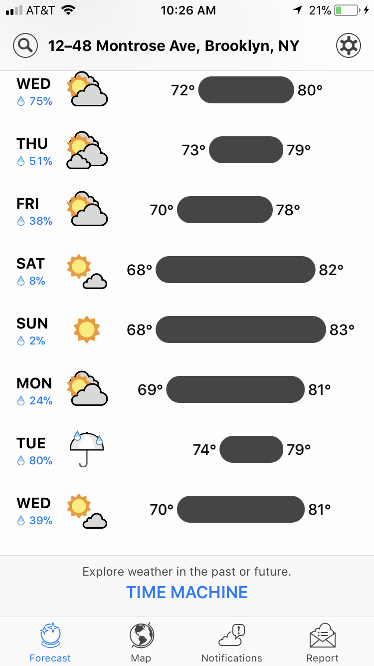
While some users may have a conceptual model that it should be possible to click on the individual days to drill down into a more detailed view, the lack of signifiers can result in lots of users missing functionality of the app. A simple fix would be to add slim down-arrows into the temperature-range bar (or elsewhere, aligned with each day), implying that there is an action to take for each day in the 7 day forecast.

Dark Sky is a powerful and feature rich weather application, and with a minor amount of adjustment some of the issues in it’s design around discoverability and the gulf of execution could be easily rectified.