Groupon is a convenient and cheap e-market where consumers are able to find thousands of local deals of the day at various discounts. The deals include a great variety of goods, activities and services. For activities and services, customers would purchase the voucher on Groupon app and later redeem these vouchers at the actual vendor. Groupon is also a wonderful promotion platform for local businesses because of their large consumer base. By the end of 2016, Groupon had slightly over 52 million active customers. This design critique will be based on the perspective of consumers. I will discuss the positive sides first and then propose my suggestion for improvement at the end.
Great discoverbility for Easy navigation
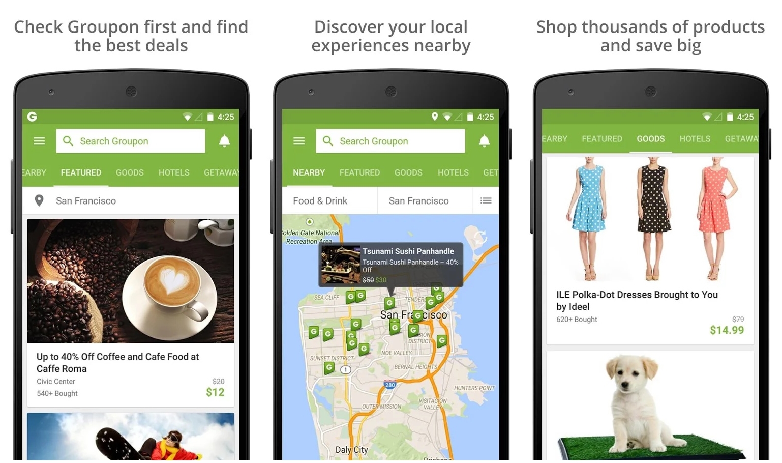
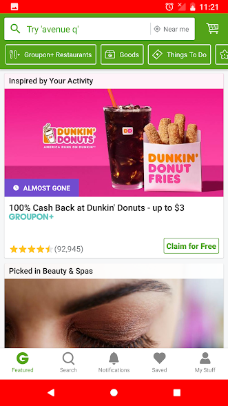
when users first logged into the app, they will see the screen below (image 1) as the default “home page”. On the top of the screen, a search bar is highlighted with location right next to it. Right below the search bar, several popular topics are suggested, such as restaurants, goods and things to do. At the very bottom, it has five options as “feature”, “search”, “notifications”, “saved” and “my stuff”. The page lists trending or new local deals. Once the app learned your habits and hobbies through the user’s search words and purchases, it will create a personalized feature list for great deals.
The layout of this app shows great discoverability. All of its main features are being showed to the users at first sight. The most important feature of searching different local deal is demonstrated through the green highlighted search bar and location button on the top. This design also demonstrates the visual hierarchy. The Norman examples of telephone system with many many features and the small car with lots of buttons didn’t happen here. Groupon’s app design overcame the “complex interface for essentially simple things” and kept this app simple and understandable.
(image 1)
Clear Mapping for a Smoother Shopping Experience
Checkout is one of the most important parts in the process of e-shopping. Great and smooth checkout experience increases the satisfaction of customers. On the other hand, frustrating and tedious checkout experience could result in unpleasant memories. More importantly, it could even make customer change their minds and give up the purchase. On Groupon, checkout is one click away. On the page of each deal, “Buy” button is always located at the bottom center of the page no matter how the customer scrolls. When the customer clicks on “Buy”, it leads to the “Review you Order” page where customer can choose their payment method. If the customer made purchases before, the app will prepopulate their payment information. As soon as the customer confirms and click on “Place Order”, the purchase is complete. A complete order message will show at the center of the screen.
The mapping of this checkout process is logical and clear. It meets people’s cultural norms of buying and imitates the process of a real life purchase which is select, buy and pay. The instant feedback when customer clicks the “buy” button is another bonus to their purchasing experience. Customers are constantly ensured that the app is in process by Groupon’s immediate feedback in correspondence to the users’ action.
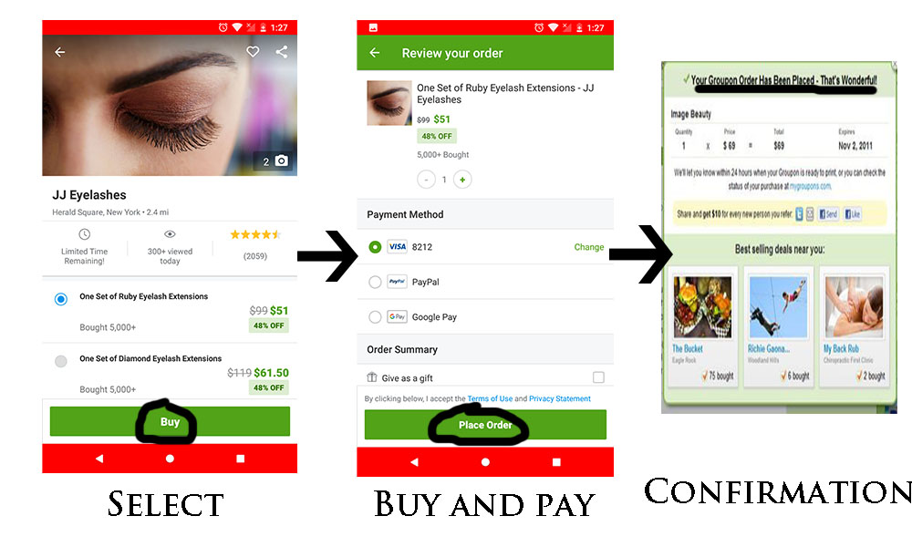
(image 2)
Inaccurate Signifier Causes Confusion
There’s a rating score along with the number of comments on the page of every local deals. When I first used the app, my tendency told me to click on the rating score which I thought would take me to the review section. However, there was no feedback. It took me a while to find out that the review section is close to the bottom of the page. Users have to scroll down four sections to see the review section. I had to admit it caused frustrations for me, because it disobeyed the previous norms. From my knowledge of using similar mobile app such as amazon and ebay, I could simply click on the rating score to go to the review section. More importantly, in consideration of how important reviews are when customer evaluates a product, it should definitely be made more accessible and apparent by linking the review section to the rating score lays right below the product title.
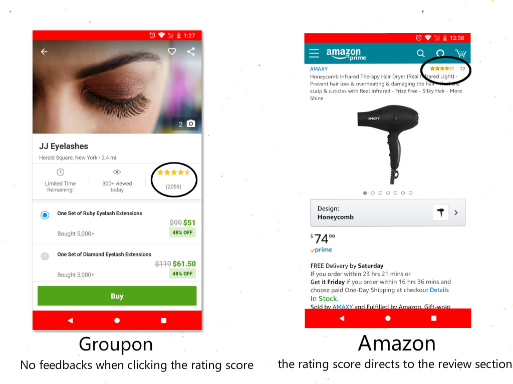
(image 3)