This critique evaluates the interface of Notebook function on Kindle PC app. The Notebook stores the following type of notes: bookmarked page, user’s written notes, colored highlights, starred highlights, and popular highlights from other users. Users can select from a drop-down menu to review their preferred type of notes. In addition, users can star or delete a specific highlight or written note.
Icon Paired with Text to Initiate Notebook Stress-free
Icon use helps the interface look clean (Figure 1.), avoiding too much text cramming on the already text-rich interface. The imagery nature of icon distinguishes itself from the text body, thus icon is visible enough to catch user’s attention when user navigates through the interface. However, since users could interpret the icon that looks like a piece of paper differently, this icon has ambiguous affordances on its own. Therefore, when the mouse touches the icon, the text label, “Notebook”, as signifier shows up, sending clear message of the icon’s purpose. Overall, combined use of icon and text increases the discoverability to initiate the Notebook, and therefore, reduces user’s stress when navigating across the content-rich interface. It is a success on the reflective level.
Intuitive Notes Viewing by Scrolling Down
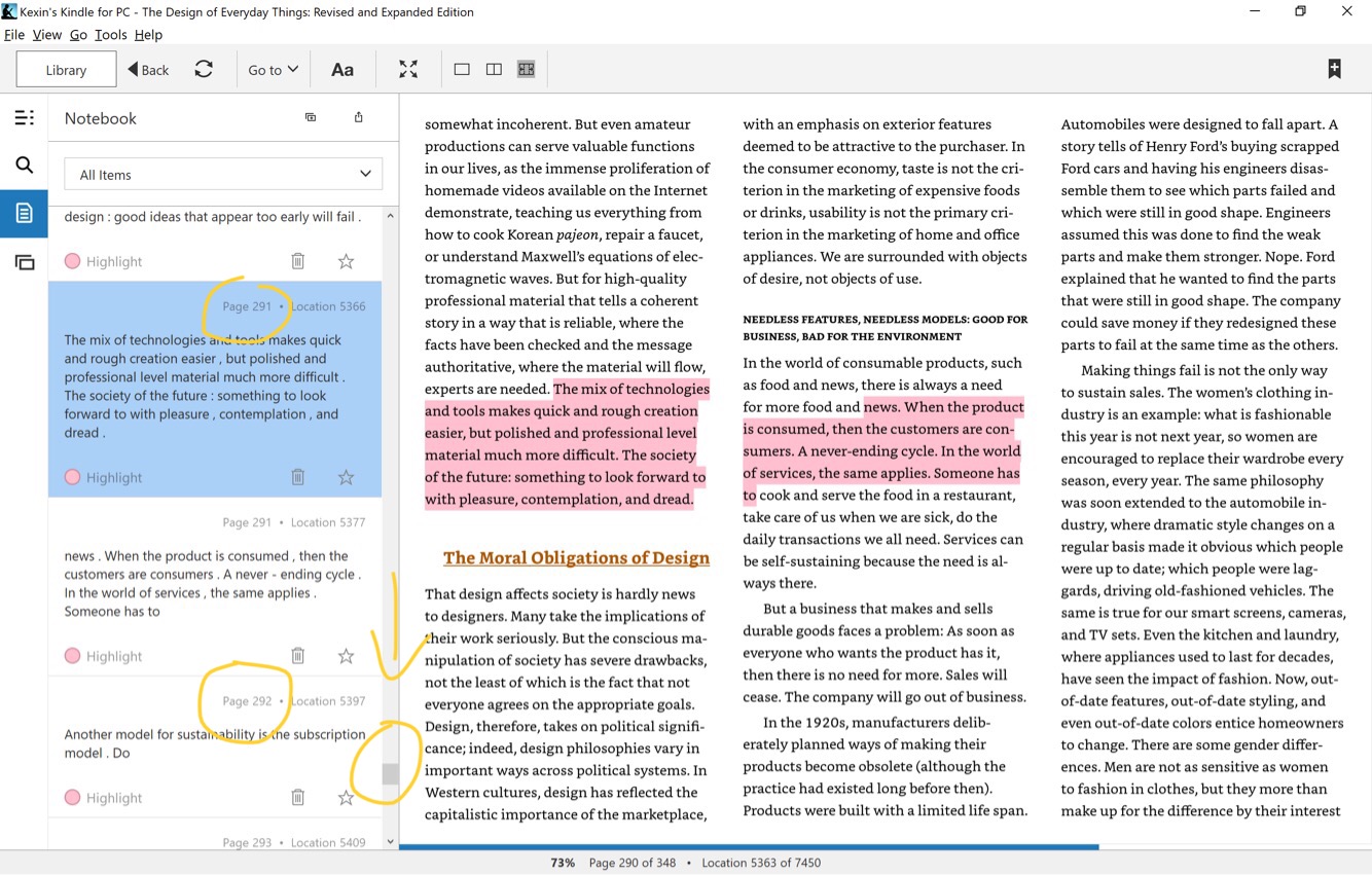
The notes are displayed in the order from the first to the last page of the book, rather than the time when the note is added. In other words, if a note on page 291 is added a few days after a note on page 292 is added, the note on page 291 is still going to show up first when the user scrolling down the Notebook column (Figure 2.). This is good natural mapping through culture. Experience on reading paper books teaches readers that the notes in the beginning of the book shows up before notes that are near the end of the page. Kindle Notebook’s system model matches user’s mental model that are learned through their past interaction with paper books. Furthermore, natural mapping also happens when the user scrolls up to reach notes in previous pages and scrolls down to reach later pages. In U.S, text content progresses in the direction from top to bottom on a single page. Therefore, it makes perfect sense to move up when searching for content in previous pages and move down when searching for content in later pages.
Weak Relationship between a Highlight and Associated Written Note
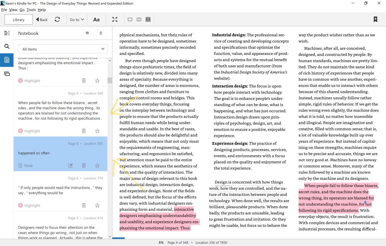
When the user highlighted a passage and generated a written note for the same passage, Kindle Notebook does not have strong signifier to address those are very different types of notes, or the association of the written note to the highlight passage. Without close attention, the written note is easily mistaken as a highlight (Figure 3.).
Solution: Instead of showing the written note on the vertical level (ie. above or below) to the highlight note, the written note could be placed in a conversing shaped box that can be extended from the highlight note. All highlight notes that are associated with written notes should look clickable. When the highlight note is clicked on, the conversing box containing written notes expands. This design signifies the relationship that the written note is an intellectual product generated from the highlight note. The shape of the conversing box carries the interactive nature of the reader and the text, and therefore semantically maps the relationship between the reader and the text.
Colored Highlight Has Ambiguous Affordances
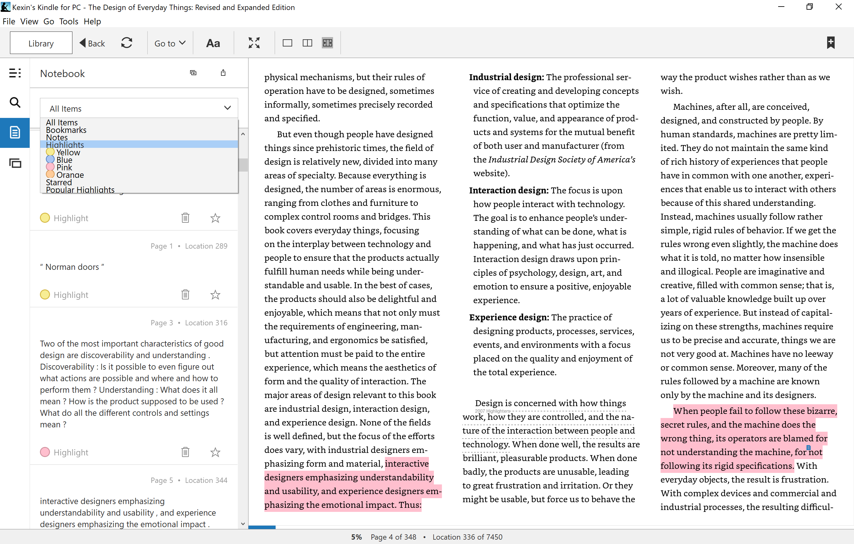
Kindle Notebook users are given four color options when they highlight, but the fact that users can view notes selectively based on highlight’s color is not signified in the design. It requires certain effort for users to assign different meanings associated with the color and to remember what they mean, such as “pink is absolutely important”, “yellow is fun reading”, “blue is scientific/technical concept”, “orange is worth to read again. The user would not actively use different colored highlights if he/she is not able to see its greater value in viewing notes in an organized way.
Solution: Whenever a novice Kindle user highlights a passage, an interactive prompt pops up as he/she is going to pick the highlight color, “Choose a color and view notes in color of your choice in Notebook later”. This prompt shows up in the first 5 times when the new user wants to highlight. This prompt indicates what actions the user can take with the highlight and what they could expect, and therefore, it improves the color highlight’s affordances.