
Netflix is a streaming service which offers its users access to TV shows, movies and documentaries. Users have to subscribe to the paid membership plan, which enables them to watch offered content without commercials on different number of devices. Netflix delivers its services in many countries and adjusts its offer per country.
Main screen
The main screen of Netflix app is divided into categories (new, popular among users and by genre). Currently, my subscription to Netflix expired, however previously Netflix was preparing a special offer for me. Categorization used by Netflix works very well – it helps user to plan and specify their next steps. Discoverability and mapping follow conventions. User can make a conceptual model of how Netflix works – it reminds a bit video shop, where movies were categorized by their genre. The personalized list, which now disappeared for me, reminds the suggestions of a shop assistant.
Recommendation: I would suggest to provide users with expired subscription the possibility to see the personalized list of movies to watch – it might remind them what movies they haven’t finished and encourage them to renew the subscription. Moreover, currently I do not see any warning that my subscription expired. This lack of forcing function, as described below, will allow me to err. Therefore, I would propose to add the note in red on the top of the screen encouraging me to Renew the subscription.
Search – new page

While clicking on Search button, I’m moved to search screen and virtual keyboard pops up. The instruction on the screen provides useful signifier that I can look in search box for my movies. However, the empty black field in the middle in my conceptual model of how app works and based on cultural convention, should take away the virtual keyboard and enable me to choose another option of the screen. It doesn’t. Eventually, I cannot remove the keyboard and it is not possible to rectify the situation and return to the place where I have been.
Recommendation: to allow user to click on the black part of the screen to hide the virtual keyboard.
Search – typing in the query

While starting to type on the Search bar, I started to receive the suggestions of possible titles I’m looking for. I have tried to use different versions of title in Polish, English and with typos and it worked. I do not need to be precise to receive what I was looking for. Designers obviously used Norman’s knowledge in the world concept. The search results show me the picture from the movie and the title. This is great natural mapping! I just need to click on it to start watching the movie.
Watching/Downloading an episode of TV series
After clicking on chosen title of TV series, I got to the last episode I have seen. It used constrains hiding from me episodes already watched and provides feedback where in the TV series I am. Netflix also provides feedforward about new episodes. Great design!
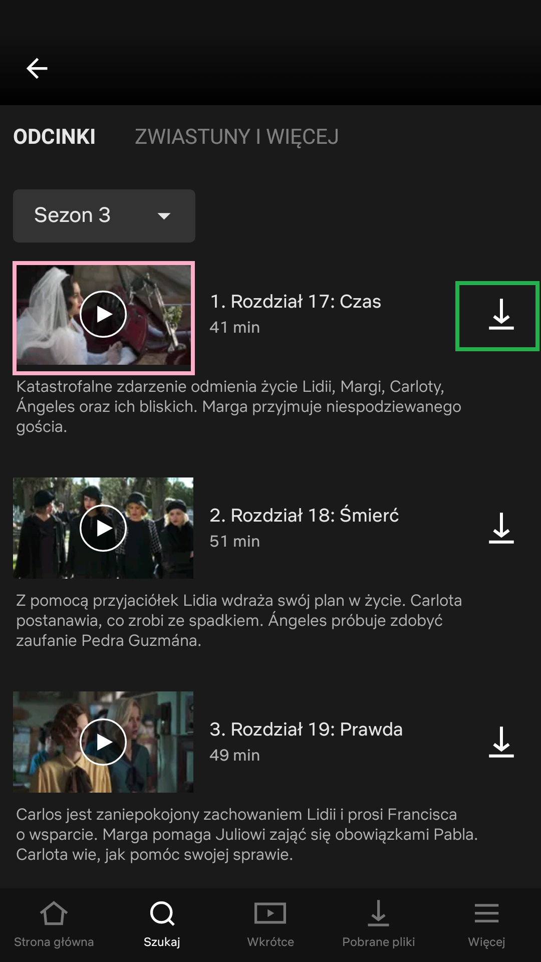
Every user can either choose to watch an episode (pink frame) and download an episode (green frame). This follows mapping (clicking on video frame) and conventions (download sign).
Watching an episode
After clicking on video frame, it is possible for me to launch an episode without active subscription. Only after trying to skip the summary, I receive a prompt in Polish explaining me that my account is not active. When I click on more info link, I’m moved to the general English language Help site, which does not provide me relevant information.
Downloading an episode

When I try to download the episode, I see orange exclamation mark next to the episode and on the downloaded files. The discoverability is good as it is easily to see that something went wrong, however, I do not know what exactly went wrong. Feedback is missing. While clicking on Downloaded Files, I receive error message who does not explain the error. I’m just prompted to either try again or cancel it.
Recommendation: I suggest to add forcing functions such as interlock, in this case in the form of constrains preventing me from trying to watch/download the episode and add feedback suggesting me to extend my subscription (with a link to do it now) instead of sending me to the general Help site.
Summary