
Roomi is a free mobile application that offers a safer and easier way for people to find co-living solutions: apartments/rooms and roommates. Users who have an empty room to rent out or look for a suitable candidate to take over the lease publish their listing information on the market. Home seekers search, connect and apply to move into an ideal place that’s compatible with their budget, lifestyle, or other needs and exceptions.
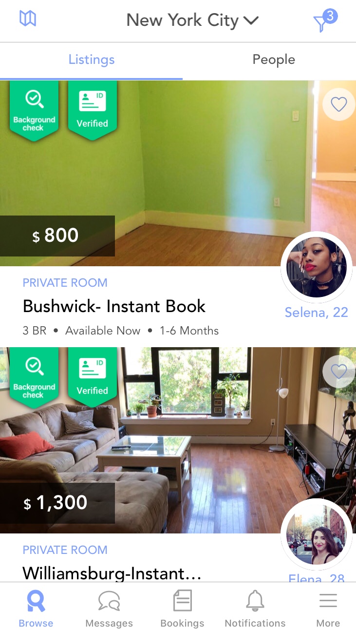
Roomi tackles the three levels of processing in different aspects. First of all, its adaption of a rounded, bubbly design style, less saturated color scheme and lighthearted graphics capture users’ at the visceral level, creating a positive emotion associated with the app by invoking a sense of friendliness and coziness.
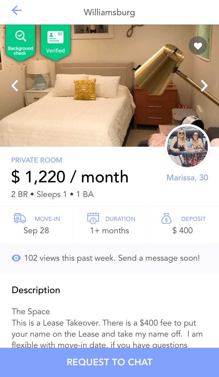
As users click into the listing detail, their gaze falls up the number of views during the past week. Sometimes this number could be as high as over 1,000. Giving out this data trigger a desired reaction from users primarily on the behavioral level. See this piece of information might not be as enjoyable, because a higher number means there are more potential competitors out there who’s eyeing on the same place, This creates an unsettling feeling that have less control over something that they would expect, but in the meanwhile, also motivates them to quickly take actions and move forward with the request.
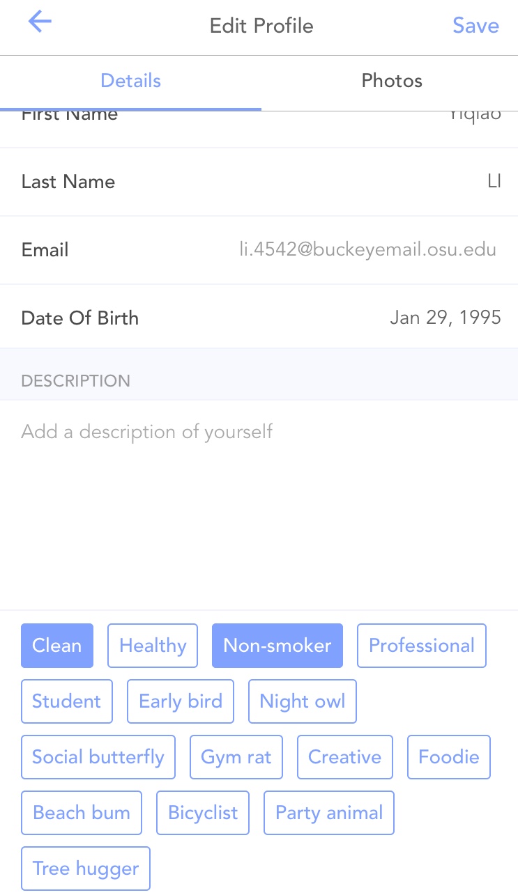
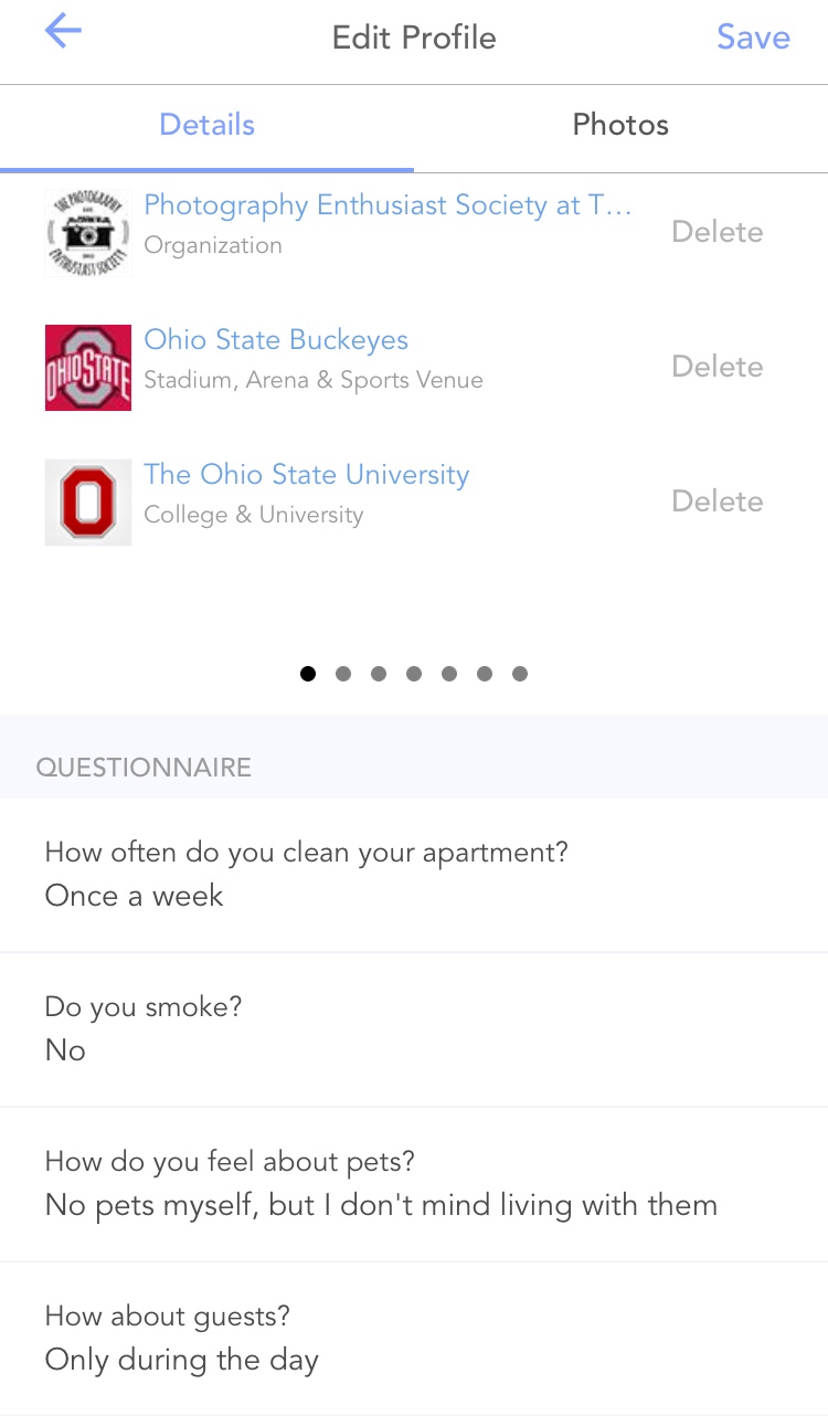
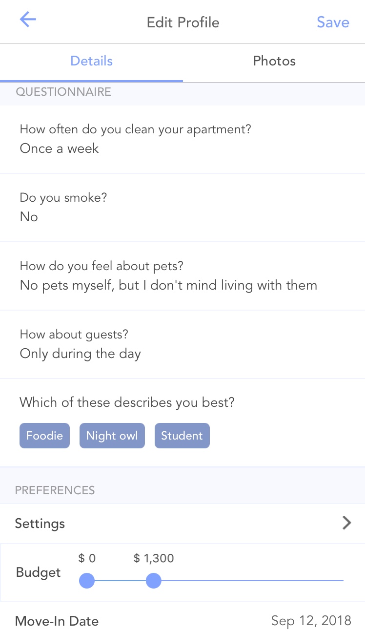
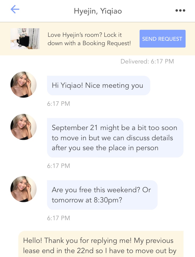
In order to connect the right person to the right place and to individuals who share similar lifestyle/interests, Roomi places an emphasis on one’s profile building. It encourages users to establish an in-app presence by adding profile picture, age, self-description, etc., and even provides a list of adjectives and questionnaires that reveals some insights about one’s personality traits and living habits. Users are also prompt to connect with social media such as Facebook and LinkedIn. In addition, the built-in messaging option is a more convenient and casual means of communication compared to other channels such as emails. These instruments essentially boil downs to the social aspect resides in the reflective level where everyone is conscious of. Roomi’s popularity does not simply come from the tangible elements seen on the surface but really heighten the value of co-living and potential for community building, especially when people just move to a new place.
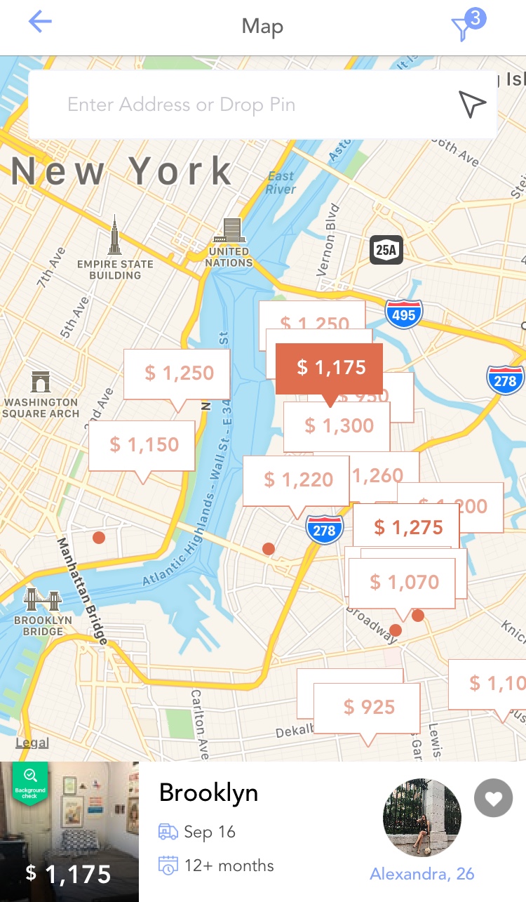
Due to a large amount of inventories within certain areas, markers placed on the map often cluttered and overlap on top of each other; but the selected one will be highlighted and brought forward to acknowledge the interaction is registered. This provides immediate visual feedback to users to indicate the current button state and their position on map. However, when I returned from listing detail back to map view, I always kept forgetting which ones I already looked at, which ones I favorite, and which ones I decided not to consider, since each marker simply displayed the price. Therefore I had to perform the action of tapping in and backing out repeatedly. According to Norman, such occurrence of errors could be considered a slip, specifically a memory-lapse slip, as they are caused by memory failure with the right intention. Norman’s suggestion for combating memory-lapse slip is to reduce the number of steps and to provide distinct indicators that remind users of the next step. In my case, my recommendation would be to gray out the listings that have already been viewed, add a symbol next to price or use a different color to highlight the marker as an indication for favorite listing. Also, giving users the option to hide the options that are passed on could effectively clear up the map and cause less confusion.
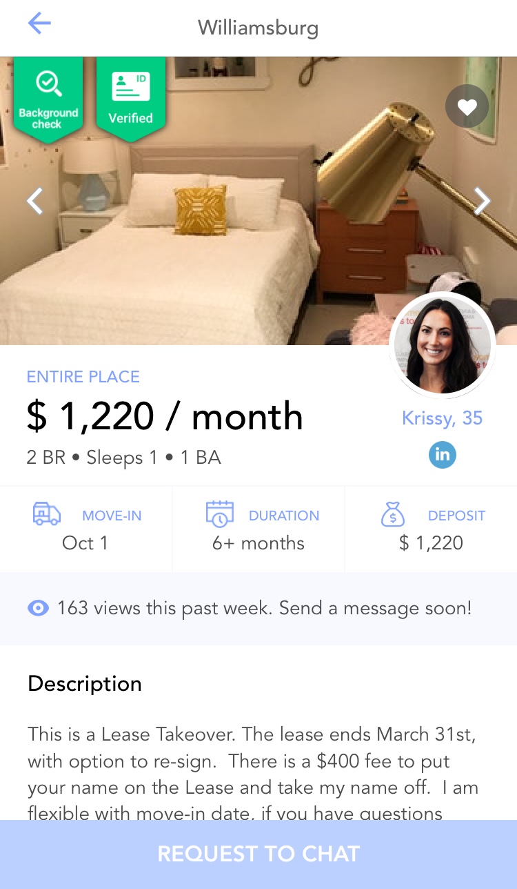
After users send out their request, the “Request to Chat” button is darkened and disabled. This not only provides a feedback to users that they have reached out to this apartment, but also imposes a nice constraint that prevent users from repeatedly sending messages before the other person accepts and replies back.