Shopbop is a US online fashion apparel and accessories shop opened in 1999. It is positioned in a high-end users’ market and also very popular especially in women’ business. Shopbop has been a subsidiary of Amazon.com since 2006. That means it allows prime users to enjoy the free shipping and returning service. Thus, the market based on mobile is no time to delay.
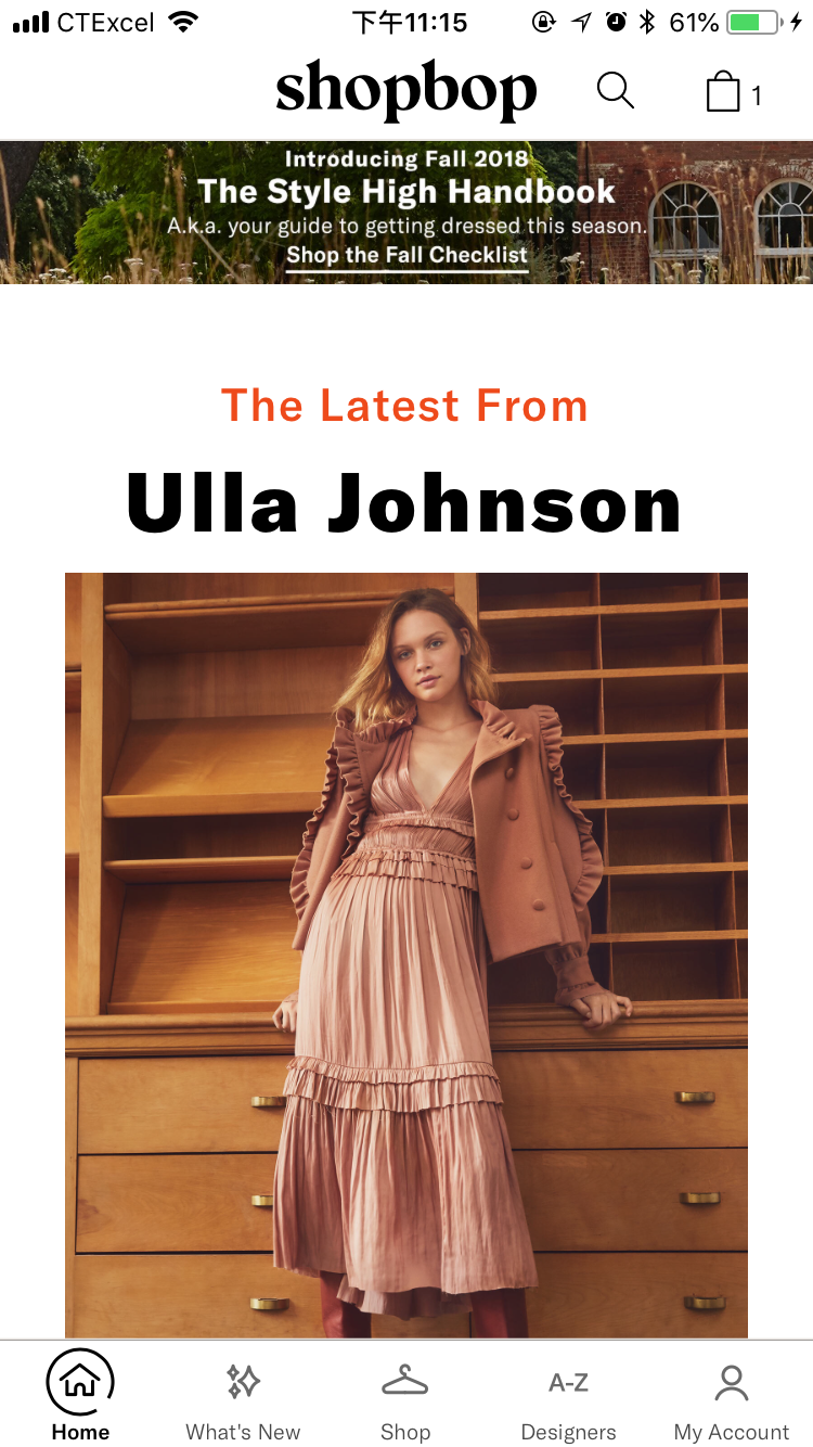
Shopbop App (IOS application) is divided into five parts: Home, What’s new, Shop, Designer, My account. In my opinion, Shop is the most used part, and this button is in the middle of the five. It is smart to make it the easiest button to click. However, by observing this App, many shortages exist. As Don Norman says: “Interaction design’s goal is to enhance people’s understanding of what can be done, what is happening, and what has just occurred.” Also “Experience design focus on the quality and enjoyment of the total experience.” Personally speaking, Shopbop App is still in the stage of Interaction design. Here are some advantages and disadvantages of its design below (I don’t mention some basic and obvious design).
Advantages:
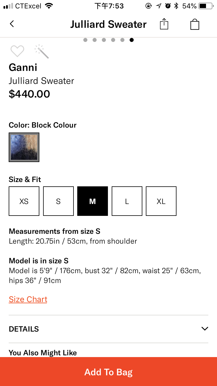
1. The “heart shape” is a clear signifier that I could click it to drop the clothes to “my favorite”. Also, the “turning pink” feedback makes me sure about it.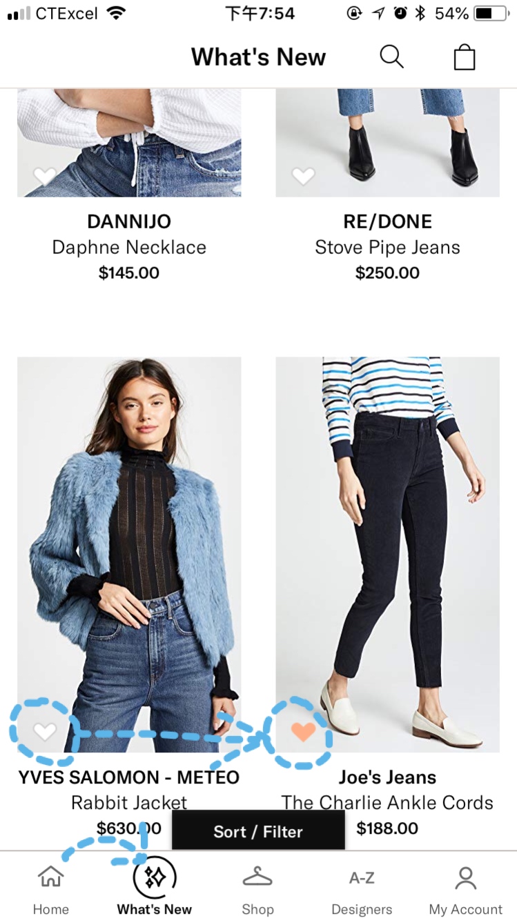 (advantages 1 & 2)
2. The main buttons are on the bottom of the page. They are in light gray without clicking. If it is clicked, it will turn to dark gray, and also a pretty dynamic effect that the circle appears from a dot. Great and cute feedback!
3. The word in the box and the passwords’ rule are great constraints to let users know what should put in the input box, and the shade in the box is a good mapping to show it is an input box.
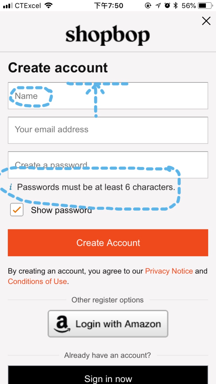 (advantage 3)
4. It is good to color the “forgot password?” Button orange but without button shape (different with “sign in”button). It makes sense because “sign in” is a strong button and mapping (users have to click it in this page to success). But the “forgot password?” button is a weak button with strong function (people are not supposed to use it, and it is a low possible button to click, but if you forget about it unfortunately, it must be easy and conspicuous to see.)
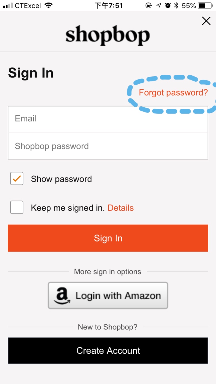 (advantage 4)
5. It is a brilliant design to keep the user still in the app instead of closing it when “my cart” has nothing. They recommend two options for users: shop by category or by what’s new, and it is a classic marketing strategy.
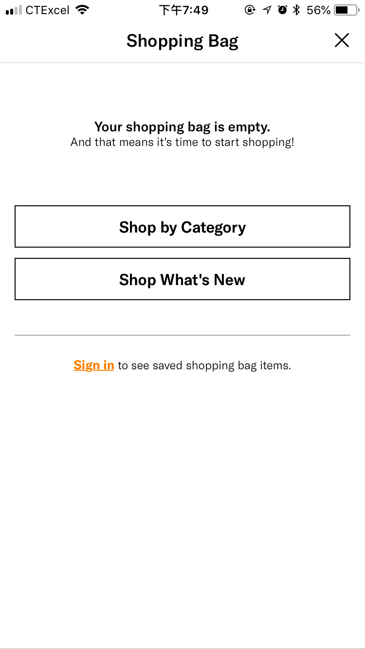 (advantage 5)
Disadvantages:
1. I don’t like the “you also might like” part because there are no brands and prices! I haven’t seen any shopping app or application showing items in this way. After all, the most important thing customers caring about is the price. If it is higher than my budget (like I prepare 100 dollars for a sweater, but the system recommends me a 200 dollar one), I will definitely not consider. However, if it is a super gorgeous 120 dollar sweater, I have to say, as for a woman’s nature, I will give it a chance.
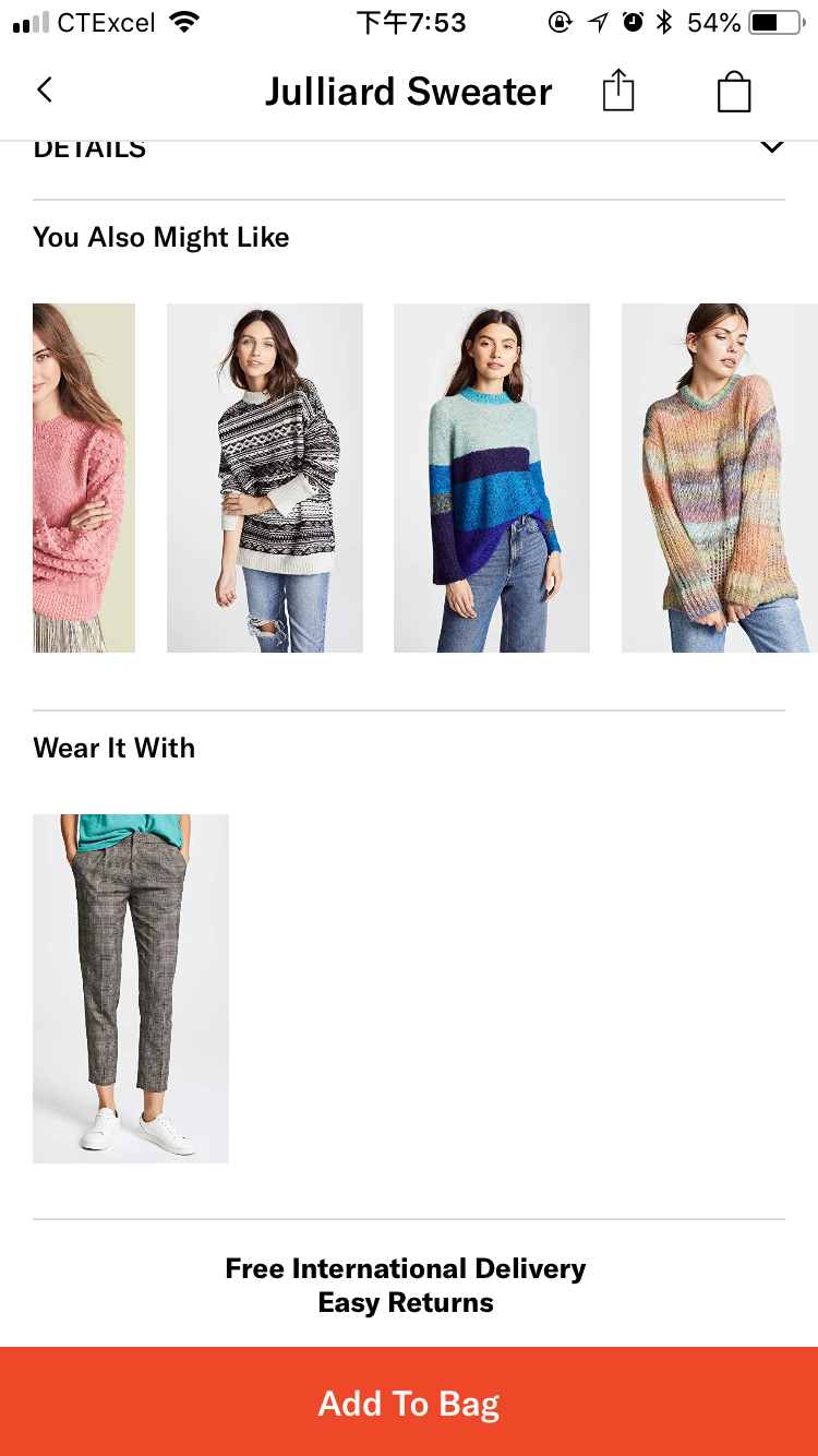 (disadvantage 1)
2. As you can see here, it loses comments part! It is a huge problem for a shopping App because most of the people are taking other’s opinion as the key information to decide to buy it or not. Without this part, I feel such insecurity. Shopping on the Internet is high risk, due to only have several pictures as reference, especially since they are beautiful skinny 5.9 inches’ model. I know Shopbop has this part on the website, so please add this function to the App.
 (disadvantage 2)
3. Bad feedback. When clicking the “magic stick” icon, the item added to wishlist as I wish. But there is no difference between I click it or not, so it is hard to know if I have already put it into wishlist after a while looking this item’s picture or information. They should add more feedback here.
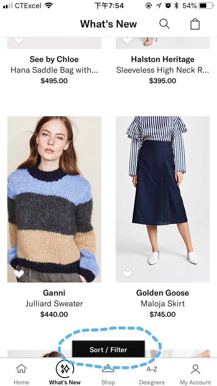
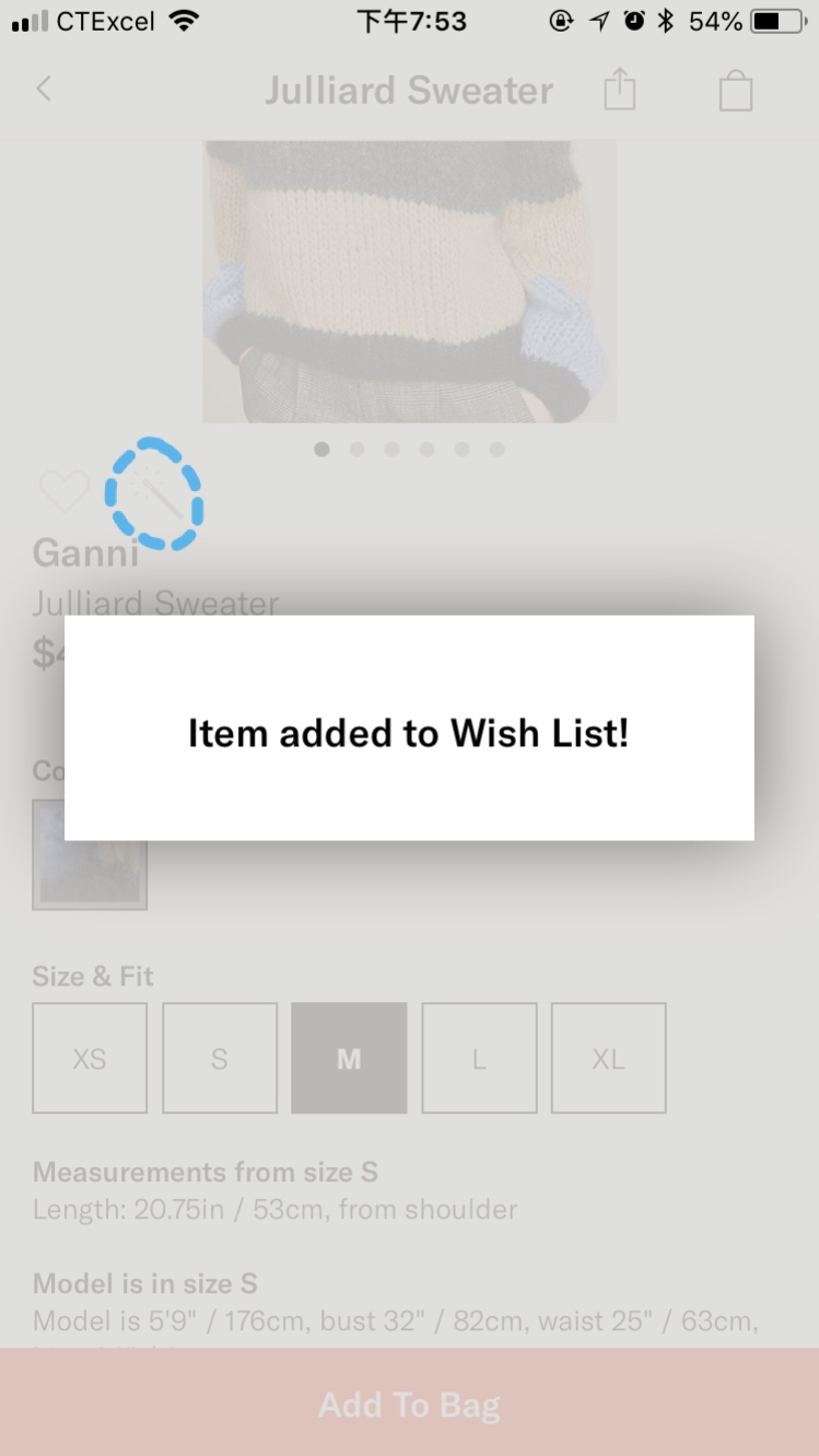 (disadvantage 3)
4. The terrified button is the “Sort/Filter”. It only shows when I scroll up (not show up when scrolling down), and it just stays there and doesn’t fade away. For me, it is so annoying, and when I want it, I have to make some extra move to open it. What’s more, Sort and Filter are both essential functions, so I prefer to make them stay on the top (maybe one on the left and one on the right). It can fit users’ habits more and be more effective.
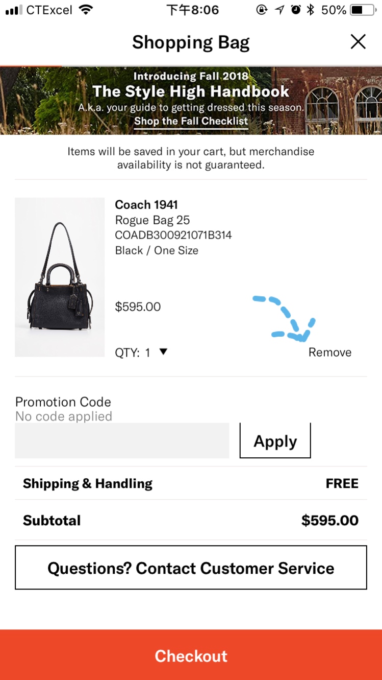
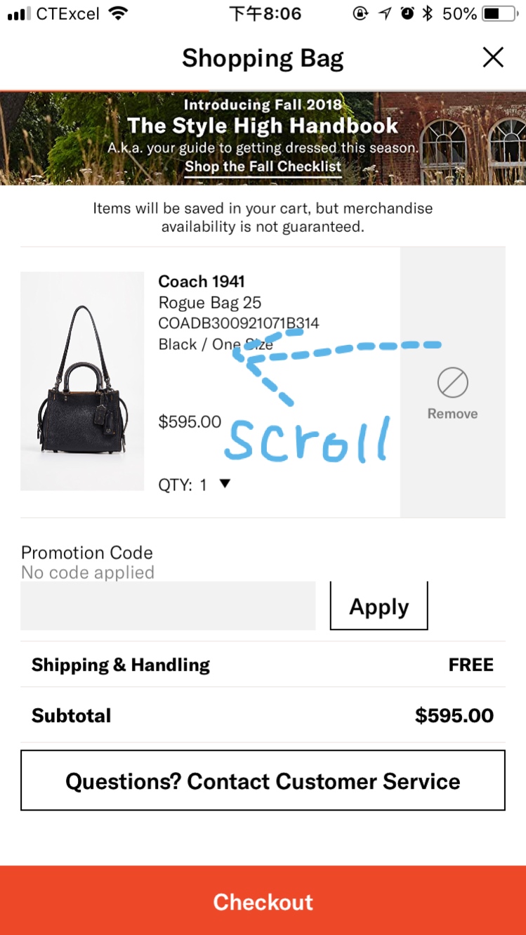
 (disadvantage 4)
5. Terrible mapping, the “remove” button is too tiny, and colored gray without button shape. It is confusing and seemed not clickable. The first time I found this function is by scrolling left, it is also a weak button there (gray looks cannot be clicked). Removing is a significant function in online shopping system, though I understand Shopbop does not want us to remove the item. But if I want to do it, the “weak button” cannot block me but only make me mad.
 (disadvantage 5)
To conclude, as Norman says: “We have to accept human behavior the way it is, not the way we would wish it to be.” Shopbop will be better and better after rounds of evaluations and redesign.
Sources: