
Shopee is the largest online shopping platform in Southeast Asia. In the past three years, Shopee has become Taiwan’s largest online shopping platform, replacing PC Home, the previous largest online shopping website in Taiwan. Shopee provides several services for people to shop easily: People can talk to buyers about the condition of the goods before they shopping, Product rating service can provide other people’s shopping experience to potential customers, and customers are accurately able to grasp the delivery process of the goods and so on.
Main Page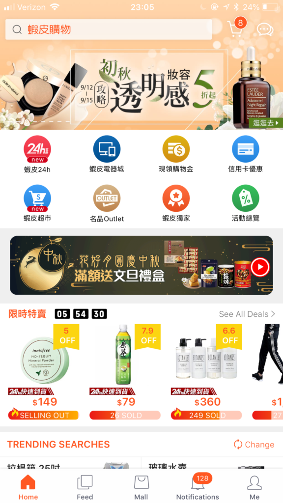
When we load into the App, we can see that the page provides logos, icons, and search bars. This delivers the concept of “Discoverability” that Don Norman mention in his book “The Design of Everyday Things.” People are easily able to figure out what actions are possible to take. In addition, these images and icons provide clues to help people navigate the App, presenting the app’s signifiers. For example, the “search” bar signifies users that they can search for their interest products and the menu always displays at the bottom that helps users find information easily. Therefore, I would say the app’s “discoverability” and “signifiers” are successful.
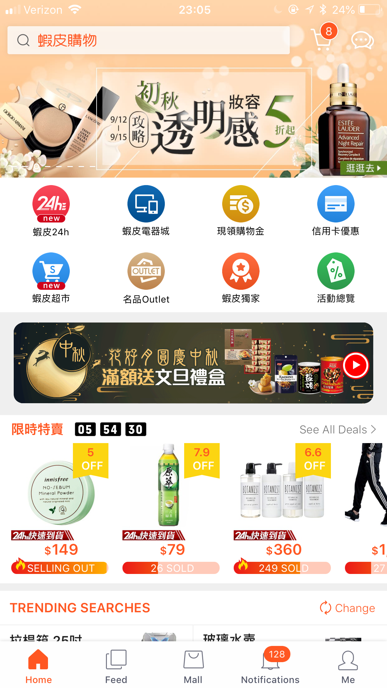
Shopping Experience
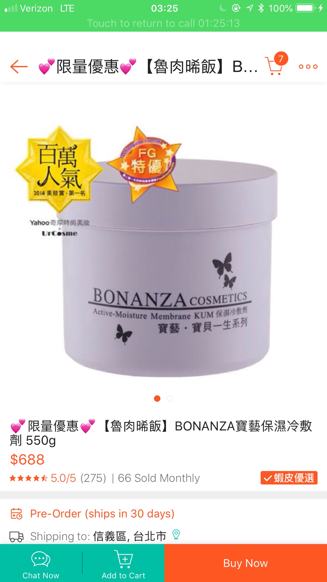
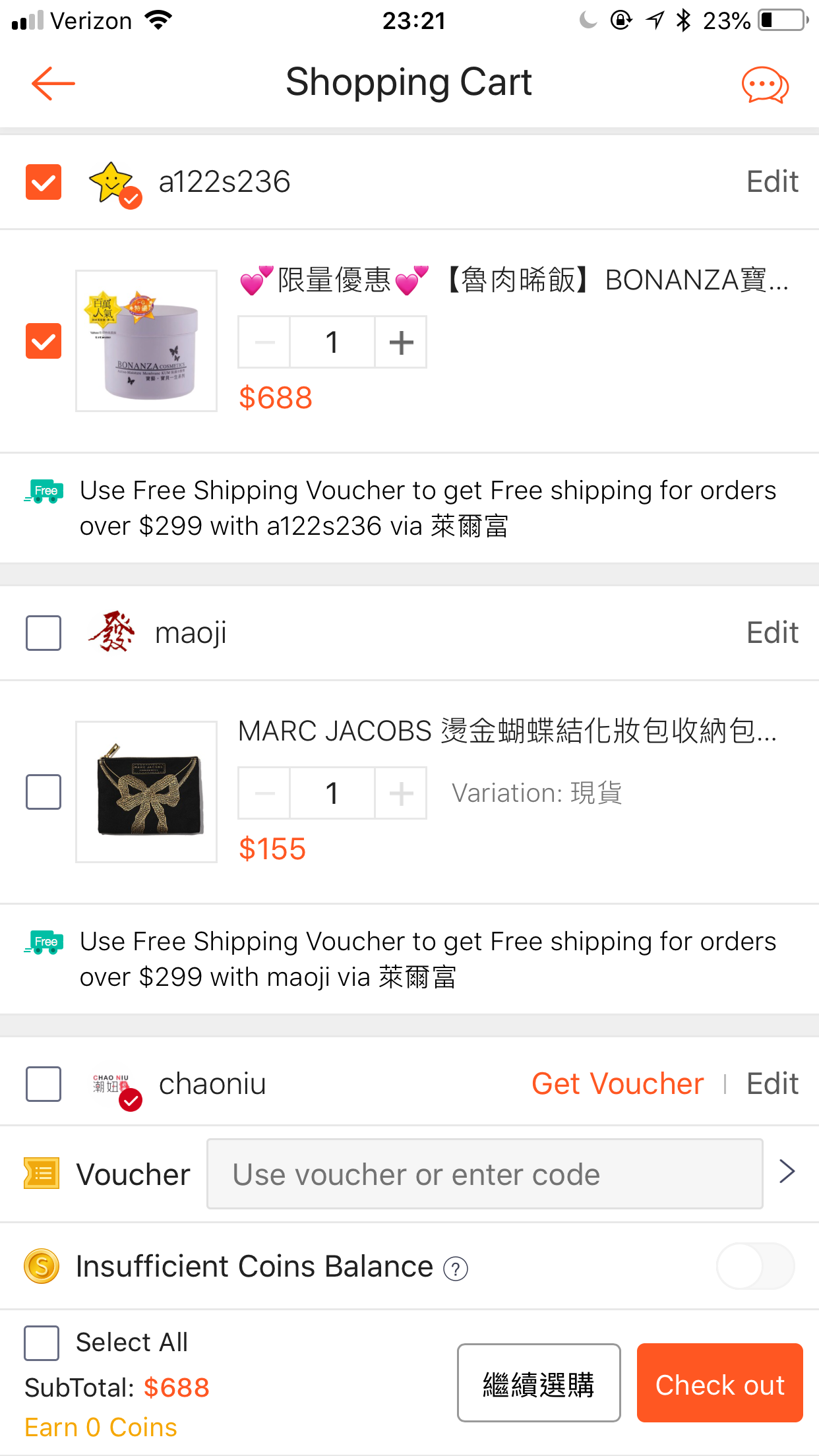
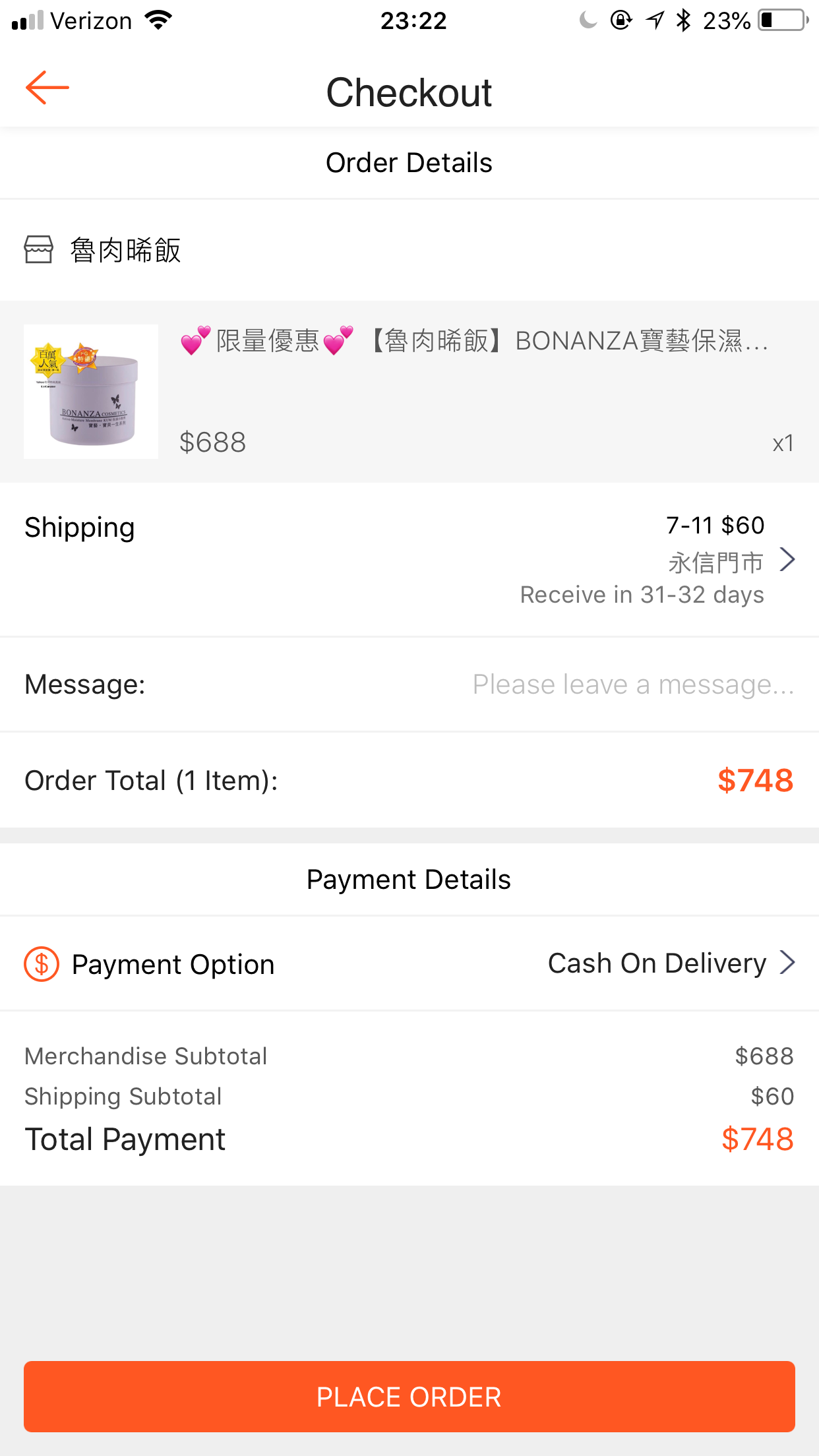
A good and smooth shopping experience can improve customer satisfaction and loyalty. However, from the first picture to the third picture, we can see that when we press the button of “Buy Now” will enter the page of the “Shopping Cart”, and then when we click the button of the “Check Out” will enter into the final checkout process. Even though the whole process is very intuitive, some customers could not able to predict the content of the next page, the next step. Hence, they could not able to understand the relationship between each page. They have no idea how many steps that they need to complete for an order until they complete the whole process or which step where they need to provide their personal information. If we can provide a diagram or a flowchart of the shopping process between each screen, it can help customers know where they are, what is the next step and how they can complete the order process. By adding a diagram or a flowchart of the shopping process between each screen, the quality of shopping experience will be improved, which led the customers to feel that the platform is worth to trust. Thus, I think “Mapping”, a technical term which mentions in Don Norman’s book, in this App is good but not perfect.
Order Options
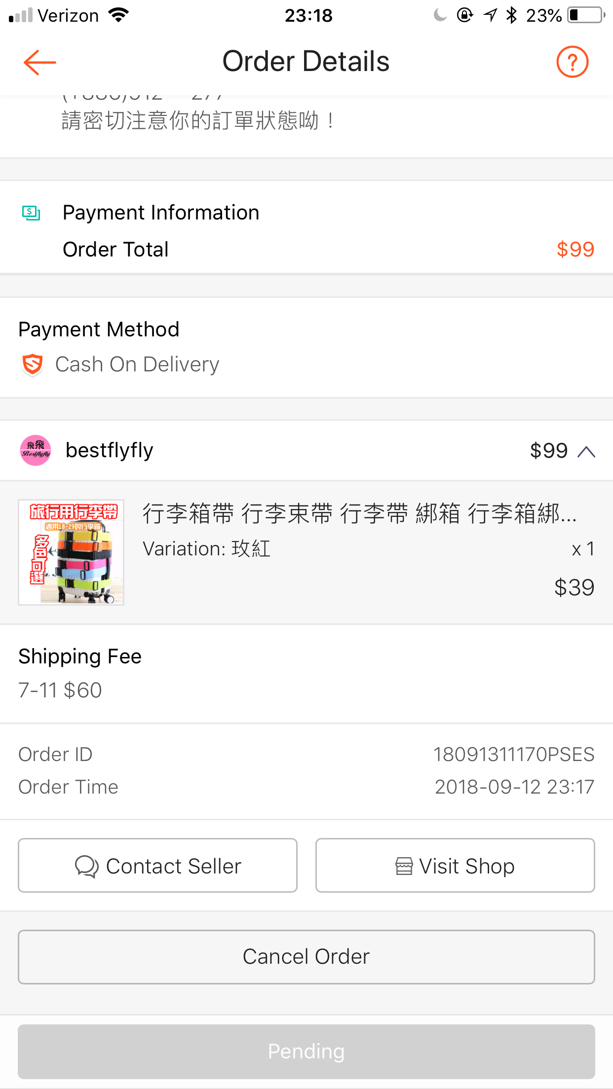
In this App, the most attractive feature is “Cancel Order” bottom. Sometimes, people will make a mistake to buy wrong colors or wrong sizes of clothes when they purchase their products online. Through clicking the “Cancel Order” bottom, they can easily cancel their orders without charging any additional fee. According to Don Norman’s suggestion in his book, a great design product includes placing an option to “undo – Obviously, undoing is not always possible. Sometimes, it is only effective if done immediately after the action. Still, it is a powerful tool to minimize the impact of the error.” If the system does not include cancel function to undo the mistake, it will make the error worse. In addition, I have used this cancel service when I purchased wrong products and those experience are truly wonderful since the bottom can help me solve the mistake. This propels me to return to this platform when next time I need to buy something that I need. Thus, I think the “Cancel Order” bottom is an extremely useful design in this App.
Oline chat service
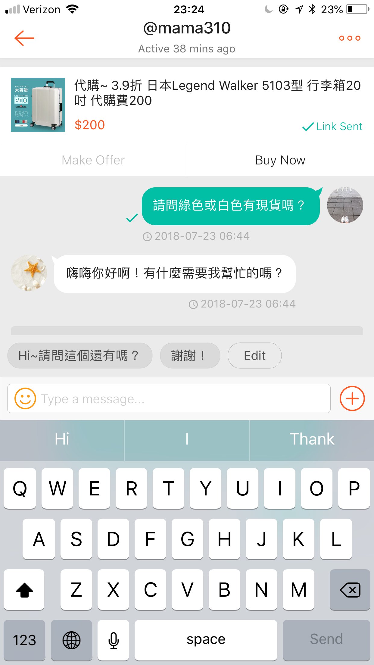
I think the “Feedback” is great. Since consumers can chat with sellers via this system anytime to ask about their interest products and they can get their answer immediately. Because the system is conduct by real people, real sellers, instead of a robot, consumers will be more confident to use the platform.
Cited:
- Norman, Donald A. The design of everyday things. New York: Basic Books, a member of the Perseus Books Group, 2013.
- https://itunes.apple.com/tw/app/%E8%9D%A6%E7%9A%AE%E8%B3%BC%E7%89%A9-9-9-%E8%B6%85%E7%B4%9A%E8%B3%BC%E7%89%A9%E7%AF%80/id959841107?mt=8