Introduction
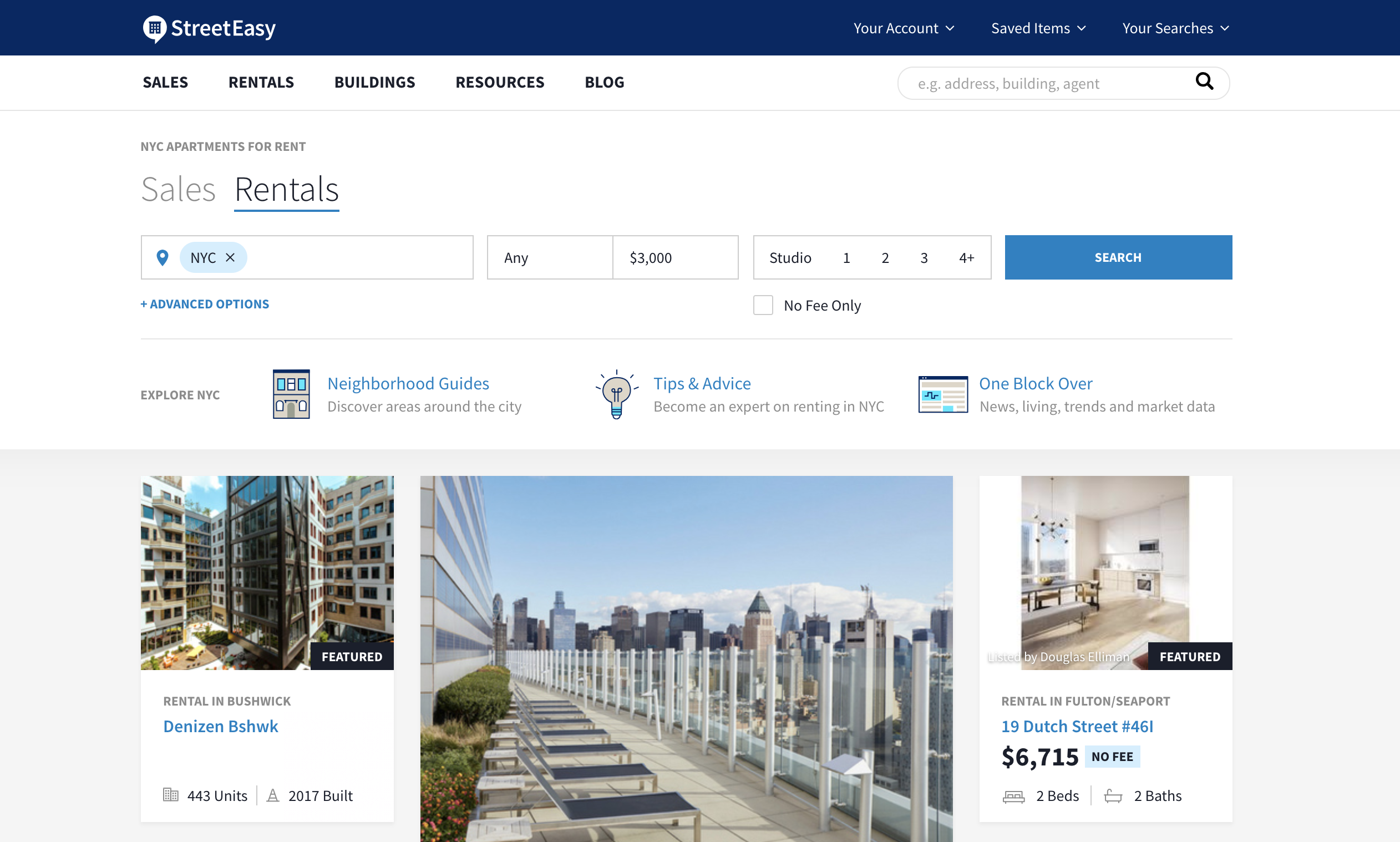
For a fresh New Yorker, the first goal to achieve might be looking for an apartment. Streeteasy.com is a marketplace provider in New York City, which links buyers, sellers and renters with access to comprehensive sales and rental listings, and information about all buildings and neighborhoods. The following critique is based on intensive usage over a time period of two weeks, with three attributes covered from consistency, feedback to constraints.
Consistency ***
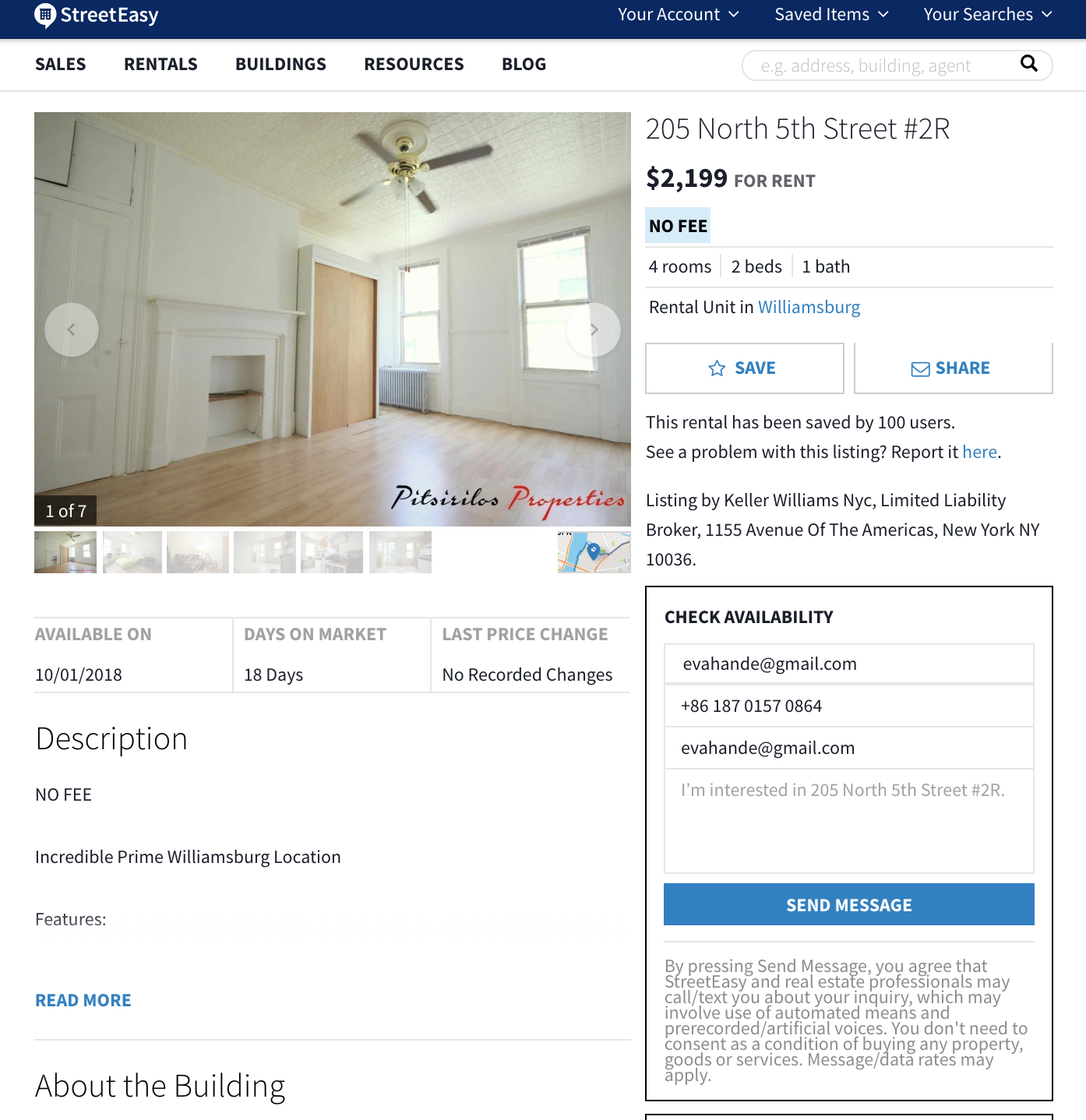
Consistency refers to designing interfaces to have similar operations and use similar elements for achieving similar tasks. However, there is a frequent button on both website and IOS App, used for contacting with the operator of the apartment, which actually brought about confusion. I was using website and I told my future roommate that I have sent messages to those available apartments, how about you. And she was confused because all she can see is CONTACT AGENT instead of SEND MESSAGE. At first I was thinking maybe the product manager changed the name of the same button because there is not enough space, but it turns out that the one on App is one letter longer than the label on website.
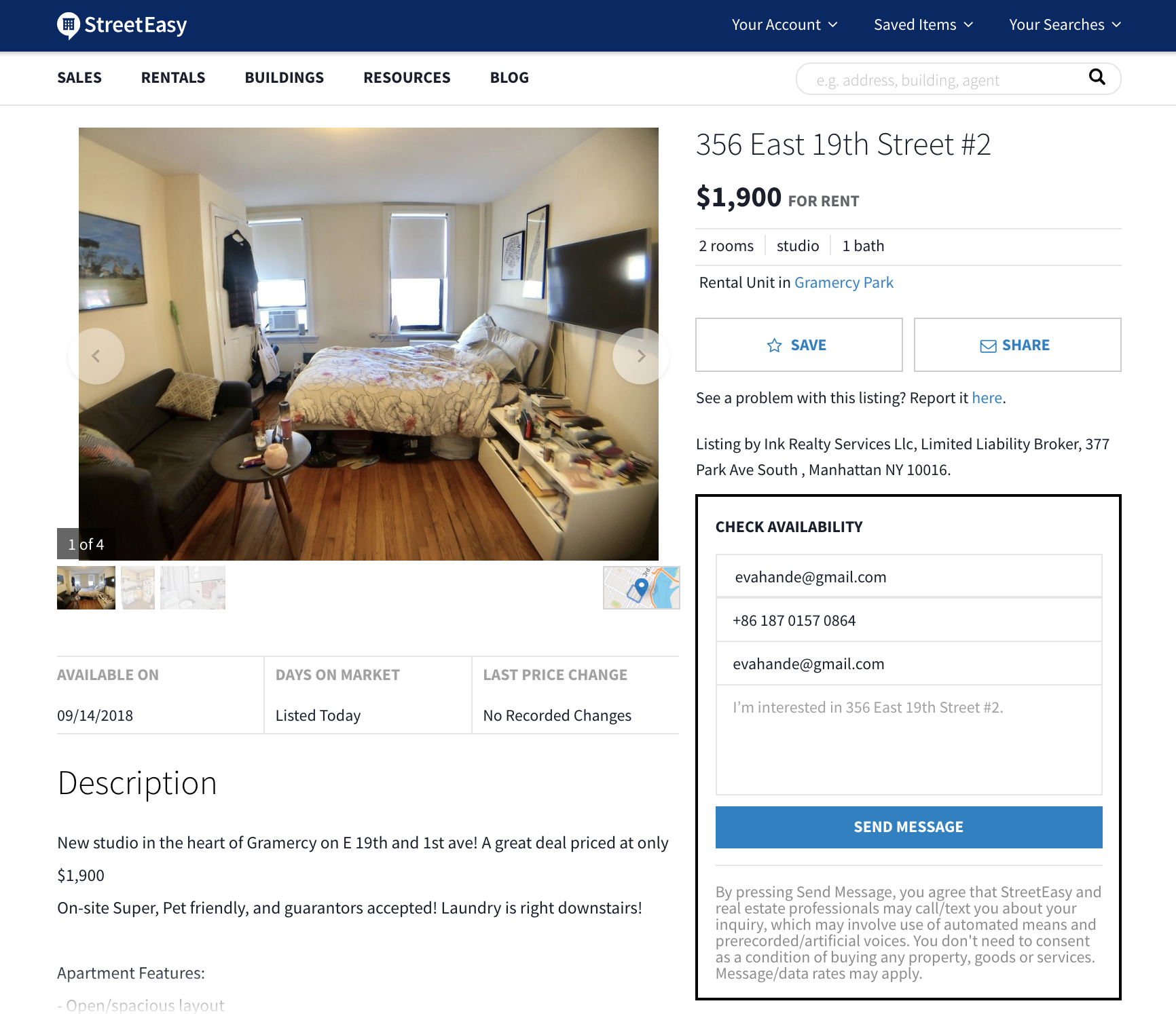
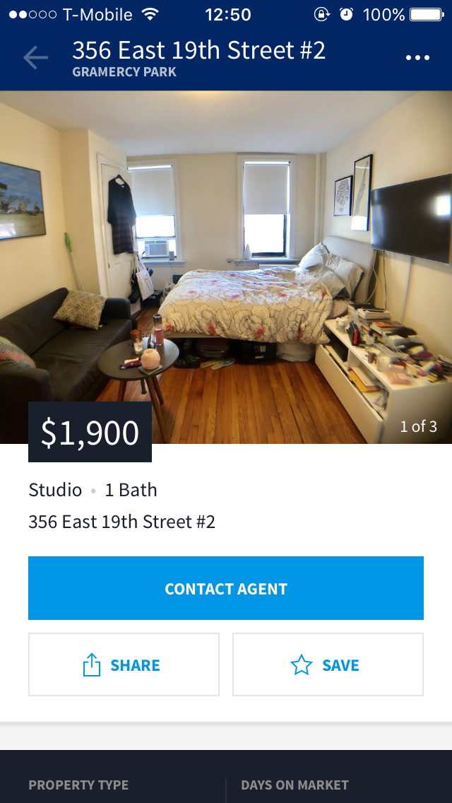
As a result, we both contacted agents and sent messages without knowing that we are under the same action to the same building, until we both received emails of notifications that those emails are sent through both buttons from website and IOS App with the same feedback.
Feedback ****
Feedback is about sending back information about what action has been done and what has been accomplished, allowing the person to continue with the activity.
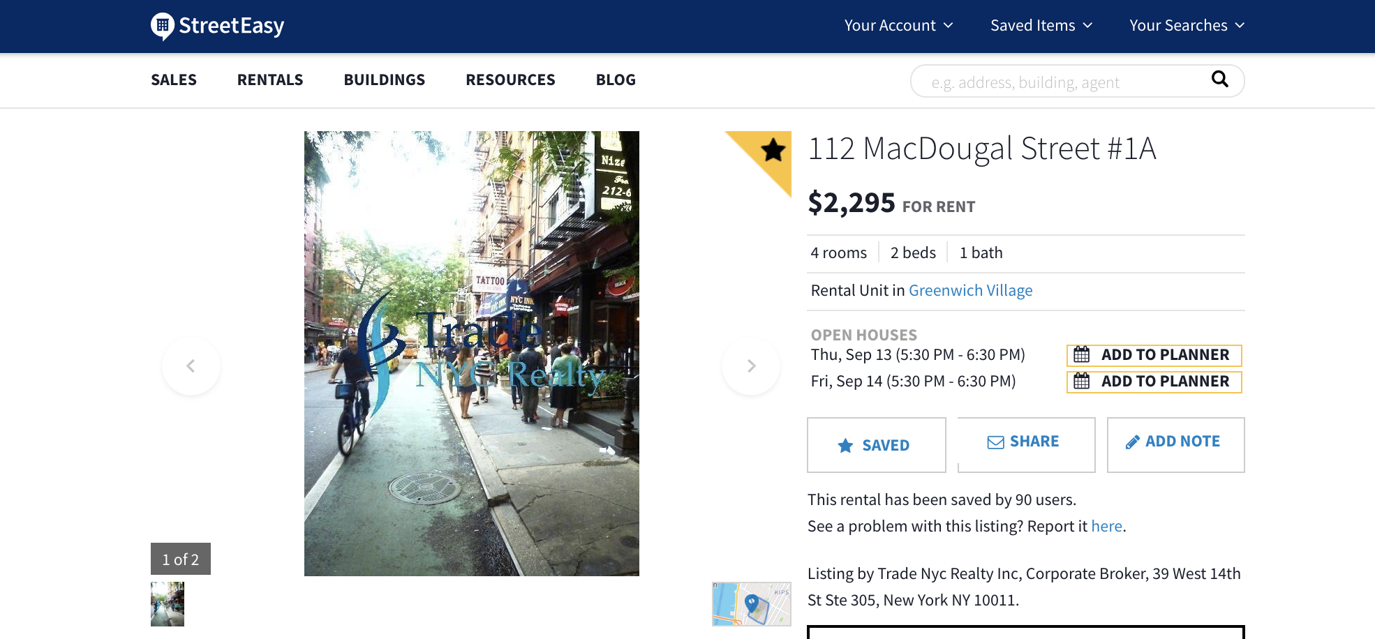
In the page of a specific rental unit, if the user want to “bookmark” an apartment, it is visible on the right side by the photo of units which are the most focused area. When save button is clicked, the label SAVE turns to SAVED, and also, a yellow label will star the profile as a recognition for user to remember this is a apartment they have viewed and shown interest. Moreover, there is another hidden button ADD NOTE, so the users are not only given feedback of the action, saving the profile, but also provided with the following process of an action.
Constraints ****
Constraints-The design concept of constraining refers to determining ways of restricting the kind of user interaction that can take place at a given moment. There are various ways this can be achieved.
Please refer to the above two screen shots.
The ADD NOTE button was hidden also provides a good example of restricting possible user interactions. It is said that, the best number of options that you can give to a boss is 2. So the third button was hidden unless SAVE button is turned to SAVED.
Affordance ***
As Norman mentioned in 1988,At a very simple level, to afford means to give a clue. When the affordances of a physical object are perceptually obvious it is easy to know how to interact with it.
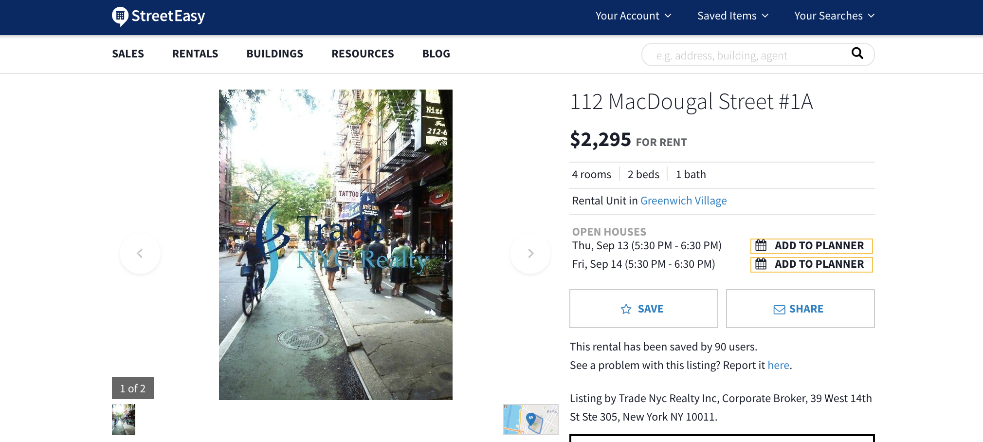
By providing some visual icon, button and clickable color and bold character, the website is of a high affordance level. First of all, words in blue shows a clickable attributes, just as clickable as buttons with blue or white colors. the show wheel of pictures and two pointing buttons imply the easy transition of photos. What’s more, the message box was designed to be similar with a real message on a paper, thus, they are all recognized without much effort. Nevertheless, the only confusion here is the envelope icon standing for SHARE, envelope icon should be used to send message instead of copying link and sending to other platforms.
Conclusion
StreetEasy is a website with users ranging from various background, and they have respective conceptual models. The website has followed most of the design principles of Don Norman, except for a couple of confusion points as I mentioned above.