Transit is a mobile app that provides directions for public transportation systems in over a hundred cities around the world. The app also allows users to subscribe to real-time updates for routes that they frequent. I’ll be critiquing the app from the standpoint of a user in New York City who only uses the subway.
The natural mapping
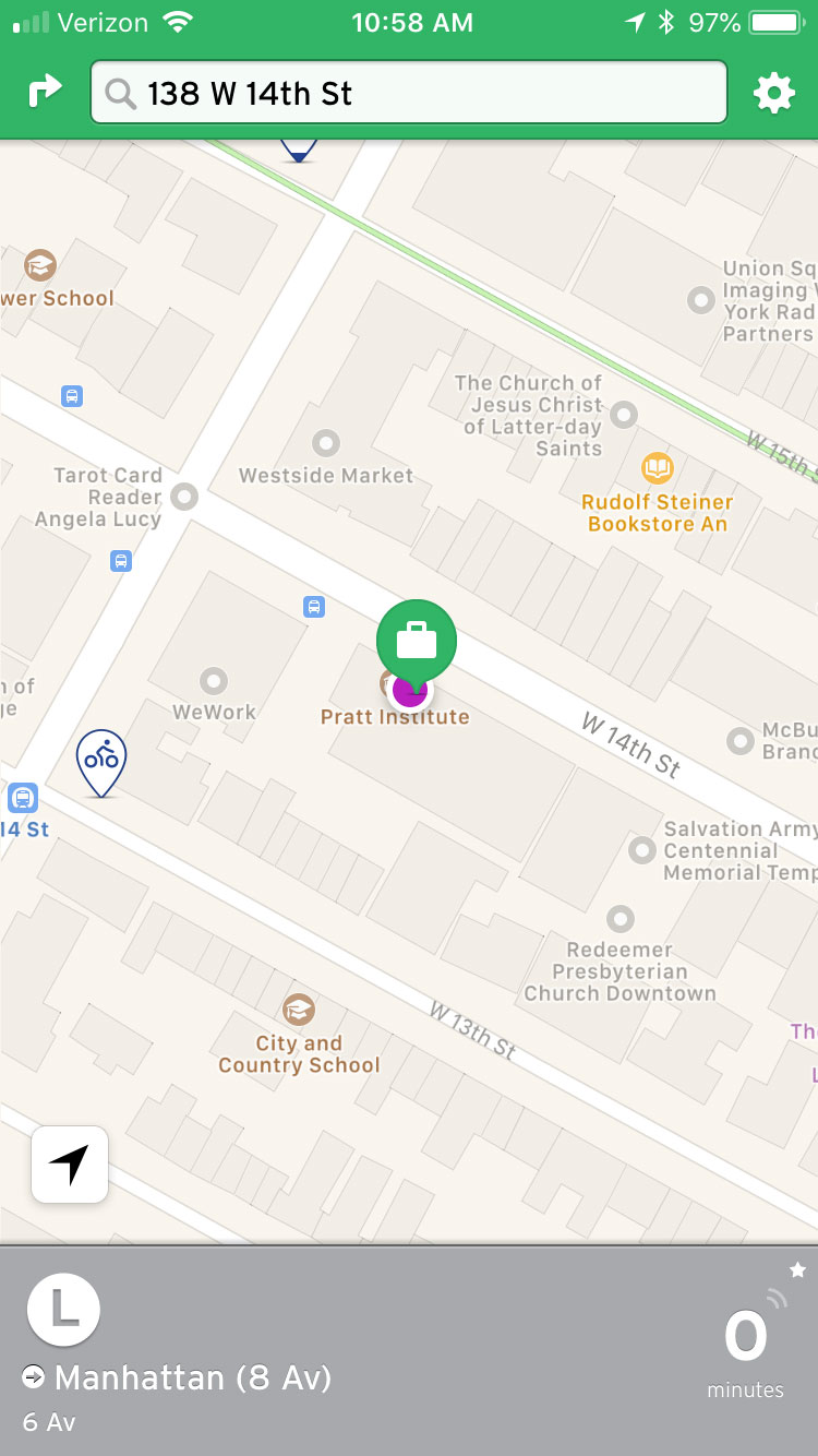
The home screen of the app shows the user’s GPS location on an interactive map with the closest routes listed underneath, sorted from nearest to furthest:
The action cycle is very clear throughout, bridging the Gulf of Execution and the Gulf of Evaluation by making the design simple yet comprehensive.
On Transit’s home screen, the designers used a perceived affordance for users to figure out that route options are selectable, and selecting a route makes two scroll dots appear signifying that the user can swipe back and forth to view next arrival times for either of the route’s directions.
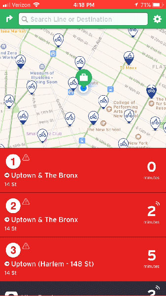
This signifier is created through a convention: if a user sees a set of dots, they usually know that the option to swipe back and forth is available to them. By making this selection, another set of icons also appear that show the current locations of each train, any scheduled maintenance or delays, an option to favorite a route, and a link to the train’s schedule. This type of feedback that clearly shows the user what they can do next is present throughout the app.
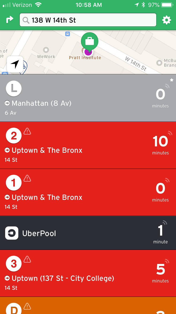
Favorite train routes
One of the best features of this app is the ability for users to add their most frequented routes to “My Transit Lines”.
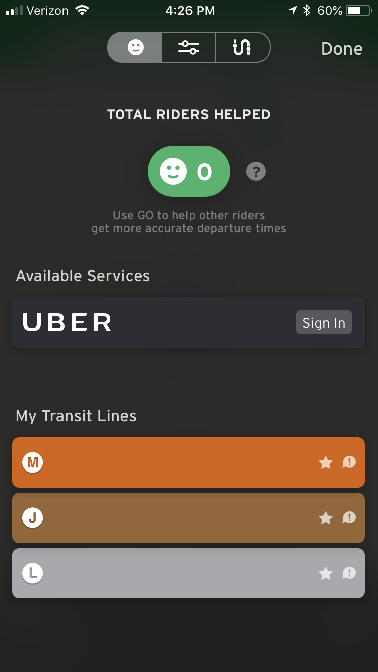
By selecting the “star” icon (another design convention meant for highlighting or favoriting a certain object on an interface) on any of the routes, the app will automatically give real-time updates in the form of push notifications to let the user know of any delays or planned maintenance on these routes.
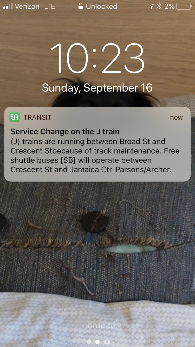
This collaboration between the app and the user helps the user perform the basic activity of getting to their destination on time by making them aware of any unexpected changes on their route.
Use of universal design
The designers made a good choice in allowing users to adjust settings in the app so that people who need an accessible subway stop can find one in real time.
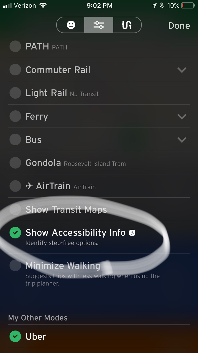
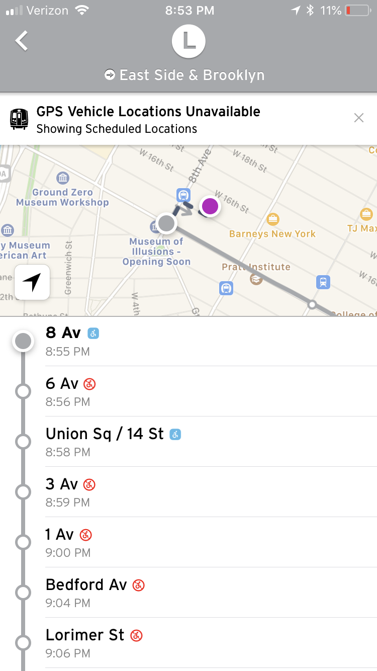
By adding this option, any user should able to find a route to their destination, regardless of ability.
Recommendation: immediately routing to a saved location
Frequent users of this app are likely trying to do one of two things: go home or go to work. The current mapping has the user first go to the search function, then select a location from “my locations”. Why not save a step by providing the most-used locations on the home screen (mockup shown below) that slides out and floats with the layer of other available train routes?
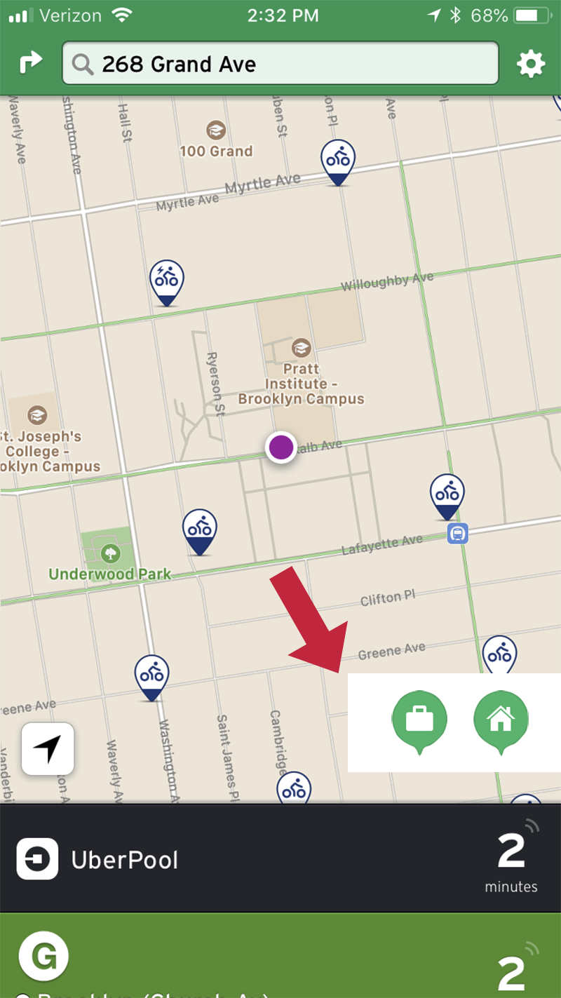
A task analysis might show that adding these icons could make the execution faster for the user, saving a step by not forcing them to go through the search function first. While these icons are selectable on the map itself if the user is already in that specific location, designers might consider allowing them to be selected at any point in the action cycle regardless of current user location.
Summary
Overall, Transit is straightforward, pleasant to use, and enables easy discoverability, giving feedforward and feedback to the user throughout the action cycle. Compared to the Metropolitan Transportation Authority’s own app, Transit is superior when it comes to usability and only requires a basic amount of knowledge of how the subway system works to operate the app, making it navigable for tourists and seasoned commuters alike. Adding “home” and “work” icons to the home screen to allow a user to quickly find directions to their most frequented destinations at any time would make this app even sleeker. A great example of activity-centered design, this app wasn’t made for a specific type of person but rather a specific type of activity: easily finding the fastest and most convenient route to a destination.