Introduction
Zillow is an online real estate database, which aggregates content from multiple listing services across the United States and Canada. Users may search the site for home rentals, sales, auctions, and foreclosures. Features of the site include the ability to save searches with multiple criteria, save favorites homes, and share these favorites with others.
Searching Zillow
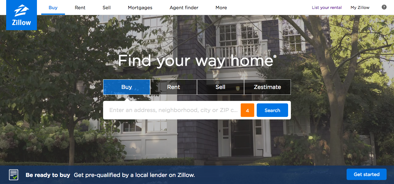
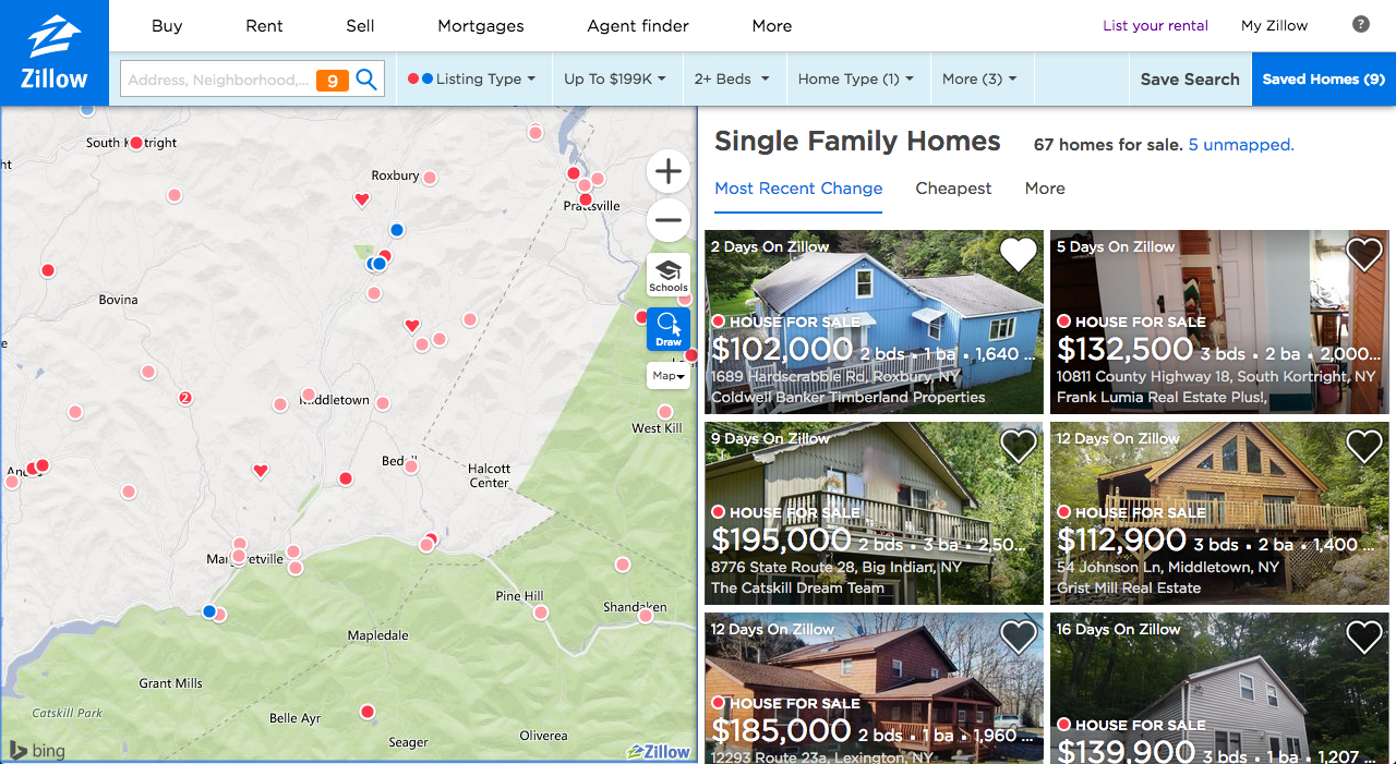
When users first visit Zillow, they are presented with a search box on the homepage as pictured in the screenshot at the top of this post. If you are a repeat visitor that has saved search criteria before, the search box will contain a number in orange that indicates results for your saved search. This is a good signifier that a specific action—to see new results that meet your criteria—can be taken. The gulf of execution can be crossed easily on Zillow’s website. Most users know what a search box looks like and how it operates, and are easily prompted by a “Search” button to complete a search. Users receive feedback that their search has occurred, and cross the gulf of evaluation when they are presented with their search results. Zillow’s search results screen divides the screen in half, with a map on the left and thumbnails of home results on the right. This provides a good conceptual model of how Zillow works—seeing both a zoomable map and results next to it helps users visualize the scope of the homes available in Zillow.
Saving Homes
Zillow users complete Norman’s seven stages of action while performing searches. Their goal is ultimately to find a home they might like to rent or purchase. They plan their search by deciding to visit the website, specify their criteria using Zillow’s filters, perform the search when they click “search,” perceive and interpret the results that are returned, and then compare them against each other. When users have found home results they like, they can save the home to their favorites list (which creates knowledge in the world) by clicking the black heart on the thumbnail list or by clicking “Save <3” on the home’s detail view.
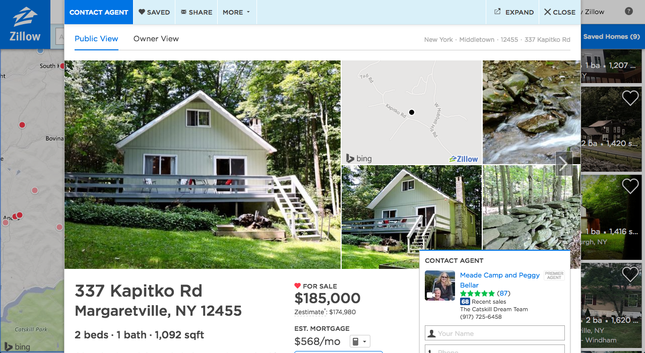
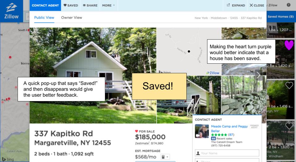
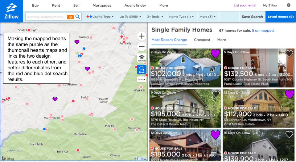
The feedback at this step is subtle and could be improved upon. When a user clicks either save option, the only indications that the home has been saved is that heart button changes from black to white and the text “Save” changes to “Saved.” I would recommend a quick pop-up of overlaid text that says “Saved!” and that the heart changes to a vibrant color like purple.
When users close the home detail view, they may also notice that the homes they have saved are now indicated by small hearts on the map (left) side of their search results. However, the tiny hearts are the same color red as the dots on the map that indicate search results. I would recommend making the tiny hearts the same purple as the heart I’ve recommended on the thumbnail view.
Sharing Homes
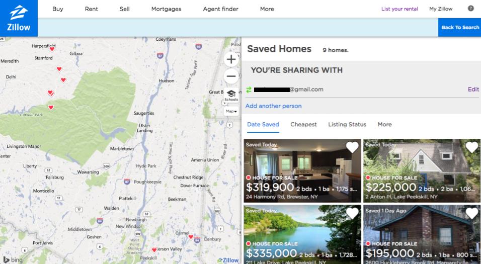
When users want to visit their saved homes, they click “Saved Homes” from the top right menu. The screen refreshes, and the user is now viewing a split screen with a map on the left and thumbnail results on the right, but they’re only seeing their saved homes. On the top right side of the screen, users can easily see who they are sharing homes with, and are able to add more people to share with. On this page the search filters have disappeared from the top bar, providing a good constraint for what is possible on this page.
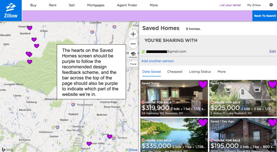
I would once again recommend changing the color of the hearts to purple, as this establishes saved homes as distinct from the red and blue dots of search results on the map. I also recommend changing the header bar color on the Saved Homes page to purple as well, to better indicate to the user which part of the website they’re viewing. If users navigate away from the Saved Homes page to another task, upon returning they may forget where they left off (which may cause a slip or mistake), so the purple header bar acts as knowledge in the world to indicate to the user where they are in the Zillow website when they return.
Conclusion
Zillow’s website is fairly user friendly in its existing state. It provides a good conceptual model of how it works with its prominent search box and easily understandable search results; it maps to other behaviors that users are familiar with on the web—searching and mapping places onto a geographical map; it provides feedback in the form of a number indicator in the search box for updated results, and a heart/saved button that changes color when clicked; and provides a constraint for what can be accomplished on the Saved Homes page. With some small changes as recommended here, Zillow’s site can become even more user friendly.